Data Presentation

A look at our latest visualization

At Juice, we recognize the importance of design and visualization in making you successful with your data. In fact, it's the design and functionality of visualizations that bring your data to life so we are always working on new and exciting ways for people to explore data and gain deeper insights. 

A common desire when examining data is an eagerness to dive deeper. Simply knowing the answer to a question isn't always enough - sometimes you want to know the ins and outs of "why". Take a metric for example. Knowing your sales number is great, but context is equally as important. Is that number higher or lower than last month? Where did the sales come from? Is there potential for growth with new customers? 

For example: when I go to Google Maps, I am usually looking for a good place to grab a meal, find a friend’s house, or maybe a local park to take my daughter to. Once I have located where I want to go, I usually zoom in to see what area of town it is in. After I get an idea for where it is generally located I’ll usually want to go deeper to see if I am familiar with that area of town. Lastly, and this may just be me, I switch to street view so that I can see what the area looks like, occasionally you will see individual people walking on the street, running, or maybe eating on a patio somewhere. The idea behind Google Maps is that you can see clearly from any level; from 20,000 all the way down to 20 feet.

At Juice, we wanted to mimic the behavior of diving deeper with our new visualization. It's appropriately named "Bubbles" and is a visual way to get an enterprise view of a large set of data - staffing data, in this case. If you are a leader of a large organization, we have created a way for you to - like a Google Map - get an enterprise view of your organization with the unique ability to drill into different departments, supervisors and individual employees. Interested in understanding the reporting relationships at a deeper level in your organization? This visualization can walk you through these relationships to discover hotspots where your organization can optimize the workforce.

We are passionate about helping businesses discover new insights in their data in creative ways and this is just one of the latest features. For more on our product and all that it offers, get in touch with us. We'd love to have a conversation about how to help you move your business forward.

Best Pie Chart Alternatives

We’ve all heard the sermons and lectures on the evils of pie charts, so why is it that they continue to be used in abundance? At Juice we’re regularly surprised by the use (and misuse) of pie charts in the market despite all the literature, blog posts, and funny tweets against them.

Perhaps there is some Illuminati connection to Pi and circles that ensures their existence. Whatever the reason, we felt it would be helpful to compile some of the best information on pie chart alternatives and share some examples. Special thanks to Cole Nussbaumer, Lee Feinberg, Nathan Yau, and Jorge Camoes for their always great work and examples.

  • When to use pie charts: Jorge Camoes does a great job in his blog post on the optimal number of categories in a pie chart. We won’t spoil it for you, but it’s probably not what you’d think. Have you gotten Jorge's book yet?  Maybe now you're convinced. 
  • Preference: One of the arguments we often hear in favor of pie chart is due to preference.  This article talks about the importance of preference and how it correlates with performance.
  • Default Setting: Another observation we’ve made is that pie charts are often the first or default option, so they get used more often. Check out these posts on default setting alternatives:

If you need more direction in your quest to branch out from pie charts, check out the Juice resource page for more valuable ideas.  

A Recipe for Success Metrics

When you’re getting out that last minute proposal or responding to the 4:55pm ad-hoc report request, metric performance is not top of mind. As a result, thinking about success metrics, in light of all our other demands, can make us feel less than successful. Knowing that you need to implement or improve your success metrics can feel like a daunting task with all that is going on around you.

Having successful metrics is very similar to getting really good at a family recipe. It's not a one and done, but an iterative process that is made up of a series of small steps and adjustments (pivots) over time. I’m sure it sounds odd, but here are some things that metrics have in common with a great family recipe:

  • Outcomes vs. Metrics - It's about creating a great conversation and experience, not collecting and publishing numbers. A successful Thanksgiving recipe is the family discussion and memories that go on for years, not the knowledge of how many sticks of butter were used. 
  • Mistakes Happen - There’s always a Metrics or Report 2.0 (3.0 and 4.0 too), so recognize it's a process that will only improve over time.  
  • Context Matters - A one pot recipe to throw together after Tuesday night soccer practice is different than something for Christmas Eve dinner.  The same can be said about the daily update vs. an annual report.  Ultimately, the desired outcome is different, so even if the metric is the same; how its shared and communicated might be different.  Remember it's about “success metrics” not just metrics, so having success is an important part of the equation.

With Juice’s 10+ years of building metric dashboards and data products, the topic of success metrics comes up often. Getting started with metrics is similar to getting that family recipe just right. It will take time, but is worth the effort. As a follow up to our 2006 blog post on success metrics, and a recent post, Goals and Metrics like Chocolate and Peanut Butter, here’s our recipe for successful success metrics:

The Recipe for Successful Success Metrics

Follow a Recipe

When getting started or having limited time, use a recipe. Minimize risks and give yourself the greatest chance of success. People will use your metrics 1.0, so give yourself the best chance of success. Use someone’s else’s metrics (recipe) to benefit from their mistakes, etc. It may not be the best fit for your organization, but work through the process of collecting, transforming and aggregating the data, which will be challenging in its own right. As time goes on you’ll improvise, be more creative and generate your own version of the recipe.

Once you have mastered a technique, you hardly need look at a recipe again
and can take off on your own. Julia Child

Use a mix

In metrics 1.0, it's not cheating to use the pre-packaged metrics that you get bundled with your transaction system or anything you get for free. While using vanity metrics is a big no-no, using the pre-packaged metrics (think cake mix), will teach you about the effort involved and the nature of the conversations your audience wants to have. In future iterations you’ll refine your metrics, the calculations, etc. to get them to where you want, but at the outset create something you can easily share with others.   

Fewer Ingredients 

In the spirit of getting something done and sharing your masterpiece, start with something simple. Just like a simple recipe has fewer ingredients, start with fewer metrics. Sure there’s a lot of information, but start with three or four. Use composite metrics (see below) if needed. You’ll certainly have a few dimensions (categories), like date, type, etc., so think 8-10 columns at most. Fewer ingredients (metrics) gives you a chance to be successful and probably more likely to get feedback.

See the two examples below to give you a comparison. It's really hard to have a fruitful conversation about the 1st one with all that information. Start with a few numbers and grow into more complex recipes.

Crowded Dashboard (not a 1.0 recipe)

https://vimeo.com/47945498

What a 1.0 set of metrics might look like.


Use your hands

One of the biggest challenges we run into at Juice is that people aren’t as familiar with their data as they should be. They’re not sure where the data comes from, how the calculation works or what they hope to accomplish with all their metrics. Well before you buy the  KitchenAid Pro Line get in there and use your hands. See how the ingredients mix, get a feel for the texture, etc. You’ll need this experience to explain what you’ve prepared, but also to address proposed changes for your 2.0 metrics.

It's so beautifully arranged that you know someone's fingers
have been all over it. Julia Child

Pinch of Experience

Having access to an expert, like Avinash in the web analytics space, is great to offer ideas on metrics as well as learn from their experience, much like a chef. Find your industry expert and leverage their content. In addition to our posts on metrics, I like this post a lot about getting started with metrics.

Combine Ingredients (Composite metric)

As I mentioned earlier, sometimes you might need a composite or calculated metric. Don’t start with QBR, save that level of complexity for later. A starting point might be a metric involving simple arithmetic from two columns like Calls per Day or Proposals per Week. Consider these calculated metrics if they’re easy and will improve conversations with your audience.   

Conversation

Ultimately, success is dictated not by your metrics or the beauty of your dashboard (meal), but the conversation that arises from it. My own memories of successful family recipes are filled with thoughtful discussions, sage advice from my elders and anticipation of the next family gathering. Focus your beginning metrics efforts on similar outcomes. Make sure your audience shares this goal as well.


Ready for Metrics 2.0?  Check out Zach’s post from a few months ago, Goals and Metrics like Chocolate and Peanut Butter. Need even more? Head over to the Juice resource page to check out the free content there for more insight on designing information experiences and getting your charts and everything else just right.

Top Signs Your Audience Isn't Data Fluent

We talk about Data Fluency a lot at Juice. We're so passionate about it, we wrote a whole book on the subject. Because of this, if you're a regular visitor to our blog there's a good chance that you're fairly data fluent. But even though you may be, oftentimes you have to present to an audience that isn't. If your audience doesn't understand and can't use the information you share with them, then all the time and effort spent into producing the data is wasted. To prevent this from happening, look for these signs to determine whether or not your audience is fluent with data.

1) They rarely use data - Understanding the frequency at which your audience uses data is key to assessing their level of data fluency. Ask yourself, how often are they looking at data? Is it daily, weekly, monthly? Once you know how much time they typically spend working with or looking at data, your strategy becomes much clearer. Plan on keeping your presentation simple, and be prepared to answer lots of questions.

2) They're surrounded by too much data - It may be the case that your audience has so much data coming at them regularly that they can't make sense out of what you're presenting to them through all the noise. These people are inundated with data daily, and are most likely pretty decent at talking the data talk (think "data conversationalist" rather than data fluent). Tailor your message to be brief, hitting only the key points and focusing on select metrics.

3) They're uncomfortable with technology - Do they have a smartphone with apps? Many apps rely heavily on data, and whether or not they're familiar with them could be a sign of their level of data fluency. If instead you notice that they have a flip phone clipped to their belt, they might be what we call data-phobic: they intentionally avoid or mistrust data. A person's lack of technology adoption may offer a clue to his or her resistance to consuming data. Be able to recognize data-phobes so that you can deliver your message without overwhelming them.

These are just a few indicators that your audience may not be data fluent. There are others, and each situation will vary by circumstance. Learn more about data fluency by checking out Juice founders Zach and Chris Gemignani's book, Data Fluency: Empowering Your Organization with Effective Data Communication. 

The Future of Dashboards

The Dashboard is dead, long live the Dashboard!

At Juice, we’ve long been dissatisfied with the common form of the information dashboard. When it comes to communicating data, I know we can do better than a densely packed grid with 4, 6, 9, or more charts. Why should we ask people to look at a page where each chart is desperately fighting for attention, like the College GameDay signs behind Desmond Howard and Chris Fowler?

#3 in best GameDay signs of 2015

#3 in best GameDay signs of 2015

Nevertheless, the conventional conception of a dashboard has been resistant to change due to a couple underlying assumptions:

1. All the information should be visible at once so readers will be able to draw important connections across the data;
2. The dashboard should perform just as well in a static environment (i.e. a print out) as on a computer screen.

Google Image search on “dashboard”. A series of packed grids, always with four or more charts.

Google Image search on “dashboard”. A series of packed grids, always with four or more charts.

Dashboards don’t need to look like this. We can stop saddling users with densely-packed visuals that do little to guide them through the data to insights. It isn't just about using smarter, cleaner, Tufte-compliant visualizations; it is about defining a new concept of what a dashboard should be. I'll call it the Undashboard.

The Undashboard is aligned with the opportunities created by modern interfaces, interactions, and devices. The Undashboard is focused on a data consumer that is tech-savvy, but doesn’t live inside a spreadsheet day-in and day-out. These data consumers are mobile information-workers who want tools to make them better at their job. They don’t have the time or inclination to spend their morning squinting at a complex print-out of tiny sparklines. Data consumers expect information relevant to their job and a user experience that is closer to a mobile app than Lotus Notes.

With these goal in mind, here are eight design guidelines for Undashboards:

1. Reader comprehension

The Undashboard isn’t obsessed with cramming everything on one page. Modern web design has taught us to respect the value of white space, which gives people the opportunity to focus their attention and absorb information a morsel at a time. We’ve also learned that vertical scrolling isn’t evil. In fact, touch screens make vertical scrolling almost effortless.

An Undashboard takes its time to gradually display information, leaving plenty of room for white space.

An Undashboard takes its time to gradually display information, leaving plenty of room for white space.

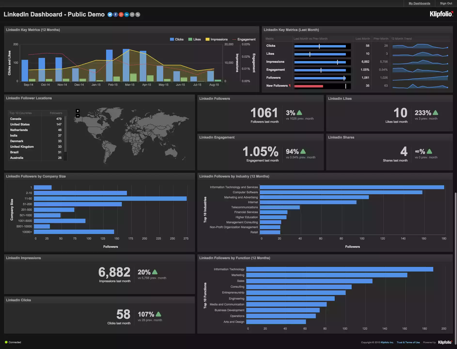
This densely-packed dashboard pulls the reader's attention in every direction at once.

This densely-packed dashboard pulls the reader's attention in every direction at once.

2. Data needs context

The Undashboard appreciates that data needs context in the form of related information and descriptions. Rather than squishing everything on one page, context can show up as details when items are selected and/or be displayed with graphical elements like color (as in the example below). Comparisons to benchmarks or goals are some of the most important ways to put data in context.

The colored metric bubbles indicate comparisons to goals while details on the right provide additional context.

The colored metric bubbles indicate comparisons to goals while details on the right provide additional context.

3. Text is the glue

The Undashboard knows that presenting data isn’t just about data — the titles, descriptions, labels, and explanations are the glue that ties the data together and makes it truly readable. Good data communication requires a mix of clear, jargon-free language and the thoughtful focus on the most important data.

Careful use of text explains the data content.

Careful use of text explains the data content.

4. Create a guided path

The Undashboard guides the reader through the content, rather than making readers find their way on their own. Traditional dashboards toss charts at a readers as if the order and relationships are meaningless. You wouldn’t scramble the paragraphs in a book if you wanted to tell a coherent story. The Undashboard uses an explicit path through the visuals to emphasize meaning and the author’s understanding of what matters in the data.

In its collapsed state, this application provides a structured, question-based flow to walk users through the data analysis.

In its collapsed state, this application provides a structured, question-based flow to walk users through the data analysis.

5. Lead with a purpose

The Undashboard is designed with the end in mind. The purpose of presenting data is to help people be smarter in their actions. What’s the point if people aren’t going to do something with the data? The Undashboard leads users to relevant actions, which can come in many forms: discussions with colleagues, action plans, or direct integrations to other systems.

Embedded actions, like this "Create Student Group" button, makes for a short step between analysis and action.

Embedded actions, like this "Create Student Group" button, makes for a short step between analysis and action.

6. Personalize the experience

The Undashboard is customizable for the different needs and interests of its users. The only valuable content is that which is pertinent to the reader. Many dashboards make the mistake of showing everything at once when the vast majority of the information is irrelevant for any individual reader. Undashboards makes the selection of scope a first-order, top-level feature. With the ability to present data interactively, you can give users control to choose what they care about, and free up a lot of visual space in the process.

This application provides ample opportunities for a user to choose what they care about:

This application provides ample opportunities for a user to choose what they care about:

This dashboard doesn't customize to meet the specific needs of a reader.

This dashboard doesn't customize to meet the specific needs of a reader.

7. Start a discussion

The Undashboard recognizes that visualizing data is only the beginning. It should spark a discussion about what is happening and what to do about it. The data discussion that follows is the truly important part because that is when actual change happens.

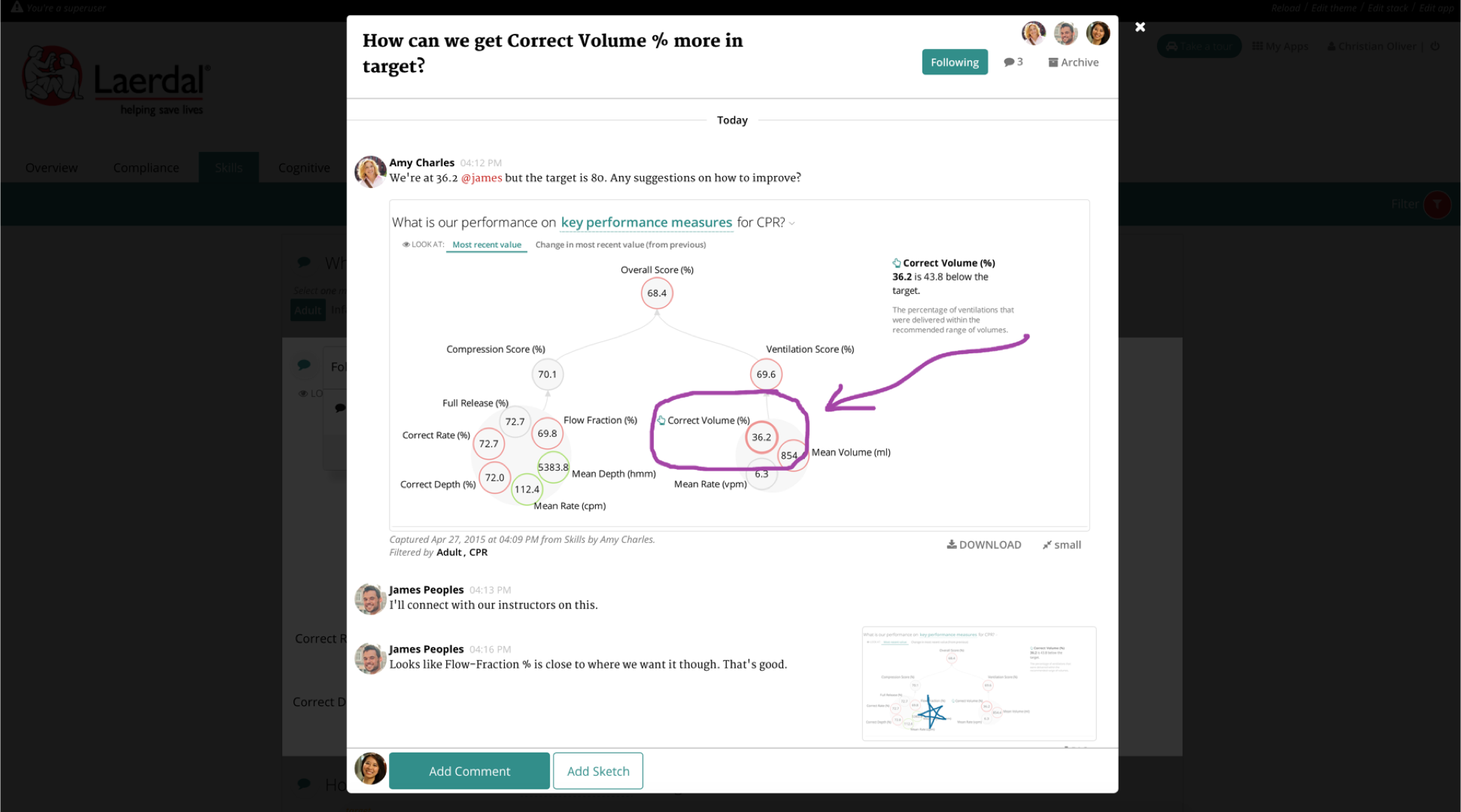
Juicebox's discussion feature lets users capture, discuss, and share the insights they find in the data.

Juicebox's discussion feature lets users capture, discuss, and share the insights they find in the data.

8. Form follows function

The Undashboard comes in different forms based on how, when, and why the reader is accessing the information. Dashboards can sometimes be considered the single form of output — the same things shown on the screen as is printed out or seen on a mobile device. Undashboards appreciate that the information and actions taken when someone is viewing on a mobile phone aren't the same as when projected in a conference room.

Fitbit's mobile dashboard

Fitbit's mobile dashboard

Like software in the cloud, it can take a while for many businesses to realize that the winds of change have already blown us a better answer. There should be no going back to static, dense, complex dashboards for communicating data. There are too many reasons why dashboards need to be transformed, including the needs of the users, new technologies, new design styles, and new understanding of how data can be embedded into business decisions. All of these factors demand a new future for dashboards.

Many of the examples above are created using Juicebox, our answer for building Undashboards. We'd love to show you how it works.

5 Design Principles for Agency Reporting

While there are roughly 25,000 companies in North America classified as agencies, each brings its own perspective to the creative process and solves different parts of a client’s advertising challenges. One thing they all share in common is a need to communicate results and data with their clients.

Over the past 10 years, Juice has worked a lot with digital marketing and advertising data. From our experience and from talking with experts such as Lea Pica, we know that reports have gotten much better, but there are still a few areas where most folks can improve. Here are 5 design best practices to use to ensure that your message is received and you’re valued as the expert you are.

1. Provide Instruction - When providing instruction with an application, there are two important things to consider: 1) the amount of instruction you’ll need to convey, and 2) how often someone will need to reference that information. Both will determine the look and location of the directions provided.

Example: Direct overlays for global interface instruction are lightweight and intuitive.

2. Make it conversational - Making your information conversational essentially boils down to one thing: injecting a bit of personality. This can be as easy as swapping out “Number of Visitors” to “How many people visited?” The most important thing to keep in mind is the context of the information you are presenting and whether or not it makes it more accessible.

Example: Scoutmob.com exhibits one of the growing trends in writing that’s personable and fun.

3. Integration with workflow - People need to work quickly and efficiently and if it takes too long to get to the information they need, they will move on. Think through your user or customers workflow and how your design can best integrate.

Example: Rapportive integrates into your Gmail, allowing you to quickly see the LinkedIn profiles of your contacts right in your email. No need to go back and forth between your email and LinkedIn to make sure you have any details correct - it'll show up right in your email.

4. Use simplest appropriate visualizations - What is the question that you’re trying to answer with your visualization? Consider this and communicate that as quickly as you can with a simple visual that’s easy to understand.

Example: The Fitbit chart below displays the number of steps taken in a day, broken down by the hour. It's a quick, clear way to see what times of day you are more active and just how active.

5. Provide next steps - Keep your users’ end goal in mind and help them get there. Give them meaningful next steps at appropriate times.

Example: This is a very linear process keeping the required action very large and obvious on the left, with any additional detail updating as needed in deemphasized text to the right. The scrollbar shows your progress naturally.


To learn more about Juice and its design, check out our ever-growing list of design principles or sign up for our newsletter to get all the Juice sent to you monthly.


Video: 10 Design Tips for Better Reporting

Often when sharing and presenting data, things can easily get lost in translation. The reason for this typically comes down to the way the information is displayed. This disconnect is easily prevented, however, by incorporating a few easy design techniques into your reports and presentations.

In this video, we go through ten tips and ideas for improving chart and presentation understanding. Watch below, or check out the slides on SlideShare, and let us know what your favorite presentation tips are.  

Automated Presentations (Slide Factory 2.0)

Much has changed since our original post in 2009, yet much remains the same.  There's been a variety of solutions, like Prezi, SlideRocket and even some home grown Python integrations, aimed at improving PowerPoint and presentation automation. However, its still challenging for a non-developer to produce a good-looking, effective PowerPoint deck with automatically updated charts.

The best way to tackle this challenge -- for the moment -- is to simplify the problem. While a utopian solution may not be available (sorry),  here's a way to break down the problem and get a partial win.

Think of the presentation automation challenge as one of three distinct challenges. 

  1. Delivering Presentations @ Scale
  2. Automating Chart Updates
  3. Improving PowerPoint Chart Availability

Delivering Presentations Scale

When you want to deliver high-quality slides or share information as a story for a large audience, like all your customers, this is what Juice refers to as Presentations @ Scale.   It manifests itself in organizations when there are multiple dedicated resources manually producing PowerPoint slides for clients. This is because a report doesn’t provide enough contextual information and narrative structure (flow) as can be delivered through slides. Some examples where organizations deliver Presentations @ Scale are:

  1. Quarterly account reviews produced by ad agencies;
  2. SLA reviews by technology providers;
  3. Quarterly reviews by insurance providers to human resources leadership.

While customers value the effort and details, the energy to produce these documents is expensive. Its not uncommon for Juice to hear about organizations with teams of 5 to 10 people dedicated to creating customer PowerPoint slides.

The opportunity to improve frequency and reduce the cost associated with delivering Presentations @ Scale lies in web-based solutions where customers can consume the information as an interactive web page vs. static slides. Here’s an recent example from the New York Times that offers a taste of a scrolling presentation or story.

It offers the easy to consume format, valuable data displays with a lot of descriptive text. Juicebox, is intended to solve exactly this kind of problem. Click here to see a quick video of Juicebox in action to get a flavor of delivering slide quality information across many customers.

Automating Chart Updates

The most popular or frequent PowerPoint automation challenge is automatic chart updates. There are an increasing amount of programatic solutions for this problem; however the options below require decent technical skills to set up and maintain. It's still a surprise that no solution has come to the forefront or solved this yet. Here are some of the technical options to check out, which require VBA skills at a minimum to automate chart updates. In addition to the ones below, Lea Pica has some product and tools on her resource page worth checking out.

  1.  Microsoft PowerPoint VBA - Some guidelines and tips for Office 2013 
  2. PowerPoint VBA FAQs - Some helpful tips on PowerPoint VBA (a little dated).
  3. PowerPoint 2010 Chart Programming - Registration required, but some good VBA answers here.

Improving PowerPoint Chart Availability

Probably the option least talked about or referred to directly are PowerPoint’s chart limitations.   Prior to 2011 the chart options were very limited. In most cases now, this represents enterprises that are still behind on their Microsoft Office upgrades and are limited by the few chart options in these earlier versions. There are some really elaborate integrations of PowerPoint using Python available now. Just search YouTube and you'll find a bunch.

Please share any other solutions that are out there in the market place that solve one or more of the presentation automation challenges. In the meantime, check out the Juicebox demo or request a personal demonstration by clicking here.   


30 Days to Data Storytelling - Updated

There continues to be interest in data storytelling. For example, consider Cole Nussbaumer’s recently-released book, Storytelling with Data.  The amount of quality content on the subject continues to grow, and that’s why we decided to do a refresh on our 30 Days to Data Storytelling document from 2013.

New look, but the basic principle is still the same. Through a series of exercises, you’ll learn some of the best techniques for delivering information in a way that people understand, absorb, and act on it. You can skip around, or follow the daily instructions - the choice is yours. Either way, in less than four weeks you’ll be telling stories like a pro.

Already completed it and ready for more? Some other thought leaders on the topic, in addition to Cole, to check out include Lynn Cherny, Robert Kosara, and Alberto Cairo.

Design Tips for Non-Designers

Although I am not a designer, I have learned much about design over the last several years. Over the past year I’ve compiled this list of items for non-designers or people who work with designers.  Its intent is to give those of us that work increasingly with dashboard or information designers greater fluency in our conversations with designers.    

Creating this list took on a new urgency for me after reading this article on IBM’s design strategy.  I knew there would be more folks like me needing some ideas on how to understand, communicate and lead designers.

While there are many great sources of design, web design, information design and data storytelling, the following items are what spoke to me in the simplest terms possible. I divided them into sections and recommend reading or doing the sections in sequence as they build on each other. The Tufte course, in the major section, requires a day’s time and costs money, but is well worth it. 

If you get beyond this list check out these other sites Storytelling with Data, Visualising Data or Flowing Data to see some of what you learned being practiced or peruse Juice's design principles  under Learning and Resources to build on what you've learned. None of this will make you a designer, but your conversations with designers will be so much more fruitful. Enjoy.