
525 historians and political science scholars got together and ranked all the Presidents. It sounds like the ultimate bar game for U.S. history professors. They releases their results recently here
As per usual, the report does no favors for the casual reader who might want to explore this data. So I put together an interactive app (open in a new window)
This is the beauty of Juicebox: if only one of those 500+ academics had asked, I could have given them a 10x better way to present their data before they released their PDF.
Battle of the Chatbots!
Which Chatbot is the best? Check out our interactive app below:
🤖 Which organizations are taking the lead with their Chatbot models?
🤖 How are Chatbots improving over time?
🤖 Which University has created a top 5 Chatbot?
The data is sourced from the Large Model Systems Leaderboard (https://lnkd.in/gvDSKSN9), "a crowdsourced open platform for LLM evals. We've collected over 200,000 human preference votes to rank LLMs with the Elo ranking system."
The Irregular Path of Data Analysis
Change does not happen in straight line. And we do a disservice when we thinking about “data driven decisions” as a simple sequence of events:
gather data —> do analysis —> find insights —> present insights —> action
Let’s take a few examples from outside the world of analytics:
1. In 1969, a community of Native Americans protested on the island of Alcatraz in the San Francisco bay. For 19 months, they occupied the island, demanding the return of the land. In the end, the protest fizzled and their demands were reject. However, their efforts were not ultimately without change. In the following years, President Nixon signed a series of bill to give back millions of acres of land to Native Americans and provide support for their communities.
2. Marketing professionals have had to embraced the messy, complex reality of multi-channel and multi-touch marketing. It recognizes that purchasing decisions aren’t a one-and-done conversion event. In fact, it can take 8 or 15 touches of a consumer to get to a purchase decision. That makes marketing more like a series of nudges than a single convincing argument.
Action comes about through a circuitous route.
Analytics professionals need to internalize this same lesson. It can change how you think about your role:
* Persistence in sharing your message > Perfection of message
* Many insightful nudges > A single comprehensive presentation
* Building relationships with your audience > Unassailable logic
Data Storytelling 2.0
I've been writing about data storytelling for a decade. The concept has grown in popularity; the underlying concepts haven't changed much.
Most courses or books will emphasize the same core concepts: focus on your audience, set up the conflict, lead your reader to resolution and action, use visualizations to deliver your messages.
These are good things if you want to convey a message with data. But if we were to put Data Storytelling on the Gartner hype curve, it would sit somewhere beyond the "Peak of Inflated Expectations" and far short of the "Plateau of Productivity." People love Data Storytelling as a concept. They struggle to make it useful in their everyday work-life.
I think it is time to reconsider and reframe Data Storytelling to make it a useful tool in our modern workplace. A few examples:
Data Storytelling v1.0 --> 🆕 Data Storytelling 2.0
One-directional presentation to an attentive audience --> 🆕 Bi-directional dialogue to an attention-starved audience
The capstone to an analytics journey --> 🆕 A set of techniques used at every stage of the journey
Visuals and language will carry the message --> 🆕 Delivering to an audience must consider Where, When, Channels, Formats.
Comprehensive narratives --> 🆕 Insights as the essential unit of communication
Target your audience --> 🆕 ...and the people your audience will share it with
Data storytellers need a collection of skills --> 🆕 Specific data storytelling skills can be applied selectively by many people
How to Summarize Data using ChatGPT
We know that ChatGPT is remarkable at generating text. It is also a powerful tool for summarizing text. It can compress a long article down to the CliffsNotes version in an instant.
How does it do with data? With some prompting guidance, I was able to teach ChatGPT an approach for summarizing a data table. Understanding what you are working with in data is often the first step before diving into analysis. I was impressed with the results once I walked ChatGPT through my general thought process.
I started with this prompt:
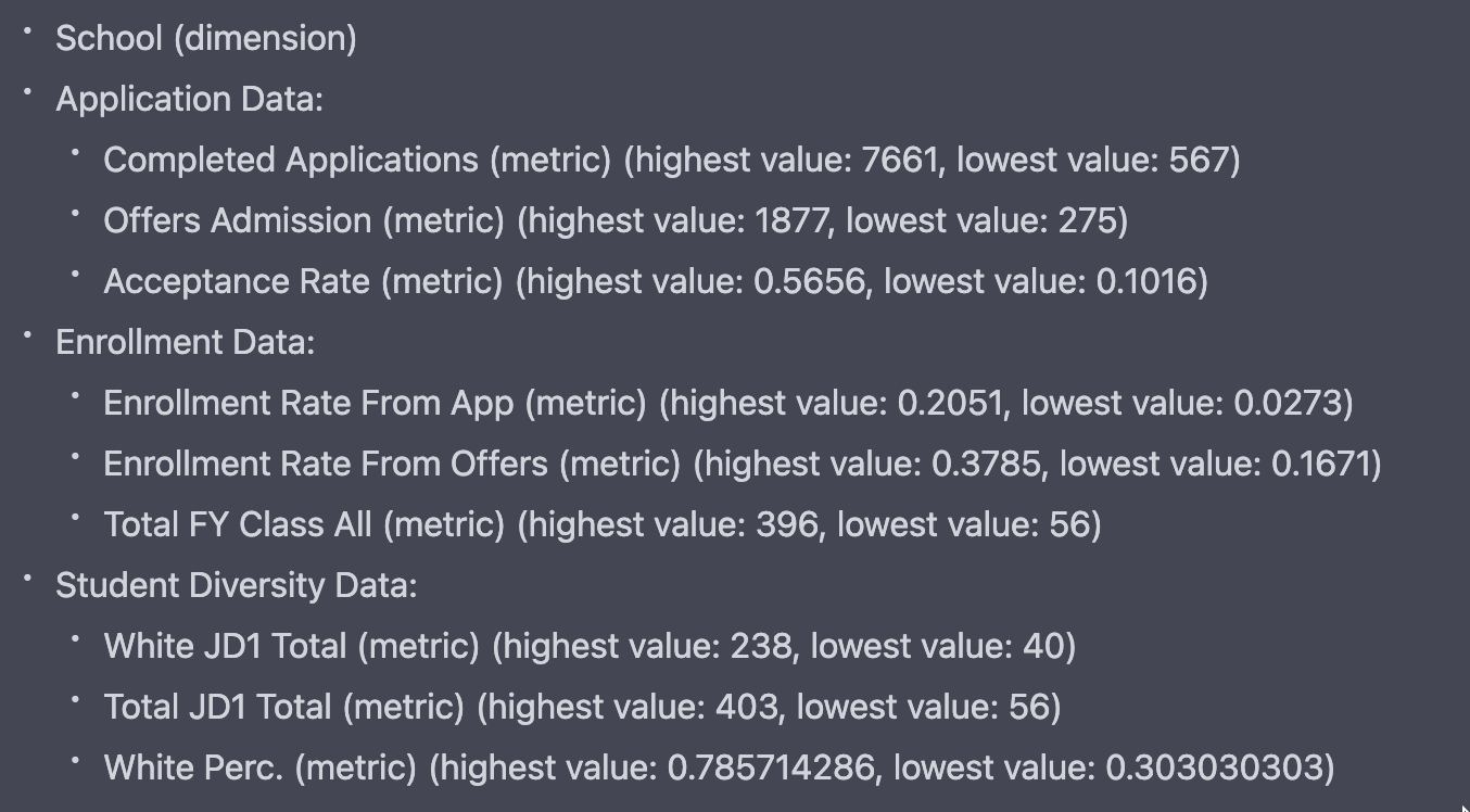
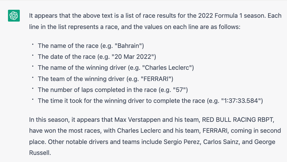
Step 1. Describe what each row in the data set represents.
Knowing what you are working in a data set starts at the row level. I found ChatGPT was exceptional at identifying the meaning of the individual rows in my tests. For example:
Step 2. Change the data field labels to make them more human readable, use proper capitalization, expand out abbreviations, and remove non-alphabet and non-numeric characters.
Many data files arrive with column names written by DBAs that are hard to decipher. Take this collection of data fields:
FTResTuition
PTResTuition
FTNonResTuition
PTNonResTuition
If you are familiar with the data, these names may be obvious. Fortunately ChatGPT is able to turn those into:
Full-time Resident Tuition
Part-time Resident Tuition
Full-time Non-Resident Tuition
Part-time Non-Resident Tuition
Step 3. Group the data fields by topic or other logical grouping. For each data field, identify if it is a metric, dimension, boolean, or date.
Finding similar concepts is another Large Language Model strength. When you are dealing with data tables with dozens of columns, it can be helpful to understand how those data fields fit together. Equally impressive is the ability for ChatGPT to understand different data types.
Step 4. For each metric data field, show the highest and lowest value in parentheses. For each date field, show the earliest and latest date in parentheses. For each dimension, show the most frequently occurring value in parentheses
It can be really helpful to get a sense of your data by seeing the range of values and common values.
Step 5. Identify any data fields that have many null or empty values. Label these data fields as "null or empty”. Also, identify any data fields that have all the same value. Describe these data fields as "uninteresting"
Finally, data tables with lots of columns often have a lot of cruft — the blank or poorly populated fields that are better to push aside as you thinking about where you want to focus.
After defining all these steps, I played around with how I wanted it to render the results. I ultimately decided to consolidate steps 2 through 4, and suppress ChatGPT’s inclination to be verbose about the instructions. Here’s the final prompt that I landed on:
I want you to use the following Data Summarization process on a data set:
Step 1. Describe what each row in the data set represents
Step 2. Change the data field labels to make them more human readable, use proper capitalization, expand out abbreviations, and remove non-alphabet and non-numeric characters. Group the data fields by topic or other logical grouping. For each data field, identify if it is a metric, dimension, boolean, or date. For each metric data field, show the highest and lowest value in parentheses. For each date field, show the earliest and latest date in parentheses. For each dimension, show the most frequently occurring value in parentheses
Step 3. Identify any data fields that have many null or empty values. Label these data fields as "null or empty”. Also, identify any data fields that have all the same value. Describe these data fields as "uninteresting"
When you show the results, you can write the Step number but don’t need to include the step description. Are you ready for some data?
After pasting that full prompt into the chat window, I simply copy and pasted a chunk of data from Excel to get a result that looks like this:
Creating an Alternative Law School Rankings Report
The The New York Times recently published a story: “Defending Its Rankings, U.S. News Takes Aim at Top Law Schools” (paywalled) about how Law Schools are fed up with the US News & World Report rankings, and how the magazine is fighting back. I was particularly struck by this passage:
Ms. Gerken, the Yale Law School dean, and other participants suggested that the data gathered by the American Bar Association already provided good information for prospective applicants. The data provided on the bar association website, however, does not allow someone to easily compare one law school with another, and it lacks the emotional punch of number rankings like the one used by U.S. News.
Another sad case of good data stuck in bad formats like Excel downloads and antiquated interfaces. Fortunately, it is a problem that is very fixable with Juicebox.
We created an alternative Law School Comparison site using data from American Bar Association and AccessLex Institute. With this type of interactive report, we think about a few key things:
How do we provide interactivity so the user can make the results most relevant to their needs?
How do we give users a workflow through the data to support their exploration?
How can we guide and narrate this journey with good descriptions, labels, and visual indicators?
When Law Schools and American Bar Association are ready to break free of the tyranny of US News & World Report (but still recognize that data transparency is important for decision-making) they know who to call. Check it out 👇
Story Endings Are Hard
“Endings are hard” is the subject of a recent episode of Malcolm Gladwell’s podcast Revisionist History. He shares a live stage with comedian Mike Birbiglia, an extremely accomplished storyteller in his own right.
Together they bemoan the inadequacy of many story endings. Gladwell compares how we evaluate people and how we evaluate stories. Unlike our snap judgements about people,
…our evaluation of stories is the opposite. It's back loaded. What happens in the last five minutes colors every conclusion we drew in the first two hours. I will guarantee you that every screenwriter and author and podcaster frets endlessly about how their stories begin, rewrites the beginning a million times, but aren't nearly as fastidious about the ending, which is nuts.
As he is known to do, Gladwell arrives at a succinct and unifying theory:
The difference between a story and an anecdote is a story is a narrative that betrays the listener's expectations. There must be an active betrayal for the story to work.
When we teach about data storytelling (check out our free lessons), we focus on using the powerful techniques of narrative to reach our audience and change minds. We want to connect by touching on ingrained concepts like setting up the conflict, connecting ideas with a logical flow, establishing characters, and using specificity.
This discussion of endings provides another guideline to consider with your data story. By the end of your story, are you subverting expectations?
This concept connects to the recent dialogue about “what is an insight?” One suggestion is that insights need to break through an existing understanding or assumption. That is, they need to “betray expectations.”
In contrast, an anecdote merely reinforces what we already believe. Anecdote-style data communication has a place, especially if you are trying to educate people in your organization. You don’t always need to be exploding their minds with a new insight — sometimes you just want your audience to take actions that are consistent with something that is known.
At one point in the podcast, Gladwell provides an example that helps solidify his distinction:
An anecdote is a narrative that conforms with your expectations. For example,
So the craziest thing happened to me last night. I found a hundred dollars bill on the street. That is not a story, that is an anecdote. The first sentence craziest thing happened is the equal of the second sentence, a hundred dollars bill on the street.
A story is a narrative that betrays the audience's expectations.
The craziest thing happened to me last night. I found a hundred dollars bill on the street. I gave it to a, tried to give it to a homeless man and he said, “I don't want your effing money.”
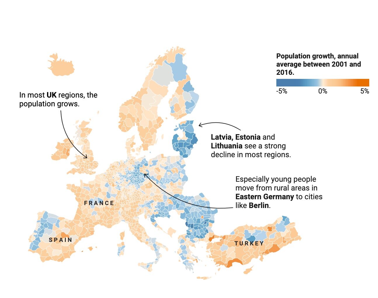
Tech Layoffs, Visualized
The last few months have been difficult for technology workers. It seems like every week, we hear about a blue-chip tech company laying off thousands of employees. Crunchbase has been tracking US-based technology layoffs here. But an ever-growing table like the one below doesn’t exactly tell the story or reveal trends.
Crunchbase data on Tech Layoffs, 2022/2023
There’s obviously a lot of value hidden in this data, so we pointed Juicebox at it to discover (and share) some of those hidden insights. The interactive report we built is embedded below, but here are some things we captured during our exploration:

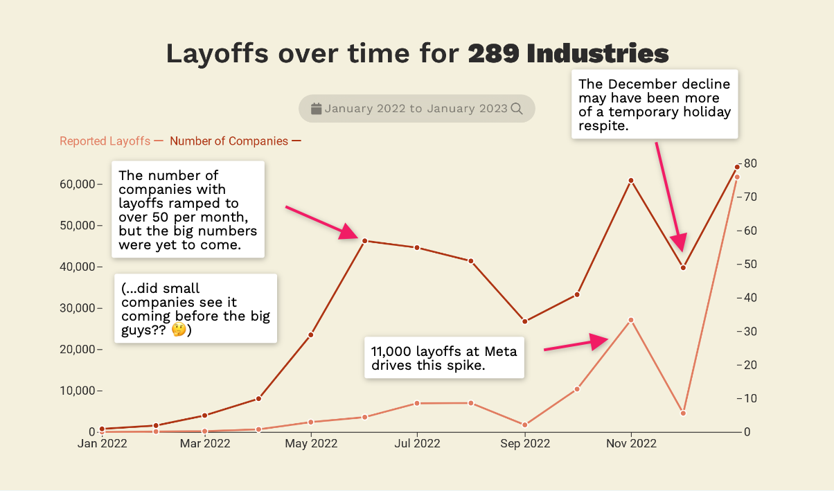
Here’s the embedded report so you can explore the data for yourself. Start scrolling:
23 Best Data Storytelling Courses, Workshops, and Free Resources (updated for 2023)
Are you looking to upgrade your Data Storytelling skills? There are many options for learning. We’ve compiled an updated list of resources, including free training, online courses, and workshops from top experts. If you just want to get a sense of what makes a good data story, you can start with our list of the best data storytelling examples.
The following resources will teach you about data visualization, narrative, and engaging your audience. In our search, we wanted to find solutions that were accessible to everyone, delivered by an experienced instructor, and did not focus on a particular piece of software. We’ve broken this list into three categories:
Free Learning Resources to get started;
Online Courses to dive deeper;
Hands-on Workshops with expert guides.
(1) Data Storytelling Free Learning Resources
We went back to our ultimate collection of Data Storytelling Resources to find getting-started resources based on the amount of time you are willing to commit.
If you’ve only have 5 minutes…
If you have 30 minutes…
If you only have an hour…
If you can commit 10 minutes a day…
Free Data Storytelling Lessons.
With more than 20 short lessons, this collection of essential lessons provides a complete overview of the skills, tips, and tricks required to become a data storyteller. The hands-on, interactive lessons are self-paced and take 5-10 minutes to complete.
Instructor: Zach Gemignani has spent 15 years helping organizations design and develop interactive analytical applications, presentations, and data stories. He is author of the book Data Fluency, Empowering Your Organization with Effective Data Communication and has guided the development of a leading data storytelling platform, Juicebox.
Data Storytelling Online Courses
When you are ready to receive guided instruction on data storytelling, the following courses are a great place to start.
Best Practical Course Collection: Story IQ
Course: Data Storytelling for Business provides learners with a solid grounding in fundamental data storytelling learning concepts. By the end of the course, learners will have the skills needed to produce impactful data visualizations layered with compelling narratives.
Access: Live virtual courses
Instructor: StoryIQ is a small group of training professionals focused on hands-on, practical teaching for a business audience.
Cost: Starts at $299

Best Free Introductory Course: EdX
Course: Introduction to Data Storytelling. “Using existing spreadsheet and quantitative reasoning skills, learners will make their data tell a story. This course is ideal for learners who are just starting out in their careers, journalists looking to expand their skill set, and marketers looking to tell a story.”
Cost: Free

Best Prestige Course: MIT Executive Education
Course: Persuading with Data — highly practical and collaborative, this course combines visualization and strategic communication best practices to help you communicate data more effectively and influence others to take action based on data through data storytelling.
Access: Live Online on specific dates.
Instructor: Miro Kazakoff is a Senior Lecturer in Managerial Communication at the MIT Sloan School of Management where he focuses on how individuals use data to persuade others.
Cost: $4,300
Best Collection of Course Extras: Data Story Academy
Course: Data Story Academy is a three-part framework built for business professionals providing the tools they need to grow their career and access to frameworks that virtually guarantee success in doing more with data. The course comes complete with templates, frameworks, and examples to help you apply your skills.
Access: On-demand
Instructor: Zack Mazzoncini has helped hundreds of organizations and individuals develop data-driven cultures centered around data storytelling. Zack's personal mission statement is: "Change people's lives for the better by being the best version of myself".
Cost: $697
Best Technically-Focused Course: eCornell
Course: Part of the Data Visualization with Python Certificate Program. The program will lead you through the process of creating meaningful data visualizations and provide you with new methods to make and modify your visualizations programmatically with Python.
Access: Online, 3-4 months.
Instructor: David Gold is a Ph.D. candidate in Environmental and Water Resources Systems (EWRS) with the Reed Research Group at Cornell University.
Cost: $3,000 to $5,000.
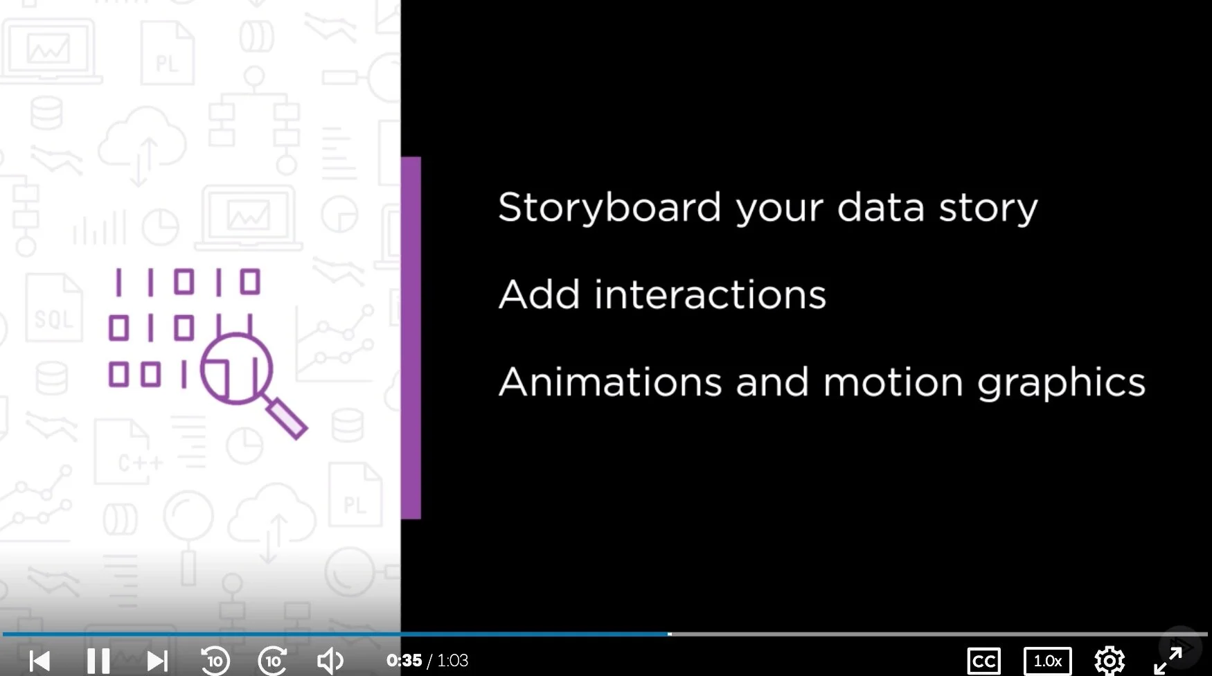
Best Design-Focused Course: Plural Sight
Course: Data Storytelling: Moving Beyond Static Data Visualizations. Learn how to package a data story for different mediums and audiences and how to craft a data story by defining your audience and end goals. Explore how to create animations and motion graphics to present an impactful moment.
Access: On-demand
Instructor: Troy Kranendonk is a Curriculum Manager for Data Access and Analytics as well as an author with Pluralsight. He considers himself to be a Pixel Ninja.
Cost: $199-299 per year (Plural Sight subscription)
Best Free Video Course: Knight Center
Course: Data Visualization for Storytelling and Discovery. The four-week course, which was powered by Google, took place from June 11 to July 8, 2018. We are now making the content free and available to students who took the course and anyone else who is interested in learning how to create data visualizations to improve their reporting and storytelling.
Access: On-demand
Instructor: Alberto Cairo is an information designer and professor. Cairo is the Knight Chair in Visual Journalism at the School of Communication of the University of Miami.
Cost: Free

Best LinkedIn Learning Option: Telling Stories with Data
Course: Telling Stories with Data. The same techniques that are used to tell stories with words—structure, conflict, resolution, emotion, and surprise—can be used with data. You can craft compelling narratives that help audiences visualize information, without complex charts or graphs.
Access: On-demand
Instructor: Paul A. Smith is author of the best-selling book Sell with a Story: How to Capture Attention, Build Trust, and Close the Sale.
Cost: $30/month (for LinkedIn Learning)
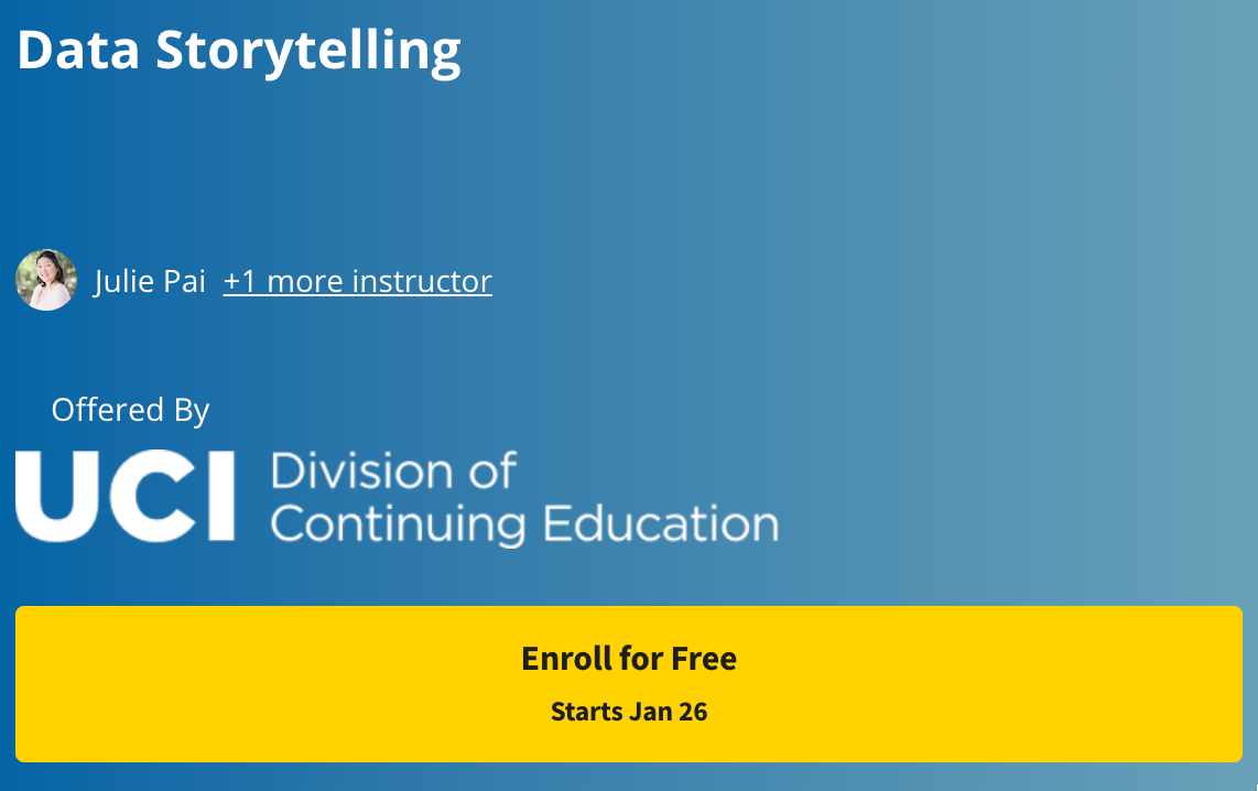
Best Coursera Option: University of California, Irvine
Course: This course will cover the more complex concepts that become involved when working beyond simple datasets. Exploring the connection between visual aspects and data understanding, we will examine how those concepts work together through data storytelling.
Access: On-demand
Instructor: Julie Pai and Majed Al-Ghandour
Cost: N/A (free for audit-mode)
Best Academic Certificate Program: Purdue
Course: Data Storytelling Certificate offers an introduction to the concept of Data Storytelling, why it matters, and how it can transform the results of your research into impactful narratives from which your audience learns new things, remembers important findings, and acts on them.
Access: Online, self-paced and self-guided
Instructor: Sorin Adam Matei, Data Storytelling Program Director and Associate Dean of Research, Purdue University.
Cost: $1,000

https://www.edx.org/course/storytelling-and-persuading-using-data-and-digital-technologies?index=product_value_experiment_a&queryID=06ee3bac3b5445ac1a10eec86f4632c5&position=2
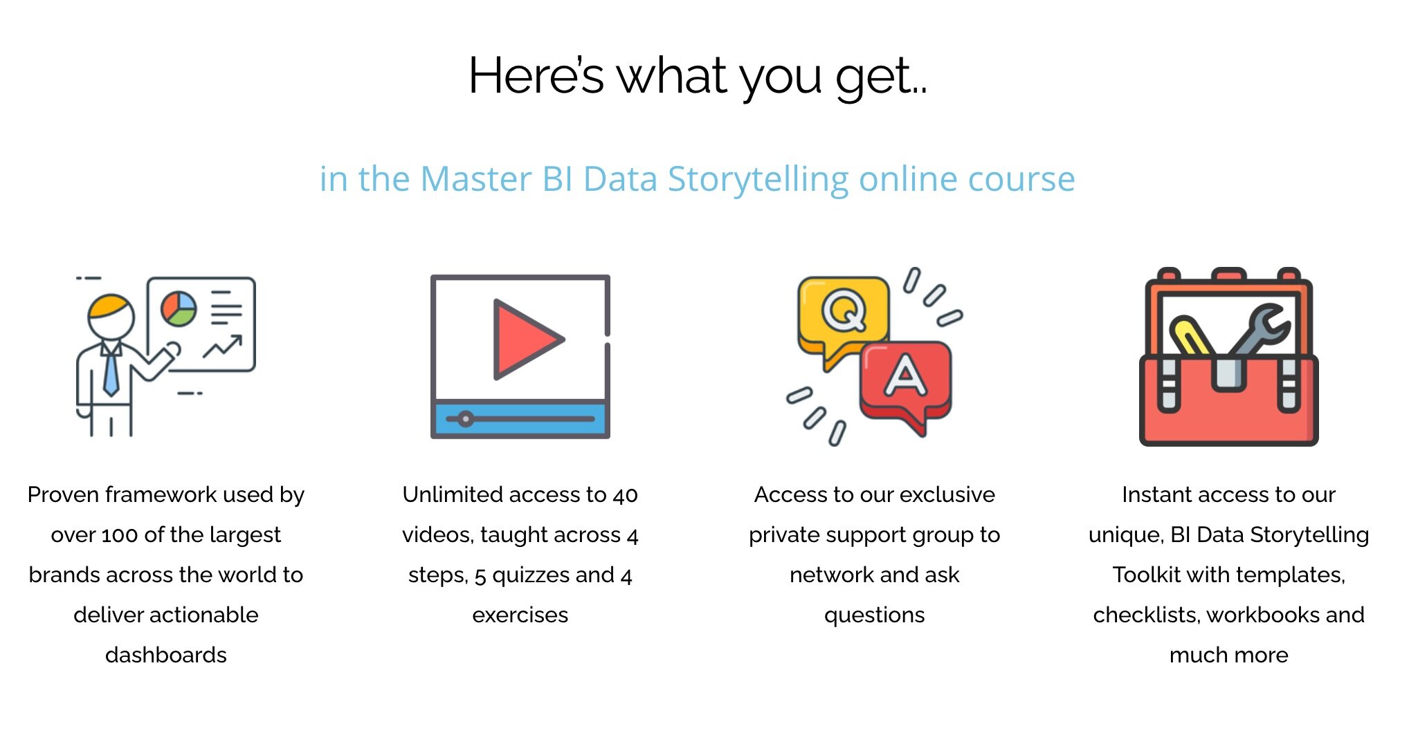
Best Dashboard-Oriented Training: BI Brainz
Course: Master BI Data Storytelling. An online course that will teach you how to easily setup, build and design your first compelling data story!
Access: On-demand
Instructor: Mico Yuk, Founder of BI Brainz and creator of the Analytics on Fire Podcast.
Cost: $497-$697
Data Storytelling Workshops
Lea Pica
Lea Pica is one of my all-time favorite presenters and an energetic entrepreneur who honed her data storytelling skills with marketing data.
Give me two days, and I’ll give you and your team the practical and strategic tools you need to visually present data in a way that gets noticed, remembered, and acted upon.
Ben Jones led Tableau’s training efforts before launching his own company. His primary focus is on data literacy, but his high quality of his content shouldn’t be missed.
We pride ourselves in being the premium data literacy training provider in the world. Our courses have been implemented by Fortune 500 companies, government agencies, and nonprofit organizations alike. We offer training on an on-demand basis or via live, virtual, instructor led sessions.

Cole Nussbaumer Knaflic has build a loyal and engaged community through her focus on practical guidance, training, and hands-on exercises.
The goal of this workshop is to enable you to bring data to life and use it to communicate a story to an audience, with a focus on simplicity and ease of interpretation. This is accomplished through a mix of data visualization and storytelling theory, best practices, and practical application.

Gilbert Eijkelenboom shares a commitment to the humanist-side of analytics, recognizing the importance of behavior and psychology to ensure your data product has impact.
Are you tired of not seeing the results of your work? Let’s enhance your impact: understand the business need and experience the joy of seeing people use your data products.

Brian O'Neill is an analytics product designer with a focus on user experience and creating impactful data products.
My workshops help data science, analytics, and product/business leaders learn how to imagine customer-driven solutions that focus on creating a business outcome and change, instead of just outputs.

Brent Dykes is author of the the book ‘Effective Data Storytelling’ and has struck out on his own to create a data storytelling training firm.
Data storytelling training can help teach you and your team how to become better data communicators so you can take full advantage of the insights at your fingertips.

Nancy Duarte is one of the pre-eminent thought leaders in presentation design. More recently, she connected her storytelling frameworks to data-rich presentations.
Almost every job today involves decision-making with data. Once you’ve formed a point of view about the problem or opportunity your data uncovered, communicating the findings well speeds up decision-making, moves others to action and yes, advances your career.

Rebeca Pop has built a following by focusing on the fundamentals of data visualization and storytelling and by working closely with her customers to meet their unique needs.
Workshops are designed for anyone who needs to communicate more effectively with data. For example, if you are a data scientist, you might see the need to create more thoughtful charts. Or, if you are an entrepreneur, you might want to include powerful charts into your pitch deck.
If you ever thought to yourself: "I wish I could communicate better with data," then you came to the right place.

More about data storytelling


15 Best Data Storytelling Tools (updated for 2023)
Data storytelling is quickly becoming a popular mode for presenting data. It combines text and graphics with data visualizations to guide an audience. Traditionally, people have used tools like PowerPoint and Excel, as well as traditional dashboard and business intelligence platforms, to communicate in this way. But these solutions are limited in their ability to balance the explanatory and exploratory elements of an effective data story.
We are seeing a new category of tool emerge: the data storytelling platform. It emphasizes features such as human-friendly visualizations, integration of text and visuals, narrative flow, connected stories, easy-to-learn authoring, and effortless sharing.
The demand for better data storytelling is being met by a growing collection of data storytelling tools. We evaluated tools that resembled the description above, leaving out more technical tools, visualization libraries, and old-school dashboard/report tools. In the end, we identified four unique categories:
Guided Analytics
Stand-alone Visualizations
Data Storytelling as a Feature
Design over Data
Stories with Words
Guided Analytics
These solutions combine exploratory data visualization with explanatory text and graphical elements. The interactive data storytelling applications created by these platforms are intended as an alternative to traditional dashboards and reports.
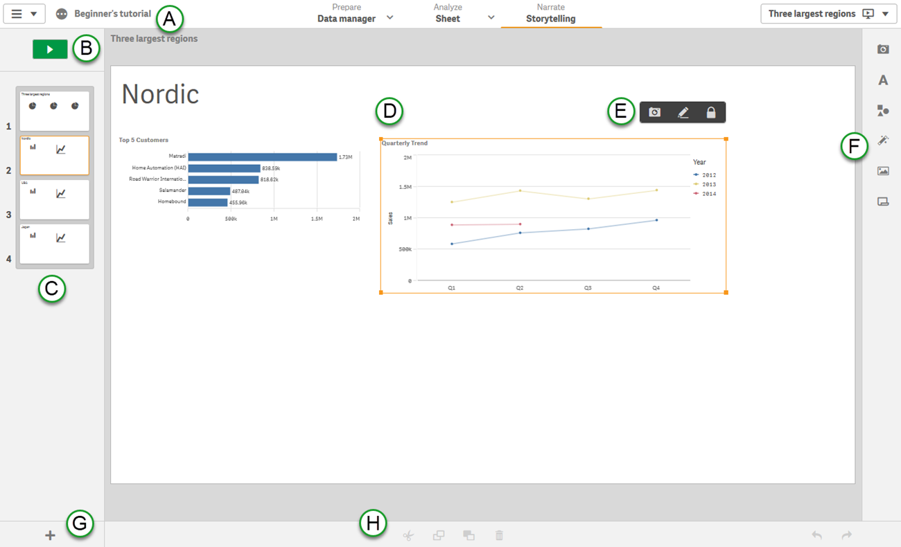
Juicebox
Juicebox combines modern, data journalism style with exploratory visualizations that are automatically connected to enable analysis. A focus on easy authoring makes Juicebox the only tool in this category that is accessible to non-technical or non-analyst users.
In their words: Deliver more “Aha!” moments in every data presentation. Present like the pros with custom graphics & interactive data.
Strengths: Lightweight, easy editing, professional web design, automatically connected visualizations.
Cost: 14-day free trial. Starter plan is $45/month.
Toucan Toco
Toucan Toco is one of the earliest solutions for data storytelling. This platform targets enterprise buyers and has a unique approach to presenting data stories. Sharing, annotation, and drill-in story views give you a chance to communicate a comprehensive overview of a topic.
In their words: Communicate actionable insights at scale using Toucan’s built-in no-code framework for storytelling.
Strengths: Dashboard-style layout; user management features; sharing via presentation-mode for sharing.
Cost: Annual subscription. Reach out for a quote.

Nugit
Nugit has flown under-the-radar for some customers but represents one of the most complete data storytelling solutions on the market. Attractive design combined with powerful text features make this a solution worth watching.
In their words: A better way to share data with colleagues and customers. Automated tools for creating data stories on web and email.
Strengths: Live API integrations, report/email automation, automated natural language generation, infographic-style graphics.
Cost: Not available.

Flow Immersive
A unique approach to visualizations and storytelling. This platform is focused on eye-catching 3D visual outputs embedded with videos or Prezi-like presentations.
In their words: Author, present, and share immersive, interactive Flow data stories through the web, a recorded video, or in a meeting.
Strengths: Multi-dimensional visuals for showing many points positioned in 3-dimensional space.
Cost: $99/month. 30 day trial.

Stand-alone Visualization
These visualization solutions offer flexibility and beautiful design to build individual visualizations. The end-product is generally intended to be embedded in a webpage, often as part of an online article.
Flourish (acquired by Canva)
Flourish has built a loyal customer base by delivering creative and beautifully-designed visualizations. They are well-known for their racing bar-chart, but have many other visual options.
In their words: Easily turn your data into stunning charts, maps and interactive stories.
Strengths: Animated visualization, easy embedding, fine-grain configuration of visualiations.
Cost: Free tier. Paid plans start at $69/mo.

RAWGraphs
RAWGraphs is one of the quickest, easiest ways to create advanced visualizations. An open source project with a long history, this tool provides a simple step-by-step process to create downloadable images for embedding in webpages.
In their words: The missing link between spreadsheets and data visualization.
Strengths: Open source, lightweight editing, advanced visualizations, data doesn’t leave your browser.
Cost: Free.

Datawrapper
Datawrapper is a popular tool for data journalist around the world. With a collection of attractive visualizations and advanced maps, Datawrapper gives you the configuration flexibility to craft the precise visual you need.
In their words: Serving charts and maps for millions of readers, every day. Datawrapper helps some of the world’s best teams to tell their stories with data.
Strengths: Maps, chart configuration options, labeling features, scaling for millions of views.
Cost: Free plan. Pro plan $599/month.
Data Storytelling as a Feature
This set of solutions are comprehensive business intelligence and visual analytics platforms. Data storytelling is presented as a feature or technique that can be accomplished within the larger platform.
Tableau Story Points
Tableau, a leader in visual analytics, saw the potential for data storytelling early on. They released a feature called ‘Story Points’ in 2014. The feature has not achieved wide-adoption among their customer base, and Tableau appears to be focusing on PowerPoint export options instead.
In their words: Story Points is a way to build a narrative from data. People tend to understand and remember concepts through stories. Story Points gives anyone the tools to create a narrative with data.
Strengths: Wide-adoption of Tableau; powerful data manipulation and visualization tools.
Cost: $70/editor/month

ArcGis StoryMaps
Built on the deeply established mapping platform, the StoryMaps feature allows for creating narrative descriptions to help readers navigate a geographically-focused story.
In their words: A story can effect change, influence opinion, and create awareness—and maps are an integral part of storytelling. ArcGIS StoryMaps can give your narrative a stronger sense of place, illustrate spatial relationships, and add visual appeal and credibility to your ideas.
Strengths: Mapping capabilities (ArcGIS is a market leader)
Cost: $500/creator/year

Qlik Sense Stories
Qlik Sense is a well-established analytics platform with strong visualization capabilities. While it gets less press than its competitors Tableau and PowerBI, Qlik understands the need to reach broader audiences in the enterprise through data storytelling.
In their words: The purpose of data storytelling is to turn data discoveries into a story. Emphasizing important elements helps create convincing stories and supports stakeholders in decision-making.
Strengths: Powerful querying technology enables rapid analysis.
Cost: $30/user/month
PowerBI
PowerBI is Microsoft’s answer to the success of visual analytics powerhouse Tableau. Like the other solutions in this category, PowerBI provides guidance, features, and instruction around data storytelling without providing a focused solution for users.
In their words: The job of a data analyst is not just technical. It entails more than just transforming data into information. It is also about clearly communicating the key messages derived from this data.
Strengths: Comprehensive BI platform; integrations with deeply-adopted technologies.
Cost: Pro starts at $10/user/month.
Observable
Observable is a collaboration-focused data exploration and analysis platform. Users can explain the data, workflow, and insights alongside visualizations.
In their words: Explore, analyze, and explain data. As a team. Uncover new insights, answer more questions, and make better decisions.
Strengths: Flexibility of visualizations; focus on narrative and descriptions alongside the data.
Cost: $12/editor/month (annual subscription required)

Design over Data
These solutions for designers are focused on creating infographics and presentations that may include charts and graphs as part of the document. The data is one of many media elements that tell the story.
Infogram
Infogram is a flexible design platform that includes capabilities for adding lightweight charts. It offers an array of formats for presenting information, including everything from dashboards and reports to social media posts and posters.
In their words: Create engaging infographics and reports in minutes
Strengths: Consistent branding, pre-defined templates, animations, output formats
Cost: Free plan. Pro starts at $25/month/user

Visme
Whether you want to create infographics, posters, social media graphics, or even videos, Visme is a designer’s toolbox. Like the other design-first tools, charts are intended to show a few data points rather than to enable analysis.
In their words: Create visual brand experiences for your business whether you are a seasoned designer or a total novice.
Strengths: A vast collection of icons and widgets; 1,000s of templates.
Cost: Free plan. Pro starts at $25/month/user
Piktochart
Piktochart is a design tool for building infographics, posters, flyers, social media graphics, and presentations. Data seems to be mostly an afterthought for a solution that focuses on brand, styling, and templates.
In their words: Improve your internal and external communication with Piktochart. Quickly turn any text- or data-heavy content into a visual story that your audience will love.
Strengths: Colors and branding, video stories.
Cost: Free plan. Pro starts at $29/month/user
Stories with Words
These solutions focus on using words as the primary way to convey the story in the data. Their algorithms identify insights in the data and present those insights in sentences and bullet points.
SiSense Narratives
SiSense is a traditional business intelligence and dashboard solution that has added narrative capabilities.
In their words: With Sisense Narratives, we use natural language generation (NLG) to automatically present you with calculations and insights in plain, easy to understand language based on what the engine recognizes as interesting.
Strengths: Integrated as part of a complete BI solution.
Cost: Not available.

ChatGPT
After Tableau’s acquisition of Narrative Science, one has to wonder whether similar capabilities will become freely, or inexpensively, available through Artificial Intelligence tools like ChatGPT.
In their words: We’ve trained a model called ChatGPT which interacts in a conversational way. The dialogue format makes it possible for ChatGPT to answer followup questions, admit its mistakes, challenge incorrect premises, and reject inappropriate requests.
Strengths: Users are exploring using ChatGPT with data sets to see how it summarizes and extracts highlights. With the ability to recognize context and answer follow up questions, we can expect many more advanced solutions in this domain.
Cost: Free for now.
Phrazor
A focused solution for Natural Language Generation analytics
In their words: Explore, analyze and get meaningful insights to make data-driven decisions at the speed of thought.
Strengths: Conversational querying tool 'Ask Phrazor' even recognizes industry jargon.
Cost: 30-day free trial, $50 per editor per month.
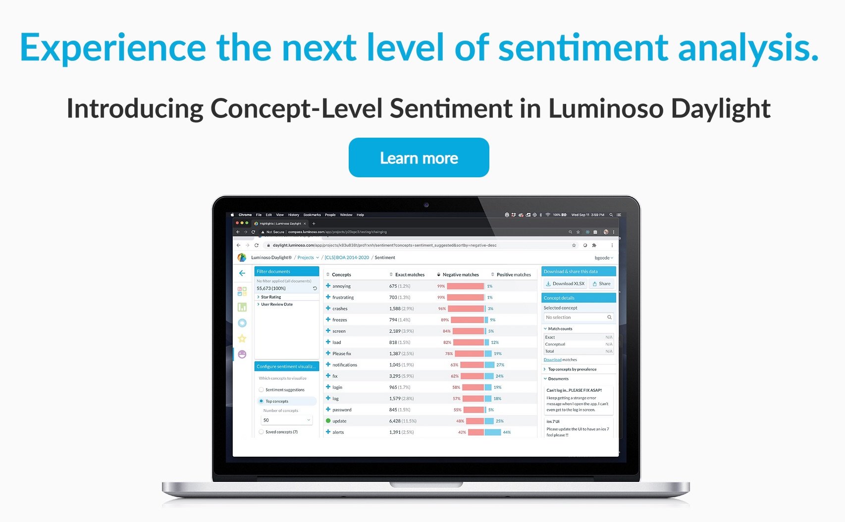
Luminoso
Luminoso’s products help people in customer experience, HR, and research roles to understand and extract understanding from text data.
In their words: Turn text data into business-critical insights. Luminoso allows users at all technical levels, and across any industry or use case to analyze unstructured text – no data science experience required.
Strengths: Automatically uncover topics of interest.
Cost: Not available.
More Data Storytelling Posts
