
Dig in. It’s free.
This is Juice’s best collected resources on Data Visualization, Data Storytelling, Dashboards, and Data Products.

12 Foundational Principles for Data Story Design
What does it take to think like a data storyteller and design high-impact data stories? From knowing your message to structuring your story, we share the point-by-point principles that you want to keep in mind.

5 Strategies for Getting Started with Workforce Analytics
Patient care should be at the forefront of the healthcare industry’s focus. But with increased demands and a tightening resource base, how can this be accomplished?
This ebook is an introductory guide to workforce analytics. Learn more about what workforce analytics are, the state of the healthcare industry, and the steps you can take to implement workforce analytics in your organization right away.

Data Is the Bacon of Business: Lessons on Launching Data Products
Just like bacon, data makes everything better. Learn how to apply this thought process to your business and create delicious data products your users will eat up.
This ebook is your step-by-step guide to the data product process. Find out what we've told the companies we've worked with in the ten years we've helped them build data products, and the lessons we've learned along the way.

Reporting Solutions: A Guide to Buy vs. Build when Design Matters
You’ve been pushing for improved reporting capability and finally crossed the hurdle of reaching consensus, gaining approvals and nailing down a budget. Now it’s time to start thinking about how you are planning on executing your reporting plans.
This ebook is a guide to help you frame the Buy vs. Build decision and highlight common assumptions and myths associated with both sides. It will also help you set up your evaluation and score your options.

Putting People First in your Big Data Initiative
Monetizing Big Data and turning it into products is all we hear about these days. But to be most effective, you need to take a different approach.
This ebook offers a way to think about and implement solutions that put people first. Make everyday decision makers the focal point of your product to ensure that your big data makes a big splash.
A Guide to Creating Dashboards People Love to Use
The power to communicate is one of your greatest assets. Make sure your dashboard is telling it like it is—in a way people understand and enjoy.
A white paper describing some of the techniques we use to make information applications that communicate better with data.

Building Customer Loyalty Through Great Reporting
We will explore how you can shift your reporting to a people-first mentality and deliver a top-notch information experience that keeps customers satisfied and thirsty for more.
In this ebook, we cover practical methods to build and maintain customer loyalty by improving how you approach the unsung hero of your service: providing data and information to customers. We call this often overlooked part of serving your customers the information experienceTM.

30 Days to Data Storytelling
Get introduced to the world of Data Storytelling over the next 30 days.
Despite having great analysis and visualization tools at your side, communicating the value and meaning of your insight can remain a great obstacle. Enter data storytelling. In this exercise, we point you to a broad range of instructional and inspirational content to help you re-imagine how to step your audience through valuable insights.
Deliver more impact with every presentation. It’s easy with Juicebox. Get Started

30 Days to Communicating with Data
Get started with a introductory 30 day visualization challenge. Ready-set-go!
They say it takes 17 days to build a habit. We have that covered and more. Follow this list of 30 daily resources and activities to expand your visualization horizons and become a better communicator.
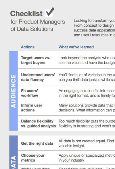
Product Manager's Checklist
An increasing number of organizations are trying to turn their data into revenue. We created the Data Product Checklist to help product managers understand what's involved with taking a data product to market.
After eight years of helping organizations implement beautiful, interactive data products, analytical tools, and dashboards, we've got a pretty good idea of what it takes. This checklist provides a good overview and a set of resources available to help you take your data to market.

Design Tips for Non-Designers
A great reading list for non-designers or people who work with designers. Its intent is to give those of us that work increasingly with dashboard or information designers greater fluency in our conversations with designers.

Dashboard Love Poster
Summarizing the principles from our dashboard design whitepaper above, this poster will keep both your left and right brain happy.
This 24”x18” poster is a great complement to our dashboard design whitepaper. We’ve taken the principles from that paper and laid them out in a thoughtful, informative, and artistic fashion that’s sure to give you that lovin’ feelin’.