
The Dashboard is dead, long live the Dashboard!
At Juice, we’ve long been dissatisfied with the common form of the information dashboard. When it comes to communicating data, I know we can do better than a densely packed grid with 4, 6, 9, or more charts. Why should we ask people to look at a page where each chart is desperately fighting for attention, like the College GameDay signs behind Desmond Howard and Chris Fowler?

#3 in best GameDay signs of 2015
Nevertheless, the conventional conception of a dashboard has been resistant to change due to a couple underlying assumptions:
1. All the information should be visible at once so readers will be able to draw important connections across the data;
2. The dashboard should perform just as well in a static environment (i.e. a print out) as on a computer screen.

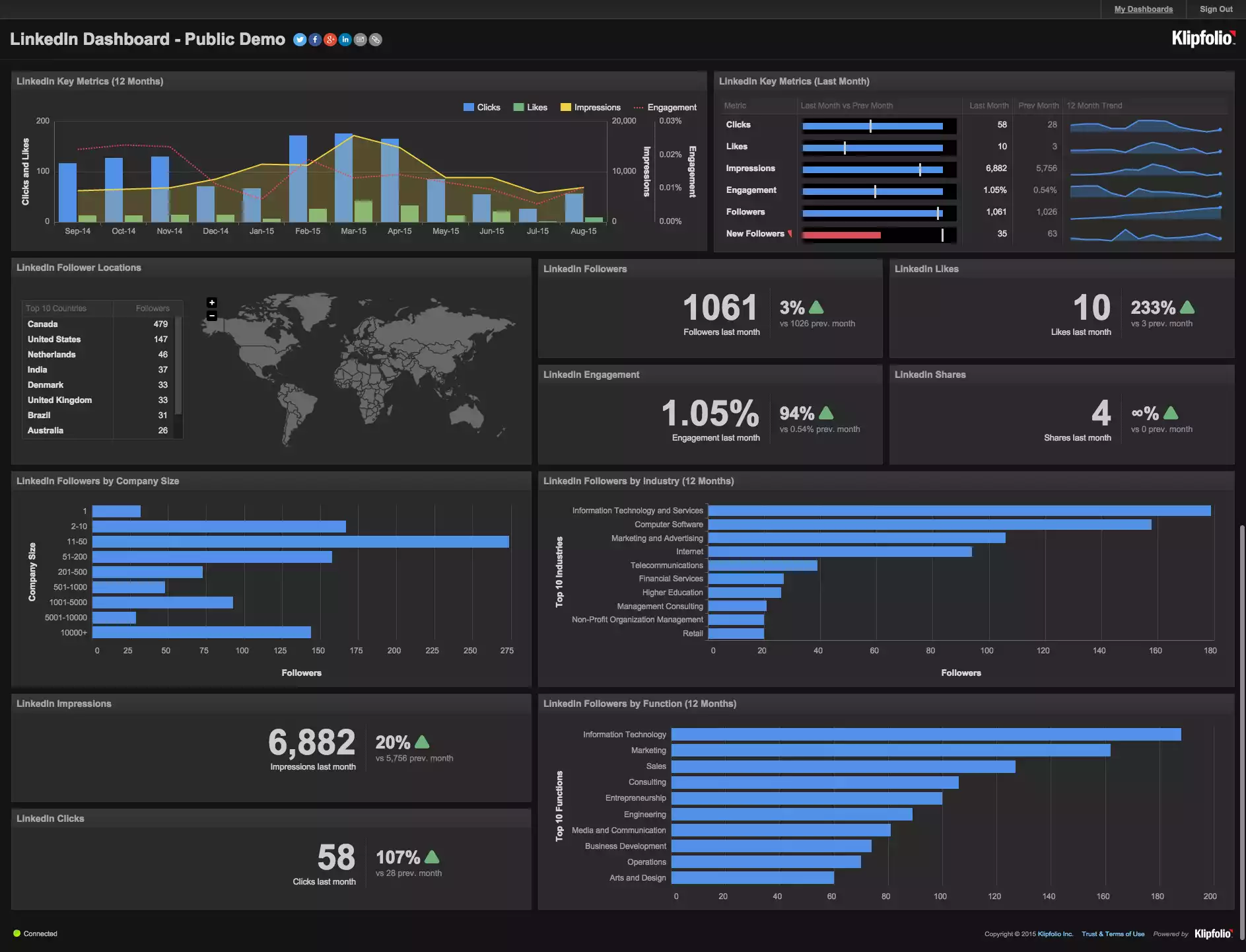
Google Image search on “dashboard”. A series of packed grids, always with four or more charts.
Dashboards don’t need to look like this. We can stop saddling users with densely-packed visuals that do little to guide them through the data to insights. It isn't just about using smarter, cleaner, Tufte-compliant visualizations; it is about defining a new concept of what a dashboard should be. I'll call it the Undashboard.
The Undashboard is aligned with the opportunities created by modern interfaces, interactions, and devices. The Undashboard is focused on a data consumer that is tech-savvy, but doesn’t live inside a spreadsheet day-in and day-out. These data consumers are mobile information-workers who want tools to make them better at their job. They don’t have the time or inclination to spend their morning squinting at a complex print-out of tiny sparklines. Data consumers expect information relevant to their job and a user experience that is closer to a mobile app than Lotus Notes.
With these goal in mind, here are eight design guidelines for Undashboards:
1. Reader comprehension
The Undashboard isn’t obsessed with cramming everything on one page. Modern web design has taught us to respect the value of white space, which gives people the opportunity to focus their attention and absorb information a morsel at a time. We’ve also learned that vertical scrolling isn’t evil. In fact, touch screens make vertical scrolling almost effortless.

An Undashboard takes its time to gradually display information, leaving plenty of room for white space.

This densely-packed dashboard pulls the reader's attention in every direction at once.
2. Data needs context
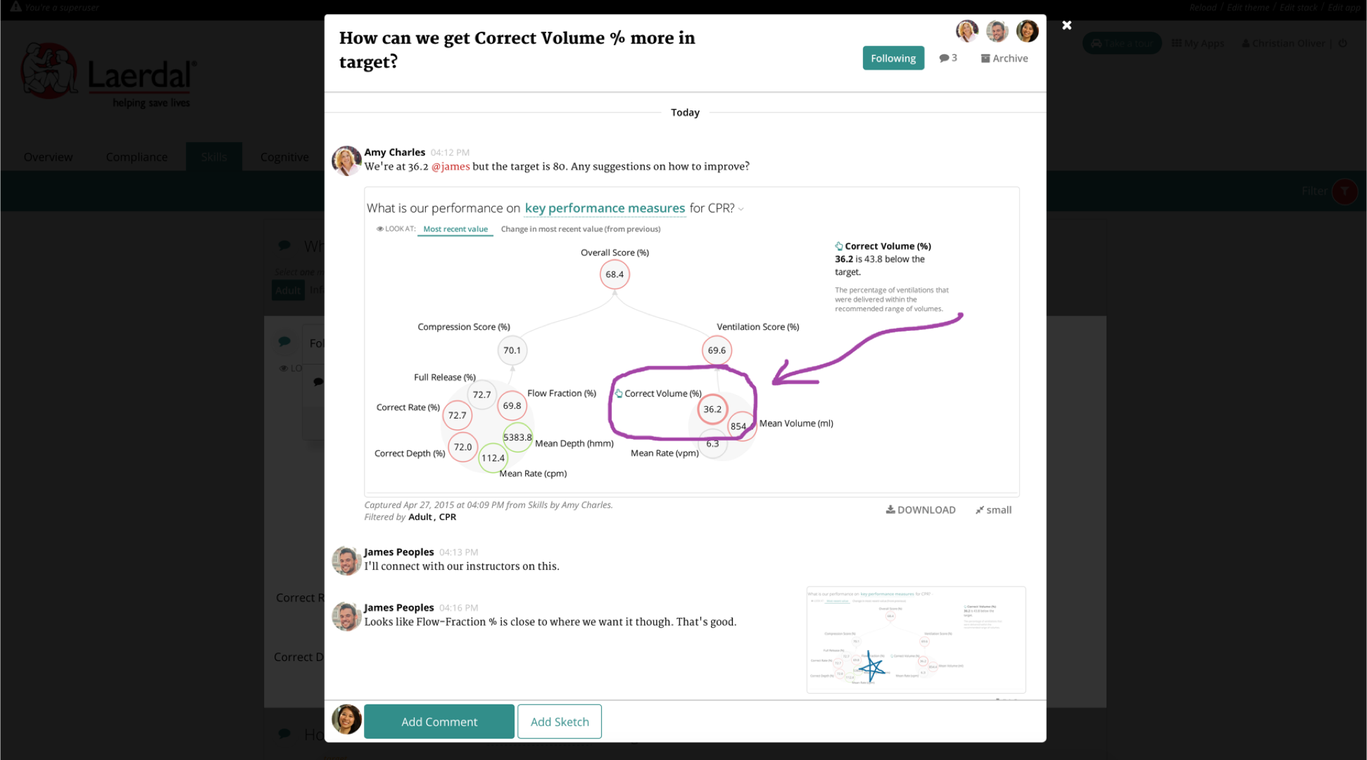
The Undashboard appreciates that data needs context in the form of related information and descriptions. Rather than squishing everything on one page, context can show up as details when items are selected and/or be displayed with graphical elements like color (as in the example below). Comparisons to benchmarks or goals are some of the most important ways to put data in context.

The colored metric bubbles indicate comparisons to goals while details on the right provide additional context.
3. Text is the glue
The Undashboard knows that presenting data isn’t just about data — the titles, descriptions, labels, and explanations are the glue that ties the data together and makes it truly readable. Good data communication requires a mix of clear, jargon-free language and the thoughtful focus on the most important data.

Careful use of text explains the data content.
4. Create a guided path
The Undashboard guides the reader through the content, rather than making readers find their way on their own. Traditional dashboards toss charts at a readers as if the order and relationships are meaningless. You wouldn’t scramble the paragraphs in a book if you wanted to tell a coherent story. The Undashboard uses an explicit path through the visuals to emphasize meaning and the author’s understanding of what matters in the data.

In its collapsed state, this application provides a structured, question-based flow to walk users through the data analysis.
5. Lead with a purpose
The Undashboard is designed with the end in mind. The purpose of presenting data is to help people be smarter in their actions. What’s the point if people aren’t going to do something with the data? The Undashboard leads users to relevant actions, which can come in many forms: discussions with colleagues, action plans, or direct integrations to other systems.

Embedded actions, like this "Create Student Group" button, makes for a short step between analysis and action.
6. Personalize the experience
The Undashboard is customizable for the different needs and interests of its users. The only valuable content is that which is pertinent to the reader. Many dashboards make the mistake of showing everything at once when the vast majority of the information is irrelevant for any individual reader. Undashboards makes the selection of scope a first-order, top-level feature. With the ability to present data interactively, you can give users control to choose what they care about, and free up a lot of visual space in the process.

This application provides ample opportunities for a user to choose what they care about:
This dashboard doesn't customize to meet the specific needs of a reader.
7. Start a discussion
The Undashboard recognizes that visualizing data is only the beginning. It should spark a discussion about what is happening and what to do about it. The data discussion that follows is the truly important part because that is when actual change happens.
Juicebox's discussion feature lets users capture, discuss, and share the insights they find in the data.
8. Form follows function
The Undashboard comes in different forms based on how, when, and why the reader is accessing the information. Dashboards can sometimes be considered the single form of output — the same things shown on the screen as is printed out or seen on a mobile device. Undashboards appreciate that the information and actions taken when someone is viewing on a mobile phone aren't the same as when projected in a conference room.

Fitbit's mobile dashboard
Like software in the cloud, it can take a while for many businesses to realize that the winds of change have already blown us a better answer. There should be no going back to static, dense, complex dashboards for communicating data. There are too many reasons why dashboards need to be transformed, including the needs of the users, new technologies, new design styles, and new understanding of how data can be embedded into business decisions. All of these factors demand a new future for dashboards.
Many of the examples above are created using Juicebox, our answer for building Undashboards. We'd love to show you how it works.