Building Really Great Data Products, Phase 3: Make It Available and Scalable

Over the past few weeks, we’ve talked about what it takes to build really great data products. We started with how to go from a blank canvas to design the right data product. This week we want to touch on how to maximize the reach of your data product with Phase 3: Make it available and scalable.

There are two primary areas that facilitate scaling: 1) how the product connects with the target users, and 2) how the technology of the data product enables a higher volume of users and data.

Connect with your target

Just like any other product you might think of, data products need to be used by their target to accomplish their one job. If you followed our Guided Story Design™ process, you’ve already done most of the heavy lifting to connect with your target audience. But there are some post-design considerations that you need to make if you want to maximize how your data product connects with your target.

Before people will use a product, they have to know about it. When you begin the process of telling others about your product, don’t take the “build it and they will come” approach and toss it out there and see what happens. Instead, be intentional about how you introduce folks to your product. Begin with properly-crafted messaging about the problem your product solves. Frame it in a way that they understand how it helps them. Avoid “Hey look at this cool thing I made.” (i.e., what it does for you) and focus on “This application will point you to departments with high staff turnover” (what it does for them). You’ll want to make this message as simple as possible, focusing on the chief problem it solves and leaving discussion of features for later. Realize that if it takes you a paragraph to get someone to understand why they should use it, you’re gonna lose folks before they’ve even tried it out.

Once you’ve connected with your target in a way that makes them want to use the product, you have to make it so that they can actually start using it. Don’t forget that the first time they see the product, they’re going to have to build their own mental framework for how they engage with it; any structure you can put in place to help them with this makes onboarding so much better. Some tricks to lower the barrier to use include gradual reveal, simple introduction videos, and step-by-step guides on how to accomplish common tasks. We love to use new-user tours in our Juicebox apps, but these can also be accomplished through other less automated means (such as onboarding emails, training, or documentation).

In addition to those “push” onboarding ideas, you’ll also want to to consider encouraging “pull” engagement -- allowing your users to connect with you (for user feedback and support) and with other users (to discuss findings and questions). Believe it or not, interpersonal connections about the product will most certainly help them to connect better with the product.

Technology scaling and operations

The second component of scaling the data product is about how well the technology base on which it was composed enables more people to use more data. Because effective scaling is a very complex topic, we’re just going to briefly touch on it here with some scaling questions you’ll want to consider. As you ponder these questions, ask yourself how important each of these are to the success of your product.

Capabilities that make it easier to operate the product on a daily basis:

* Can I bulk add new users? Adding a handful of users by hand is no problem, but if you have to add dozens or hundreds, that’s no fun.

* Can I assign users to group access permissions? If different people need to have restricted access to different things, it may be more efficient to have permission groups to which you assign users so that there are no privacy slip-ups.

* Can I monitor what users are doing and how they’re using the data product? When you know who’s actually using the product you can better tune onboarding efforts.

* Can I load data using automation? Automation reduces error; if data quality is important, this may help.

* Do system resources (e.g., servers, data storage) autoscale to accommodate both growth and idle time? Making sure response times stay reasonable keeps users happier.

Capabilities that report on system health:

* Do I know who’s using the data product (now and in the past)? When you know who’s actually using the product and what they’re doing, you can better respond to questions and feature requests.

* Do I know if data loads ran successfully? Everything works perfectly… until it doesn’t. Then you’ll want to know.

* Can I effectively identify performance bottlenecks? If you know things that impact user experience, you can improve user experience.

* Am I notified when there’s a system issue? You won’t have to spend too much time looking for broken things before you’ll really appreciate smart issue notifications.

Capabilities that enable future improvements:

* Does my technology support my data product’s life cycle? Design → Develop → Production → Upgrade → Retire.

* Can I work on new features and bug fixes without disrupting production? Being able to make changes in a development environment prevents oh so many embarrassing moments.

* Can I reliably deploy a new release without breaking the data product? Don’t miss any pieces and don’t include pieces that don’t belong.

* Can I provide branded versions to my customers that have the same core code? White labeling and customer-specific configurations.

* Can I set up users that have access to different versions of the data product for testing purposes? Giving existing users access to pre-release versions can cure headaches before they happen.

All of these are important things to take into consideration when making your data product available and scalable. It can be a difficult undertaking, but it's not an impossible one. If you have questions or want to know more about the approach we take to build our data products, send us an email at info@juiceanalytics.com or send us a message using the form below.

Building Really Great Data Products, Phase 1: Narrow the Story Options

This is the second of three posts in a series that discuss best practices for designing data products. This post focusses on narrowing all of the “blank canvas” options down to the right design. Check out part one of the series here

The Starting Line

Folks who have data of any size in their possession also typically have some ideas and goals for what insights they want extracted from that data. While a sense of curiosity about data is never a bad thing, it’s often too broad to hone in on important insights that should be extracted from the data. Think about it like an artist who starts with a blank canvas: transforming the canvas into a beautiful work takes expertise, focus, and execution. In the case of properly crafting a great data product, by adhering to a carefully crafted process that functions to narrow the focus of the story that the data will ultimately tell, they’ll be able to go from broad ideas to authoring their very own data story that has purpose and direction.

How to do it

We use a process called Guided Story Design™. This process takes the infinite "blank canvas" options that every data visualization tool offers and narrows the options down to the one that best enables the target audience to act on the data. We do this by helping the data product author see the reporting challenge from the perspective of their users/audience, and then put the data into a context that is easily understood and acted upon. This all-important process of narrowing the purpose and function of the data application is accomplished in 3 steps.

Step 1: Identifying the Audience

The author’s attention when thinking about his or her data must be narrowed to focus on how the data will be used for the good of the business. In order for authors to truly consider and understand how their data will be consumed, they must step into the shoes of their users. These should be users that will have specific roles and goals within the data application.

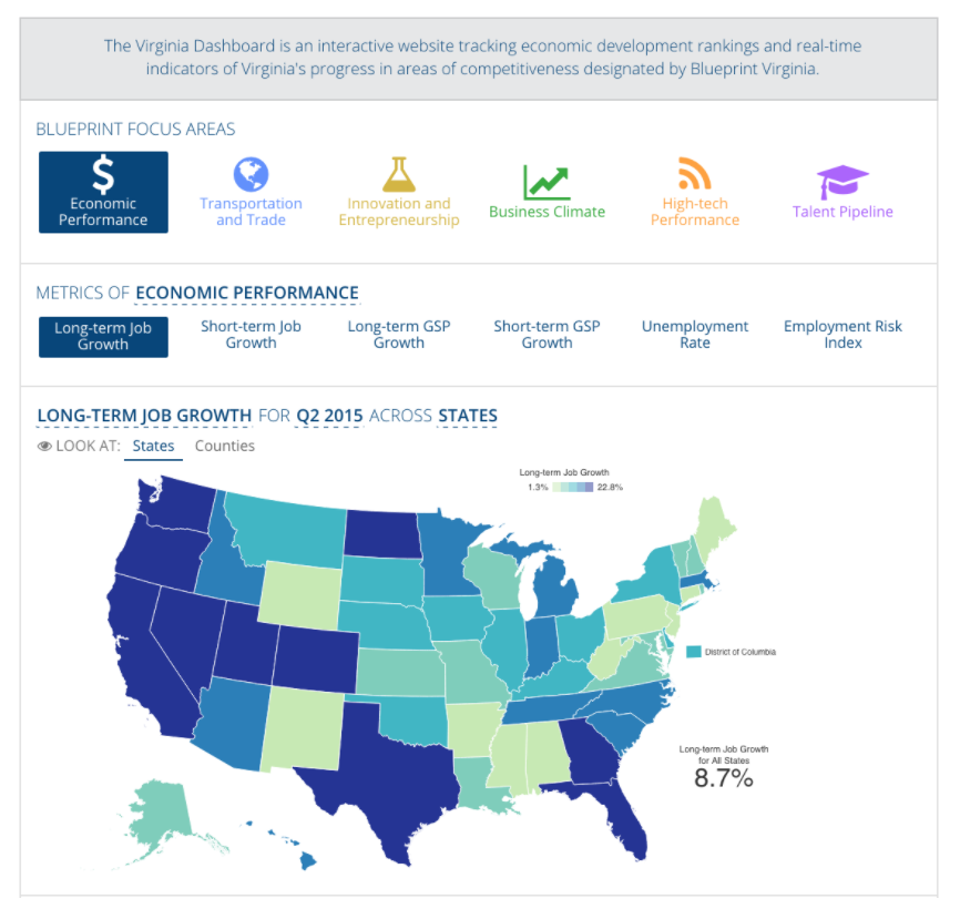
For instance, consider a data product intended to enable a state chamber of commerce to better plan for future economic development in their state. Clearly identifying users as policy makers as opposed to investors or target corporations introduces the critical nuance of full disclosure as opposed to only show people where I’m the best. This can dramatically impact the focus and purpose of your data story.

This laser focus on the user persona gives the author a sense of context as to what the purpose of the data application is and encourages them to consider who the audience of their data application will be. When someone is forced to consider what his or her users’ goals are, the metrics and dimensions that will be most valuable to their audience come to the surface.

Step 2: Designing the App

Now that the focus and the goal of the application are in place, the design is the next key factor to make the data story one with which users want to engage. When we lay out the scope of a design, it includes three components: content, layout and flow, and styling. All three play an important role in connecting with the users and deserve intentional attention.

Picking the right content typically starts with identifying the metrics that support the goals of the audience. Once metrics are defined, specifying how to reveal additional detail about each one is the next step. For example, a metric about sales revenue might be most useful when trended across time. Or perhaps it’s more useful shown as a breakout across regions. Try to avoid showing as many breakdowns as you can think of since your target user most likely prefers just a few (or one) of your options (and more breakouts frequently lead to more confusion.)

Once you have the right content, it needs to be laid out in the proper sequence with the proper visual and interaction connections so that the user can understand it. Think of it like writing a thesis: there’s an introduction (typically key metrics), a body (the break outs for each metric you’ve identified), followed by a conclusion (either a summary of findings or perhaps a listing of lowest-level elements such as students or transactions). The key thing to remember: there should be a flow through the content that seems natural and leads the audience to an action.

The purposeful styling of the application should invite the user to engage and seek understanding while supporting any branding guidelines that are necessary. Company logos, color palettes, and relevant images should be embedded into the app to fulfill styling guidelines and to make the application feel personalized.

Step 3: First Eyes on the App

Once the data application is ready, publishing it to a small group of actual users that fit the target gives you the ability to test and refine your design. From this test group, insights about the effectiveness and usefulness of the application will come pouring in. The subset of users should be given a window of time (the amount of time can vary, but it’s important that there’s a specific period identified to keep things moving -- we feel a few weeks is typically enough) to explore the data and give their feedback while being able to test this feedback with fellow users. The conversations and direct feedback generated through this process will make the path forward for final touch-ups to the final product very clear. The feedback given by the users also functions as an affirmation to the author that the application they’ve put together is one that is actually useful to its target audience.

The author has gone from having a blank canvas to a data application that users interact with and give feedback on, all thanks to the Guided Story Design process that puts the focus of the application’s design onto its actual end-users. In the next post, we will take you through the steps required to take the application from a small subset of test users to a living, breathing product that supports thousands of users.

Have questions about our Guided Story Design process? We've got answers! Send them our way at info@juiceanalytics.com or check out our Contact page to shoot us a quick message.

3 Phases of Building a Data Product

This post is the first part of a three-part series. To begin, we’ll discuss discuss the difference between reporting and data products. The second part will talk about what it takes to design an effective data product. The third and final post will review what factors to consider to get to scale with your data product.

Over the years, we’ve written about the virtues of proper data visualization and use, from Chart Chooser to dashboard design best practices. As we’ve practiced these principles with our customers to help their audiences use data, we’ve observed over and over again that the most impactful results come not as data visualizations, but rather as persistent data applications that are purpose-built and long-lived. We call these data applications "data products."

Let’s review what we mean by “data product”

In our Data Reporting Maturity Model (↑) there’s a full spectrum of attributes from raw data to lifecycle management. While not all data reporting opportunities justify the attention and effort necessary to productize the data, true data products demonstrate nearly all of those attributes. These attributes fall into four broad groups: data, defined audience, accessible and usable, and productized.

Data

Data products begin with quantitative and specific data every time. This includes raw data as well as “re-formatted” data such as tables or charts. Smart and legitimate qualitative explanation and description enables full bloom of the meaning and consequently, full reach of the audience, but the qualitative part is always subject to the quantitative data.

Defined Audience

“Reporting” implies some specific audience and distribution along with a level of summarization and interpretation. We like to clarify this by thinking about reporting as primarily intended for “up and out.” “Up” refers to people in the author’s own organization who are less familiar with the details of the data (e.g., up the reporting chain), and “out” refers to people outside the author’s domain who are less familiar with the domain itself (e.g., peer departments, or customers). In both cases, the target audience needs the guidance of a trusted advisor in order to fully understand the importance of the data, among other things.

Accessible and Usable

Most of the attention in the data visualization space has been on the side of what we refer to as ad-hoc reporting -- "I have some data and need to explore it to find out what it might tell me." This is a necessary part of the data value chain, but let’s not be deceived: it’s by no means the last mile. The goal is to get people to act on what the data reveals. This means crafting an intentional message and providing that message in a form that is consistently available in the same way. It supports access management, enables easy new-user onboarding through guidance and help, features robust interactivity, and provides operational support (such as usage, error reporting, auto-scaling) — all those things you would expect from any real application platform.

Productized

All data reports have a lifecycle, but for the really important stuff we’ve found it helpful to think about it from the perspective of what it will take to provide it to customers over an extended period of time. You’ll want to consider its market, what sort of feature planning is required, what it takes to manufacture its first version versus future versions, how you take it to market and get users to adopt it, how you provide support and answer questions about it, and how you retire it when its time has come.

The building phases 

Now that we know what data products are, how do we build them? We break this journey down into three phases.


Phase 1: Narrow the Story Options

This first part is about narrowing a virtually infinite number of options presented by a “blank canvas” approach down to the right design. We use our own process called Guided Story Design™ to solve this problem (see chart above). 

Phase 2: Build It

This phase is about taking what you’ve designed and Pinocchio-ing it into a "real boy" (no blue fairies needed).

Phase 3: Make It Available and Scalable

The final phase of making a data product is about enabling what you’ve made to scale both in usage and capacity. This means accessible, usable, low barrier-to-entry and guidance for new users, interpretation, easy to share, discussions, and support.

What comes next

Now that we’ve set the stage and defined what a data product is, you may be interested for more detail on how to make it happen. Over the coming weeks, we’ll be delving into the first and third phases*, so stay tuned.

*Phase two is left up to the interested reader for self-exploration based on your tool/technology of choice. Once you have the first stage result, you can implement it using many different technologies. Juicebox is what we use to create the best apps for telling data stories. If you want to learn more about it, contact us.

"Choose Your Own Adventure" Data Stories


Before the days of iPads, smart phones, gaming systems, and on-demand TV, children read to keep themselves entertained. I know what you're thinking -- "What?! How could that be possible? Kids hate reading!" False! When I was growing up in the 80’s and early 90’s, one of my favorite modes of entertainment was reading, and I especially loved the “choose your own adventure" genre. I can remember reading with a flashlight under the covers eagerly awaiting the next page to choose what happened to the main character. Even though I was choosing from a set number of options, I still felt in control of the adventure. At Juice, we see multiple parallels with “choose your own adventure” stories and data storytelling.

One of the main challenges when it comes to data storytelling is being able to get both analytical and non-analytical users on the same page. Data always tells a story, and we want to enable people to communicate the story to their audience and ultimately deliver something of value, regardless of their level of data fluency. This means giving users a common language in which to communicate and a platform to do so.

Some data stories are simple: they have a few metrics and a number of ways you can slice and dice the data. But what if a user wants to aggregate different sets of data and find trends, commonality, and meaning? This is one of the challenges we have taken on in Blueprint, and the starting point for finding such commonality is deciding on a root unit of measure. For Blueprint that is the employee of a hospital or health system. In our conversations with these organizations, we have discovered that leadership wants to see their employees under many different lenses (such as hiring, turnover, tenure, engagement, compensation etc.). The problem is that each of those lenses is a different data set. With Blueprint we have created an aggregator for those disparate data sets to live. By filtering the data down to an organization, department, or supervisor, we can allow a leader to “choose their own adventure” and find the story in the data that is most important to them. This allows them to see more clearly into their organization and make smart, thoughtful, data-driven decisions.

Blueprint may be the first of its kind, as demonstrated by its use of shorter modules/stacks that allow the user to make his or her selection and then carry it onto the next module, but we know it won't be the last. We're truly excited about what this “choose your own adventure” type of navigating means not only for the future of our products, but for the industry as a whole. And now the choice is up to you -- what will be the next step of your data storytelling adventure?

Creating User Personas to Tell Data Stories

Juicebox boasts a wide variety of users who all prefer to experience their data stories in different ways. Some users like to follow the story chronologically, some like to jump around to different parts of the story, and others prefer to simply sit back and explore the story. Our top priority is making sure that all of our users are able to achieve their different goals while using Juicebox's Guided Story Design. In order to ensure that this happens, we've created user personas. Here are the steps we took to create our user personas that you can recreate with your own users.

The first thing we did was sit down with our users and ask them questions. A lot of questions. Our personas were not created from what we think our users’ behaviors and goals are, but instead were born from real conversations with the real people who use Juicebox. Without the specific comments our users were able to provide us about their  wants, needs, and desires, we would not have been able to create successful user personas.

The second thing we did once we had collected this juicy information was to share it with everyone in our organization. We didn’t want to keep these critical details limited to a small number of people at Juice - we wanted everyone to feel as if they knew each of our users’ preferences and needs on a personal level. When sharing the information we also wanted to make it fun and easy to reference, so we made playing cards for each of our personas and spread them around the offices. Now whenever Juicers talk about product design, they can use the cards to make sure that all types of users are included in the big decisions being made about how our stories are structured.

Once you create your user personas, it's important to remember that users' behaviors, preferences, and goals are constantly changing. To ensure that we are always correct in our user personas and our ideas of what they need, we monitor users' actions with Fullstory. The benefits of being able to monitor our product use this way are seemingly endless. For example, when a user experiences confusion with the functionality of our product, we’re able to know about it immediately and address it.

Successfully taking large groups of our users, discovering how they prefer to experience our Guided Story Design, and humanizing them through persona playing cards has allowed us to walk a mile in the shoes of our users. This ability has fostered a strong sense of empathy for our users because we truly believe that we understand their preferences in a data product and can share the feelings they experience while using Juicebox. Using these tools as a concerted effort to bring the user into the front of everyone’s mind at Juice Analytics has been instrumental to our success. Because we truly care about users’ experience when navigating the stories we tell with their data, we’ll continue to strive to create the most engaging and insightful stories possible. And now that you know the secrets to our success, you can too. 

Want to learn more about Juicebox? We want to tell you about it! Send us a message at info@juiceanalytics.com or click the link below to schedule a demo.

Data Storytelling: The Ultimate Collection of Resources II

When we wrote the first installment of "Data Storytelling: The Ultimate Collection of Resources" the world was a different place. It was 2013 and we were all busy celebrating a new royal baby, adding the words "twerk" and "selfie" to our vocabularies, asking ourselves "What Does the Fox Say?", and just beginning to recognize the idea of data storytelling as a hot new concept in data visualization.

Flash forward four years and the concept of data storytelling has only increased in popularity. Since that first collection of resources was posted, the amount of quality content on the subject has grown exponentially. Below are some of our favorite blog posts, videos, presentations, and more about data storytelling that have been published since. Peruse and enjoy at your leisure.

Blog Posts

Videos & Presentations

Podcasts

Books

Other Resources

1. Blog Posts

Series on Storytelling by Jon Schwabish

What Is Story? “ While it sounds good to say that we’re telling stories with our data, I think far too often, far too many of us are not applying the word story to data correctly."

Story Structure “As the terms “story” and “data” get mixed together more and more, it’s worth taking a look at traditional story structure to see if we are appropriately applying the word story to data."

Applying Data to Story Structure “If, however, we are telling stories with data, then these models of story structure should apply to data and data visualization. But they don’t."

The Storytellers “In this final post, I look at the differences between analyzing data and talking to people and how those two ends of the spectrum differ across different types of content creators."

More Story References and Resources - A list of resources inside a list of resources -- so meta. Jon Schwabish details the materials he used while writing his series on data storytelling.

So What? By Cole Nussbaumer Knaflic “Everyone wants to "tell a story with data." But very often, when we use this phrase, we don't really mean story. We mean what I mentioned above—the point, the key takeaway, the so what?"

Storytelling with Data Visualization: Context is King by Nick Diakopoulos “To fully breathe life back into your data, you need to crack your knuckles and add a dose of written explanation to your visualizations as well. Text provides that vital bit of context layered over the data that helps the audience come to a valid interpretation of what it really means."

Data Storytelling: Separating Fiction from Facts by Brent Dykes “As various people step forward to provide opinions on how to tell data stories, I’ve seen misinformation creep in which—if left unaddressed—could lead aspiring data storytellers astray."

The Role of Data in Data Storytelling by Teradata “An (alarmingly) large number of comments and opinions describe in great lengths how people in technical professions are unable to explain or storytell their experiments and findings. Have we regressed that far that something as natural as stories has disappeared from our skillset? Not really."

Will You Present the Data As-Is, or Tell a Story? By Ann K. Emery “It’s not that one visualization style is better or worse than the other. They’re apples and oranges. I want you to figure out when your viewers are expecting to see each style and then learn how to switch back and forth."

Story: A Definition by Robert Kosara “Once you start looking at actual stories, you will find these elements everywhere. And they do apply to well-crafted stories about data just as they apply to traditional stories about people."

Implied Stories (and Data Vis) by Lynn Cherny “Even very simple stories, whatever the discourse form, rely on the reader filling in a lot of invisible holes. Some of the interpretation we do is so 'obvious' that only sociologists or cognitive scientists can make explicit the jumps we don't notice we're wired to make. "

Everything We've Ever Written On Storytelling by Juice Analytics

2. Videos & Presentations

3. Podcasts

Visual Storytelling w/ Alberto Cairo and Robert Kosara by Data Stories (Enrico Bertini and Moritz Stefaner)

Adam Greco’s 5 Analytics Data Storytelling Strategies by The Present Beyond Measure Show (Lea Pica)

Data Storytelling with Brent Dykes by Digital Analytics Power Hour

4. Books

5. Other Resources

30 Days to Data Storytelling by Juice Analytics

Did we miss your favorite data storytelling blog, presentation, podcast, or book? Send us a message to let us know!

3 Jobs Every Data Story Should Do

One of the companies we love is FullStory. Recently, they wrote a nice piece about how when people buy a product, they’re really hiring that product to do a job — a job they already needed to do but that is easier with the assistance of the product. 

This is true for data stories, too. In a nutshell, data stories are the assembly of data, visuals, and text into a visual narrative about the meaning of the data. Properly crafting an effective data story — one that connects the reader to their data, its meaning, and how it relates to their environment, all while assisting the reader in accomplishing a meaningful task — is not an easy endeavor in which to succeed. 

But don’t despair! Give your data story these 3 jobs to do and your readers will be more effective with their data.

Job #1: Tell them something they already know.

When you write a data story, the very first thing you have to do is build trust with your reader. Until they have confidence in your story, the best you can hope for is to drag them into the slog of figuring whether or not they can trust your story, which is typically performed through in-depth and independent data forensics. Did somebody say “Party!”? Um, no.

So, how do you build trust? By meeting them on common ground: tell them something that they already know and agree with. Here’s an example from an application we created using Juicebox, our data reporting application platform, that addresses the greatest opportunities for cost and care management in the world of population health.

We start by presenting a key metric of total number of members, a metric that most users would be familiar with and would give them the sense that we’re both talking about the same thing. Now we’re on the same page with the reader and, presuming we’ve done it correctly, the data story is ready to do its next job.

Job #2: Tell them something they don't already know.

A data story that only tells the reader what they already know isn’t terribly useful. So the second job of the data story is to make them smarter and introduce them to something new. This new piece of information demonstrates the value of your data story. If done properly, the reader comes away saying “A-ha! I see it!”

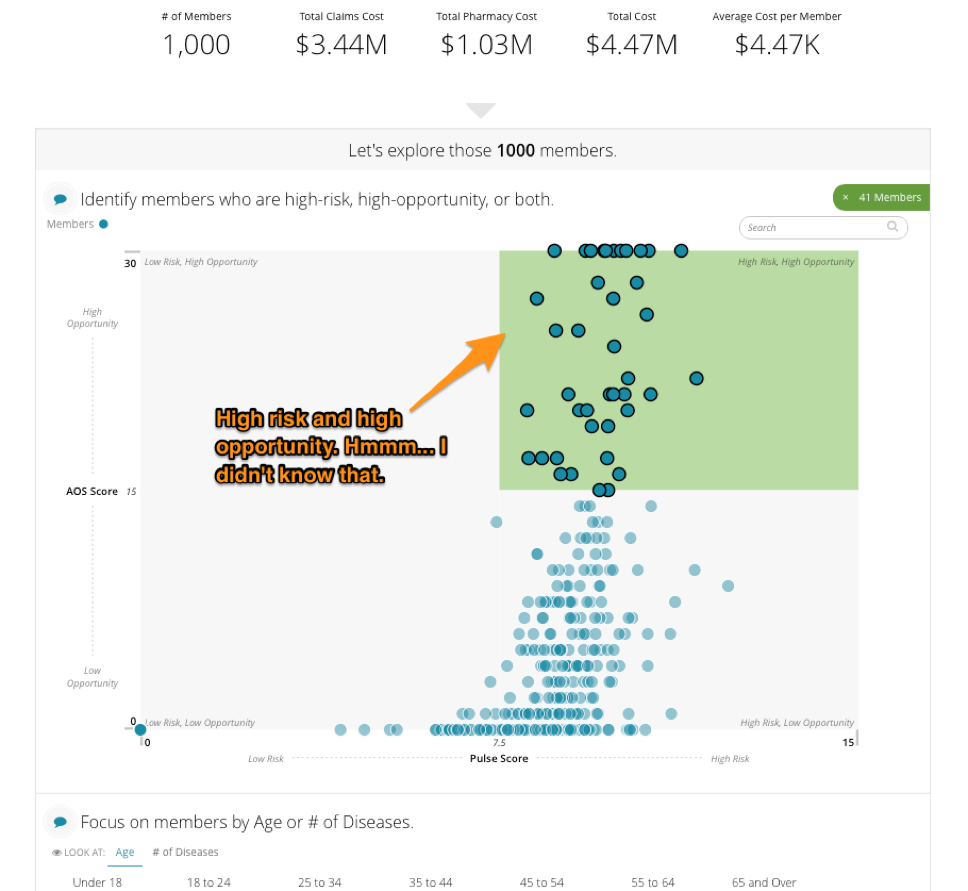
Continuing with our population health example from above, we introduce the bucketing of population members into a high-risk/high-opportunity group. “Oh look, there are 41 people in that group that are at risk, but who have a high opportunity for change."

But, as GI-Joe always says, “knowing is half the battle.” The other half? On to your data story’s third and final job.

Job #3: Give them something to do.

If data is presented and no-one acts, did it matter? If a tree falls in the forest and no-one hears it, did it make a sound? If the rubber doesn’t meet the road, is the cliché reality? Seriously though, when the new thing that the audience learned inspires actions, that’s when it become truly useful. Continuing with our example, you can see that the user is presented with a list of specific people who fall into the high-risk, high-opportunity bucket — perhaps feeding these folks into a campaign to actively manage their risk would be the next step. 

The more specific you can get with the recommendation, the better. This last step is most successful when your data story is written around a very specific and targeted narrative. This is what we at Juice call a short story... but more on that another day.

The next time you write a data story, give it these three jobs and we’re certain you’ll make your readers more effective at using your data. Need some more help with your data story? Send us a message at info@juiceanalytics.com or fill out the form below!

Lessons from More Than Insights: Beyond Exploratory Data Viz

Last month a group of Juicers attended a lecture at Georgia Tech entitled “More Than Insights: Beyond Exploratory Data Visualization” given by Hanspeter Pfister, Professor of Computer Science and Director of the Institute for Applied Computational Science at Harvard University.

Pfister cited the rise of the infographic, as well as an increased general interest in subjects like data storytelling and data journalism as evidence that more and more people are becoming interested in using visualization to communicate and explore information. But what comes after information is shared?

“After insight comes the message,” Pfister explained. “The information is the ‘what’, the message is the ‘so what’ - the ‘why should I care?’”

Being able to address the “so what” brings a whole new set of challenges to data communication, Pfister told the audience. He explained that we’ve only just begun to scratch the surface of what is possible, that we actually don’t know as much as we think we do about these subjects, and that much more research is needed to even begin to understand these intricacies. To illustrate his point, he used examples from three different subject areas: data visualization, data storytelling, and data tools.

Data Visualization

Pfister cited a study that he had participated in along with Michelle Borkin on what makes a visualization memorable. In the study, participants were shown a string of various visualizations and told to respond if they remembered having seen it previously.

So what did the researchers find made a visualization memorable? The charts were found to be more memorable if they contained human recognizable objects (such as dinosaurs or faces), if it was colorful, visually dense, or had a title, labels, and/or paragraphs.

Are these descriptions setting off alarm bells and making you scream internally? It’s probably because these characteristics are the exact design elements we’re taught to avoid. To further prove this point, Pfister shared that the least memorable visualizations were what we’d think of as more “Tufte-compliant.”

So the question on everyone’s minds: do we toss out the old guidelines in favor of brighter, busier visualizations? Not necessarily. Pfister shared that he believes the answer may lie in “something beyond [Tufte] that we haven’t explored that much.”

Data Storytelling

Pfister then brought up the ultra-new method of using comics to communicate data. Ultra-new because, as Pfister pointed out, there are few actually using comics to communicate data, there is no real definition of what a data comic actually is, and there are no real tools to create data comics.

A data comic, he explained, is communicating data in a way that comic books typically communicate stories. He explained that the four essentials for data comics were visualization flow, narration, words, and pictures, and demonstrated how all of these work together by displaying a data comic that showed the various power struggles that contributed to World War I.

It’s hard to do the comic justice by just talking about it, but to give you some idea of the effect it had on the audience, I would like to use one audience member’s own words: “It’s like a punch to the brain.”

Viewing the information in the form of a data comic was a faster and clearer way to communicate the information than any textbook could have done. It was evident from this example that data comics are more likely to play a larger role in the future, but, Pfister questioned, how will it fit into data storytelling overall?

Data Tools

The last subject Pfister hit on was data tools. He explained how the majority of popular data tools are relatively easy to use, but lack ability to customize visualizations easily. On the other side of the spectrum, however, are tools that are more expressive but lack ability to add insight. He argued that data scientists not only want but deserve better tools, and because of this there should be a product that falls somewhere in between Excel and InDesign.

The answer that Pfister and a team of individuals, in collaboration with Adobe, came up with was a program in which the user puts data into a spreadsheet, then uses guides that constrain the data to create a visualization. It was an interesting way of displaying data, but will it satisfy data scientists’ quest for the perfect tool? Only time will tell.


It was clear from Pfister’s lecture that more research needs to be done in all of these areas before we can truly say for sure what the best methods of communicating data are. It’s an exciting time to be in visualization, and we’re excited to see what the future brings. In the meantime though, check out our design principles for what we’ve found to be some pretty effective strategies for communicating data.

New Ebook: Data Is the Bacon of Business

There are some things in life that just go together. Peanut butter and chocolate. The Captain and Tenille. Data and… bacon?

It may seem like an unconventional pairing, but it’s true. We’ve said it before, and we’ll say it again: Data is the bacon of business. What do people do to liven up boring foods? Add bacon to them! What do businesses do to liven up their products? Add data to them!

The truth is, data products are a real and current opportunity for businesses, including yours. We should know -- we’ve spent the last ten years helping companies to create their own data products. Now we’re sharing what we’ve learned with you in our newest ebook. With just a few clicks, you'll learn our data product process and be well on your way to making your very own data products.

Have we whet your appetite? Download the ebook for free now!

Three Simple Steps to Customer Discovery

Building a data product is no different than building any software product in that you have to really know your customer and value proposition before you go to market and scale. The process of getting to know your customer and how your proposed solution can help solve a problem is most commonly known as customer discovery. As you’ve seen in our other blog posts about the Blueprint product, we went through an extensive customer discovery process prior to developing our go-to-market strategy.

If the customer discovery concept is new to you, I’d recommend reading the following two books before diving head first into new product development:

The Lean Startup by Eric Ries

Four Steps to the Epiphany by Steve Blank

We’ve adapted what we’ve learned from these books to a process that we can use to test the viability of other products that we’ve built on the Juicebox Platform such as JuiceSelect (a product that helps chambers of commerce communicate data and drive to action), and now we're sharing it with you.

Step 1: Craft your value proposition hypothesis. Before you start having conversations with potential customers, you need to have an idea of the problem you believe you are solving with your product. Once you have a basic outline of the problem and your solution, you’re ready to test your hypothesis. Here’s how we structured our initial description of the JuiceSelect value proposition:

  • Target audience - The primary audience is lawmakers and chamber members/investors

  • Urgent need - Chambers need to publish data to support important policymaking  decisions and track progress against strategic plans

  • Ease of setup  - To turn the website on, it requires minimal effort from chamber staff

Step 2: Set up phone calls and in-person meetings to test your value proposition and demo your product (if you don’t yet have a minimum viable product [MVP], wireframes are good enough at this step). You should set up meetings with potential customers in your market and with organizations affiliated with your potential customers. For JuiceSelect, this meant reaching out to small, large, state, and regional chambers to make sure we were testing all aspects of our market. We also reached out to an Association for Chambers of Commerce and to a few vendors that sell other products to chambers to get a better understanding of our potential clients.

Step 3: Compile feedback and re-asses product-market fit. Now it’s time to pull together all of your findings and figure out if your original hypothesis about the problem and your solution were correct.

After completing these three steps, you’ll often find that you didn’t completely understand the problem and/or that your proposed solution is really only a partial solution. For instance, when we started our customer discovery process for the JuiceSelect product, we had made an assumption that the product would be valuable to all 2,000+ chambers of commerce nationwide. After a few weeks of demos and conversations about our value proposition, we discovered that the product was really primarily suitable for state chambers of commerce. State chambers of commerce need a public website to display all key economic metrics to help drive public policy decisions, while regional chambers only want to display data relevant to helping them attract new businesses to their region.

Good thing we didn’t sink tons of marketing and sales dollars into a market for which we didn’t have the right fit! However, all is not lost. We can still sell the original product to the state chambers while developing a related product that will fit the needs of the remaining 1,950 regional chambers.

If you’re interested in seeing how Blueprint or JuiceSelect can help your organization, we’d love to hear from you. Send us a message at info@juiceanalytics.com or tell us about yourself in the form below!