Blueprint

New Ebook: 5 Strategies for Getting Started with Workforce Analytics

Picture this: you're an HR executive in a top healthcare organization. You love your job, and you're committed to providing the absolute best patient care possible. But with increased demands and a tightening resource base, doing so is becoming more and more challenging. How are you supposed to provide more when you're being given less?

Thankfully, there's a solution. Workforce analytics can provide invaluable insight into healthcare organizations that can have a direct impact on patient care and satisfaction. However, getting started with workforce analytics can be a confusing process. That's where we come in.

For years we've been working with healthcare organizations to address these very issues using workforce analytics. We've got some of the best minds in the industry tackling the same problems you face, and now they're sharing what they've learned about workforce analytics in our newest ebook. It will walk you through what workforce analytics are and the steps you can take to implement workforce analytics in your organization right away.

5 WA 3D.jpg

So if you're feeling ready to get started with workforce analytics, download the ebook for free now! 

"Choose Your Own Adventure" Data Stories


Before the days of iPads, smart phones, gaming systems, and on-demand TV, children read to keep themselves entertained. I know what you're thinking -- "What?! How could that be possible? Kids hate reading!" False! When I was growing up in the 80’s and early 90’s, one of my favorite modes of entertainment was reading, and I especially loved the “choose your own adventure" genre. I can remember reading with a flashlight under the covers eagerly awaiting the next page to choose what happened to the main character. Even though I was choosing from a set number of options, I still felt in control of the adventure. At Juice, we see multiple parallels with “choose your own adventure” stories and data storytelling.

One of the main challenges when it comes to data storytelling is being able to get both analytical and non-analytical users on the same page. Data always tells a story, and we want to enable people to communicate the story to their audience and ultimately deliver something of value, regardless of their level of data fluency. This means giving users a common language in which to communicate and a platform to do so.

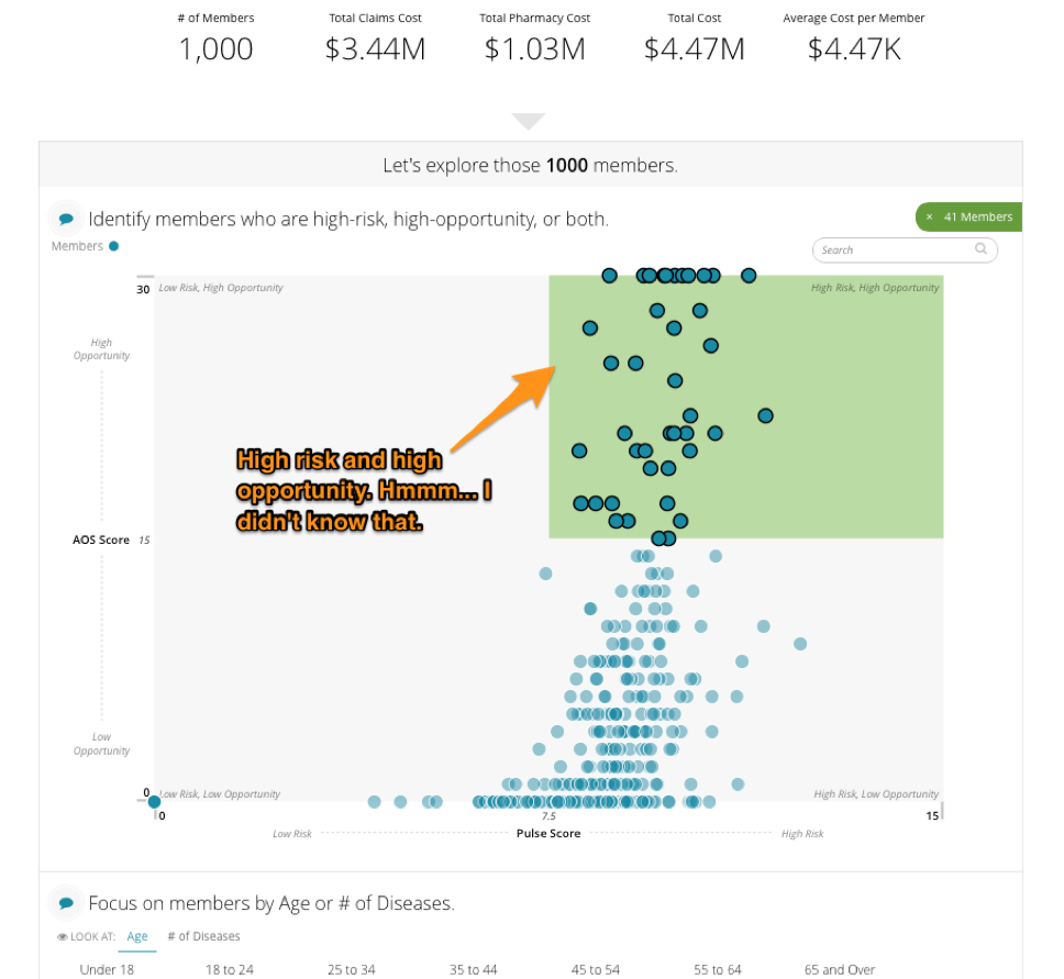
Some data stories are simple: they have a few metrics and a number of ways you can slice and dice the data. But what if a user wants to aggregate different sets of data and find trends, commonality, and meaning? This is one of the challenges we have taken on in Blueprint, and the starting point for finding such commonality is deciding on a root unit of measure. For Blueprint that is the employee of a hospital or health system. In our conversations with these organizations, we have discovered that leadership wants to see their employees under many different lenses (such as hiring, turnover, tenure, engagement, compensation etc.). The problem is that each of those lenses is a different data set. With Blueprint we have created an aggregator for those disparate data sets to live. By filtering the data down to an organization, department, or supervisor, we can allow a leader to “choose their own adventure” and find the story in the data that is most important to them. This allows them to see more clearly into their organization and make smart, thoughtful, data-driven decisions.

Blueprint may be the first of its kind, as demonstrated by its use of shorter modules/stacks that allow the user to make his or her selection and then carry it onto the next module, but we know it won't be the last. We're truly excited about what this “choose your own adventure” type of navigating means not only for the future of our products, but for the industry as a whole. And now the choice is up to you -- what will be the next step of your data storytelling adventure?

3 Jobs Every Data Story Should Do

One of the companies we love is FullStory. Recently, they wrote a nice piece about how when people buy a product, they’re really hiring that product to do a job — a job they already needed to do but that is easier with the assistance of the product. 

This is true for data stories, too. In a nutshell, data stories are the assembly of data, visuals, and text into a visual narrative about the meaning of the data. Properly crafting an effective data story — one that connects the reader to their data, its meaning, and how it relates to their environment, all while assisting the reader in accomplishing a meaningful task — is not an easy endeavor in which to succeed. 

But don’t despair! Give your data story these 3 jobs to do and your readers will be more effective with their data.

Job #1: Tell them something they already know.

When you write a data story, the very first thing you have to do is build trust with your reader. Until they have confidence in your story, the best you can hope for is to drag them into the slog of figuring whether or not they can trust your story, which is typically performed through in-depth and independent data forensics. Did somebody say “Party!”? Um, no.

So, how do you build trust? By meeting them on common ground: tell them something that they already know and agree with. Here’s an example from an application we created using Juicebox, our data reporting application platform, that addresses the greatest opportunities for cost and care management in the world of population health.

We start by presenting a key metric of total number of members, a metric that most users would be familiar with and would give them the sense that we’re both talking about the same thing. Now we’re on the same page with the reader and, presuming we’ve done it correctly, the data story is ready to do its next job.

Job #2: Tell them something they don't already know.

A data story that only tells the reader what they already know isn’t terribly useful. So the second job of the data story is to make them smarter and introduce them to something new. This new piece of information demonstrates the value of your data story. If done properly, the reader comes away saying “A-ha! I see it!”

Continuing with our population health example from above, we introduce the bucketing of population members into a high-risk/high-opportunity group. “Oh look, there are 41 people in that group that are at risk, but who have a high opportunity for change."

But, as GI-Joe always says, “knowing is half the battle.” The other half? On to your data story’s third and final job.

Job #3: Give them something to do.

If data is presented and no-one acts, did it matter? If a tree falls in the forest and no-one hears it, did it make a sound? If the rubber doesn’t meet the road, is the cliché reality? Seriously though, when the new thing that the audience learned inspires actions, that’s when it become truly useful. Continuing with our example, you can see that the user is presented with a list of specific people who fall into the high-risk, high-opportunity bucket — perhaps feeding these folks into a campaign to actively manage their risk would be the next step. 

The more specific you can get with the recommendation, the better. This last step is most successful when your data story is written around a very specific and targeted narrative. This is what we at Juice call a short story... but more on that another day.

The next time you write a data story, give it these three jobs and we’re certain you’ll make your readers more effective at using your data. Need some more help with your data story? Send us a message at info@juiceanalytics.com or fill out the form below!