Data-Driven Decisions

6 Cool Companies Who Are Rethinking How We Work

It can be a challenging climb to reshape how people think about solving problems. We encounter this challenge daily as we work to build the best solution for communicating data the world has ever seen. We operate in an arena where good-enough solutions — Excel, PowerPoint, and other visual analytics tools — have left people with deeply-rooted habits and a blasé acceptance of the status quo. That’s not good enough for us, and it isn’t good enough for these six companies that are rethinking how business tools should work:

Slack

slack.png

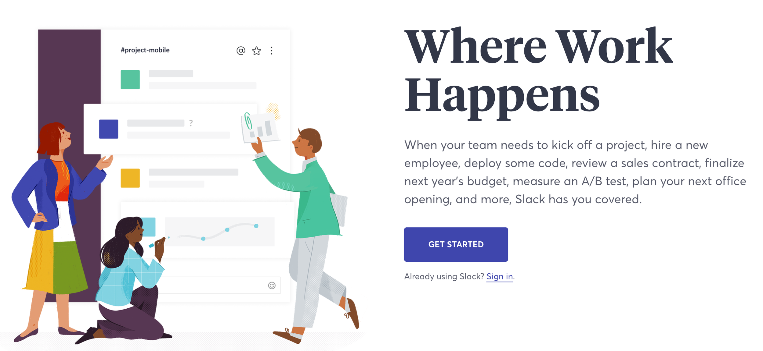
Slack is the current king-of-the-hill for shaking up the status quo. Sure, we had email, file sharing, and messaging apps before Slack, but we didn’t have single, elegant tool for team collaboration.

What’s cool about it?
Slack made integrations easy from the start. We use everything from ChatOps with our development team to HeyTaco for everyday appreciation of our colleagues. Slack's approach to 'channels' found the right balance for open communication by topic.

Flourish

flourish.png

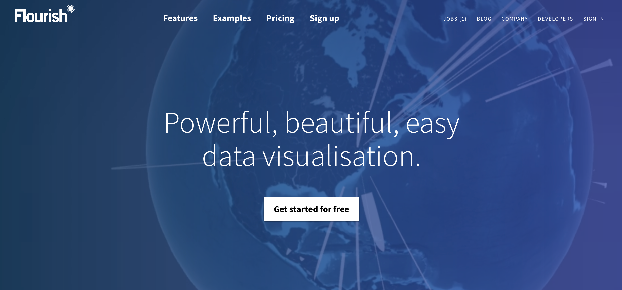
I only recently stumbled across the excellent visualizations available through Flourish. There are many, many tools for putting data visualizations on a screen; few vendors are so obviously passionate about their craft. 

What’s cool about it?
Flourish is more than another charting library — they are making world-class visualizations accessible. I was particularly impressed by the clever use of animation in those visualizations. At Juice, we appreciate that new users won’t always be able to read a visualization without some guidance. Animation can help draw a user’s attention to the most important information right off the bat.

Kialo

kialo.png

Kialo is “a debate platform powered by reason.” It cuts through the noise of social and online media by removing the worst parts of debating online (trolls, fake statistics, unrelated cat gifs) while strengthening the best.

What’s cool about it?
Kialo creates a structured dialogue with visualization, voting, and commenting. Whether discussing politics or the merits of a new project, Kialo has focused on an overlooked need: a place other than the comments section to examine arguments and consider new viewpoints. 

Typeform

typeform.png

Typeform is "the versatile data collection tool for professionals." It's a thoroughly modern survey-building solution that I’ve enjoyed using for over a year.

What’s cool about it?
Typeform's survey-authoring interface is remarkably intuitive. Adding questions, structuring logical flows, and navigating your survey is silky smooth. Similarly, the end-user experience is beautifully designed with selectors and animations that make it (almost) fun to fill out a survey.

Beautiful AI

beautifulai.png

From the founder of SlideRocket, Beautiful AI is a next-generation solution for creating web-based presentations. They say all you have to do is "think of an idea, choose a template, and get to work."

What’s cool about it?
Beautiful AI has taken a giant leap past a tool like Google Slides. It comes with a collection of smart slide layout templates. Better yet, these slide layouts automatically update as you add more content. The tool also comes with an easy-to-use integration with third-party image libraries so you can incorporate pictures into your presentation.

Toucan Toco

toucantoco.png

A data storytelling solution to build data apps for your business. We may be a bit biased, but that sounds awesome.

What’s cool about it?
While I don’t have hands-on experience with this solution, I love their message. Like Juice, they see the need to:

  • Communicate data to non-analysts with guided narratives ("Address the remaining 99% of your employees”)

  • Create targeted applications that solve specific business problems (“A business need = an app”)

  • Include simple, clear data visualizations ("The comfort of using consumer apps, finally in a business setting”)

Honorable mentions

  • Quid: Quid puts the world’s information at your fingertips, drawing connections between big ideas.

  • Skuid: Accelerate deployment of personalized applications that let your business people drive innovation, without the wait.

  • Trifacta: Trifacta enables anyone to more efficiently explore and prepare the diverse data.

  • Datawrapper: Datawrapper makes it easy to create beautiful charts.

Thinking about changing the way you work? Check out our app trial process. Download the info sheet below to learn more.

You Don't Need a Slide Factory

You might be surprised to learn that one of our most popular blog posts of all time is Automated PowerPoint Generation, or Making a “Slide Factory.” Even though this post was published almost nine years ago, month after month we continue to see it rise to the top of our most visited pages. 

Whenever someone reaches out to us asking if we have a ‘Slide Factory’ solution, we tell them two things:

  1. Sorry, we do not.

  2. You don’t actually need a slide factory.

In fact, the need for automated presentation delivery is the genesis of our data storytelling solution, Juicebox. We are intimately familiar with the need to deliver data to customers, co-workers, stakeholders, etc., in a consistent, structured manner that communicates a message while providing each person with the data that is most relevant to him or her. Instead of attaching a 50-slide PowerPoint deck, Juicebox does that same job with an interactive reporting application. Users benefit from a guided analytical story, ability to capture insights, and features to collaborate with others.

Not only do your users benefit, but you no longer have to deal with report production and ad hoc headaches! Juicebox was designed with the data consumer in mind, meaning that the need to spoon feed your audience data and information through long-drawn-out PowerPoint slide decks is no more. 

Screen Shot 2018-01-03 at 5.50.06 PM.png

In recent months, we have made it more affordable and simpler than ever to get started with Juicebox. Through our Guided Design Process, customers are seeing what their data looks like in a Juicebox application within days not months. We give you four weeks and ten user accounts to test Juicebox with your data, you have plenty of time to get user feedback and build a business case for using Juicebox. Pricing starts at only $6 per user (with a 50 user minimum). With tiered discounts for more than 500 users, Juicebox is a competitive option for any budget!

If you would like to test drive your data in Juicebox, fill out our Get Started form and we will be in touch ASAP.

Check out some of our Juicebox apps in action:

The Rise of Analytical Apps — Are We Seeing the Last Days of Dashboards and Reports?

dinosaur_comic.png

66,038,000 years ago, a massive asteroid smashed into the earth in what is now Mexico's Yucatan Peninsula. After this massive collision, it took only 33,000 years before the dinosaurs were entirely extinct — a blink of an eye in terms of the history of the earth.

This asteroid is considered to be the "final blow" after a series of ecosystem changes (other asteroids, volcanos, etc.) created a fragile environment for the poor dinosaurs. The climate changed, the dinosaurs died out, and the mammals took over.

Incumbent solutions for delivering data —dashboard and reporting tools— are facing their own "fragile environment." The big asteroid may not have hit yet, but it is only a matter of time. Here's why.

Exhibit A:

A thoughtful answer from an experienced Tableau user to the question “Why do people still use Tableau?”

We need to consider why (and when) people might stop using Tableau. My opinion is that Tableau has failed to realise two important things about their software and that if another company can solve this problem then Tableau could really lose out:

1. Companies need to create applications, not just reports

Yes, Tableau is interactive but you cannot use Tableau to make applications that write back to a database. It has maps, yes.. But you cannot use Tableau as the basis for an app like you might with MapBox (which has multiple SDKs for different platforms) or Leaflet.js for instance. Tableau is not designed for this, so if you need apps and not reports then it is not for you. You need a developer (or dev team) instead. This is a big gap in the product that other companies are also failing to see.

2. Tableau’s software does not directly generate revenue for (the majority) of their users

For a company to run several copies of Tableau desktop costs several thousand pounds. This is without the additional costs of Tableau Server or end-user licenses that you will need if you want your customers to use your hosted visualisations and dashboards. Any business that chooses to use Tableau to deliver interactive reports to its customers would need to consider passing some of that cost (or all of it) onto its end users. But when we’re talking about interactive reports, not applications, it is hard to justify data reporting as a stand-alone or additional cost.

That’s a real user wondering whether the paradigm of visual analytics tools for analysts, dashboards for executives, and reports delivered to customers and stakeholders is going to hold up for much longer.

Exhibit B:

Analytics vendors and market analysts are using language that leans more toward delivering "apps." 

Alteryx

Alteryx

PwC analytical app marketplace

PwC analytical app marketplace

Infor

Infor

Gartner's IT Glossary

Gartner's IT Glossary

IBM Cognos

IBM Cognos

Is “app” more than a rebranding of a decade of data visualization tools? We think so. Here’s why we see analytical apps are on the way to taking over the BI world:

1. Apps have a purpose. A report or dashboard may carry a title, but it is less common that they have a clear and specific purpose. A well-conceived analytical app knows the problem it is trying to solve and what data is necessary to solve it. In this way they are similar to the apps on your phone — they solve a problem the same way a mapping app shows you how to get to the Chuck E. Cheese and a weather app lets you know if you need to bring an umbrella.

2. Apps make data exploration easy. I’ve spent a decade railing against poorly designed dashboards that put the burden on users to find where to start, how to traverse the data, and what actions to take. Good analytics apps willingly carry that burden. Whether we call it “data storytelling,” narrative flow, or quality user experience design, the app should deliver a useful path through the data to make smart decisions.

3. Apps are collaborative. Most business decisions are made as a group. If that weren’t the case, you’d have a lot fewer meetings on your calendar. Why should data-driven decisions be any different? Historically, reports and dashboards treat data delivery as a broadcast medium — a one-way flow of information to a broad audience. But that’s just the start: the recipients need to explore, understand, and find and share insights. They should bring their own context to a discussion, then decisions should be made. Our belief is that data analysis should be more social than solitary. It is at the heart of the “discussions" feature built into our data storytelling platform, Juicebox.

4. Apps lead to action. "What would you do if you knew that information?” That’s the question we ask again and again in working with companies that want to make data useful. Understanding the connection between data and action creates a higher expectation of your data. Analytical apps connect the dots from data to exploration to insight to action.

5. Apps are personalized and role-specific. The attitude of "one size fits all" is typically applied when creating a dashboard or report, and then it is up to individuals to find their own meaning. Analytical apps strive to deliver the right information for each person. How? By utilizing permissions for a user to only see certain data, automatically saving views of the data, and presenting content relevant to the user’s role.

The mammals took over because conditions changed, and the outdated species — with its size and sharp teeth — couldn’t adapt. Expectations are changing the analytics world. Consumers of data want an experience like they enjoy on their mobile devices. They don’t have the attention to pour over a bulky, unfocused spreadsheet, and they expect the ability collaborate with their remote peers. The climate has changed, and so too must our approach to delivering data.

If you’re still churning out reports, we can help you do better. Or if you’ve constructed a one-page dashboard, we can show you a different approach. Drop us a line at info@juiceanalytics.com or send us a message using the form below.

What's in a Juicebox: Discussions

What good is information if it cannot be shared and discussed? One of the founding pillars of Juicebox is communication; we aim to allow users, regardless of their familiarity with data analysis, the ability to easily identify and discuss important data points.

In taking on this challenge of what we call "The Last Mile of Business Intelligence", the question we must constantly ask ourselves is, "How do we make starting a conversation around data as easy as sending a text message?"

In order to solve for this, we have taken the knowledge gained from our 11+ years of designing and creating custom data applications and created an interactive data storytelling platform that helps everyday information workers make smarter decisions. Our goal for Juicebox is to reinvent the way people discuss and communicate data in the workplace and to their customers.

Our Discussions feature within Juicebox does just that by enabling those conversations around data in a method that is intuitive, quick, and effortless, especially compared to traditional processes. In the past when an insight was discovered within a spreadsheet, an analyst would have to send a report to a decision maker and ask him or her to review the finding. Not only was this process clumsy and time-consuming, the analyst and the decision maker were often on different planes in terms of data skill level. With Discussions, those conversing over the data can take a snapshot of the visual, mark it up, and download it in order to ensure the most relevant and important information is being shared. 

If you're interested in having conversations around your data, we would love to talk with you. Send us a message at info@juiceanalytics.com or click below to tell us more about what you're looking for. 

New Ebook: 5 Strategies for Getting Started with Workforce Analytics

Picture this: you're an HR executive in a top healthcare organization. You love your job, and you're committed to providing the absolute best patient care possible. But with increased demands and a tightening resource base, doing so is becoming more and more challenging. How are you supposed to provide more when you're being given less?

Thankfully, there's a solution. Workforce analytics can provide invaluable insight into healthcare organizations that can have a direct impact on patient care and satisfaction. However, getting started with workforce analytics can be a confusing process. That's where we come in.

For years we've been working with healthcare organizations to address these very issues using workforce analytics. We've got some of the best minds in the industry tackling the same problems you face, and now they're sharing what they've learned about workforce analytics in our newest ebook. It will walk you through what workforce analytics are and the steps you can take to implement workforce analytics in your organization right away.

5 WA 3D.jpg

So if you're feeling ready to get started with workforce analytics, download the ebook for free now! 

Turning Healthcare Workforce Data from a Challenge into an Asset

“Since people are a huge investment, the hospital needs to make sure that it’s hiring and retaining the best people. Once hired, though, how does a HR leader keep an enterprise view of the workforce, and how do they identify problem areas quickly?”

It’s a tricky question, and it’s the one we set out to solve when we created our latest product, Blueprint.

If you’ve been paying close attention to the Juice blog, you might have noticed we’ve been talking about Blueprint quite a bit lately (see here, here, and here). Each one of these posts has featured a different aspect of Blueprint, depicting a small sample of its various features and demonstrating its ultimate purpose: to provide HR leaders with an easily accessible enterprise view of their workforce in order make better data-driven decisions.

Michael Dean, Juice’s Director of Business Development, sat down recently with HealthStream to further discuss Blueprint’s features, provide more information about who might most benefit from it, and share some examples of Blueprint in action. Download the latest issue of PX Advisor, HealthStream’s online magazine dedicated to improving the patient experience, to learn more about how Blueprint might be the perfect fit for your organization.

Done with reading and want to get an up-close look at Blueprint for yourself? We’d love to show it to you! Send a message to info@juiceanalytics.com or set up a demo below.

Image Source: http://www.healthstream.com/resources/px-advisor/pxadvisor/2017/02/10/winter-2017

Taking Your Organization’s Pulse with Workforce Analytics

What is the first thing that comes to mind when you hear the word “healthcare”? Is it an image of an industry dedicated to patient health? Or do visions of budget cuts and federal mandates dance in your head? My bet is on the latter.

Whether you’re a healthcare employee or not (and whether you like it or not), you’re still a part of the healthcare industry. And we can all probably attest to associating “healthcare” with an industry encumbered by increased demands and limited resources, instead of one that is focused on the health and wellness of patients.

Whatever your political and personal stance, I think we can all agree that patient care should be at the forefront of the industry’s focus. But with increased demands and a tightening resource base, how can this be accomplished?

It’s a basic economics principle – the only way to do more with less is to change the way things are being done. This means challenging the traditional approach. One CIO article went as far as to compare healthcare to Blockbuster, suggesting that the industry is in need of a “Netflix-type” level of disruption. Unfortunately, trying to compare the model intricacies of healthcare delivery with video rentals is like comparing the complexities of the human body with that of a VHS tape (one is a little more complicated).

However, I think we knew where the article was going with this analogy, and that the takeaway is the need for a new approach. But with a multitude of different interventions and efforts currently intertwined and underway, the question is, “Where does one start?” For an industry in need of determining which piece of the puzzle to focus on, it would make sense to consider where the largest investment lies. For healthcare? That’s staffing.

Hospitals invest millions annually in financial and clinical IT systems, but tend to spend much less on "the people side of the business.” Staffing expenses currently make up over 54.2% of a hospital’s overhead costs, and staff-related expenses can cost upwards of 70% of an organization's total costs – easily the largest expense line item on the books. Furthermore, healthcare employment is projected to grow 29% by the year 2022 according to the Bureau of Labor Statistics. That’s twice as fast as the expected overall employment growth!

Perhaps the most important reason to focus on staffing practices is that they have been shown to have a direct impact on patient satisfaction and outcomes, with considerable amounts of research linking staffing variables to patient outcomes. In other words, happy workers equal happy patients equal happy profits.

Fortunately, what we’ve learned through the development of our analytics platform, Blueprint, is that it does not take a whole lot of complex workforce data to begin measuring staffing areas that are directly tied to quality of care and cost management. Below is an example of some of the strategic areas on which Blueprint focuses. Give these data-driven efforts the attention and resources they deserve, and you’ll be moving towards better clinical and financial outcomes.

  • Turnover Calculations - Replacing a valued healthcare employee can cost up to 250% of the employee’s salary. According to an NSI study, 83.9% of healthcare respondents don’t record the costs of employee loss. With the report finding that the vacancy rate for nurses is expected to grow, hospitals need to do all they can to keep retention high to avoid a lapse in patient care quality and a need to increase clinical workloads even more.
     
  • Retention and New Hires - Mentioned above, retention can provide the continuity of care that plays a large role in clinical care and patient satisfaction. Furthermore, employees with less than one year of tenure make up nearly 25% of all healthcare turnover nationally(!) 

    Try tracking turnover in groups by tenure such as 0-3 months, 3-6 months, 6-12 months, >1 year, etc. Reporting the data in cohorts will make it easier to pinpoint where in the lifecycle the attrition is occurring.
     
  • Managerial Span of Control - According to studies, smaller spans of control are linked to higher rates of employee retention – and the alternative being true with wider spans of control.

    Use supervisor/employee data to compare the number of direct reports by hierarchy level. Spans of control should be similar for supervisors in the same hierarchical level, with the exception of differences in direct report skill level, experience, and tasks performed.
     
  • Staffing Ratios - Staffing ratios define the relationship between your revenue-producing employees and the staff needed to support them. According to the Agency for Health Research and Quality (AHRQ), the risk of nurse burnout increases by 23% and dissatisfaction by 15% for each additional patient. However, when hospitals have accurate staffing, nurse burnout and dissatisfaction can drop significantly. Studies suggest that the higher the ratio of support staff per FTE physician, the greater the percentage of medical revenue after operating cost. Health systems with higher nurse employment had a 25% lower chance of receiving penalizations for readmissions through HRRP than those that had lower nurse staffing levels.
     
  • Leverage Your Internal Resource Pool - With an enterprise view of your staffing needs, it’s easier to make strategic staffing decisions for the entire organization, enabling you to find that sweet spot between optimal care delivery and labor cost management.

    Begin by analyzing data that represents staffing by facility, specialty, and department, while considering patient needs and the corresponding staffing data across the organization. Monitor staffing distribution and find opportunities for reallocation (as opposed to hiring/terming) with staffing surpluses and shortages.
     
  • Strategic Staff Allocations - Employ known enterprise concepts, such as economies of scale by identifying opportunities where you have a concentration of facilities in a given geographic area. Also, back-office, phone clinical roles and administrative functions, such as billing and purchasing, can be streamlined with centralization efforts that leverage economies of scale.

    When faced with healthcare’s “do more with less” dilemma, it is an opportune time to rethink how we approach labor cost containment and quality of care improvement strategies.

In the midst of healthcare reform and quality care initiatives, healthcare systems have an opportunity to place patient care back in the forefront of the healthcare delivery model. By recognizing that the missing link between quality of care and cost containment is the healthcare workforce, they will be doing just this. After all, people are at the heartbeat of healthcare -- patients and staff.

Let us help you keep your finger on the pulse of your organization and visualize your data in way like never before. Interested in learning more about a one-stop-shop for workforce analytics? Send us a message to get a preview of Blueprint.


A New Juice Tool for You: Buyer's Guide to Analytics Solutions

At Juice, we like to create useful tools for our readers. Here favorites seem to come out every two to three years:

The data and analytics space is a confusing place, densely populated with dozens and dozens of vendors, each one claiming they alone can solve your problems. But who’s really offering the right tool for your situation?

Big Data Landscape, Matt Turck 2016

Big Data Landscape, Matt Turck 2016

Our Buyer’s Guide is designed for technology decision-makers who are trying to make the most of their data. Whether you are looking to analyze large data sets, map location data, or build visualization tools for your customers, we’ve done the dirty work of scanning the landscape and categorizing what we found. We’ve categorized the more than 100 analytics solutions into 19 categories of tools.

We start The Buyer's Guide with a question about your end-user.

We start The Buyer's Guide with a question about your end-user.

The Guide is a decision tree where you answer questions about your needs, and each answer leads you down a path toward the right type of analytics solution. Think of it as a "Choose your Own Adventure" book where your happy ending is the best tool for the job. For each category of analytics tool, we’ve tried to compile a comprehensive list of providers. 

After navigating the choices available to you, you will have the option to submit your results. If you’d rather keep your results private, no problem. For those who submit their results and email, we’ll send you our three most popular white papers and include you in our monthly newsletter. 

If you find that we’ve missed analytics vendors that you are familiar with, send us a note at info@juiceanalytics with the subject line "Buyer’s Guide". 

New Year's Data Resolutions

I am oftentimes on the front lines of receiving emails and calls from people interested in what Juice does, what we think, and what we have to offer. Most of the conversations I have are exploratory in nature where someone is reaching out to see if Juicebox would be a good fit for the project they are thinking about. From my experience in having conversations with companies that are working on a data project, I have noticed a few common themes.

  1. Companies are usually good at collecting data, and with modern technology it is relatively straightforward. Cloud storage is easy to obtain and becoming cheaper, but organizations struggle with the presentation of that data. (Hint: We can help with that!)
  2. Most companies have a way to access that data, but often they may not know where it is or what department or manager has access to it.
  3. There is usually one person who has the vision to bring all of it together in one place, but he or she doesn't have to support to bring the project to life.

Knowing that we can help, that person and I usually discuss what it would take to get the project off the ground. I usually hear "We have been talking about this for a long time, it is a headache, but no one will own it." I reply with, "What is stopping you from owning this and starting your data project?"

Since it is the season of New Year's resolutions, I will pose the same question to you. What is stopping you from starting your data project? Is it ownership, complexity, or maybe even leadership? Whatever it is, it is time to start. As organizations grow, complexity increases, making it more difficult. Now is the time!

There are hundreds of articles out there about data and the business value it can offer an organization. If your problem is leadership, I recommend putting together a business case as to why your organization needs to do this. The amount of time and labor to bring that data into an organized, aggregated fashion is often constrained by the amount of time available and the fact that no one has ownership. 

It usually isn't a matter of technological constraints because there is a myriad of technologies out there to gather, store, organize, disseminate, and present data. Usually it is a matter of becoming organized and the time commitment necessary to complete the project. Often there is one person who has all the relevant knowledge about where the data is and what format it is in. I recommend buying that person lunch and picking their brain about the problem. Chances are they already have some ideas about how it can be solved.

So go ahead, impress your boss, start that data project you've been putting off for months!

Have questions about starting your data project? Don't hesitate to reach out! Get in touch with us either via email at info@juiceanalytics.com or send us a message.

Battery Meters and the Goldilocks Problem

"Actionable data." It is a phrase well on its way to becoming a cliché. But clichés are often founded in truth, and it's true that the essential quest in analytics is finding data that will guide people to useful actions.

Apple’s battery meter offers a lesson in the challenges in delivering such actionable data.

The battery meter on Apple's new Macbook Pro included an indicator of the estimated battery life remaining. If you’re sitting on an airplane hoping to watch a movie or finish your blog post, time remaining is a critical measure and a source of stress. But Apple faced a problem with presenting the time remaining value. According to The Verge, “it fluctuated wildly on Apple’s newest laptops...the ability of modern processors to ramp power up and down in response to different tasks made it harder to generate specific, steady estimates.”

Marco Arment put it in simpler terms: "Apple said the percentage is accurate, but because of the dynamic ways we use the computer, the time remaining indicator couldn’t accurately keep up with what users were doing. Everything we do on the MacBook affects battery life in different ways and not having an accurate indicator is confusing.” 

It's an issue of excess precision. Users want to know a precise time-remaining answer, but the fundamental nature of the machine results in a great deal of variance. I first heard about this problem from the excellent Accidental Tech Podcast. During the discussion, John Siracusa suggests an alternative to the problem: a burn-down chart like the kind used in agile software development. Android phones offer something that looks a lot like what he describes.

Siracusa admits that a more detailed visualization of this nature probably isn’t for everyone. It may work for him (and I like it a lot), but not everyone spends their days visualizing data.

It's a classic Goldilocks problem. Too little detail (and too much precision) can be deceptive and difficult for users to understand when the number jumps around. The lonely key metric without context can be inscrutable.

Too much detail, such as in the form of a full-fledged chart, may be more information than the average user wants to know. The predominant feature of the chart, the slope of the trend, isn’t fundamentally what the casual user cares about. They want to know if the battery is going to still have life when they are getting to the exciting final scene in their movie. Data visualizations should not be engineers serving engineers (as I noted when Logi Analytics asked that Fitbit embed a self-service business intelligence dashboard in their apps).

There is a third option available -- a "porridge that's just right." The alternative is to jump straight to solving the user’s problem while still using data. The data or metric itself isn’t the point; the user’s goal is the point. A better solution for Apple might look like this:

When it comes down to it, the problems Apple faces with its battery life estimates aren't so different from the problems we all face in delivering actionable data. The solution can be boiled down to a simple formula: Use the data to solve the problem. Keep the user informed. Give them a smart choice. 

And always have your charger handy, just in case.

Thirsty for more? Check out these related blog posts: