Data-Driven Decisions

What Can WordleBot Teach Us About Actionable Data Insights?

I’m a Wordle obsessive. Which is to say, every morning I find myself staring deep into my coffee in search of an elusive 5-letter word.

The New York Times (who bought the word game from software developer Josh Wardle for $3 million) knows their audience. We may be playing with words, but the analytical nature of this game is the appeal. It is a game of odds and mathematical deduction as we try to reduce the potential options available.

To appease us (and sink the hook a bit deeper), the NYT recently released WordleBot. Here’s how it describes itself:

I am WordleBot. I exist to analyze Wordles. Specifically, your Wordles.

In the next slides, I’ll examine your puzzle and tell you what, if anything, I would have done differently. Words I especially recommend are marked with my seal of approval. And, if you’re curious, I’ll show you the math behind my recommendations.

Below is an example of what WordleBot shows about a game (I chose a particularly lucky game for me).

WordleBot delivers data insights in a particularly clever way. Rather than guiding you to an answer (I built a data app for that — and it immediately sucked the fun out), it takes a different tact. It guides by teaching. Let’s see how:

There is so much good data communication here:

  1. WordleBot teaches me how to think about my Wordle performance by defining different measures that impact success. Getting to the answer is a combination of Skill and Luck with the goal of reducing the number of potential Solutions Remaining.

  2. In straightforward language, it describes my performance on the first guess.

  3. Rather than telling me what I should have done, it provides alternative options and explains how the outcome could have been different. I can play out different scenarios.

After stepping through the series of guesses, WordleBot summarizes my choices compared to the optimal, data-driven choices.

This is a non-traditional way of sharing data insights — and something worth learning from. If you approached delivering data insights like WordleBot, you would focus less on telling people what they should do or, worse, what they should have done. Instead, you would ask yourself, how can I teach by showing different decisions and explain the resulting outcomes?

In other words, show how to think, not just what to think. In this way, the role of data in informing decisions will become evident through the evidence.


Brace your audience for impact. Get started with Juicebox


15 Lessons from the Data Story Creative Process

What do you get when you put a Data Scientist and a Data Storyteller in a room full of executives for two days?

Sorry, no punchline…this is serious. The answer is The Data Story Creative Process (DSCP) workshop — a hands-on, case study-based learning event that teaches a framework for using data to drive informed action.

We played with data, explored insights, structured stories, and discussed the barriers to reaching our audience. Here is a tasting menu of the lessons we shared:

A repeatable process

Every data project is unique. Yet our methodology applies common steps and best practices to bring discipline and focus. The DSCP is a more thoughtful approach to solving tough problems with data.

Hands-on learning with real data.

We learned a lot from our workshop. Lesson 1A: People like to get their hands into data in a realistic scenario to apply the concepts and skills we are teaching.

Find your data story

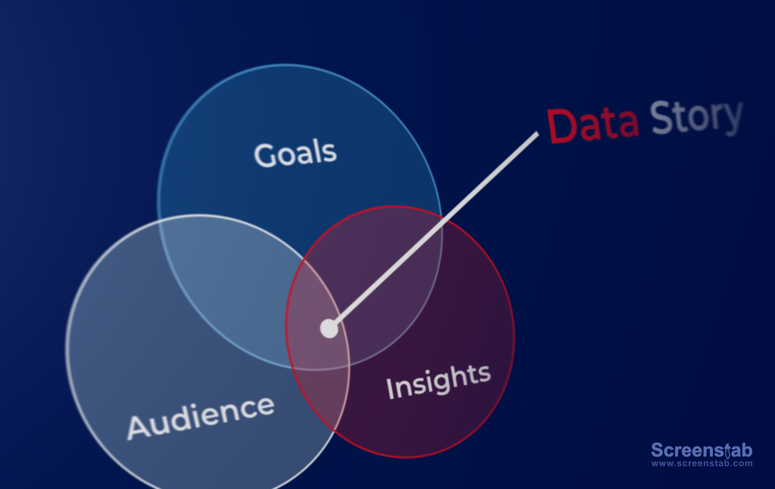
Your data story exists at the intersection of your goals, your audience’s priorities and levers, and the impactful data insights you are able to find.

This is one of many places where we emphasize the need for focus.

Visualize for readability and shared meaning

When it comes to visualizing your data, you have two primary objectives:

Readability: How do you minimize your audience's effort to understand the visualization?

Shared Meaning: Does the visualization support and emphasize your insight?

Guide your audience to actions

Actionable insights should be the goal of your story, even if that action is a need to gather more data. We discussed the characteristics of a data-driven action and the frustrations of presenting insights that can’t be acted upon.

The goals is to change the mind of your audience

Working with data is a matter of mindset as much as skillset. Most importantly, you want to understand the needs of your audience so you can tell a story that changes their perspective.

Where are you in the movie?

Charlie shared a fantastic analogy for considering how to analyze data. You want to think of the data as if you are at a particular scene in a movie. You can look back to understand what got you to that particular point. Then you can use models to predict where the story is going to end up.

Data is a team sport

Our workshop discussion underscored our belief that data is a team sport. You need different players — the analyst, the subject matter expert, the decision-maker — to work together from the beginning to chart out a successful path.

Preparing your data

Preparing your data is the hard work that needs to be done before the fun begins.

For our executive audience, we wanted them to appreciate the potential complexity and effort that data preparation can require.

Demystified data terminology

There are a lot of data buzzwords and abbreviations flying around: AI, ML, lakehouse, data engineering, storytelling. We took some hot-air out of these terms and discussed what they really mean.

Different sources of insights

Finding data insights is part of the “Play” stage in our process. And there are many tools and techniques to reveal those insight. We want to combine both data-led insights (e.g. modeling) with exploration that is guided by human understanding of the problem.

Kill your darling data insights

Analytical play-time is great, but at some point you need to evaluate and extract the most valuable and actionable nuggets. We provided an approach for sifting through insights to find those that are “story-worthy.”

Structure a data story

Data storytelling uses the patterns and expectations of traditional narratives to grab and keep the attention of your audience. We can use the classic three-act play structure to set-up and deliver on inherent story expectations.

The (Short) Attention Economy

With our full inbox and onslaught of text messages, it is hard to grab and keep the attention of your audience. We shared techniques that can help your data story stick: be unexpected, connect to emotions, be specific, and be relatable.

Advocate for your data products

Our workshop was about defining a problem to be solved with data and creating the data story that will lead to action. We closed with a final message: you need to step up to advocate for your results. Think of your dashboard, report, or analysis as a product, one that needs to be marketed and sold for people to get the value.


A Hierarchy of Needs to Live Your Best #DataLife

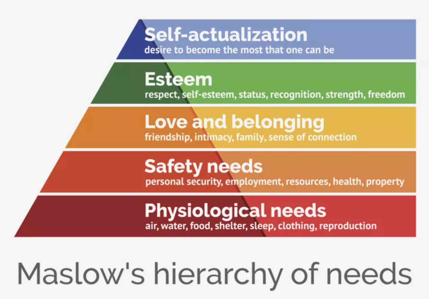
Maslow’s Hierarchy of Human Needs provides a useful framework for understanding the drivers of behaviors. He recognized that basic needs must be met before higher level functions can happen. He also identified that once a need is met, it becomes an expectation.

Plateresca / Getty Images

Can we apply a similar framework to our life with data?

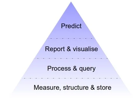
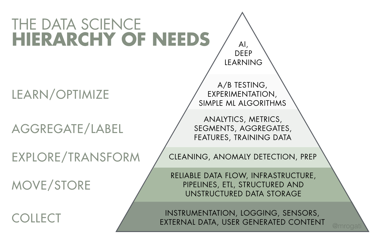
I’m far from the first person to ask this question. However, the data-oriented “Hierarchies of Need” tend to focus on the needs and capabilities of the organization. Here are a couple of examples:

https://medium.com/@hugh_data_science/the-pyramid-of-data-needs-and-why-it-matters-for-your-career-b0f695c13f11

As is so common in the analytics space, the focus is on technology and capabilities. If you are the CDO or CTO, this may provide a useful roadmap. It is less so if you are a data analyst, operations manager, or student learning how to work with data.

We’ve always been more interested in the human side of data. What do people need? What are the pains and concerns when it comes to using data? That’s why we are hell-bent on making the most human-friendly creative tool for expressing with data.

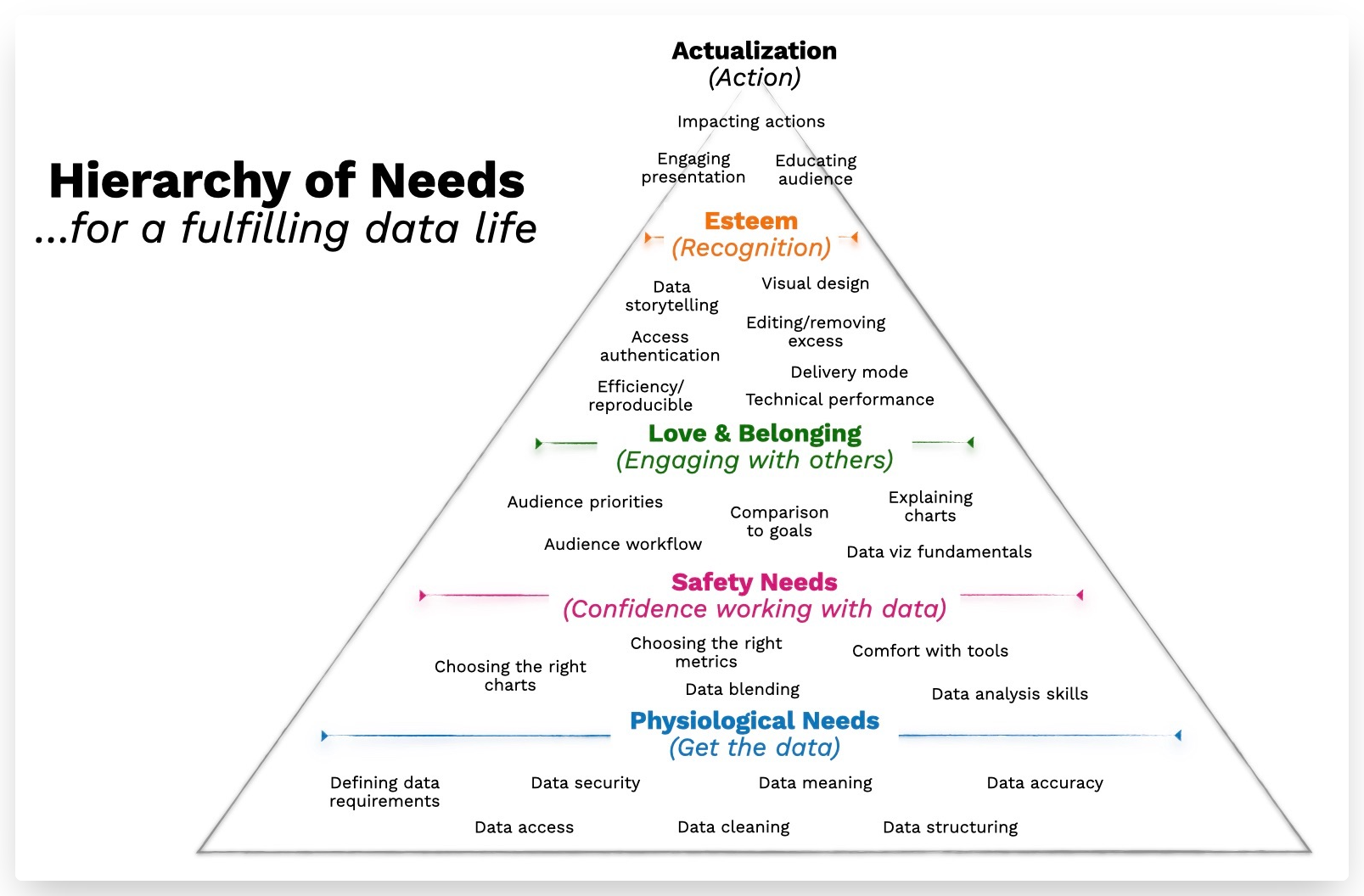
This is where my “DataLife Hierarchy of Needs” fits in — it highlights the ascending needs for an individual to make use of data. We’ve talked to hundreds of people who are using data in their jobs. Similar themes come up again and again, and this structure helps explain where people get stuck.

A quick tour of the levels:

Level 1: Physiological needs, i.e. get the data

Nothing happens if you can’t get your hands on the data. And once you have the data, you need to make sure it is accurate, understood, cleaned, and structured for analysis. Like the basic needs for food and shelter, this is the place where the under-served and under-resourced people run into a barrier. The challenge of not knowing how to define data requirements is sometimes enough halt any movement up the pyramid of needs.


Level 2: Safety needs, i.e. the confidence to work with data

Long before anyone can express themselves with data, they need to develop foundational data analysis skills. These skills include: combining data sources, being able to define important metrics, and choosing the right charts to explore and express data.

Without this sense of confidence, they won’t feel safe moving forward into finding and sharing insights in a social environment.


Level 3: Love and belonging needs, i.e. engaging with the broader organization

The work of data exists in a social environment. The next step up the pyramid is when we understand how our use of data starts to impact the people around us. This is where we expand outside ourselves to start to consider the audience, the priorities of the organization, and how to best visualize data for understanding.

Social and communication skills become increasingly important as we move to higher level needs. It was 15 years ago (!) that I wrote that the problem of analytics “isn’t a technical problem, it’s a social problem.”


Level 4: Esteem, i.e. pursuing recognition for the data insights

At last, it is time to become a data author, a creator of data products. With the skills and data access, you can look for ways to express your insights through data stories, design repeatable reports, and manage who gets access to the data and how they receive it. The social capabilities from the previous level gives you direction to know what you should create from data.


Level 5: Actualization, i.e. achieving action from the data

Ultimately, the goal of using data is to guide informed actions. If your insights are effectively communicated, you have the opportunity to change minds. But you will face resistance from people who have pre-existing assumptions or incentives to push back on the results you share. Perhaps this last level is the hardest of all because it takes subtly and skill to influence others to change how they view their world.

Download a PDF version of the Data Life Hierarchy of Needs.

The 7 Stages of Data Projects

Why do data projects take so long? It’s exhausting — finding data, cleaning data, identifying problems in the data, creating presentations, hitting resistance...on and on.

I’ve seen the struggle up close for over 15 years. It is my belief that the challenges of analytics have less to do with technology limitations and more to do with people challenges. The barriers often relate to Psychology, Sociology, Anthropology, and Mindsets.

We will often have clients who are energized to get started, but then disappear for months as they struggle with their data problems. I see people bounce back and forth from optimism to pessimism.

With that in mind, I wanted to offer a framework for thinking about the journey that both people and organizations go through as they tackle data projects. The framework describes the sequence of behaviors and emotions that people express. Getting stuck in these stages helps to explain why data projects can take so long:

  1. Skepticism. Like anything that is new, people will start by questioning whether it is worth their time and effort.

  2. Irrational Exuberance. The pendulum swings and people get (over-)excited, about what they can do with data. Reality may not match their growing expectations.

  3. Confusion. Then back to Earth. When it comes time to embark on an actual data project, the uncertain grows. Where do you even start?

  4. Discovery of Purpose. Getting to this step requires finding a small piece of the data potential that can be bitten-off first.

  5. Doubt. Now that you’re committed to a direction, the reality of your data comes into play. Will you be able to find value and insights?

  6. Denial. Even after emerging from stage 5 with progress, now you face an audience that may not be ready to change. Their skepticism is now your blocker to progress.

  7. Acceptance. Finally, the data project comes to fruition, perhaps at a smaller scope than was originally imagined. Time to find the next opportunity.

I made this infographic as a visual display of this framework:

Download the infographic as a PDF.

Why Self-Service Analytics Adoption Is Persistently Low? Hint: ⏱

Low user adoption for data solutions is the problem that won’t go away. It is the…

…sticky-wicket of Cricket

…‘Transformers’ of Sci-Fi movies

…barnacle of boats

…‘Two and a Half Men’ of TV

The data and analytics industry has struggled for decades to get more people in organizations to use the data. Re-labeling it “data democratization” didn’t fix it. The advent of visual analytics didn’t do it. Low adoption is the “last mile” problem that we’ve been talking about for 15 years. The checklist looks like this:

✅Invest in data tooling

✅Gather and consolidate data

✅Build models

😩 Use data for everyday decision-making

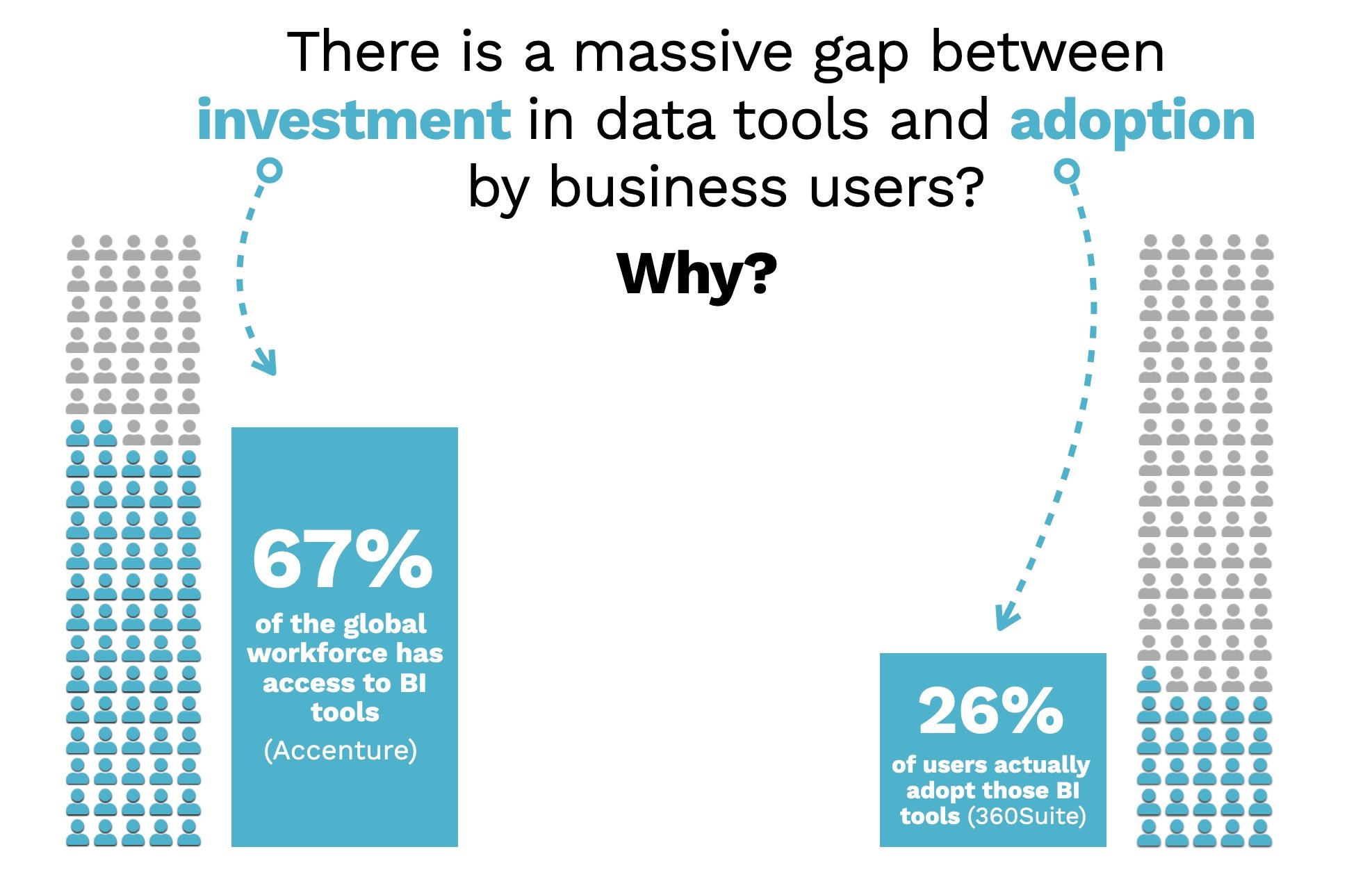
That’s why you see statistics like: 67% of workers have access to analytics tools. Only 26% of those people are using them.

In my experience, those 74% of non-adopters live in a world of limitations that is not fully appreciated. The non-adopters are not the data analysts who work with data as a core element of their role. They are the managers, consultants, marketers, salespeople, and front-line decision-makers. They already have a full-time job, and acting as a data analyst isn’t it. Working with data needs to fit into the cracks — not transform how they work. They have limited time and limited attention for data.

Meanwhile, the analytics vendors have been moving in a different direction. They are eager to add more features. And why not? Their users — the 26% of adopters — demand it. They want more integrations, more ML/AI, more ability to tweak and configure and manipulate across their tsunami of data.

Check out the update from Tableau. “It has a number of highlights that everyone is going to love.”

Everyone will love it if they are already on board. But this is what we hear when we talk to the 74% who haven’t adopted these increasingly complex analytical tools like this:

I don’t have time to learn a new tool

“This looks easy to use. Can you just do it for me?”

“I’d rather stick to things that I’m comfortable with, like Excel and PowerPoint”

I don’t have time to put together a great presentation

“I spend all my time gathering, cleaning data. Then I have to do the analysis.” 

“I don’t love my slides, but it take too much work and time to do a better job.”

I can’t get my audience to give the data much attention

“They don’t want to sit through a long presentation.”

“They don’t want to open my spreadsheet.”

Logi Analytics conducted a survey that hints at the gaps between the available tools and these time and attention limitations:

Are better tools the answer?

My friend Mike Kelly, CEO and founder of TeamOnUp, gives me a hard time because I like to say that the challenges of data are more about human issues than technology issues. Then he says: “If you believe that, why the heck are you selling a technology solution?”

Maaaaaybe he’s right. Maybe I’ve downplayed the importance of tools that recognize the real-world constraints of users.

We need ‘Analytics for the rest of us.’

And that’s what we set out to do with Juicebox. We wanted to make a data storytelling platform that my mom could use (she did for a non-profit), my 10-year-old could use (she did and blew her teacher’s mind), and a busy consultant could use to impress their clients.

If you are in that 74% who haven’t logged into that Cognos, Salesforce, or PowerBI account in a while, why not try something built for the busy non-analyst.

5 Phases of Data Analytics Maturation

Recently, while meeting with one of our clients, they mentioned their desire to provide their customer’s business team with the ability to run ad-hoc reports. This notion spurred me to think about whether or not I thought this was a plan for success. Would having this additional analytics ability help the non-analyst be more effective at getting their job done? Over the next few days, we’ll be exploring the different stages of maturity that information workers go through as they try to become more effective and efficient at consuming and acting on information. By our reckoning, we figure there are 5 Phases in the maturation cycle:

  1. Phase 1: Tribal Elders

  2. Phase 2: Static Reports

  3. Phase 3: Bigger Static Reports

  4. Phase 4: Ad-hoc reports

  5. Phase 5: Experienced Guide

As we go through the different stages, we’ll discuss the breadth (how wide is coverage of all available information), depth (how deep is the understanding about covered information), reach (how easy is the access to the covered information), the typical user of the analytics method, and the signs that the organization is outgrowing each phase in the model. So, without further ado, let’s get started.

Data Analytics Maturation Phase 1: Tribal Elders

Answers from the Experts

The earliest stage of analytics maturity is one in which the organization relies entirely on the expertise of one or two individuals who use their business savvy to provide analytics. These folks, we’ll call them Tribal Elders, have been around the company for a long time and have "seen it all." Just like those "elders" in the movies, they’re wizened leaders who can mash all the data in their heads and join it with their experiences to make good decisions. In effect, there is no formal analytics that is performed during this stage. However, every day, the expert is using their training in the school of hard knocks to observe, analyze, act and advise on what they know to be the best for the business.

On the other hand: No rest for the weary

An organization outgrows this phase when the business becomes complex either through growth or through changing environment (such as variance in market conditions, or the expert leaving the business). All of a sudden, the leaders find themselves in a situation where they can’t scale the decision-making quickly enough to continue to drive the business. The huge asset of the expert’s experience has turned into a liability that acts as an anchor on the organization’s maneuverability.

Data Analytics Maturation Phase 2: Static Reports

Answers to questions you know

An organization has reached the second phase when they have realized that they have outgrown their ability to rely wholly on what they can get out of the Tribal Elders to run the company. So they start to write down all the questions they normally ask. They use this list to start to build reports that that can provide answers to those questions that they know. Once completed, the organization now has the ability to enable a broad audience to answer the questions that have been asked on a regular basis.

On the other hand: Surprise!

The limitation of this approach is that the Tribal Elders are still needed to answer the questions that fall outside of the standard "what I know to ask" category. The beginning of the end of this phase happens when an event that was unforeseen occurs that dramatically and negatively impacts performance. The logical question arises "why didn’t we see this coming?" followed by the answer "we didn’t have that data." The organization then begins the transition to Phase 3.

Data Analytics Maturation Phase 3: Bigger Static Reports

Answers to questions you don’t know

Once the organization realizes that they need answers to questions that they don’t yet know, they start to extract all sorts of permutations on all of the data that they have and distribute those reports to the "need to knows" on a regularly scheduled basis. In most cases, an analytics team is set up to manage the requests from the business for more or different information. Sometimes the reports are modified, but many times new reports are created because the users already know how to use the old reports. The analytics team works hard to maintain the information flow to the individual requests with the intent to provide all the information that would ever be needed by the consumers.

On the other hand: Page 73, Row 14, Column G

The downside is that this typically manifests itself in the form of the dreaded 124-page monthly report. So, the reporting "Oracle of Delphi" shows up in the inbox. For a little while, there’s some excitement along the lines of "I never knew we could get all this information." However, soon folks realize that interpreting the data for "questions you don’t know" turns out to be pretty difficult and once they figure out where are the answers to the questions they know, they just look at those few rows of the report and leave the rest for analysis "later" (which probably means it ends up in the recycle bin...if we’re lucky).

Data Analytics Maturation Phase 4: Ad-hoc reports

Answer your own questions

Phase 4 begins when a few folks who get the 124-page data dump realize "if I could just filter the data down a little I could much better understand the answers to this specific question". The organization provides the ability for end-users to create ad-hoc reports. Now the user has the ability to construct their own custom reports to answer the specific and unique questions they have about their data.

On the other hand: Water, water everywhere...

Sadly enough, however, most people who need to know the answers get stuck in any of a few traps down in the weeds. The first trap is that they may be sure they know what questions to ask, but even in spite of their confidence, they’re really asking the wrong ones. Secondly, most people in this situation are more business-oriented and less technical (presumably the more technical ones have already figured out how to query the data directly). In all but a few cases, the tool that is provided requires too much technical expertise for most business people to overcome in order to be really productive. Thirdly, even if they can actually get to the data that really does help them to be more productive, they lack the analytical expertise to interpret the data and turn it into usable information. The end result of these three hurdles is that the users end up either in analysis paralysis, or just plain giving up.

Data Analytics Maturation Phase 5: Experienced Guide

Answers to questions you should know

To solve the barriers presented by having a lot of data available only to technical users, maturing organizations provide solutions targeted at specific business areas that make exploration accessible to those who can impact business performance (in other words, everyone involved in the workflow). These solutions are not about the technology or even the data, but rather about providing information that translates easily into getting stuff done.

The results are provided in a fashion that makes access to the right information easy by guiding the user through a process to help them answer the known questions, discover new questions to ask and explore answers to these questions. It’s sort of like the guide you might hire on a photo safari. The experienced guide will make sure you find the animals that you came to see in the first place, but will also point out really interesting things along the way that you had never thought of. And you might even discover something amazing and exciting that you didn’t even know existed. Good information tools are just like an experienced safari guide.

On the other hand: Few and far between

The sad part about "experienced guide" information tools is that there are so few that exist. The good news is that we see more and more information workers and decision-makers "seeing the light" when it comes to understanding their need for these sorts of tools. And, we believe that as more and more organizations mature and experience the challenges of the first 4 Phases of Analytics Maturation that more and more will see the benefits of Phase 5, and implement solutions that help us all be more effective and efficient users of information.

The Last Last-Mile of Analytics

Discover & share this Field Of Dreams GIF with everyone you know. GIPHY is how you search, share, discover, and create GIFs.

I was wrong about the “last mile of analytics.”

Over a decade ago, this was a term we started using to express the challenges of the analytics (then: business intelligence) world. We highlight how many organization struggled to bridge the gap between their data investments and the minds and actions of decision-makers:

This critical bridge between data warehouses and communication of insights to decision-makers is often weak or missing. Your investments and meticulous efforts to create a central infrastructure can become worthless without effective delivery to end-users. “But how about my reporting interface?” you wonder. That’s a creaky and narrow bridge to rely on for the last mile of business intelligence.

When we talked about “the last mile” we emphasized the need to better visualize data and communicate insights.

But I missed something. You can make a data product that is intuitive, friendly, simple, useful…but it still needs to be sold.

Sold?! It is an ugly word for many data people. But if want people to use your data, you need to change behaviors and assumptions. You need to convince your audience that it is worth their attention.

For example, we’ve been working with a global manufacturer committed to becoming more data fluent and data-driven across their worldwide operations. They have invested in data warehouse efforts and designed thoughtful new dashboards. Fortunately, our client realized that “built it and they will come” is a fantasy. Instead, we’ve helped them with a comprehensive plan to ensure their data has impact:

  1. Train a cohort of evangelists in data storytelling to improve the quality of the data products;

  2. Develop an internal communications campaign to go alongside their data product rollouts, explaining the value and purpose of each solution;

  3. Create a support structure and tutorials to ensure that data product users fully understand each data product;

  4. Gather feedback and update their data products.

More than anything, the data leadership team recognizes that technology and design are not the complete answer. They also need to change the culture and attitude of the organization.

This is the Last Last-Mile of Analytics, the selling and changing of minds to ensure your data gets used.

Discover & share this Workaholics GIF with everyone you know. GIPHY is how you search, share, discover, and create GIFs.


Why Build a Data-Savvy Culture?

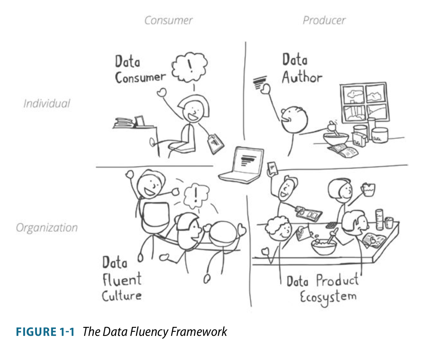
In our book Data Fluency, we describe the four pillars of a “data fluent” organization:

Data_Fluency_Framework.png
  1. Data Consumers — the people who use data products to make better decisions;

  2. Data Authors — the people who create data products to influence and inform decisions;

  3. Data Ecosystem — the set of tools, processes, and capabilities to create effective data products;

  4. Data Culture — the norms, expectations, and leadership that encourage a data-savvy organization.
Of these pillars, perhaps the most foundational and critical is the data culture. Research suggests that many organizations struggle to create this data culture and a healthy data culture is tied to overall performance.

What does the data say?

A recent article from the MIT Sloan Review (authored in part by Thomas ‘Competing on Analytics’ Davenport) summarizes survey results showing that many organizations lack an adequate data culture. Among the key data points:

  • Only 37% of those surveyed said they would describe their organizations as either “analytical companies” or “analytical competitors.” 

  • 67% percent of those surveyed (all senior managers or higher) said they are not comfortable accessing or using data from their tools and resources.

At Juice, we’ve been saying for over a decade that analytics is a social problem, not a technology problem. Another survey from NewVantage Partners underscores this point:

  • Only 7.5% of executives cite technology as the challenge to their data objectives;

  • 93% of respondents identify people and process issues as the obstacle.

But why is it so important to build a culture that supports and encourages data-informed decisions? The MIT Sloan research shows that companies with strong analytical cultures perform better:

  • Among the 37% of companies in the survey with the strongest analytical cultures, 48% significantly exceeded their business goals in the past 12 months.

  • In the 63% of companies that do not have as strong an analytics culture, only 22% significantly exceeded their business goals.

Where to next?

If a data culture was something you could purchase, the companies answering these surveys would have done so. Most large organizations are investing heavily in data science, AI, data infrastructure, master data management, and analytical tools (we can save you money there). Culture isn’t the result of a budget line item; it comes from top-level leadership and a long-time persistence.

Here are a few of the places to start.

Executive support. From the board and CEO to leaders in HR and marketing, top-level commitment to bringing data into the decision process will set organizational expectations and provide the necessary resource commitments. 

Modeling behavior. Actions speak louder than words. When leaders throughout the organization show data-savvy behavior, like incorporating key metrics into status meetings or championing a new dashboard, everyone will get the message. 

Building habits. Changing behaviors is hard for anyone. It requires a lot of enabling factors including culture, convenience, confidence, and visible impact. Putting these elements in place for your organization is the hard work required to create new habits of thinking.

Ask us about our new workshop to kick-start your data communication skills and plan a path forward toward a data-savvy culture.

Toward a Data Personality Framework

With all the talk about Data Literacy (led by folks like @Ben Jones, @Jordan Morrow, @Valerie Logan) and/or Data Fluency (👀@Dalton Ruer), the time is right for a more rigorous methodology for understanding the audiences for data dialogue.

Which got me thinking: What if there was a Myers Briggs-style personality type indicator for data personalities? It could be used to predict how someone is going to respond to data when it is presented, and by extension, what are the best ways to get the desired outcome.

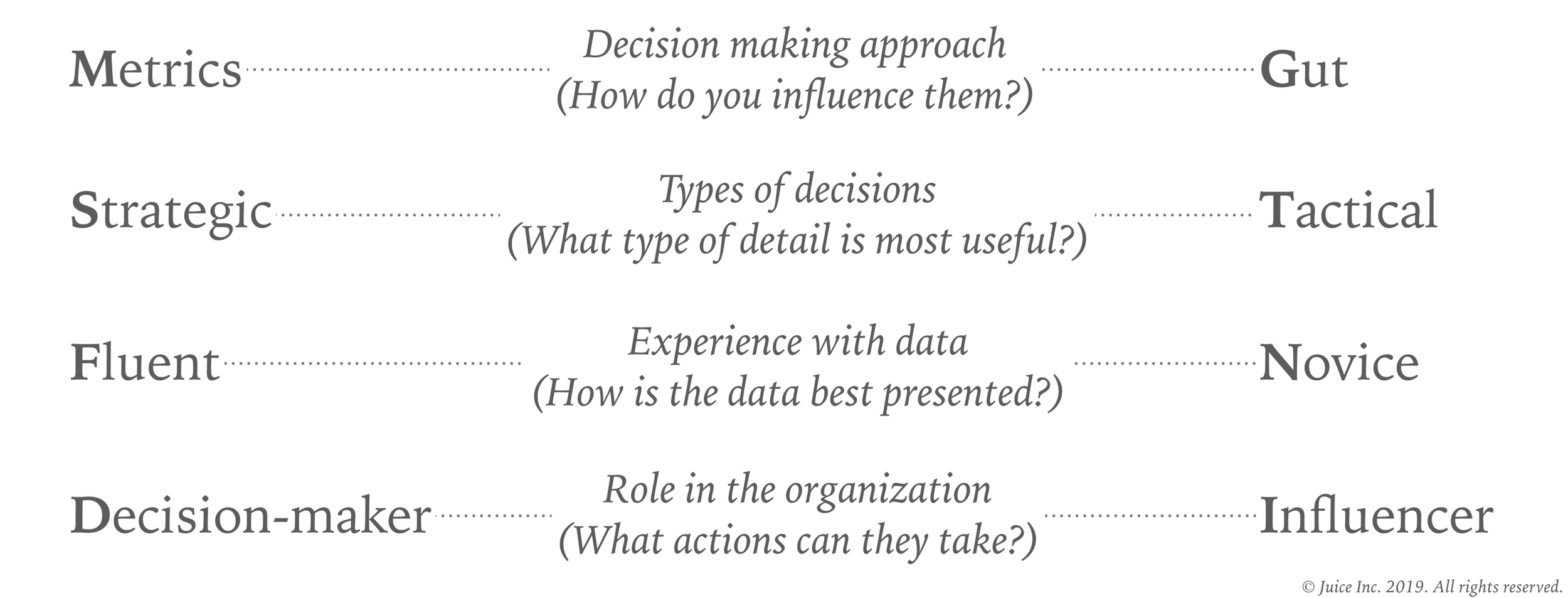
I’d like to share a framework for profiling Data Personalities. Like Myers Briggs, it has four dimensions on which an individual can exists on a spectrum between two extremes.

The_Juice_Guide_to_Data_Storytelling.png

Here’s how I think about each dimension:

  1. Decision-making approach. How does this person integrate data into their decision-making process? Do they lean on data to guide their thinking or are they more likely to depend on their experience and instinct?

  2. Types of decisions. Is this person in a role where they make decisions that have a long-term and strategic perspective, balancing more uncertainty and more sources of information? Alternatively, are most of this person’s decisions more real-time, tactical, or operational in nature?

  3. Experience with data. Does this person have a high level of data literacy — comfort analyzing, communicating, and interpreting data? Or are you dealing with someone who is relatively novice in working with data and who may express discomfort with data?

  4. Role in the organization. Is this person in a role where they can make decision directly from the data they are presented? Alternatively, will this person take your data and use it influence other people?
As a data author intent on encouraging smarter decisions, there is nothing more important than understanding your audience. The Data Personality Profile (DPP) is a good place to start. Now we just need some data.

The Future Belongs to Purpose-Built Apps. We're Betting On It.

“Purpose-built apps”

“Low-code app development”

“hpaPaaS”

“Citizen Data Scientists”

“Data monetization”

Witness the cloud of new buzzwords floating in the air. Let me see if I can knit these concepts together to shed light on their meaning and implications for the future of analytics.

Collectively, these phrases are a reaction to the long-standing challenge of getting more data into more hands. “Democratization of data” can seem perpetually right around the corner (if you’re listening to vendor marketing) or a distant illusion (if you are in most organizations).

At Juice we have a picture that we call ‘The Downhill of Uselessness’. It shows how the usefulness of data seems to decline as you try to reach more users. On the far left, the most sophisticated data analysts and data scientists are happily extracting value from your data. But as you extend to the outer edges of your organization, data becomes distracting noise, TPS reports, and little-used business intelligence tools.

downhill-of-uselessness.png

Three barriers to democratizing data

The struggle of getting data to more people in more useful ways boils down to a few unsolved problems.

First, general purpose platforms and tools (data lakes, enterprise data warehouses, Tableau) can be a foundation, but they don’t deliver end-user solutions.

"Vendors and often analysts express the idea that you can master big data through one approach. They claim if you just use Hadoop or Splunk or SAP HANA or Pervasive Rush Analyzer, you can “solve” your big data problem. This is not the case.”

— Dan Woods, Why Purpose Built Applications Are the Key to Big Data Success

Second, reporting and dashboards deliver information, but often lack impact. In our experience, most data delivery mechanisms lack: 1) a point of view as to what is important; 2) an ability to link data insights to actions in a users’ workflow.

Third, the people who truly understand the problems that need to be solved don't have the technical capacity to craft re-usable solutions. We all have that elaborate spreadsheet that is indispensable to running your business and, frighteningly, only understood by a single person.
A better path forward

Finally, there is a realization that these problems aren’t going away. There needs to be better approach. It will come in two parts:

  1. Focus on creating targeted solutions (applications) that solve specific problems. Apps can integrate into how people work and the systems where actions occur. They attempt to let people solve a problem rather than simply highlighting a problem. And applications are better than general purpose tools because they can bake in complex business rules, context, and data structures that are unique to a given domain.

  2. Give greater impact and influence to the people best know the problems. It has always been unfair to ask technologists to create solutions for domains that they don’t deeply understand.

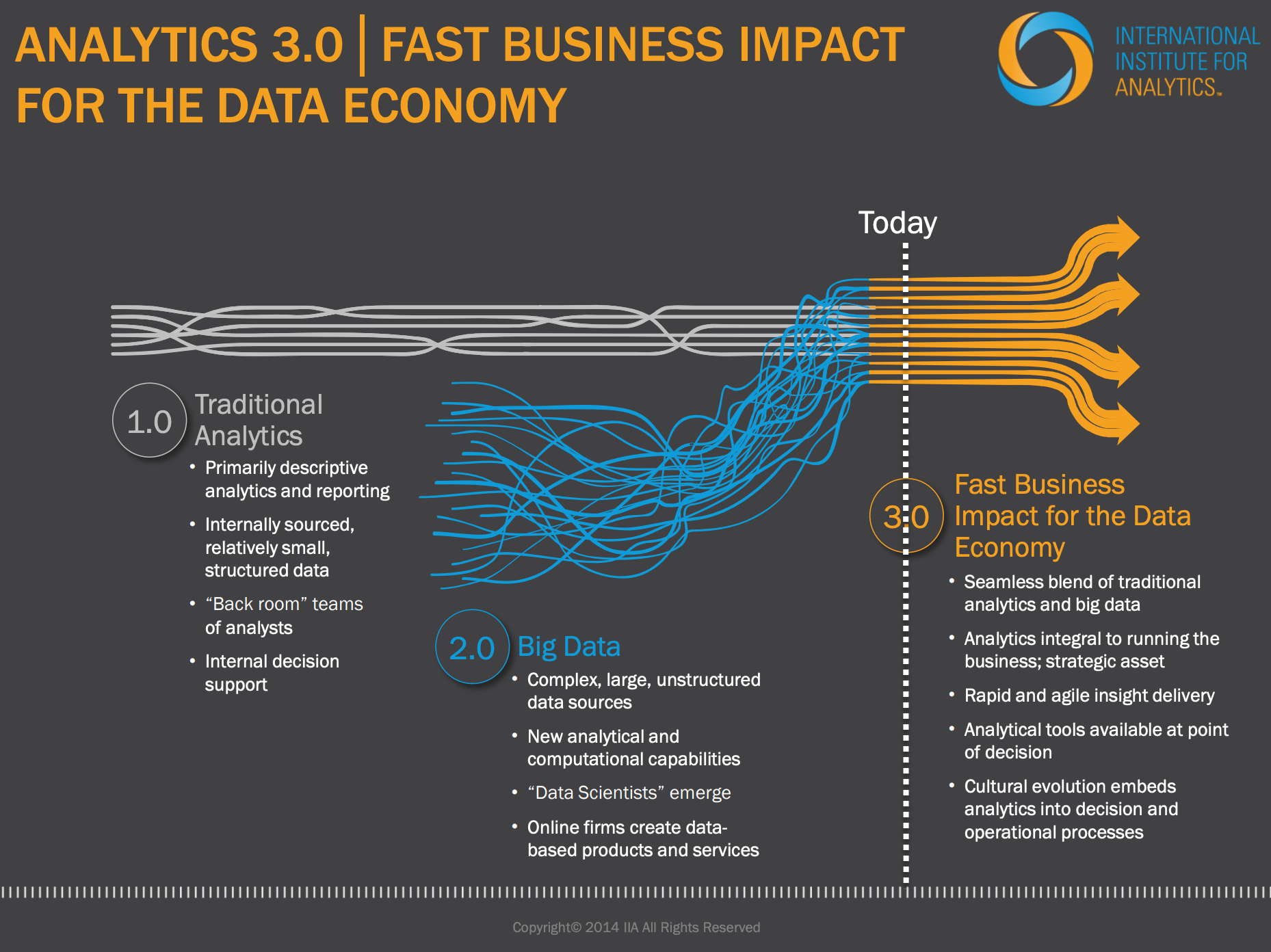
This direction aligns with Thomas Davenport’s view of Analytics 3.0 (from way back in 2013). He postulated that the next generation of analytics would be driven by purposeful data products designed by the teams who understand customers and business problems. (No offense, Tom, but we were griping about ivory tower analytics back in 2007.)

And so emerges a new model and new collection of buzzwords...

Purpose-Built Applications

Solutions that start with the problem and craft an impactful answer. Their success is measured by fixing a problem rather than in terabytes of data stored.

…built using a high-productivity Application Platform as a Service (hpaPaaS)

Cloud-based development environments requiring little coding ability (‘low-code’) — but requiring knowledge about the domain and the problem to be solved.

…to be used by Citizen Data Scientists (CDS).

the people who know the problems most intimately.

At Juice, we may have backed into this trend or cleverly anticipated it. Either way, now I can say that Juicebox is a low-code hpaPaaS designed for CDS to create purpose-built apps. Better yet, we are now fully buzzword compliant.