
Books, movies and music all have a beginning. Data, when presented or shared, often does not have an intuitive starting point. The challenge of not having a clear beginning is that when you see a dashboard littered with a dozen competing charts it’s easy to disengage. Tables of raw data can be even worse. Dashboards or reports are often designed to deliver everything and the kitchen sink.
Here are a couple of examples of dashboards that miss the mark in terms of telling their audience where to start. In both of these cases the user has to be familiar with the data and know how to read the information correctly. Beginner or infrequent users will struggle to understand the value of this data. Without guiding them, the users can lose interest and choose to avoid using the information altogether.

http://www.dashboardzone.com/health-metrics-dashboard-from-idashboard
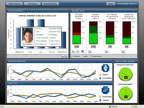
http://www.informationbuilders.com/products/webfocus/operational_dashboard
Good dashboards or reports start with a high-level summary and then let users progressively and logically drill into more complex details and context. They are also simple and uncluttered. They use white space and have a clear visual hierarchy. Here are a few of alternative examples to get the wheels turning.

Even this more advanced interactive visualization, called a TreeMap, offers clarity on where to start and how to use it.

To have your audience follow your story it’s important to get them started on the right path. Think Steven Covey’s, Begin with the End in Mind. Just like a story your audience is along for the ride. Carry them from initial explanation to a new, shared understanding. Only then will they begin to value the effort you put into assembling and presenting the information you’ve given them.
For a demo of our product, Juicebox, schedule an appointment.
Find out more on effective data visualization from our book, Data Fluency. Excerpted here with permission from the publisher, Wiley, from Data Fluency: Empowering Your Organization with Effective Data Communication by Zach Gemignani, Chris Gemignani, Richard Galentino, Patrick Schuermann. Copyright © 2014.