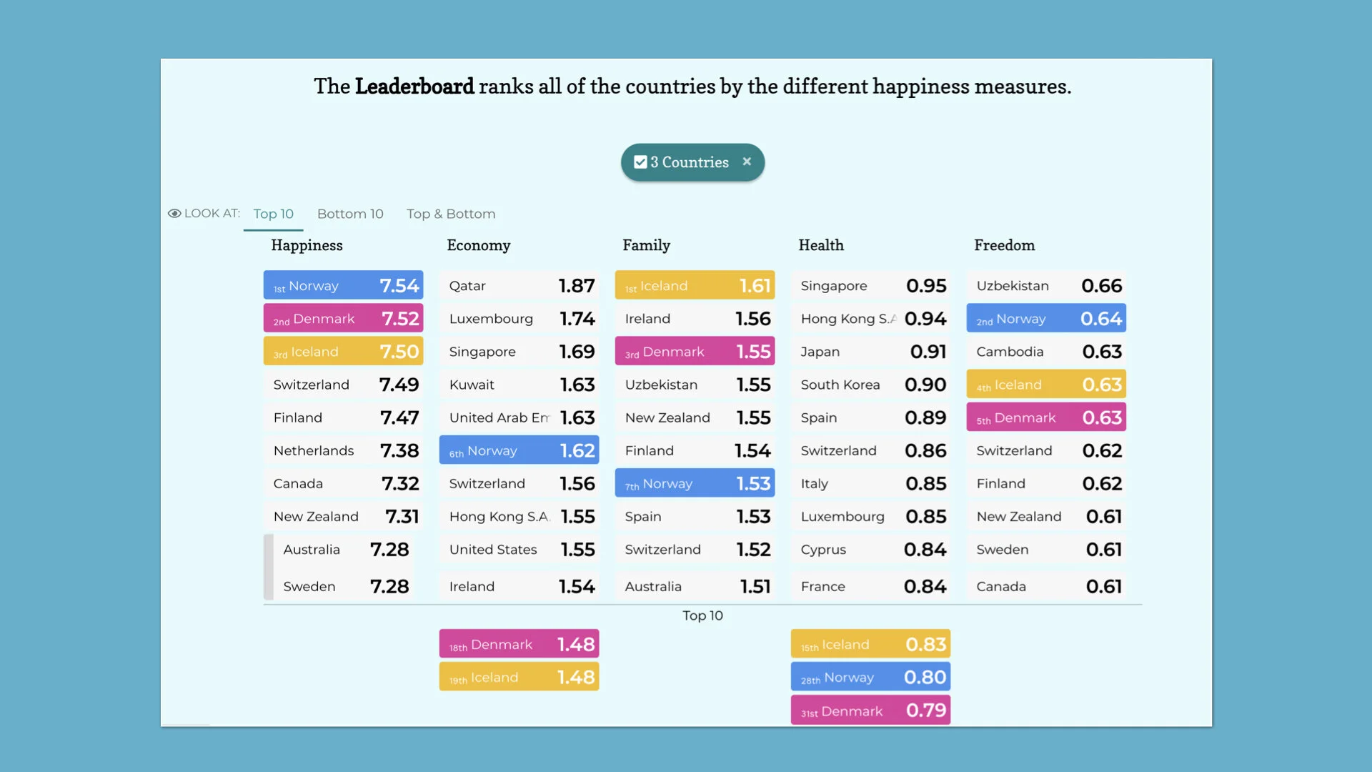
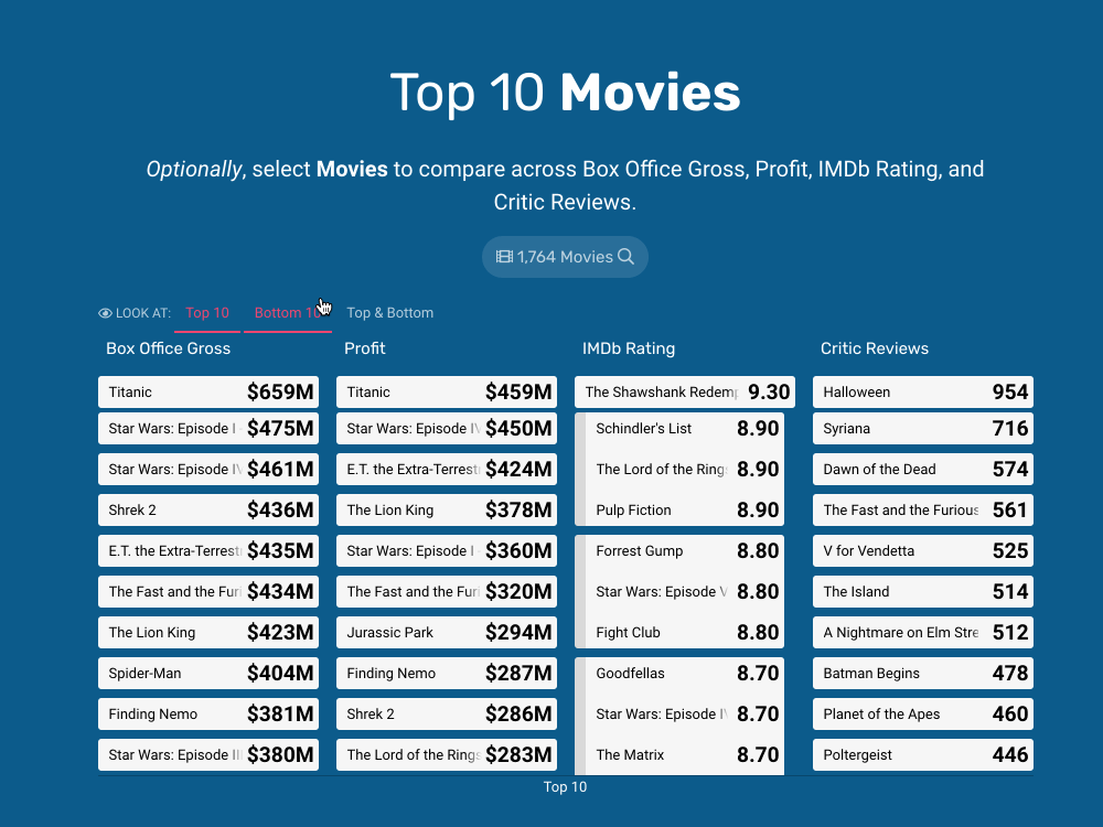
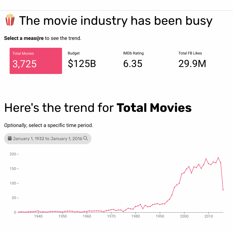
When Najmah Salam at Notion demonstrated how to build a Google Data Studio dashboard to show email campaign data, I had to create the Juicebox version. This dashboard is a common use case for many marketers who want to see how their email efforts are performing and identify what is working.
I appreciate that Najmah used a tool they were comfortable with. Here’s how their dashboard came out:
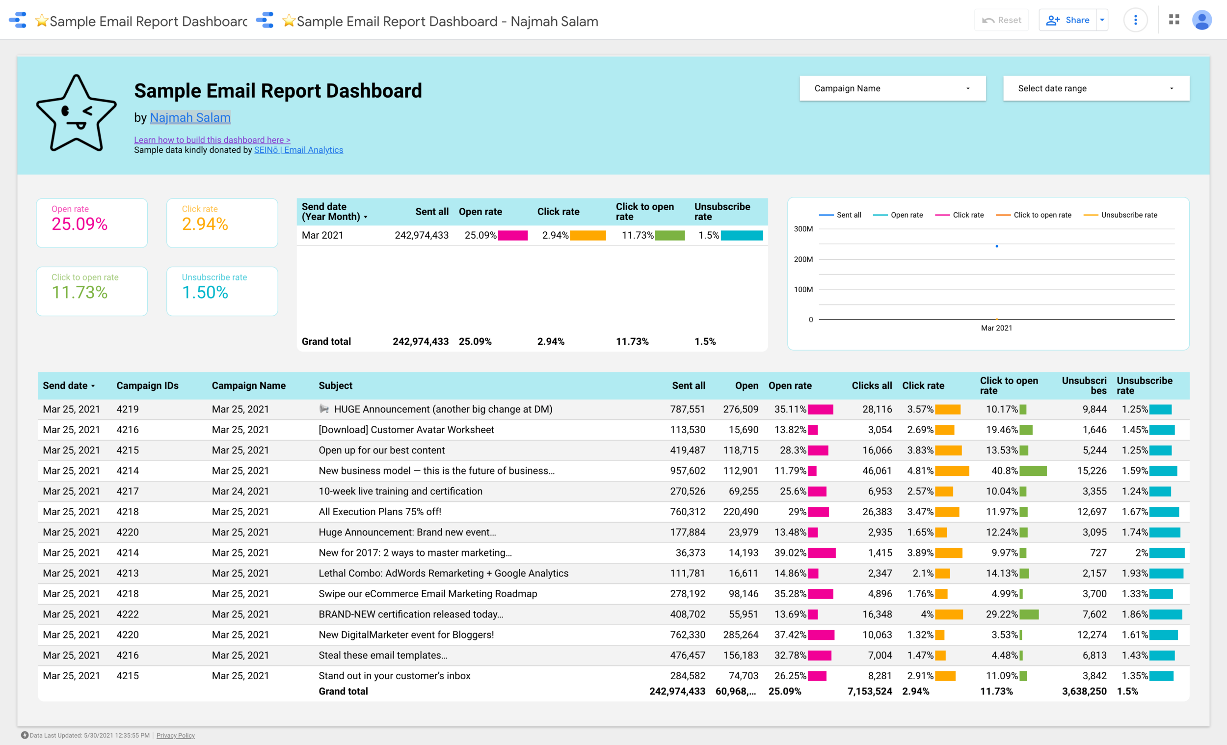
https://datastudio.google.com/u/0/reporting/c03801dd-e707-4ca6-a1fe-11daad8d390c/page/FthGC
Data Studio is eager to fit all the content on one page in the traditional “collage of data visualizations” style.
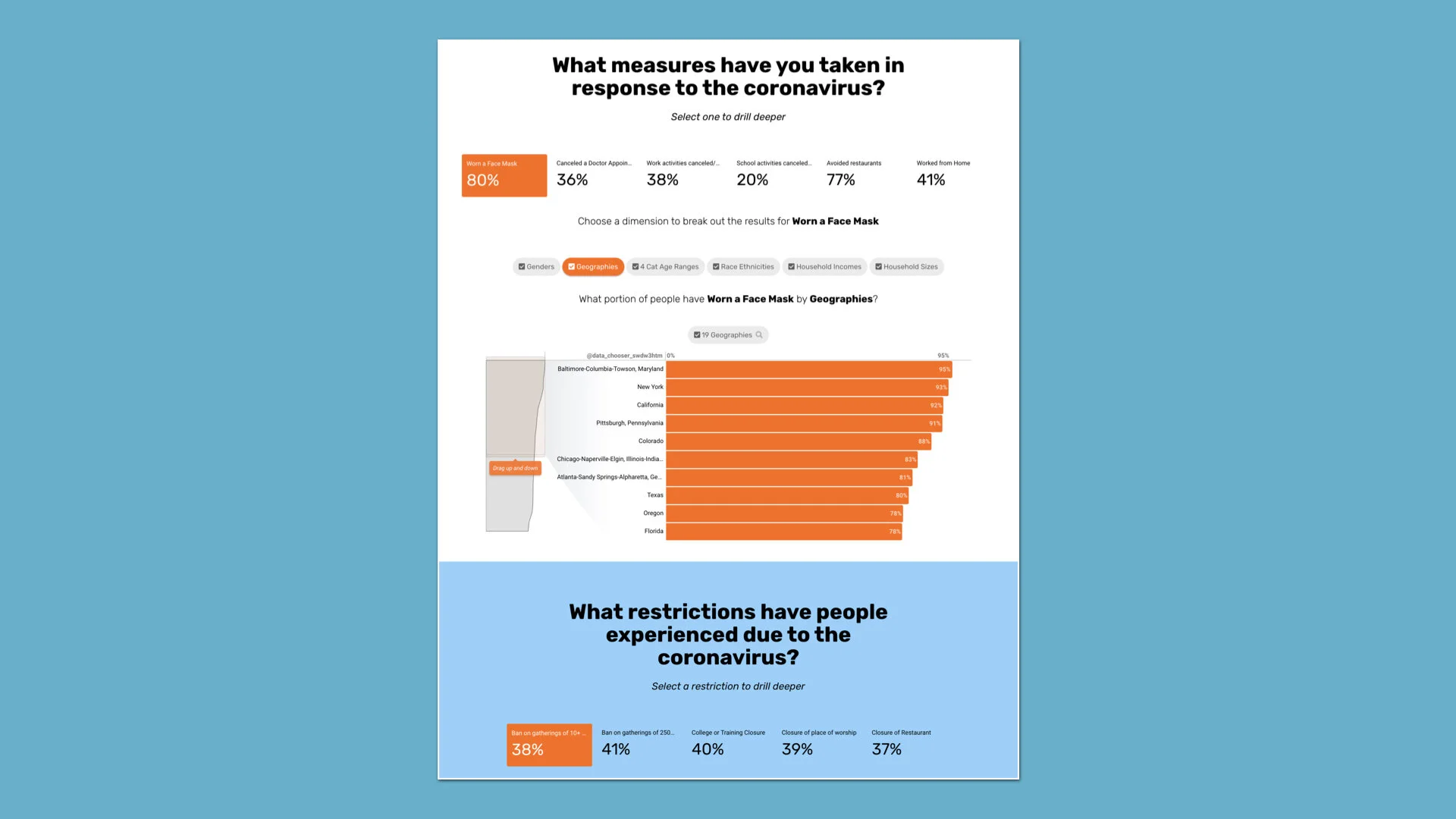
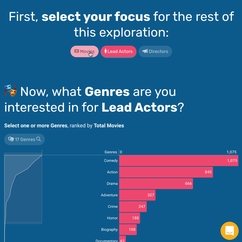
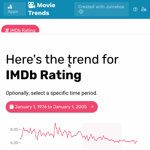
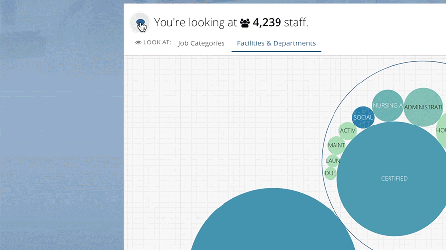
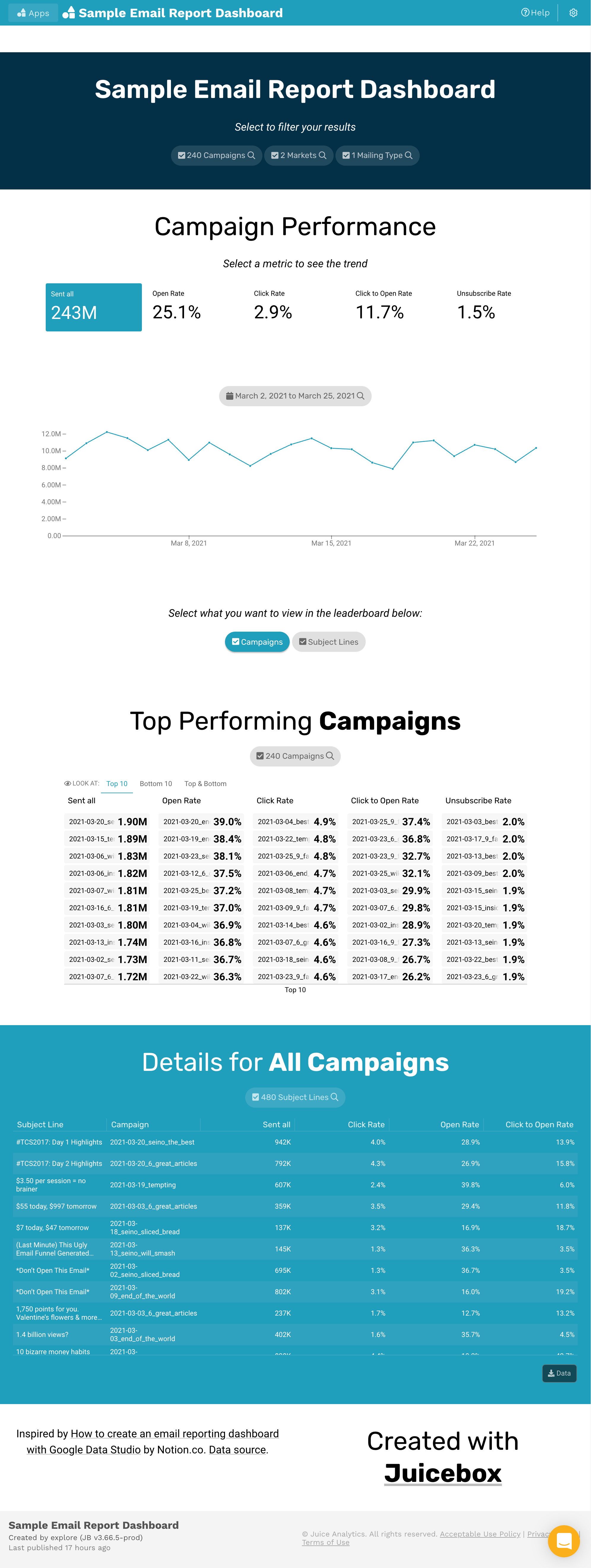
Juicebox offers a different approach, more reminiscent of scrollable websites and data journalism. Here’s what I put together:
This exercise helps highlight a few things our design team cares about. We want to make presenting data…
Easier than a HelloFresh meal kit. We are dead-set on making it dead-simple, whether you are calculating measures, adding visualizations, or laying out your app.
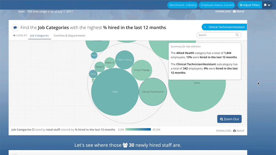
More collaborative than Among Us. Google Data Studio shows the data in a largely static view. We want to enable discussions through interaction and exploration. Good data visualization will raise more questions than it answers. Interactivity lets you answer the next level of questions…like Who’s the imposter?!?
Better looking than a Telsa Cybertruck. No offense Cybertruck. We want to make it easy to deliver an attractive, balanced, modern web app, not something from a ‘90s Paul Verhoeven film.
As portable as an iPhone. What if I could fit 1000 data points in my pocket…or a million. A modern visualization tool should be responsive for viewing on mobile devices. Data Studio is still working on that.
To sum up: Juicebox is like HelloFresh prepared in a Ford F150 Lightning while playing Among Us on your phone.