
Do you remember when Facebook first launched its News Feed? I do. I can recall complaining with friends that it was "too stalker-ish" (we were right) and that "no one was going to use it" (we were wrong).
Today it's hard to imagine Facebook without its signature News Feed, but for a long time I did not care for it at all. That's because once people get used to a certain way that things operate on the web, they don't like it when those practices are changed. Not only do they dislike change, but they come to expect certain design practices online. Take for example the horizontal navigation bar found across the tops of web pages: around 88% of websites have its main navigation panel there on every page. Nine times out of 10, that's the first place a user will look when attempting to navigate through a website.
Another piece of design experience that all users expect is vertical narrative flow. Web pages flow from top to bottom and as you want to learn more about a company, product, piece of news, etc. you scroll down.
Juicebox is not unique among BI solution to offer a design layout that flows from top to bottom. Infographics and web pages have taught us that people want to read data the way the same way that they read text. However, Juicebox has a special ability to seamlessly connect the narrative flow, dynamic textual content, and complex filters to give users an effortless experience while navigating data.
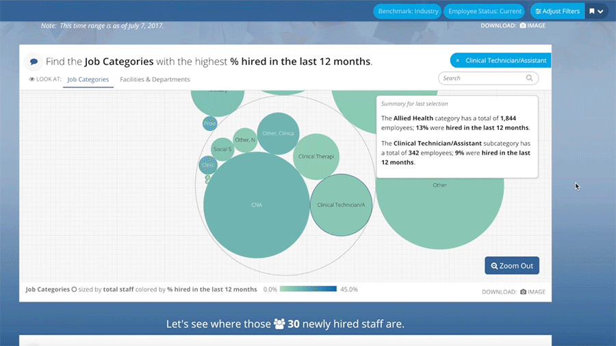
Narrative flow is essential to the experience of Juicebox and our user-centered design. As a user interacts with a Juicebox application, they are continually making decisions about what they would like to see in the data, what relationships are most important to them between segments and tables, and what details they need to make informed decisions. All of these complex interactions are done behind the scenes as Juicebox provides that infographic-type feel in a web-based format.

Can you think of a situation where you need to deliver data to an audience of users? Maybe it is customer reporting or a data model that needs a user interface for people who are not data savvy. In recent months we have made it even more easy for you to get started with Juicebox. Through our Guided Design Process you can see your data in Juicebox and give access to 10 users so that they can experience the ease of navigating through your data in a narrative flow. To learn more about Juice's Guided Design Process, check out our resources page.