3 Jobs Every Data Story Should Do

One of the companies we love is FullStory. Recently, they wrote a nice piece about how when people buy a product, they’re really hiring that product to do a job — a job they already needed to do but that is easier with the assistance of the product. 

This is true for data stories, too. In a nutshell, data stories are the assembly of data, visuals, and text into a visual narrative about the meaning of the data. Properly crafting an effective data story — one that connects the reader to their data, its meaning, and how it relates to their environment, all while assisting the reader in accomplishing a meaningful task — is not an easy endeavor in which to succeed. 

But don’t despair! Give your data story these 3 jobs to do and your readers will be more effective with their data.

Job #1: Tell them something they already know.

When you write a data story, the very first thing you have to do is build trust with your reader. Until they have confidence in your story, the best you can hope for is to drag them into the slog of figuring whether or not they can trust your story, which is typically performed through in-depth and independent data forensics. Did somebody say “Party!”? Um, no.

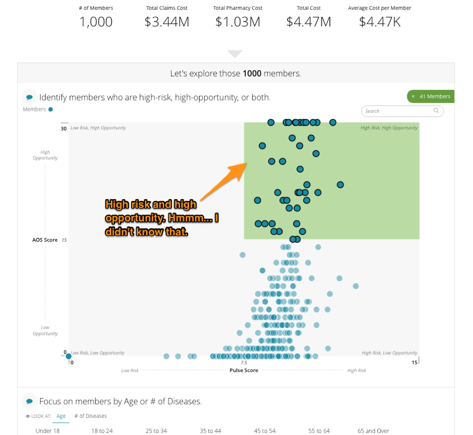
So, how do you build trust? By meeting them on common ground: tell them something that they already know and agree with. Here’s an example from an application we created using Juicebox, our data reporting application platform, that addresses the greatest opportunities for cost and care management in the world of population health.

We start by presenting a key metric of total number of members, a metric that most users would be familiar with and would give them the sense that we’re both talking about the same thing. Now we’re on the same page with the reader and, presuming we’ve done it correctly, the data story is ready to do its next job.

Job #2: Tell them something they don't already know.

A data story that only tells the reader what they already know isn’t terribly useful. So the second job of the data story is to make them smarter and introduce them to something new. This new piece of information demonstrates the value of your data story. If done properly, the reader comes away saying “A-ha! I see it!”

Continuing with our population health example from above, we introduce the bucketing of population members into a high-risk/high-opportunity group. “Oh look, there are 41 people in that group that are at risk, but who have a high opportunity for change."

But, as GI-Joe always says, “knowing is half the battle.” The other half? On to your data story’s third and final job.

Job #3: Give them something to do.

If data is presented and no-one acts, did it matter? If a tree falls in the forest and no-one hears it, did it make a sound? If the rubber doesn’t meet the road, is the cliché reality? Seriously though, when the new thing that the audience learned inspires actions, that’s when it become truly useful. Continuing with our example, you can see that the user is presented with a list of specific people who fall into the high-risk, high-opportunity bucket — perhaps feeding these folks into a campaign to actively manage their risk would be the next step. 

The more specific you can get with the recommendation, the better. This last step is most successful when your data story is written around a very specific and targeted narrative. This is what we at Juice call a short story... but more on that another day.

The next time you write a data story, give it these three jobs and we’re certain you’ll make your readers more effective at using your data. Need some more help with your data story? Send us a message at info@juiceanalytics.com or fill out the form below!

Lessons from More Than Insights: Beyond Exploratory Data Viz

Last month a group of Juicers attended a lecture at Georgia Tech entitled “More Than Insights: Beyond Exploratory Data Visualization” given by Hanspeter Pfister, Professor of Computer Science and Director of the Institute for Applied Computational Science at Harvard University.

Pfister cited the rise of the infographic, as well as an increased general interest in subjects like data storytelling and data journalism as evidence that more and more people are becoming interested in using visualization to communicate and explore information. But what comes after information is shared?

“After insight comes the message,” Pfister explained. “The information is the ‘what’, the message is the ‘so what’ - the ‘why should I care?’”

Being able to address the “so what” brings a whole new set of challenges to data communication, Pfister told the audience. He explained that we’ve only just begun to scratch the surface of what is possible, that we actually don’t know as much as we think we do about these subjects, and that much more research is needed to even begin to understand these intricacies. To illustrate his point, he used examples from three different subject areas: data visualization, data storytelling, and data tools.

Data Visualization

Pfister cited a study that he had participated in along with Michelle Borkin on what makes a visualization memorable. In the study, participants were shown a string of various visualizations and told to respond if they remembered having seen it previously.

So what did the researchers find made a visualization memorable? The charts were found to be more memorable if they contained human recognizable objects (such as dinosaurs or faces), if it was colorful, visually dense, or had a title, labels, and/or paragraphs.

Are these descriptions setting off alarm bells and making you scream internally? It’s probably because these characteristics are the exact design elements we’re taught to avoid. To further prove this point, Pfister shared that the least memorable visualizations were what we’d think of as more “Tufte-compliant.”

So the question on everyone’s minds: do we toss out the old guidelines in favor of brighter, busier visualizations? Not necessarily. Pfister shared that he believes the answer may lie in “something beyond [Tufte] that we haven’t explored that much.”

Data Storytelling

Pfister then brought up the ultra-new method of using comics to communicate data. Ultra-new because, as Pfister pointed out, there are few actually using comics to communicate data, there is no real definition of what a data comic actually is, and there are no real tools to create data comics.

A data comic, he explained, is communicating data in a way that comic books typically communicate stories. He explained that the four essentials for data comics were visualization flow, narration, words, and pictures, and demonstrated how all of these work together by displaying a data comic that showed the various power struggles that contributed to World War I.

It’s hard to do the comic justice by just talking about it, but to give you some idea of the effect it had on the audience, I would like to use one audience member’s own words: “It’s like a punch to the brain.”

Viewing the information in the form of a data comic was a faster and clearer way to communicate the information than any textbook could have done. It was evident from this example that data comics are more likely to play a larger role in the future, but, Pfister questioned, how will it fit into data storytelling overall?

Data Tools

The last subject Pfister hit on was data tools. He explained how the majority of popular data tools are relatively easy to use, but lack ability to customize visualizations easily. On the other side of the spectrum, however, are tools that are more expressive but lack ability to add insight. He argued that data scientists not only want but deserve better tools, and because of this there should be a product that falls somewhere in between Excel and InDesign.

The answer that Pfister and a team of individuals, in collaboration with Adobe, came up with was a program in which the user puts data into a spreadsheet, then uses guides that constrain the data to create a visualization. It was an interesting way of displaying data, but will it satisfy data scientists’ quest for the perfect tool? Only time will tell.


It was clear from Pfister’s lecture that more research needs to be done in all of these areas before we can truly say for sure what the best methods of communicating data are. It’s an exciting time to be in visualization, and we’re excited to see what the future brings. In the meantime though, check out our design principles for what we’ve found to be some pretty effective strategies for communicating data.

New Ebook: Data Is the Bacon of Business

There are some things in life that just go together. Peanut butter and chocolate. The Captain and Tenille. Data and… bacon?

It may seem like an unconventional pairing, but it’s true. We’ve said it before, and we’ll say it again: Data is the bacon of business. What do people do to liven up boring foods? Add bacon to them! What do businesses do to liven up their products? Add data to them!

The truth is, data products are a real and current opportunity for businesses, including yours. We should know -- we’ve spent the last ten years helping companies to create their own data products. Now we’re sharing what we’ve learned with you in our newest ebook. With just a few clicks, you'll learn our data product process and be well on your way to making your very own data products.

Have we whet your appetite? Download the ebook for free now!

Three Simple Steps to Customer Discovery

Building a data product is no different than building any software product in that you have to really know your customer and value proposition before you go to market and scale. The process of getting to know your customer and how your proposed solution can help solve a problem is most commonly known as customer discovery. As you’ve seen in our other blog posts about the Blueprint product, we went through an extensive customer discovery process prior to developing our go-to-market strategy.

If the customer discovery concept is new to you, I’d recommend reading the following two books before diving head first into new product development:

The Lean Startup by Eric Ries

Four Steps to the Epiphany by Steve Blank

We’ve adapted what we’ve learned from these books to a process that we can use to test the viability of other products that we’ve built on the Juicebox Platform such as JuiceSelect (a product that helps chambers of commerce communicate data and drive to action), and now we're sharing it with you.

Step 1: Craft your value proposition hypothesis. Before you start having conversations with potential customers, you need to have an idea of the problem you believe you are solving with your product. Once you have a basic outline of the problem and your solution, you’re ready to test your hypothesis. Here’s how we structured our initial description of the JuiceSelect value proposition:

  • Target audience - The primary audience is lawmakers and chamber members/investors

  • Urgent need - Chambers need to publish data to support important policymaking  decisions and track progress against strategic plans

  • Ease of setup  - To turn the website on, it requires minimal effort from chamber staff

Step 2: Set up phone calls and in-person meetings to test your value proposition and demo your product (if you don’t yet have a minimum viable product [MVP], wireframes are good enough at this step). You should set up meetings with potential customers in your market and with organizations affiliated with your potential customers. For JuiceSelect, this meant reaching out to small, large, state, and regional chambers to make sure we were testing all aspects of our market. We also reached out to an Association for Chambers of Commerce and to a few vendors that sell other products to chambers to get a better understanding of our potential clients.

Step 3: Compile feedback and re-asses product-market fit. Now it’s time to pull together all of your findings and figure out if your original hypothesis about the problem and your solution were correct.

After completing these three steps, you’ll often find that you didn’t completely understand the problem and/or that your proposed solution is really only a partial solution. For instance, when we started our customer discovery process for the JuiceSelect product, we had made an assumption that the product would be valuable to all 2,000+ chambers of commerce nationwide. After a few weeks of demos and conversations about our value proposition, we discovered that the product was really primarily suitable for state chambers of commerce. State chambers of commerce need a public website to display all key economic metrics to help drive public policy decisions, while regional chambers only want to display data relevant to helping them attract new businesses to their region.

Good thing we didn’t sink tons of marketing and sales dollars into a market for which we didn’t have the right fit! However, all is not lost. We can still sell the original product to the state chambers while developing a related product that will fit the needs of the remaining 1,950 regional chambers.

If you’re interested in seeing how Blueprint or JuiceSelect can help your organization, we’d love to hear from you. Send us a message at info@juiceanalytics.com or tell us about yourself in the form below!


Market Validation of a Data Product: A Story of Success

Juice has spent the last year and a half developing Blueprint and bringing it to market. It all started with the idea that we could monetize the data we have access to through our partnership with HealthStream, and create and launch something useful for our customers.

As we worked to bring this idea to fruition we put together a product roadmap of features we would like to see and ways that we think our customers would interact with it. We realized that it wasn’t enough to just put the data into Juicebox and throw some visualizations at it; we wanted to ensure we had a product that would sell, be easy to describe, and bring value to our customers. In order to do that, we established some phases that we needed to go through with the product to bring it to market.

For the purposes of this blog post, I am going to just talk about market validation and the steps we took that you can incorporate into your own data product research.

Our first step in launching our data product was to validate some important things. Primarily, we needed to discover if there even was a market for Blueprint. We went about that a number of ways, and ultimately discovered that there was indeed a good-sized market. We researched who our potential competition was and studied their features to ensure that our product was unique enough to differentiate ourselves. This turned into a really valuable exercise for us as a team. We took the time to write out, brainstorm, and verbalize how we are different from others in our space. This was a vitally helpful step in the process to not only gel our team, but to get us all on the same page.

Secondly, we needed to validate that we had buyers! This was quite possibly the most important step, as we could have created the most stunning visuals in the world with the cleanest possible data, but without a buyer we would be left with only some fancy visualizations and no one to share them with (whomp whomp). We were strategic in our approach to finding the right buyer. We worked hard to understand industry trends, their pains, and craft Blueprint to make sure it met those needs.

We also had to understand our customers' motivation for buying Blueprint. Was it to fix an immediate problem? Address an issue coming down the pike? Or proactively equip their organization to make good decisions in the future? We found out all of these were motivations.

User feedback was vital for us in understanding if the end user of Blueprint was an organization, a person, or a group of people. We had to work through who we wanted our end users to be and settled on HR leadership as our primary users within a health system. We discovered that other executive leadership received value from insights into their staff. This turned out to be a discovery that led us to new customers. When reaching out to these groups of leaders we offered a demonstration of Blueprint and asked for feedback of what they would like to see in such an application. It was important for us to take their feedback and incorporate it into Blueprint, and then go back to them once it was completed to get more input. We also asked some of the individuals we interviewed and demoed for to be on our product advisory panel. Doing that gave us great insight on how to best design the product for the market.

Incorporate these steps into your own data product market research, and you're well on your way to your first sale!

Here because you want to know more about Blueprint? Ask us your questions and see how it works by setting up a time to talk!

Turning Healthcare Workforce Data from a Challenge into an Asset

“Since people are a huge investment, the hospital needs to make sure that it’s hiring and retaining the best people. Once hired, though, how does a HR leader keep an enterprise view of the workforce, and how do they identify problem areas quickly?”

It’s a tricky question, and it’s the one we set out to solve when we created our latest product, Blueprint.

If you’ve been paying close attention to the Juice blog, you might have noticed we’ve been talking about Blueprint quite a bit lately (see here, here, and here). Each one of these posts has featured a different aspect of Blueprint, depicting a small sample of its various features and demonstrating its ultimate purpose: to provide HR leaders with an easily accessible enterprise view of their workforce in order make better data-driven decisions.

Michael Dean, Juice’s Director of Business Development, sat down recently with HealthStream to further discuss Blueprint’s features, provide more information about who might most benefit from it, and share some examples of Blueprint in action. Download the latest issue of PX Advisor, HealthStream’s online magazine dedicated to improving the patient experience, to learn more about how Blueprint might be the perfect fit for your organization.

Done with reading and want to get an up-close look at Blueprint for yourself? We’d love to show it to you! Send a message to info@juiceanalytics.com or set up a demo below.

Image Source: http://www.healthstream.com/resources/px-advisor/pxadvisor/2017/02/10/winter-2017

Taking Your Organization’s Pulse with Workforce Analytics

What is the first thing that comes to mind when you hear the word “healthcare”? Is it an image of an industry dedicated to patient health? Or do visions of budget cuts and federal mandates dance in your head? My bet is on the latter.

Whether you’re a healthcare employee or not (and whether you like it or not), you’re still a part of the healthcare industry. And we can all probably attest to associating “healthcare” with an industry encumbered by increased demands and limited resources, instead of one that is focused on the health and wellness of patients.

Whatever your political and personal stance, I think we can all agree that patient care should be at the forefront of the industry’s focus. But with increased demands and a tightening resource base, how can this be accomplished?

It’s a basic economics principle – the only way to do more with less is to change the way things are being done. This means challenging the traditional approach. One CIO article went as far as to compare healthcare to Blockbuster, suggesting that the industry is in need of a “Netflix-type” level of disruption. Unfortunately, trying to compare the model intricacies of healthcare delivery with video rentals is like comparing the complexities of the human body with that of a VHS tape (one is a little more complicated).

However, I think we knew where the article was going with this analogy, and that the takeaway is the need for a new approach. But with a multitude of different interventions and efforts currently intertwined and underway, the question is, “Where does one start?” For an industry in need of determining which piece of the puzzle to focus on, it would make sense to consider where the largest investment lies. For healthcare? That’s staffing.

Hospitals invest millions annually in financial and clinical IT systems, but tend to spend much less on "the people side of the business.” Staffing expenses currently make up over 54.2% of a hospital’s overhead costs, and staff-related expenses can cost upwards of 70% of an organization's total costs – easily the largest expense line item on the books. Furthermore, healthcare employment is projected to grow 29% by the year 2022 according to the Bureau of Labor Statistics. That’s twice as fast as the expected overall employment growth!

Perhaps the most important reason to focus on staffing practices is that they have been shown to have a direct impact on patient satisfaction and outcomes, with considerable amounts of research linking staffing variables to patient outcomes. In other words, happy workers equal happy patients equal happy profits.

Fortunately, what we’ve learned through the development of our analytics platform, Blueprint, is that it does not take a whole lot of complex workforce data to begin measuring staffing areas that are directly tied to quality of care and cost management. Below is an example of some of the strategic areas on which Blueprint focuses. Give these data-driven efforts the attention and resources they deserve, and you’ll be moving towards better clinical and financial outcomes.

  • Turnover Calculations - Replacing a valued healthcare employee can cost up to 250% of the employee’s salary. According to an NSI study, 83.9% of healthcare respondents don’t record the costs of employee loss. With the report finding that the vacancy rate for nurses is expected to grow, hospitals need to do all they can to keep retention high to avoid a lapse in patient care quality and a need to increase clinical workloads even more.
     
  • Retention and New Hires - Mentioned above, retention can provide the continuity of care that plays a large role in clinical care and patient satisfaction. Furthermore, employees with less than one year of tenure make up nearly 25% of all healthcare turnover nationally(!) 

    Try tracking turnover in groups by tenure such as 0-3 months, 3-6 months, 6-12 months, >1 year, etc. Reporting the data in cohorts will make it easier to pinpoint where in the lifecycle the attrition is occurring.
     
  • Managerial Span of Control - According to studies, smaller spans of control are linked to higher rates of employee retention – and the alternative being true with wider spans of control.

    Use supervisor/employee data to compare the number of direct reports by hierarchy level. Spans of control should be similar for supervisors in the same hierarchical level, with the exception of differences in direct report skill level, experience, and tasks performed.
     
  • Staffing Ratios - Staffing ratios define the relationship between your revenue-producing employees and the staff needed to support them. According to the Agency for Health Research and Quality (AHRQ), the risk of nurse burnout increases by 23% and dissatisfaction by 15% for each additional patient. However, when hospitals have accurate staffing, nurse burnout and dissatisfaction can drop significantly. Studies suggest that the higher the ratio of support staff per FTE physician, the greater the percentage of medical revenue after operating cost. Health systems with higher nurse employment had a 25% lower chance of receiving penalizations for readmissions through HRRP than those that had lower nurse staffing levels.
     
  • Leverage Your Internal Resource Pool - With an enterprise view of your staffing needs, it’s easier to make strategic staffing decisions for the entire organization, enabling you to find that sweet spot between optimal care delivery and labor cost management.

    Begin by analyzing data that represents staffing by facility, specialty, and department, while considering patient needs and the corresponding staffing data across the organization. Monitor staffing distribution and find opportunities for reallocation (as opposed to hiring/terming) with staffing surpluses and shortages.
     
  • Strategic Staff Allocations - Employ known enterprise concepts, such as economies of scale by identifying opportunities where you have a concentration of facilities in a given geographic area. Also, back-office, phone clinical roles and administrative functions, such as billing and purchasing, can be streamlined with centralization efforts that leverage economies of scale.

    When faced with healthcare’s “do more with less” dilemma, it is an opportune time to rethink how we approach labor cost containment and quality of care improvement strategies.

In the midst of healthcare reform and quality care initiatives, healthcare systems have an opportunity to place patient care back in the forefront of the healthcare delivery model. By recognizing that the missing link between quality of care and cost containment is the healthcare workforce, they will be doing just this. After all, people are at the heartbeat of healthcare -- patients and staff.

Let us help you keep your finger on the pulse of your organization and visualize your data in way like never before. Interested in learning more about a one-stop-shop for workforce analytics? Send us a message to get a preview of Blueprint.


Lessons from a Data Monetization Workshop

Data monetization is a hot topic. And like the early days of ‘big data,’ there is uncertainty about what the term means and the opportunities it creates.

Nashville’s data community came together a couple of weeks ago to push the data monetization discussion forward. My friend Lydia Jones, founder of InSage, put on the second annual Data Monetization Workshop. She gathered industry leaders from as far away as Australia for a half-day event that shared real-world experiences and raised important questions about how to think about your data as an asset.

I was happy to participate in a panel called “The Arc of the Data Product” — a familiar topic as we work with companies launching data products on our Juicebox platform. Here’s how I like to frame the undercurrent for data products:

Whether it is Fitbit’s personal health dashboard, smart routers, or an analytical dashboard for a SaaS product, data products are about enhancing your existing products to make customers smarter, more engaged, and (hopefully) more loyal.

Creating data products is seldom a linear process — but for the sake of discussion, I laid out the common steps involved with bringing a data product to market. 

The discussion on our panel — and the remainder of the workshop — was wide-ranging. Here are a few of the important takeaways from the conversation:

  • We need to consider both the direct and indirect business models for data monetization. Direct — selling your data to other organizations, through brokers or marketplaces — is still an emerging model. Nevertheless, several people at the workshop expressed interest in how this data would be valued. Indirect data monetization — creating new products and features from the data — seems to me a more established path in part because it sidesteps challenging questions about data ownership. Like the oil industry, there will be those who make money through the raw materials and those that add value along the many steps in the value chain.
  • The hard work is in getting your data right. Many organizations are tempted to race ahead to building data products without realizing they are building on an unstable foundation. Any issues involved with gathering, cleaning, or validating your data will inevitably be revealed in the process of launching a data product. 
  • How do you deliver value from your data early, so you can buy time to get to long term solutions? This was a common refrain from the data professionals who had been stung by executive teams impatient for results. However, in the eagerness to deliver value from data, I reflected on the inevitable: if you build it, you own it. Even the smallest data report can become an albatross around your neck if customers come to depend on it.
  • Data products come in many forms: an insightful report for your customers, a feature that recommends useful actions, or a stand-alone analytical solution that transforms how your customers make decisions. Regardless of the form, they are products that need to be researched, tested, marketed, sold, supported, and refined.

To learn more about our experience with building and launching data products, here are some other resources:

Data Product Resources
How to Build Better Data Products: Getting Started
Data is the Bacon of Business: Lessons on Launching Data Products

Want to build a data product? Don't take inspiration from an El Camino

You’ve connected your data highways, built the bridges, and now it’s time to take a ride. Do you have the right vehicle? Do you even have a vehicle?

Hopefully you’ve put some plan in place to extract value out of your information highway. If not, may God have mercy on your soul and the executive who decided to fund your bridge to nowhere. Most likely you know what it is you hope to get out of your “Big Data” investment, but there are a lot of unanswered questions.  

At this point you’re faced with what I like to call the “Chinese Buffet” of data analytics vendors. Do you really want to eat pizza, chicken tenders, and Kung Pao chicken all in one sitting? This infographic looks a lot like a “Big Data” buffet and proves how overwhelming the vendor selection can be:

https://www.capgemini.com/blog/capping-it-off/2012/09/big-data-vendors-and-technologies-the-list

https://www.capgemini.com/blog/capping-it-off/2012/09/big-data-vendors-and-technologies-the-list

It’s no surprise why it’s so tempting to try to whittle the selection down to one vendor that does it all. You’ve convinced yourself that if you select one vendor, this decision will save money and eliminate the potential indigestion of integrating with multiple vendors from the Big Data buffet.

This can prove to be a fatal decision, especially when the solution you’re trying to build has a revenue target pinned to it. Some of you may already be familiar with the infamous Chevy El Camino. For those of you who aren’t, it’s the truck/car hybrid that’s about as appealing to look at as the mutant puppy/monkey/baby courtesy of last year’s Super Bowl commercials:

The El Camino was the ultimate utility play for people who wanted something that could haul like a truck yet still ride like a sedan. It was a one-size-fits-all solution for motorists, but unfortunately it was neither a great sedan nor a good truck.  

Let’s imagine for a minute that you’re in the construction industry and competing for a bid to deliver construction materials. The job is 1 mile off-road in the mountains and the prospective client asks what kind of vehicle you’ll be using to deliver the materials. You tell the client “I’ve got an El Camino, it’s a car with a truck bed!” Your competitor submits a bid and tells the client they’ll be using a F350 Super Duty V8 4x4. Who do you think wins that bid?

How does this relate to your problem? Let’s imagine now that you’re building a data product. Many vendors in the data analytics space bill their products as a one size fits all solution, like the El Camino.  Picking one vendor to do everything can leave you with an undersized and underperforming platform.  

For example, your client may have asked for both an executive dashboard and unbridled access to your data so their analysts can perform ad hoc analysis. You go out and find the most whiz bang drag and drop analyst friendly chart builder. It has 80+ visualizations (half of them are 2-D and the other half are 3-D) so your client can dig in and make all the 3-D pie charts they ever wanted. The vendor also claims to have an awesome dashboard solution.  You go to build your executive dashboard and it looks something like this:

https://blog.rise.global/2015/10/28/the-5-big-design-decisions-you-need-to-make-when-creating-a-personal-dashboard/

https://blog.rise.global/2015/10/28/the-5-big-design-decisions-you-need-to-make-when-creating-a-personal-dashboard/

The vendor you selected gave you a great ad-hoc tool, but their data presentation/communication platform is seriously lacking. Your potential client takes one look at your platform and decides they only want to pay for access to your data at a fraction of what you hoped to charge for your product. You’re stuck in the mud with an El Camino full of data bricks.  

It’s worth noting that the executive dashboard is for executives and the ad-hoc tool is for analysts.  Last time I checked, executives were the ones who were responsible for cutting checks.  

It’s always important to pick the right vendors for any job. Don’t expect to find a one-size-fits-all tool in the Big Data space.  When building a data product, remember that the presentation of the meaning, flow, and story of your data is more important than any ad-hoc capabilities. If you fall short on effectively communicating the value of your solution, you may soon find yourself standing alone on that bridge to nowhere.

Need help finding the solution that best solves your data problems? Check out Juice's new tool, the Buyer's Guide to Analytics Solutions. 

A New Juice Tool for You: Buyer's Guide to Analytics Solutions

At Juice, we like to create useful tools for our readers. Here favorites seem to come out every two to three years:

The data and analytics space is a confusing place, densely populated with dozens and dozens of vendors, each one claiming they alone can solve your problems. But who’s really offering the right tool for your situation?

Big Data Landscape, Matt Turck 2016

Big Data Landscape, Matt Turck 2016

Our Buyer’s Guide is designed for technology decision-makers who are trying to make the most of their data. Whether you are looking to analyze large data sets, map location data, or build visualization tools for your customers, we’ve done the dirty work of scanning the landscape and categorizing what we found. We’ve categorized the more than 100 analytics solutions into 19 categories of tools.

We start The Buyer's Guide with a question about your end-user.

We start The Buyer's Guide with a question about your end-user.

The Guide is a decision tree where you answer questions about your needs, and each answer leads you down a path toward the right type of analytics solution. Think of it as a "Choose your Own Adventure" book where your happy ending is the best tool for the job. For each category of analytics tool, we’ve tried to compile a comprehensive list of providers. 

After navigating the choices available to you, you will have the option to submit your results. If you’d rather keep your results private, no problem. For those who submit their results and email, we’ll send you our three most popular white papers and include you in our monthly newsletter. 

If you find that we’ve missed analytics vendors that you are familiar with, send us a note at info@juiceanalytics with the subject line "Buyer’s Guide".