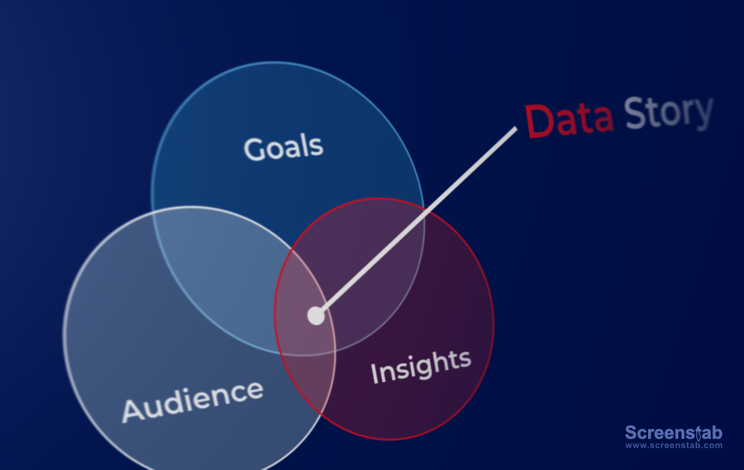
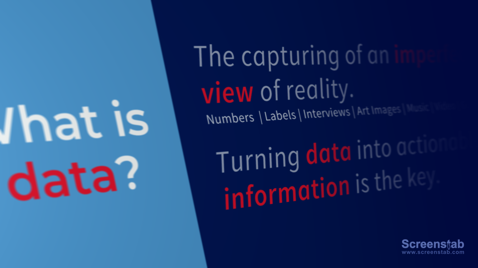
Data storytelling is quickly becoming a popular mode for presenting data. It combines text and graphics with data visualizations to guide an audience. Traditionally, people have used tools like PowerPoint and Excel, as well as traditional dashboard and business intelligence platforms, to communicate in this way. But these solutions are limited in their ability to balance the explanatory and exploratory elements of an effective data story.
We are seeing a new category of tool emerge: the data storytelling platform. It emphasizes features such as human-friendly visualizations, integration of text and visuals, narrative flow, connected stories, easy-to-learn authoring, and effortless sharing.
The demand for better data storytelling is being met by a growing collection of data storytelling tools. We evaluated tools that resembled the description above, leaving out more technical tools, visualization libraries, and old-school dashboard/report tools. In the end, we identified four unique categories:
Guided Analytics
Stand-alone Visualizations
Data Storytelling as a Feature
Design over Data
Stories with Words
Guided Analytics
These solutions combine exploratory data visualization with explanatory text and graphical elements. The interactive data storytelling applications created by these platforms are intended as an alternative to traditional dashboards and reports.
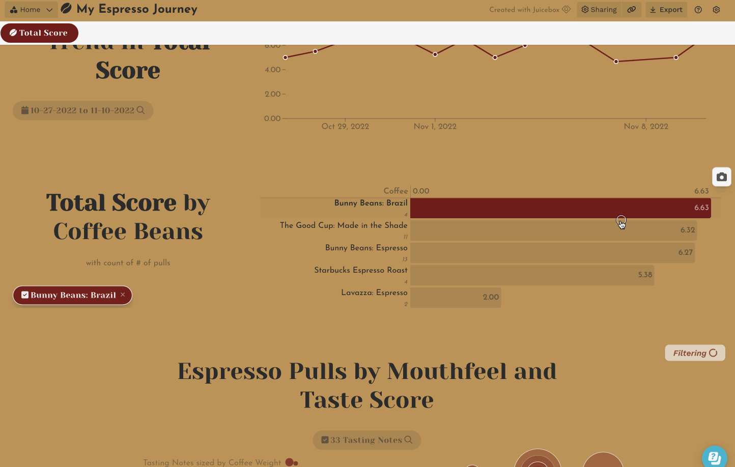
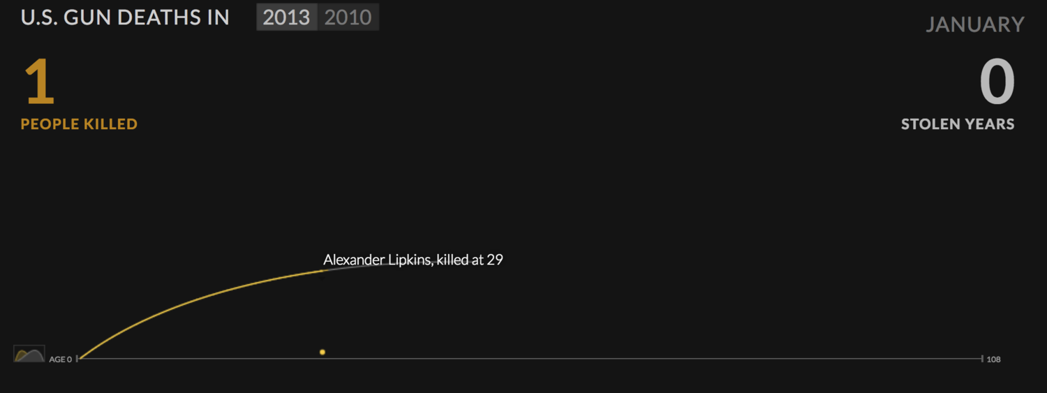
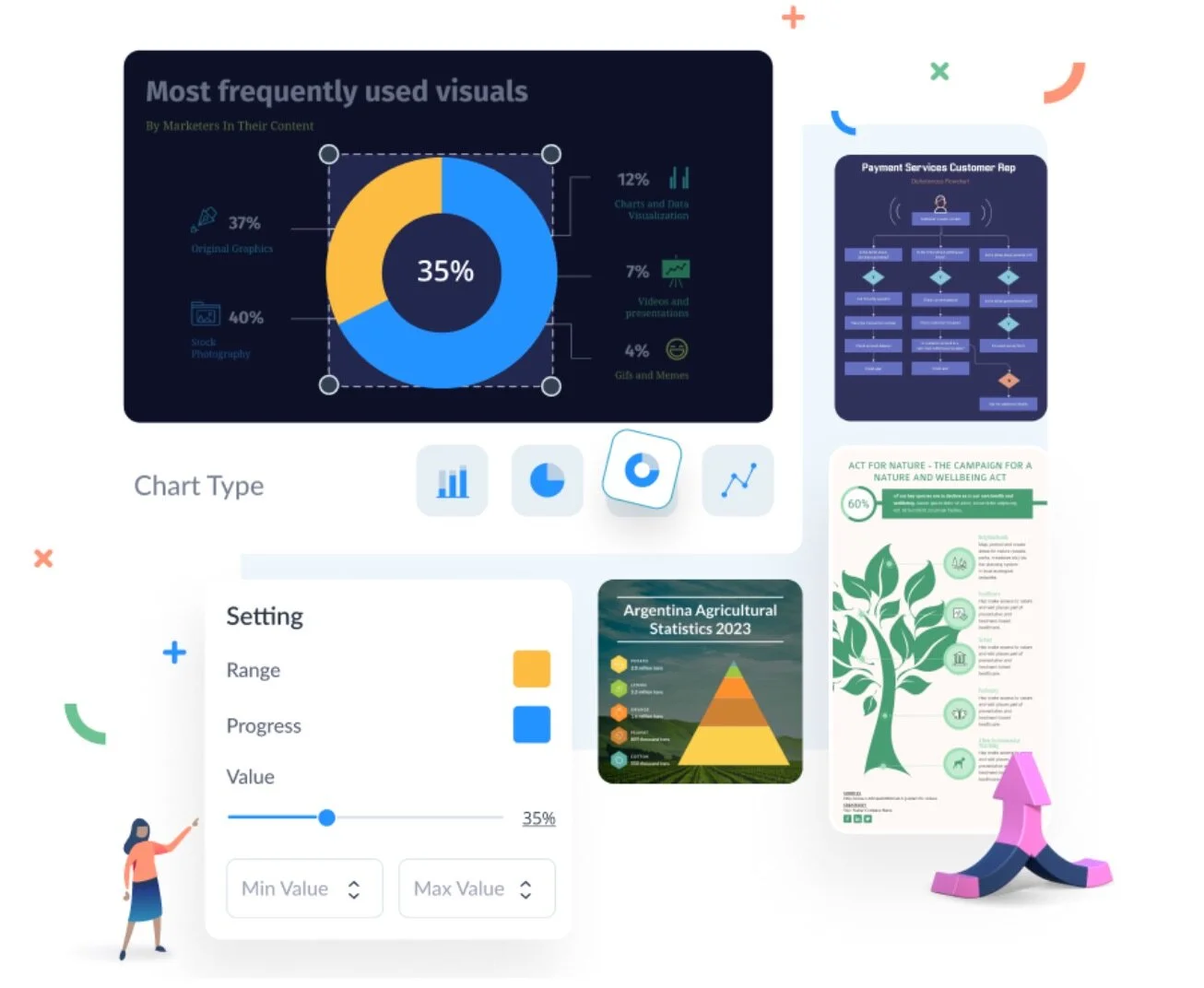
Juicebox
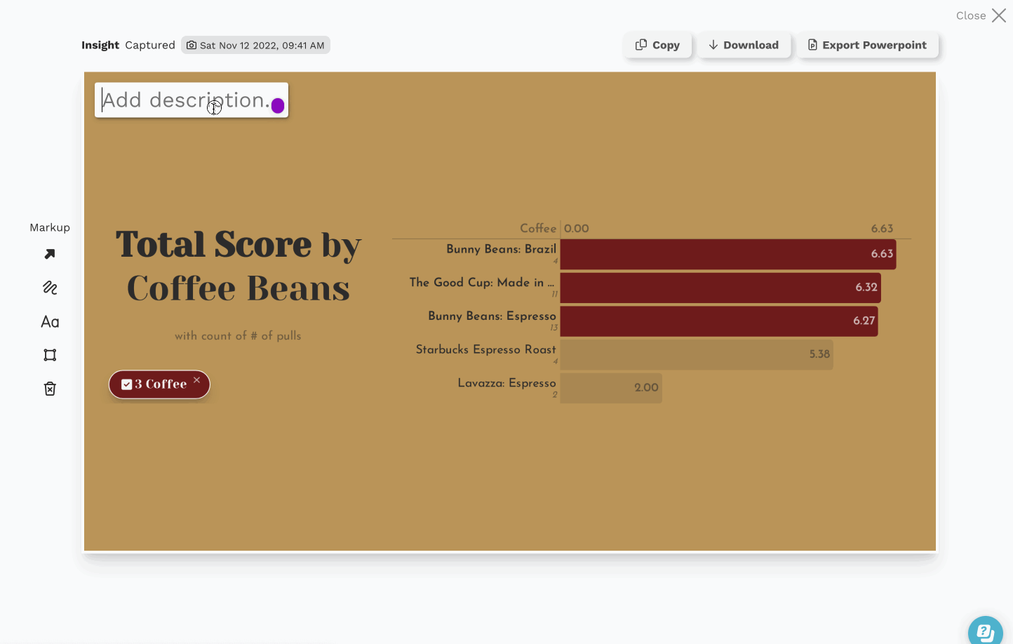
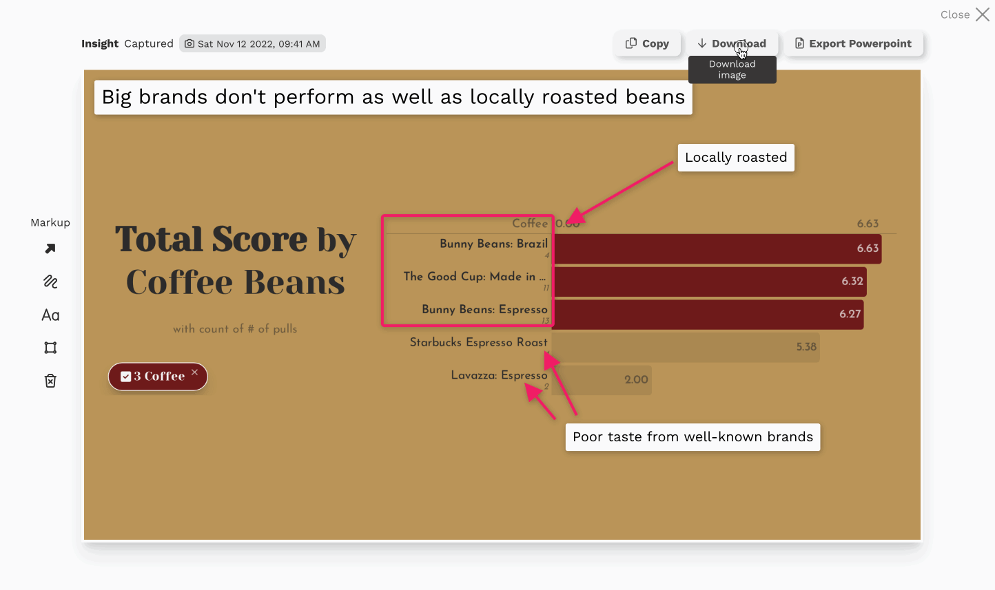
Juicebox combines modern, data journalism style with exploratory visualizations that are automatically connected to enable analysis. A focus on easy authoring makes Juicebox the only tool in this category that is accessible to non-technical or non-analyst users.
In their words: Deliver more “Aha!” moments in every data presentation. Present like the pros with custom graphics & interactive data.
Strengths: Lightweight, easy editing, professional web design, automatically connected visualizations.
Cost: 14-day free trial. Starter plan is $45/month.
Toucan Toco
Toucan Toco is one of the earliest solutions for data storytelling. This platform targets enterprise buyers and has a unique approach to presenting data stories. Sharing, annotation, and drill-in story views give you a chance to communicate a comprehensive overview of a topic.
In their words: Communicate actionable insights at scale using Toucan’s built-in no-code framework for storytelling.
Strengths: Dashboard-style layout; user management features; sharing via presentation-mode for sharing.
Cost: Annual subscription. Reach out for a quote.

Nugit
Nugit has flown under-the-radar for some customers but represents one of the most complete data storytelling solutions on the market. Attractive design combined with powerful text features make this a solution worth watching.
In their words: A better way to share data with colleagues and customers. Automated tools for creating data stories on web and email.
Strengths: Live API integrations, report/email automation, automated natural language generation, infographic-style graphics.
Cost: Not available.

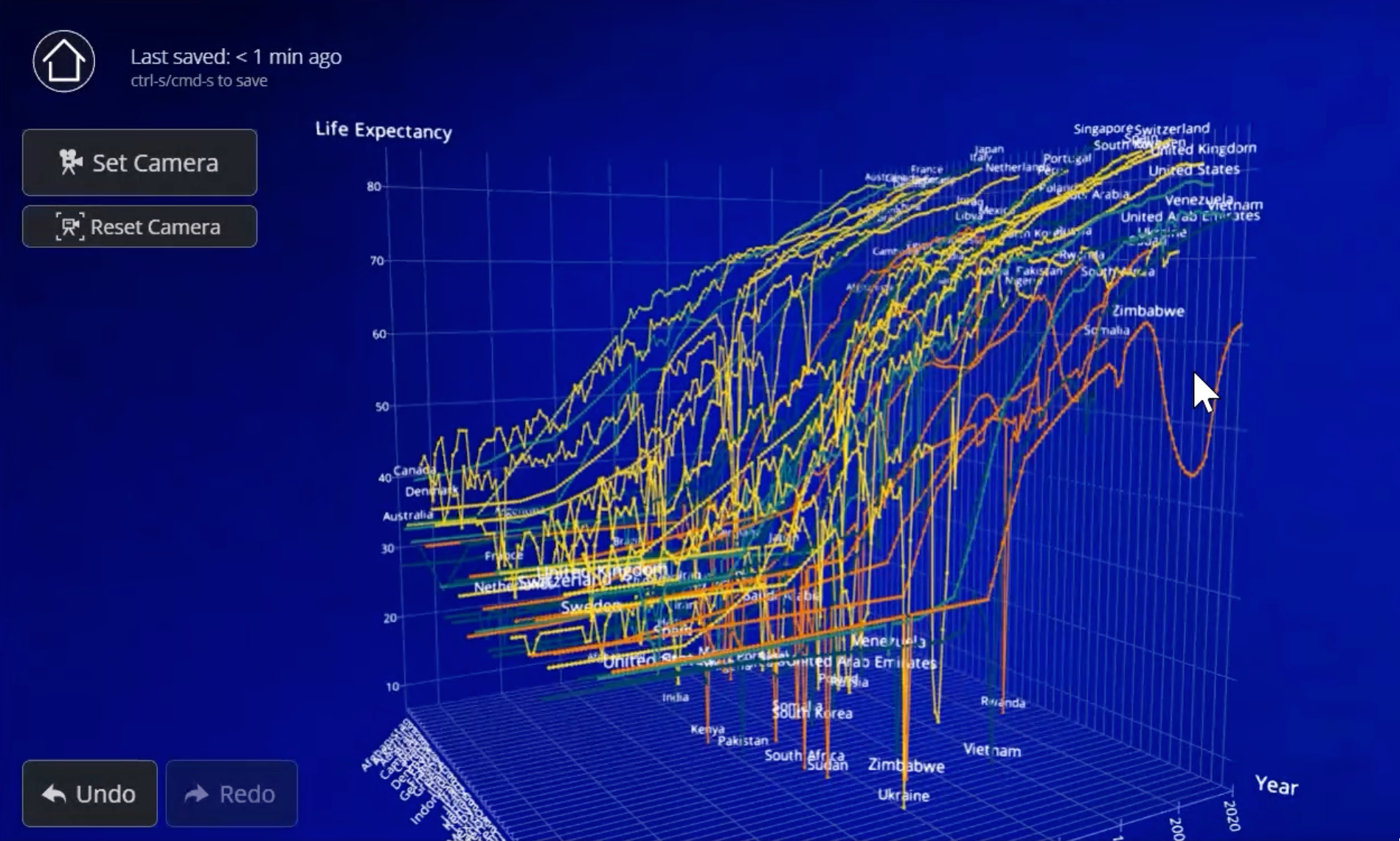
Flow Immersive
A unique approach to visualizations and storytelling. This platform is focused on eye-catching 3D visual outputs embedded with videos or Prezi-like presentations.
In their words: Author, present, and share immersive, interactive Flow data stories through the web, a recorded video, or in a meeting.
Strengths: Multi-dimensional visuals for showing many points positioned in 3-dimensional space.
Cost: $99/month. 30 day trial.
Stand-alone Visualization
These visualization solutions offer flexibility and beautiful design to build individual visualizations. The end-product is generally intended to be embedded in a webpage, often as part of an online article.
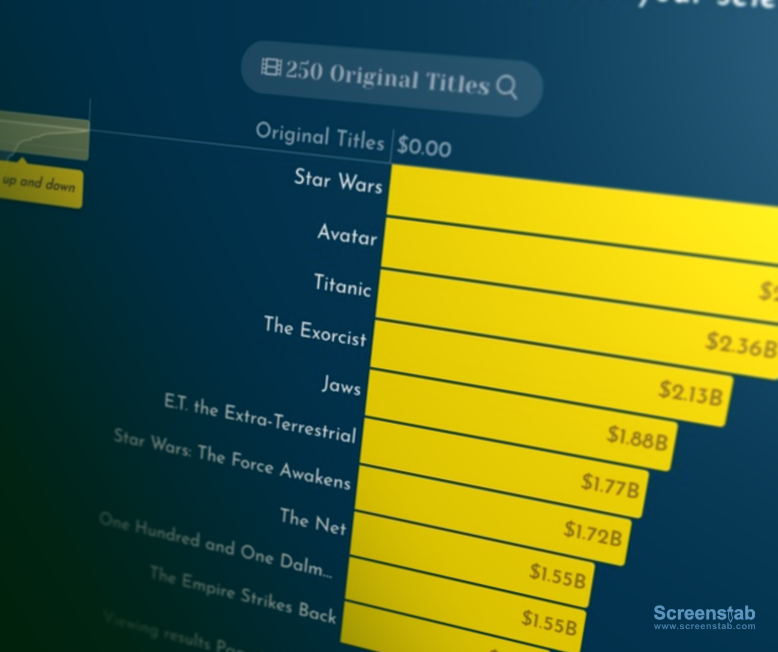
Flourish (acquired by Canva)
Flourish has built a loyal customer base by delivering creative and beautifully-designed visualizations. They are well-known for their racing bar-chart, but have many other visual options.
In their words: Easily turn your data into stunning charts, maps and interactive stories.
Strengths: Animated visualization, easy embedding, fine-grain configuration of visualiations.
Cost: Free tier. Paid plans start at $69/mo.

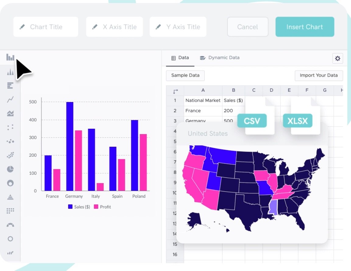
RAWGraphs
RAWGraphs is one of the quickest, easiest ways to create advanced visualizations. An open source project with a long history, this tool provides a simple step-by-step process to create downloadable images for embedding in webpages.
In their words: The missing link between spreadsheets and data visualization.
Strengths: Open source, lightweight editing, advanced visualizations, data doesn’t leave your browser.
Cost: Free.

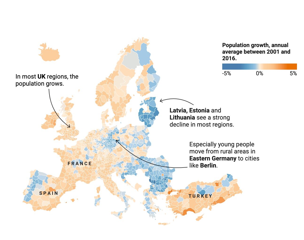
Datawrapper
Datawrapper is a popular tool for data journalist around the world. With a collection of attractive visualizations and advanced maps, Datawrapper gives you the configuration flexibility to craft the precise visual you need.
In their words: Serving charts and maps for millions of readers, every day. Datawrapper helps some of the world’s best teams to tell their stories with data.
Strengths: Maps, chart configuration options, labeling features, scaling for millions of views.
Cost: Free plan. Pro plan $599/month.
Data Storytelling as a Feature
This set of solutions are comprehensive business intelligence and visual analytics platforms. Data storytelling is presented as a feature or technique that can be accomplished within the larger platform.
Tableau Story Points
Tableau, a leader in visual analytics, saw the potential for data storytelling early on. They released a feature called ‘Story Points’ in 2014. The feature has not achieved wide-adoption among their customer base, and Tableau appears to be focusing on PowerPoint export options instead.
In their words: Story Points is a way to build a narrative from data. People tend to understand and remember concepts through stories. Story Points gives anyone the tools to create a narrative with data.
Strengths: Wide-adoption of Tableau; powerful data manipulation and visualization tools.
Cost: $70/editor/month

ArcGis StoryMaps
Built on the deeply established mapping platform, the StoryMaps feature allows for creating narrative descriptions to help readers navigate a geographically-focused story.
In their words: A story can effect change, influence opinion, and create awareness—and maps are an integral part of storytelling. ArcGIS StoryMaps can give your narrative a stronger sense of place, illustrate spatial relationships, and add visual appeal and credibility to your ideas.
Strengths: Mapping capabilities (ArcGIS is a market leader)
Cost: $500/creator/year

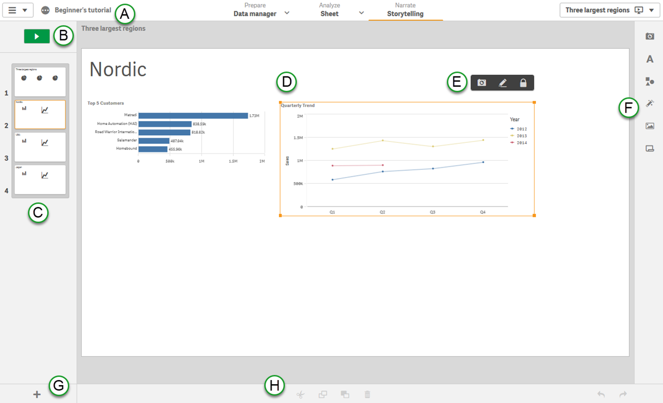
Qlik Sense Stories
Qlik Sense is a well-established analytics platform with strong visualization capabilities. While it gets less press than its competitors Tableau and PowerBI, Qlik understands the need to reach broader audiences in the enterprise through data storytelling.
In their words: The purpose of data storytelling is to turn data discoveries into a story. Emphasizing important elements helps create convincing stories and supports stakeholders in decision-making.
Strengths: Powerful querying technology enables rapid analysis.
Cost: $30/user/month
PowerBI
PowerBI is Microsoft’s answer to the success of visual analytics powerhouse Tableau. Like the other solutions in this category, PowerBI provides guidance, features, and instruction around data storytelling without providing a focused solution for users.
In their words: The job of a data analyst is not just technical. It entails more than just transforming data into information. It is also about clearly communicating the key messages derived from this data.
Strengths: Comprehensive BI platform; integrations with deeply-adopted technologies.
Cost: Pro starts at $10/user/month.
Observable
Observable is a collaboration-focused data exploration and analysis platform. Users can explain the data, workflow, and insights alongside visualizations.
In their words: Explore, analyze, and explain data. As a team. Uncover new insights, answer more questions, and make better decisions.
Strengths: Flexibility of visualizations; focus on narrative and descriptions alongside the data.
Cost: $12/editor/month (annual subscription required)

Design over Data
These solutions for designers are focused on creating infographics and presentations that may include charts and graphs as part of the document. The data is one of many media elements that tell the story.
Infogram
Infogram is a flexible design platform that includes capabilities for adding lightweight charts. It offers an array of formats for presenting information, including everything from dashboards and reports to social media posts and posters.
In their words: Create engaging infographics and reports in minutes
Strengths: Consistent branding, pre-defined templates, animations, output formats
Cost: Free plan. Pro starts at $25/month/user

Visme
Whether you want to create infographics, posters, social media graphics, or even videos, Visme is a designer’s toolbox. Like the other design-first tools, charts are intended to show a few data points rather than to enable analysis.
In their words: Create visual brand experiences for your business whether you are a seasoned designer or a total novice.
Strengths: A vast collection of icons and widgets; 1,000s of templates.
Cost: Free plan. Pro starts at $25/month/user
Piktochart
Piktochart is a design tool for building infographics, posters, flyers, social media graphics, and presentations. Data seems to be mostly an afterthought for a solution that focuses on brand, styling, and templates.
In their words: Improve your internal and external communication with Piktochart. Quickly turn any text- or data-heavy content into a visual story that your audience will love.
Strengths: Colors and branding, video stories.
Cost: Free plan. Pro starts at $29/month/user
Stories with Words
These solutions focus on using words as the primary way to convey the story in the data. Their algorithms identify insights in the data and present those insights in sentences and bullet points.
SiSense Narratives
SiSense is a traditional business intelligence and dashboard solution that has added narrative capabilities.
In their words: With Sisense Narratives, we use natural language generation (NLG) to automatically present you with calculations and insights in plain, easy to understand language based on what the engine recognizes as interesting.
Strengths: Integrated as part of a complete BI solution.
Cost: Not available.

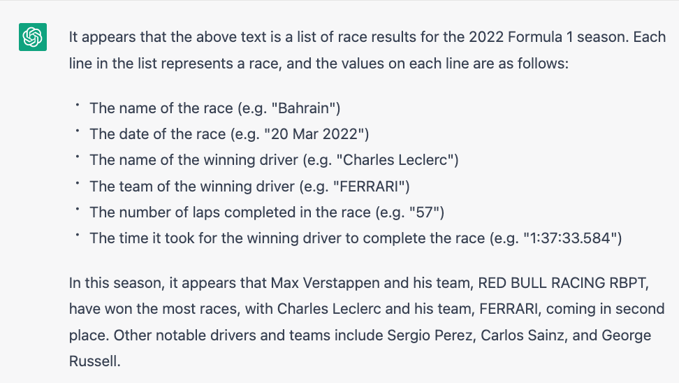
ChatGPT
After Tableau’s acquisition of Narrative Science, one has to wonder whether similar capabilities will become freely, or inexpensively, available through Artificial Intelligence tools like ChatGPT.
In their words: We’ve trained a model called ChatGPT which interacts in a conversational way. The dialogue format makes it possible for ChatGPT to answer followup questions, admit its mistakes, challenge incorrect premises, and reject inappropriate requests.
Strengths: Users are exploring using ChatGPT with data sets to see how it summarizes and extracts highlights. With the ability to recognize context and answer follow up questions, we can expect many more advanced solutions in this domain.
Cost: Free for now.
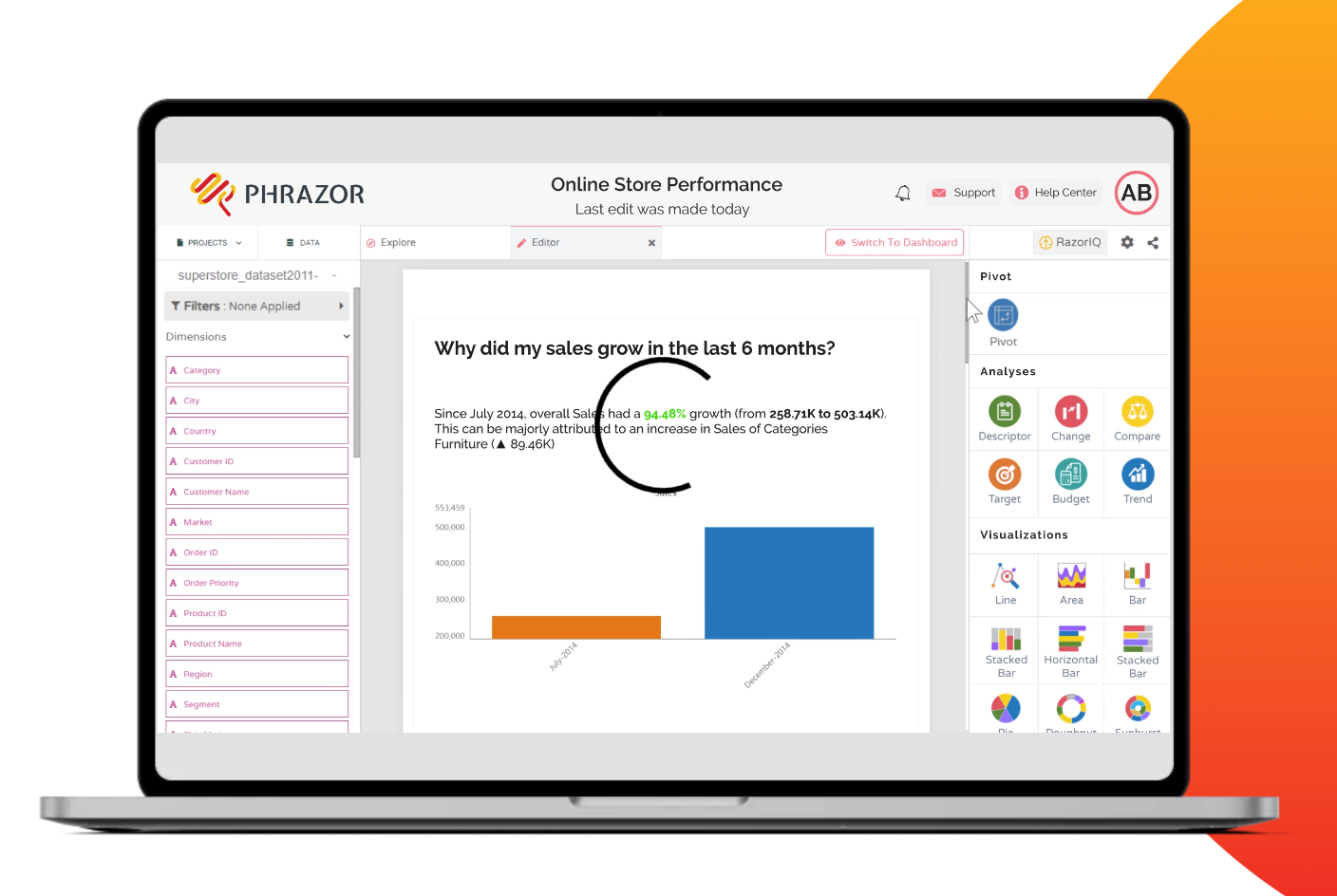
Phrazor
A focused solution for Natural Language Generation analytics
In their words: Explore, analyze and get meaningful insights to make data-driven decisions at the speed of thought.
Strengths: Conversational querying tool 'Ask Phrazor' even recognizes industry jargon.
Cost: 30-day free trial, $50 per editor per month.
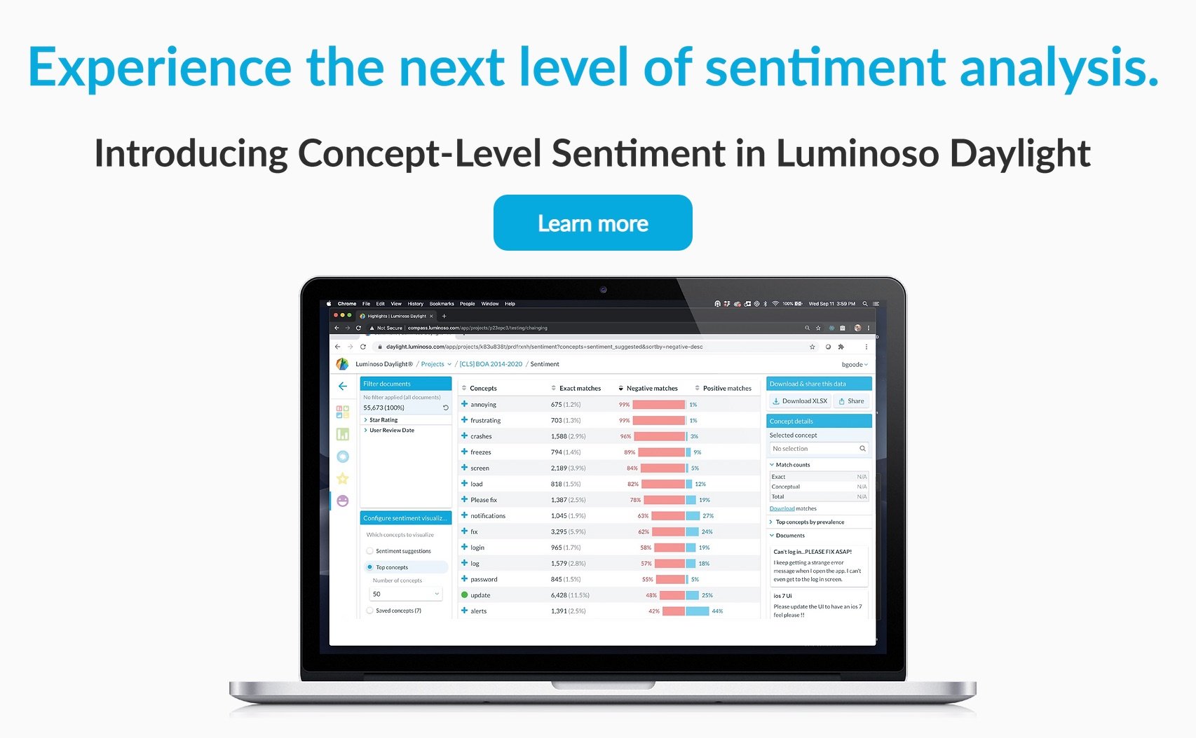
Luminoso
Luminoso’s products help people in customer experience, HR, and research roles to understand and extract understanding from text data.
In their words: Turn text data into business-critical insights. Luminoso allows users at all technical levels, and across any industry or use case to analyze unstructured text – no data science experience required.
Strengths: Automatically uncover topics of interest.
Cost: Not available.