Data Fluency

Data Discussion Lessons from Brad Pitt

Before Matt Damon impersonates an investigator in Ocean’s Eleven, Brad Pitt’s character delivers a little pep talk. 

Watch this 40 second clip:

Rusty Ryan (Brad Pitt) explains the rules of undercover conversation to Linus (Matt Damon). From: Ocean's Eleven (2001)

Now imagine yourself giving a pep talk to the next email, PowerPoint slide, or dashboard that you are about to send out. 

Presumably, your data is not meant to distort, yet we can gather from this short scene some practical communication tips to improve data-informed discussions.

Let’s break down the key moments.

Be natural.

[Damon takes an unnatural, stiff stance] “No good. Don’t touch your tie. Look at me.”


His first posture is fidgety and self-conscious with an overly professional stance. 

First impressions endure when it comes to perceived levels of interest and credibility. Most of us have an uncanny ability to sniff out a fake, and how data enters the discussion is no exception. We’re not computers, so we don’t enjoy an overwhelming data dump of facts, findings, and insights. Two paragraphs and 15 slides in, everyone wonders, “Where is this going? What’s the point?” Messages must be clear and focused and eliminate the unnatural, mechanical chart headings and the unnecessarily complex statistical jargon. 

Be honest.

“I ask you a question. You have to think of the answer. Where do you look? No good. You look down; they know you’re lying. And up; they know you don’t know the truth.”


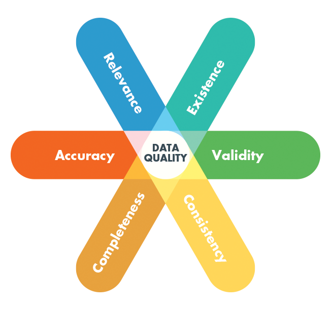
Be honest with what you do and do not know and what data you do and do not have. Your audience expects to have certain questions answered in order to take your information seriously. Your audience wants to both hear and understand answers to questions like these:

  • How do I know I can trust this data? How was it collected and who was involved?

  • How exactly is this metric calculated?

  • I see the number is X, but how do I know whether that is good or bad?

  • What’s the history of this number and the frequency of its collection?

  • How quickly does this number usually change?

  • Why is this useful for me to know? How will it change what I care about?

These questions aren’t novel. They follow the 5W’s basics. Yet they are often either left out or overcomplicated in most data discussions. The goal here is to acknowledge these needs in the simplest, most useful way.

Start with a (very) short story.

“Don’t use 7 words when 4 will do.”


With data, as with words, precision is as much an art as a science. Still, helpful tools exist. Ann Gibson wrote a relevant post and I highly recommend reading the article for all the details, but here’s the magical excerpt:

Once upon a time, there was a [main character] living in [this situation] who [had this problem]. [Some person] knows of this need and sends the [main character] out to [complete these steps]. They [do things] but it’s really hard because [insert challenges]. They overcome [list of challenges], and everyone lives happily ever after.

The beauty of this frame narrative is that it provides a structure for those who are too long-winded to focus on the essence of their own message, and it helps others whose ideas tend to dart all over the place to preserve a sequential flow.

Each of these [placeholders] are candidates for data context that help satisfy the previous "Be Honest" section. I mocked up a quick scenario that demonstrates a short story with useful data context:

Set your mark.

“Don’t shift your weight. Look always at your mark but don’t stare.”


You’ve likely heard of S.M.A.R.T. goals before, but are your charts smart? Something as simple as a target value by a specific date on a chart can work wonders at moving towards something tangible. People crave purpose, so set and communicate your goals. But don’t be that presenter who stares incessantly at your metrics and goals. 

Be enjoyably useful.

“Be specific, but not memorable. Be funny, but don’t make him laugh. He’s got to like you; then forget you the moment he’s left your sight.”


Jazz it up,” “Make it shine,” and “Make it pretty” are all phrases you’ve either heard or used yourself. Few situations are more disappointing than when a company tries to overcompensate with their insufficient, irrelevant data by lathering on the “wow factor.” Don’t succumb to making your data memorable for the wrong reasons. For businesses, the goal isn’t memorable chart-junk, but that does not mean your data should be lifeless and shallow.

Don’t leave people hanging.

And for God’s sake whatever you do, don’t, under any circumstances…”


The worst move you can make is to omit the call to action. End with clear next steps, key questions posed, or an action button that allows your audience to engage with immediacy, while your solid ideas are fresh and ripe for action.

9 Habits of Data Fluent Organizations — and How to Learn Them

With our book, resources and workshops, we’ve shared guidance about what it takes to become a data fluent organization. Most of all, it starts with cultural habits that get people focused on using data in their decision-making. At Juice, we are working everyday to create these habits and we wanted to share how we are building a data-first mindset and where we look for inspiration.

Habit 1: Define shared metrics

Data fluency requires getting everyone on the same page as to what matters most. Matt Lerner in conjunction with Business of Software delivers online workshops that help you determine your “North Star Metric” and the set of key drivers that are bottlenecks to achieving that overall success. He also emphasizes how the key drivers will change over time as you improve.

Habit 2: Create a shared vocabulary for your data

What is an “active user”? How do we track “first success” for a user? These are terms that need to be carefully defined and documented so we can move on to how we are going to improve them.

Val Logan of The Data Lodge is one of the premier thinkers on how organizations can build shared skills in using data. Check out her podcast: Speaking Data: Information as a Second Language

Habit 3: Evaluate the strengths and weaknesses of data sources

When we measure user activities for Juicebox, we have multiple 3rd-party tools and internal data sources to choose from. We needed to determine what sources are more reliably accurate, and what is the trade-off for convenience.

If you are going to lean on data, you want to understand its quality. Here’s an overview article from Neil Patel about assessing data quality.

Habit 4: Ensure transparency into how data is manipulated, modeled, and presented

You need to build alignment to avoid constantly reverting to discussions about the quality or meaning of your data. The discussion needs to move on to: What are we going to do to improve?

Alberto Cairo is a preeminent advocate for truth in presentation of data his book, How Charts Lie is a must-read on this topic.

Another thought leader in this area is Alan Schwarz, a journalist who has consistently used data to uncover hard truths.

Alberto Cairo gave the closing keynote address at the 2019 Great Lakes Business Intelligence & Big Data Summit hosted by WIT on March 7, 2019. In the past fe...

Habit 5: Use metrics as the starting point for everyday discussions

Getting focused on a few key metrics has started to transform how we work. We start meetings by reviewing how we are performing, then focus on what activities are going to move those metrics. For difficult choices, we have shared baseline: How will it impact our North Star Metric?

Fortunately, we have a tool in Juicebox that fluidly integrates data visualization with the ability to explain context, priorities, and next steps. It acts like a dashboard combined with a project management tool.

Habit 6: Established guidelines to create purposeful data products

A data-eager organization will spawn plenty of reports, dashboards, and data presentation in an effort to communicate and explore. A data fluent organization will be purposeful about why each of those data products exists.

You want to start with a clear understanding of the problem you want to solve and who is going to use the information.

We created a short Data Product Checklist to help evaluate if your solution is ready to share.

Habit 7: Develop a feedback mechanism for data products to evolve and improve

Your report or dashboard is a product. Like any other product, it needs to show value — even if you are only asking for your users’ attention. To fully discover that value, you are going to need to talk to users, improve, and iterate on the data and how you show it.

There are many ways to think about product development. We’ve found the product-led growth framework a useful set of guidelines.

In this video, you'll learn what product-led growth is and how you can use it to accelerate the growth of your business. 📺Subscribe To Our Channel and Get M...

Habit 8: Celebrate examples of quality data products

When you create data products that have made a difference, make a big deal out of it. These winning examples will give other groups in your organization a benchmark to pursue.

Here’s our 20 best data storytelling examples that show how to change minds with data.

wefeelfine.png

Habit 9: Leadership promotes a data-driven culture

Data fluency needs to emanate from the top because people emulate the behaviors of their leaders.

Few people have been studying and advocating for data-driven cultures longer than Tom Davenport, the Surgeon General of Analytics in the Enterprise.

Creating_a_Data-Driven_Culture.jpg


Keys to Data Fluency: Less Data, More Insights

The most common mistake in ineffective data products is an inability to make difficult decisions about what information is most important. Amanda Cox of The New York Times graphics department summed up this problem perfectly:

“Data isn’t like your kids—you don’t have to pretend to love them equally.” — Amanda Cox, New York Times Design Group

Photo: Unsplash - Etienne Girardet

Photo: Unsplash - Etienne Girardet

Often information gets included in data products for reasons that are superfluous to the purpose, audience, and message—reasons that cater the product to someone influential or use information that has been included historically. The bar should be higher. Here are a few strategies to help narrow down to the information that matters:

Find the core problem

Your data product should be more than a lot of data on a screen or page. It should have a core theme based on the essence of the problem. For example, a sales dashboard may be designed around the question, “How can we more effectively move leads through our pipeline?” Or a marketing dashboard may strive to answer, “How can we optimize our marketing investments?” Finding this core problem can give you the logic and argument for discarding extraneous information.

Ask a better question

Data requirements can quickly turn into a laundry list of unrelated metrics, dimensions, and half-baked analyses. The root of this problem stems from asking, “What would you like to know?” The follow-up question that narrows down the list of requirements is, “What would you do if you knew this information?” This question separates the novel and whimsical desires from the important and actionable information.

Push to the appendix

Sometimes, it is impossible to ignore the requests for certain information to be included in a data product. Multiple audiences demanding a multitude of metrics. In these cases, it can be helpful to create an appendix report that includes some of these requests. Doing so can help keep the focus on the most critical data.

Separate explanation from exploration

Tools designed for explaining data need to be narrowly focused with a clear topic and address a limited set of questions. Exploration or data analysis tools serve a different purpose. There are many data products designed to give the users a broad palette to explore a variety of data. It helps to understand which of these goals you are setting out to serve. Here’s an article with the five differences between exploration and explanation.


The success of many data products is determined by an ability to distinguish between useful, productive information and interesting but ultimately extraneous information. In short, we echo the sentiment expressed by French author Antoine de Saint-Exupéry:

“Perfection is achieved, not when there is nothing more to add, but when there is nothing left to take away.”

The Data Fluency Framework

Data alone isn’t valuable—it’s costly. Gathering, storing, and managing data all costs money. Data only becomes valuable when you start to get insights from it and apply those insights to actions. But how do you empower your organization to do that?

The answer is not simply a better dashboard or more carefully designed data visualizations. These are helpful, but small pieces.

The foundation of getting value from data depends on creating a data fluent culture in your organization. There are many benefits of having a data fluent culture, but what does it take to get there? Here’s the framework we first outlined in our book Data Fluency:

Data fluency is a web of connected elements. It requires (1) people who speak the language of data, (2) skilled producers of data products, (3) an organizational culture with the conditions to support data discussions, (4) and the systems, tools, and ecosystem to create and share data products. The Data Fluency framework explains the roles of individuals, the organization, and the systems necessary to achieve it.

(1) Data Consumers

The most fundamental element of your Data Fluency Framework is the individual or data consumer. Enabling these individuals to understand and draw deeper meaning from data is the fundamental condition for a data fluent organization. It takes more than a solitary listener to give meaning to data. When individuals are informed, they can participate in comprehensive dialogue around that data. This is the domain of the many data literacy training programs that have emerged (check out our partners). Becoming data literate boils down to being able to ask and answer three questions about data:

  • Where does the data come from? Not simply what database or system—rather, what real-life behavior does the data reflect? What is the scope and granularity of the data? And what do the data fields actually mean?

  • What can I learn from the data? People need to learn how to interpret charts, recognize the unexpected, and contextualize the data through comparison.

  • What can I do with it? The ability to take action on data requires both an understanding of the validity and reliability of the insights, and seeing how the insights connecting to the decisions available to you.

Data_Fluency_pdf__page_105_of_290_.jpg

(2) Data Producers

Your organization’s data producers must work with your raw data and deliver the content in ways that are easy to understand and act on. Each data consumer comes to the information with different priorities, needs, and perspectives. As a producer of data products, your successful translation of data builds on this variety as an asset - everyone in the discussion adds to the overall understanding of the group and finds their own insights.

To bridge the gap between data and an audience, the data author has a complex job. The author must decide what data is most important to focus on to answer the questions at hand, and how to optimally harness and depict data to inform thinking and action. Effective communication with data is a rare skillset. Here are a few hats that data product authors must wear:

  • Salesman—Data product authors must know their audience. To do so, they must consider how to best capture their audience’s attention, how they might perceive the data, and what it may take to gain the audience’s buy-in. An effective data product needs to be enticing, clear, and convincing to lead an audience to action.

  • Therapist—Data product authors need empathy—the desire and ability to understand and share the feelings of others. By getting into the hearts and minds of the audience, they can find the questions that are most influential. What will motivate an audience to action? What is the audience afraid of? How can the data address these concerns?

  • Connoisseur—The best data authors are willing to make tough distinctions between data that is interesting and data that is important and actionable. It can go against our nature to put aside data that others might want to see. But the desire to deliver everything needs to be offset by an appreciation for an audience’s limited attention span.

  • Data analyst—Data authors can’t create great art if they don’t like working with their materials. Data authors need to be comfortable with core statistical concepts and comfortable with manipulating data. Getting involved with deep data analysis can reveal the important messages and accurate ways to convey them.

  • Ethnographer—Data product authors should have a perspective on how the data product will fit into the way people work within their organization. How will the data product get incorporated into your audience’s workflow? How does information travel throughout the organization? What do people care about and what do they ignore?

(3) Data Product Ecosystem

To enable the flow of information and the creation and sharing of data products, you need standards, tools, and processes in place. A good example is what Apple did with the App Store in creating a platform and standards by which apps are created, tested, distributed, and reviewed. Your data product ecosystem is no different, you must come up with those same standards, tools, and processes to facilitate the data environment. We’ve worked with large enterprises to establish these pieces:

  • Standards are the design patterns and style guidelines that make it easier for data producers to effectively communicate with the data.

  • Tools enable you to design and build data products and ensure they are discoverable for your target audience.

  • Processes encourage the sharing of insights and collaboration between producers and audiences, as well as ensure data hygiene and quality throughout.

Data_Fluency_pdf__page_193_of_290_.jpg

(4) Data Fluent Culture

As your company develops more data consumers and producers, the data fluent culture will develop and flourish. Your company will develop your own unique dialect of data fluency through defining key terms, data collection, and interpretation. This leads your company to actions based on results and goals —and that is a culture everyone wants to have!

The ability of your organization to use data hinges on developing a team of people who share a common vocabulary and skillset to understand data. This culture often starts from the top. Leaders need to lead in three important ways:

  1. Set and communicate expectations. Data fluent leaders must lead by example. They should express expectations for quality data products and then use data products to support the organization’s mission. To build a data fluent culture, leaders must communicate using data to support their decisions and organizational priorities. By doing so, they set the standard for quality data products and demonstrate their data literacy in public forums, modeling the expected behaviors of their team.

  2. Celebrate effective data use and data products. Everyone watches leaders in an organization. What is appreciated, recognized, and celebrated by leaders signals the key values of the organization. In addition, these celebrations of work products provide an opportunity to demonstrate that high standards and performance are achievable.

  3. Use data to inform decisions and actions. Leaders and employees in a data fluent culture bring well-understood key metrics into meetings, understand how to measure the performance of a new project or product, and include data fluency skills in the hiring and employee evaluation processes.

Building a Data Fluent Organization

This framework (and our book) reveal some of the important areas you can work on:

  • Evaluate strengths and weaknesses;

  • Define an organizational plan;

  • Define training and skills needed;

  • Data product inventory;

  • Set a technology roadmap.

Pick up our book, Data Fluency, to learn more about how to create a data-fluent culture within your organization our check out our product Juicebox to experience the easiest way for everyday information works to communicate with data.

How to Create a Data Fluent Organization

The following is an excerpt from Chapter 1 of Data Fluency: Empowering Your Organization with Effective Data Communication. If you’d like to read the full chapter, download the PDF here.

Few people, and fewer organizations, consistently engage with the data and use it to guide their thinking. Our vision is for everyone, from front-line customer service agents to senior executives, to leverage the mountain of data at their disposal. Forget the complex Wall Street trading models or IBM’s Watson computer diagnosing disease—data in your organization can and should be used in simple, incremental ways to improve conversations, focus resources on priorities, and make small, everyday decisions with clarity.

Making use of data is a problem common to organizations large and small, public and private, and across market segments. According to a study conducted by the consulting firm Avanade, “more than 60 percent of respondents said their employees need to develop new skills to translate big data into insights and business value.”

With all the promise that data holds and the hope that data can help us make more informed decisions, the big question is: What is causing the gap between the vast opportunity of data and the reality of organizations struggling to act on this data? Here are a few theories:

  1. Many people are data phobic and unwilling to engage with data to make decisions.

  2. Technology and personnel limitations constrain organizations’ ability to work with their data sources.

  3. Organizational constraints inhibit the effective use of data.

We believe that data-phobia, technology limitations, or organizational dysfunction are symptoms of something broader—not the root causes of the lack of payoff we are currently realizing from data. The root cause is something we call “the last mile” problem. Fundamentally, failing to use data isn’t a technological problem, but a social problem.

The last mile analogy comes from telecommunications were bridging the final few feet from the big pipes carrying gigabytes of Internet traffic throughout your city to each individual house is the most costly. With data, collecting and storing information is the easy part. The technologists have done their job. It is analytics, application, and adoption that pose the greatest challenge. Although data storage can be done en masse, the last mile is personal and often organization-specific. Revealing insights, influencing decisions, and taking action requires skill and motivation at a personal and organizational level. This is the missing link—the last mile—requiring individual and organizational data fluency.

This book is about how organizations can more effectively communicate with data—both internally and with external constituents. It is about people and the specific skills needed to be capable consumers and effective producers of data-based reports and presentations.

Data Fluency cover.png

Data Fluency: Unlock the Potential Energy of Data In Your Organization

In many ways, data is like oil—and it is certainly so in the economic engine of your organization. Just like you can’t pull crude oil from the ground and pump it directly into your gas tank, or mold it into a plastic LEGO® brick, you can’t dump data into an organization and expect it to be useful. Creating value from data is a complex puzzle; one that few organizations have solved. Although there isn’t a simple answer (and thus why so many organizations struggle), the good news is that understanding the nature of the problem offers a starting point for our path forward. Data fluency is the path—the ability to use the language of data to fluidly exchange and explore ideas that are important to your organization.

In this book, the goal is to help you unlock the potential of data in your organization. Your data challenges have less to do with technologies and organizational constraints, and more to do with developing the capacity of data consumption and production within individuals and organizational teams.

Data fluency applies to individuals (everyone needs the skills to “read and write” and “listen and speak” using data) and also to organizations that must create an environment that rewards productive data conversations. There are many practical resources and books that address individual data skills. However, there are fewer resources for helping transform an organization to achieve data fluency. This book draws on foundational organizational development literature as well as best practices from current industry leaders.

The goal is to offer a framework that can help you understand the pieces required to construct a data fluent organization. At the same time, it provides practical guidance that you can act on. You don’t live in the theoretical, so the insights in this book won’t stop there, but instead are rooted in real-life examples intended to provide actionable guidance.

Our Data Fluency Framework

With the goal of helping you unlock the potential of data for individual work, for collaborative working teams, and entire organizations, we have developed a framework for data fluency. The framework, as shown below, portrays the skill sets and competencies that you can develop.

The framework specifies two primary categories of skills required to develop data fluency, namely those required to be an expert consumer of data presentations as well as the expertise required to be a skilled producer of data presentations. The development and application of these skills occur at two levels: the individual and the organization.

Want to learn more about Data Fluency? Download the first chapter.

We’ve also built a solution that makes it possible for anyone in your organization to create and share interactive data stories. It is called Juicebox.

The End of the One-Page Analytics Dashboard

Any viewer with a passing interest will (or should) want to know more, drill deeper, and ask “why?”.

The one-page dashboard was once the predominant form of visualizing data. It was the standard and the expectation. With touch screens, mobile devices, on-demand data, and interfaces crafted for interaction and user experience, the one-page dashboard is a relic. Use cases for one-page dashboards exist, but they are increasingly rare.

One-page dashboards came from the best of intentions: The objective was to provide an audience with a single view that showed all the key information together. In this way, the viewer could monitor important data and see where performance was good or bad, all at a glance with the necessary context.

A lot has changed since this type of dashboard was considered the peak of dashboard design (no offense to Jason Lockwood who did a great job within the confines of this exercise):

http://www.perceptualedge.com/blog

http://www.perceptualedge.com/blog

The admirable use of color and layout cannot overcome the misguided one-page constraint and disconnect from the needs of the viewer. You have to ask whether this form serves basic needs:

  • Can I see all the important information at a glance? While there is a lot of information, not all the useful detail finds a place (axis scales, for one thing). Worse, the volume of information is difficult to absorb with the exception of the person who is very experienced with the data.

  • Can you quickly spot the issue areas? The red dots are a start. But they skim the surface of the concerns that could be highlighted. And what if my definition of “concerns” changed based on the viewer's perspective? Furthermore, the viewer gets no guidance as to why certain items are highlighted and what they might do about it.

There is a broken assumption for one-page “monitoring” dashboards: seeing a problem (with whatever data can be fit on the page) is enough for the viewer. It seldom is. Any viewer with a passing interest will (or should) want to know more, drill deeper, and ask “why?”. A dashboard must not pass on this inherent responsibility to help the viewer. Identifying problems isn’t enough. A good dashboard attempts to help solve those problems.

Jerome Cukier describes the goal of purpose of dashboards:

“It’s about putting the needs of your users first...What is something that your users would try to accomplish that could be supported by data and insights?” 

The one-page dashboard is “a man without a country.” It tries to do too much for an executive who would much rather get an alert for the two problem areas...or at least more guidance about the meaning and relevance of what they are seeing. For someone who wants to engage more deeply with the data, the one-pager offers far too little. If done well, it only starts the conversation.

Changes in technology also undermine the premise of single-page dashboards. Trends in how we interact with information mean there isn’t a need to cram all the information together:

  1. The scrolling myth. A decade ago, asking users to scroll was nearly a sin. That’s no longer the case. Touch screens, mouse-scroll wheels, and gestures have made it easy and natural to move vertically on a screen. These interaction models have elongated what user experience designers consider a single screen. Our online experiences are entirely navigated through vertical scrolling. Scrolling acts as a form of guided gradual reveal.

  2. The power of dynamic interfaces. It was once a fair assumption that a dashboard would be a static snapshot of data, lacking the ability for users to interact with the content. Excel was the tool of choice and it took advanced Excel skills to make it interactive. Today dashboard building tools offer features for connecting key metrics to details that help explain reasons behind changes or outliers.

  3. The limits of attention. The information age has become the (limited) attention age. Mobile apps, smartwatches, and voice-activated interfaces recognize the need to deliver only the most critical information at the right time and let the user ask for more. The person provides context and desires; the computer provides notifications and answers. This new model of information exchange is at odds with the one-page dashboard. It is unreasonable to expect someone to stare deeply into the densely packed digits and sparklines of a one-page dashboard. There are better ways.

Scrolling-style dashboard

Scrolling-style dashboard

Nevertheless, the goal of the one-page dashboard remains: How to show viewers the big picture and understand it in context? How to encourage people to connect the dots across different data points? Modern interfaces have brought us better means to these ends.

Often there isn’t a meaningful distinction between dashboards to monitor and dashboards to understand. Monitoring highlights problems — and should flow seamlessly into the analysis of the root cause.

The best dashboards do even more: they guide viewers to details that are actionable, tell viewers what actions can be taken, and enable discussions between colleagues. All this doesn’t happen on a single page.

The Last Last-Mile of Analytics

Discover & share this Field Of Dreams GIF with everyone you know. GIPHY is how you search, share, discover, and create GIFs.

I was wrong about the “last mile of analytics.”

Over a decade ago, this was a term we started using to express the challenges of the analytics (then: business intelligence) world. We highlight how many organization struggled to bridge the gap between their data investments and the minds and actions of decision-makers:

This critical bridge between data warehouses and communication of insights to decision-makers is often weak or missing. Your investments and meticulous efforts to create a central infrastructure can become worthless without effective delivery to end-users. “But how about my reporting interface?” you wonder. That’s a creaky and narrow bridge to rely on for the last mile of business intelligence.

When we talked about “the last mile” we emphasized the need to better visualize data and communicate insights.

But I missed something. You can make a data product that is intuitive, friendly, simple, useful…but it still needs to be sold.

Sold?! It is an ugly word for many data people. But if want people to use your data, you need to change behaviors and assumptions. You need to convince your audience that it is worth their attention.

For example, we’ve been working with a global manufacturer committed to becoming more data fluent and data-driven across their worldwide operations. They have invested in data warehouse efforts and designed thoughtful new dashboards. Fortunately, our client realized that “built it and they will come” is a fantasy. Instead, we’ve helped them with a comprehensive plan to ensure their data has impact:

  1. Train a cohort of evangelists in data storytelling to improve the quality of the data products;

  2. Develop an internal communications campaign to go alongside their data product rollouts, explaining the value and purpose of each solution;

  3. Create a support structure and tutorials to ensure that data product users fully understand each data product;

  4. Gather feedback and update their data products.

More than anything, the data leadership team recognizes that technology and design are not the complete answer. They also need to change the culture and attitude of the organization.

This is the Last Last-Mile of Analytics, the selling and changing of minds to ensure your data gets used.

Discover & share this Workaholics GIF with everyone you know. GIPHY is how you search, share, discover, and create GIFs.


Too Many Buttons: Gaming and The Would-Be Data Analyst

The official GIPHY channel for Saturday Night Live. Saturdays at 11:30/10:30c! #SNL

Have you watched a teenager play Xbox? It is kind of magical. The dizzying action on screen is a tribute to the uninterrupted connection between his mind, fingers, and controller.

Now and then, my son will twist my arm to play FIFA. My poor soccer team stumbles around the pitch. I have two things I know how to do — pass and tackle — which leads to a lot of yellow cards and few goals. I don’t find it fun. And I am certainly not able to express myself through the game.

I’d love to battle head-to-head. But I’ve been left behind, and I’ve given up trying to catch up. Fortunately, it just gaming — I have better ways to spend my time.

But what if we were talking about my professional career?

If your job touches data, this is how it can feel. I talk to people all the time who feel left behind. They know what they should be doing to bring data into their organization. They have a vision for how data should be presented and shared. Yet the actual working with data feels like mastering the 12+ input devices on an Xbox controller (“Dad, just hit L-B to switch players!”)

https://support.xbox.com/

https://support.xbox.com/

The complexity of being in-the-game keeps rising. Your controller — let’s call it Tableau or PowerBI — keeps getting more buttons. The experienced data users gain new moves, new tricks. Great for them; not good for the noobs. This is where we’ve lost the thread in the analytics industry:

  1. A lot of analytics isn’t about more complexity, more features, or even bigger data. Many organizations are stuck in the starting gate just trying to do the basic things right. Show me some metrics, let me explore the drivers, and let me talk with other people about what we are seeing.

  2. Complexity creates a steeper learning curve for the new data users. We aren’t inviting new people in; we’re catering to those already in.

Casual gaming was the answer in the gaming world. Invite people who don’t identify themselves as “Gamers” to enjoy a low-barrier distraction. Games like Among Us explode in popularity when accessible game play combines with fun game dynamics.

When there are fewer buttons, I’m back in — playing a game and bonding with my son. Now I only lose because of my limited skills at deception, not because I’m a clumsy button masher.

For more on what we can learn from gaming.

New Years Resolutions to be a Better Data Product Manager

It is the the New Year, my favorite time for New Year’s resolutions. Time to look inward to see how we can change ourselves to change your world.

If you’re responsible for a data product or analytical solution, you might consider a little self-reflection in pursuit of a better solution for your customers. Here are a few places to start:

annie-spratt-54462-unsplash.jpg

Empathy

the ability to understand and share the feelings of another.

When it comes to data products, you’ll want to foster empathy for the users of your data. More likely than not, they have concerns such as:

  • Your data may replace their power in the decision-making process.

  • They don’t have the data fluency skills to properly interpret the data and what it means for their decisions.

  • They are afraid of changes that will impact how they do their work.

Appreciating and acknowledging these fears is a first step in building trust with your users.

zach-reiner-631836-unsplash.jpg

Learn to flow

“I would love to live like a river flows, carried by the surprise of its own unfolding.” — John O’Donohue

We all a little guilty of wanting to make others bend to our view of how things should work. This year, you may resolve instead to “flow like water.”

Data products should enhance how people make decisions, giving them the right information at the right time. This is best accomplished when the data product can fit into the existing workflows so you are augmenting the user’s role rather than trying to change it.

holger-link-699972-unsplash.png

Patience

“Wise to resolve, and patient to perform.” — Homer

Patience is accepting that progress takes baby steps. This is a critical skill to help manage your data product ambitions. The possibilities for analytical features can seem limitless — there are so many questions that should be asked and answered.

Beware this temptation. You’ll want to find the most impactful data first to allow your users to learn what they can learn. Before you try to do it all, have the patience to gather feedback and plan your next release.

nikhita-s-615116-unsplash.jpg

Growth mindset

“People believe that their most basic abilities can be developed through dedication and hard work.” — Carol Dweck

Analytics is best served by a growth mindset, the belief that taking on a challenge (and sometimes failing) with expand one’s mind and open up new horizons. Useful analysis begets questions, which leads to more analysis and even better questions.

As a data product manager, you want to encourage this growth mindset in your customers, encouraging and enabling them to expand their understanding of their world.

tobias-mrzyk-569902-unsplash.jpg

Inclusive

“We are less when we don't include everyone.” — Stuart Milk

Every year I tell myself I need to be better at meeting new people and keeping up with old friends. It’s a good ambition if you are leading efforts on a data products. It takes a diverse set of roles to get the support and commitment in your organization. Have you gotten legal on board? How about IT security? Does marketing and sales understand the value of your data product and who you are trying to target? You may need to change the way people think about making use of data to build company-wide support for your solution.

Data Fluency Dorks Unite

How we communicate data is broken.

There. I said it.

It may not be nice to hear, but deep down you know it's true. You can see it in the way that data gets delivered to audiences: email attachments no one wants to open, 50-page slide decks filled with never-ending complex charts, and scrolling pages of dashboards with no context around them. It's not only messy, it interrupts the ability to adequately share and communicate important information about data.

So what's the solution? How do we deliver data to audience where they can draw out conclusions and information that is going to be meaningful to them? The answer: data fluency.

Data fluency, or data literacy, is something that we at Juice have been talking about for years (we literally wrote the book on it). We recently sat down with Dalton Ruer, or as he's more familiarly known around the web, QlikDork, to discuss the details of data fluency and how to achieve it. Check out the video below to hear from Juice CEO Zach Gemignani and Global Head of Data Literacy at Qlik Jordan Morrow and learn what having data literate consumers means, how to get good at choosing visualizations and weaving them into engaging stories, what a data fluent culture looks like, and so much more.