Getting unstuck: Give your data a jumpstart

It’s a predicament that we’ve seen many times over: your data is stuck. You’ve tried some reporting through some Excel pivot tables, or you’ve messed around with a Tableau trial, but felt like there wasn’t enough engaging content to get your users excited. Rationalizing why you can’t get your data to be impactful for your business, you think things like, “maybe my users are talking about the data but I just don’t know about it” or “maybe the data isn’t structured in a way that allows for valuable insights to be extracted from it."

If you’re sitting there thinking that your mind is being read by our artificial intelligence, you’re wrong. It's because at Juice we have seen this scenario played out too many times and we’ve made it our mission to make these issues a thing of the past. What you need to do is give your data a jumpstart.

Here’s our suggested plan of action for getting your data unstuck and giving it the jumpstart it needs:

1. Get your data into a readable structure.

  • The first row of your data should always represent the column’s title
  • Columns should contain the same type of values, respectively

  • Each row should represent a case or a single instance within the data and should contain a date of when that data was collected. This means that two different rows in the data can represent the same entity with data collected for it at different points in time.

  • As a consequence of the rule above, the data should include a row identifier column that can be repeated to indicate that different rows of data are representing the same entities.

  • Make yourself a metadata sheet (also commonly known as “data definitions”) that you and other users of the data can refer to.

Here are some simple example data & metadata using the principles above.  

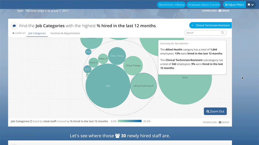
2. Present your data in hierarchical manner catered to specific audiences.

  • Give your audience a call-to-action, let them know why the data is important and why they should care.

  • Begin with presenting high-level key metrics. Think about what the most important numbers are you to your intended audience(s).

  • Give your audience the option to select a few different categories in which to segment and parse-out those important numbers. Doing this will allow your audience to drill-down in the data to get from a high-level to a granular level.

  • Allow your audience to take the data they have drilled down to with them. This could be one row of data out of the thousands they started with at the high-level.  

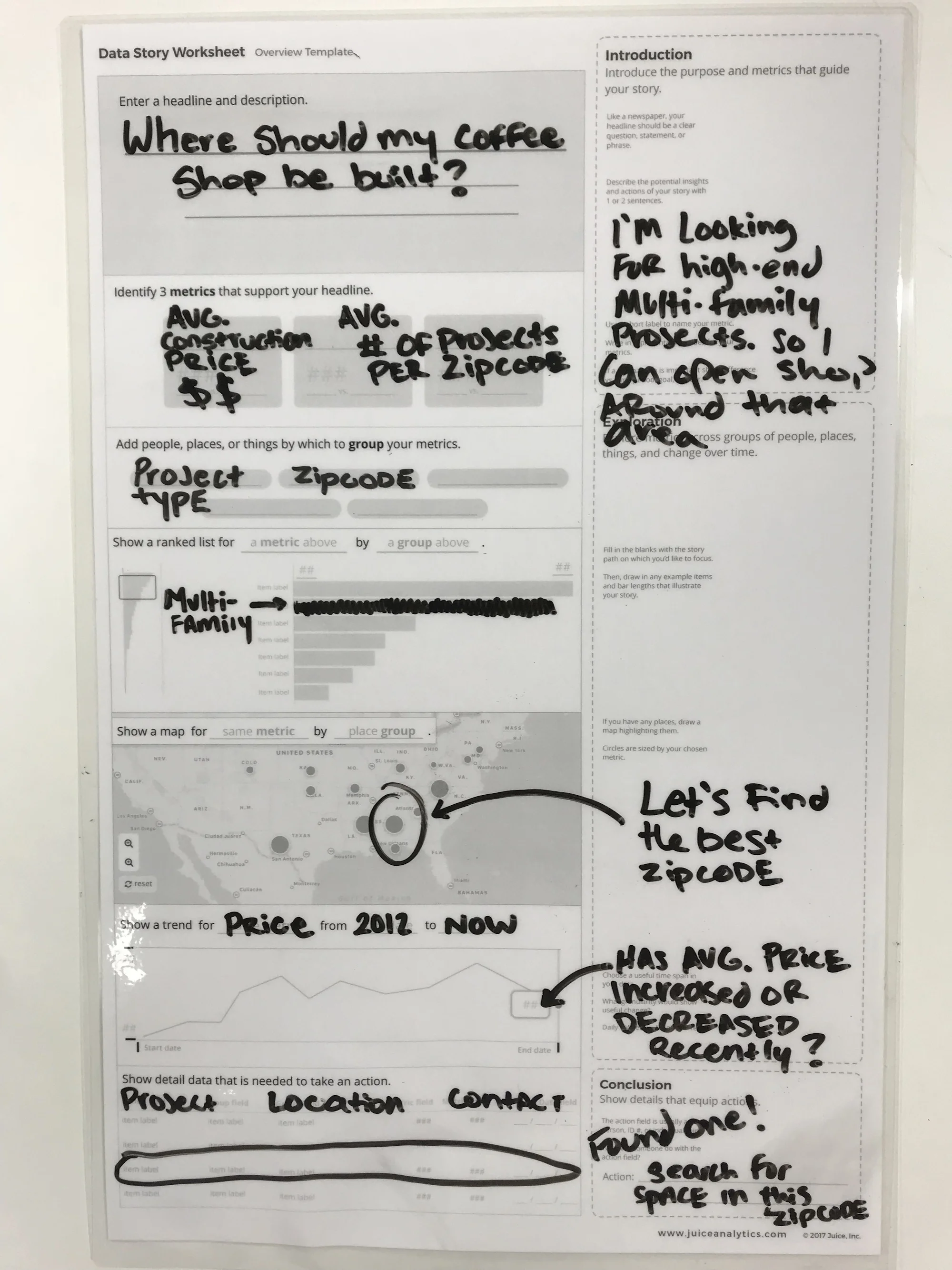
Here’s an example of this data presentation flow.

3. Engaging your audience in data discussions

  • This one is self-explanatory: talking about the data with others is the best way to squeeze the value from it.

Here’s an example of effective data discussions.

Sounds like a good plan of action, right? If you're still not sure what your next steps should be, we’re here to help.

We’ll work with you to get your data in a structure that makes it valuable, or even create data for you. We’ll build you a data story with that data that helps you and your users understand the data so that you can turn data insights into business actions. We’ll get your users engaged in data discussions and app design feedback so that you know they’re engaged with the data and you know how valuable they perceive the app to be. So drop us a line, we’re here to help.

6 Cool Companies Who Are Rethinking How We Work

It can be a challenging climb to reshape how people think about solving problems. We encounter this challenge daily as we work to build the best solution for communicating data the world has ever seen. We operate in an arena where good-enough solutions — Excel, PowerPoint, and other visual analytics tools — have left people with deeply-rooted habits and a blasé acceptance of the status quo. That’s not good enough for us, and it isn’t good enough for these six companies that are rethinking how business tools should work:

Slack

slack.png

Slack is the current king-of-the-hill for shaking up the status quo. Sure, we had email, file sharing, and messaging apps before Slack, but we didn’t have single, elegant tool for team collaboration.

What’s cool about it?
Slack made integrations easy from the start. We use everything from ChatOps with our development team to HeyTaco for everyday appreciation of our colleagues. Slack's approach to 'channels' found the right balance for open communication by topic.

Flourish

flourish.png

I only recently stumbled across the excellent visualizations available through Flourish. There are many, many tools for putting data visualizations on a screen; few vendors are so obviously passionate about their craft. 

What’s cool about it?
Flourish is more than another charting library — they are making world-class visualizations accessible. I was particularly impressed by the clever use of animation in those visualizations. At Juice, we appreciate that new users won’t always be able to read a visualization without some guidance. Animation can help draw a user’s attention to the most important information right off the bat.

Kialo

kialo.png

Kialo is “a debate platform powered by reason.” It cuts through the noise of social and online media by removing the worst parts of debating online (trolls, fake statistics, unrelated cat gifs) while strengthening the best.

What’s cool about it?
Kialo creates a structured dialogue with visualization, voting, and commenting. Whether discussing politics or the merits of a new project, Kialo has focused on an overlooked need: a place other than the comments section to examine arguments and consider new viewpoints. 

Typeform

typeform.png

Typeform is "the versatile data collection tool for professionals." It's a thoroughly modern survey-building solution that I’ve enjoyed using for over a year.

What’s cool about it?
Typeform's survey-authoring interface is remarkably intuitive. Adding questions, structuring logical flows, and navigating your survey is silky smooth. Similarly, the end-user experience is beautifully designed with selectors and animations that make it (almost) fun to fill out a survey.

Beautiful AI

beautifulai.png

From the founder of SlideRocket, Beautiful AI is a next-generation solution for creating web-based presentations. They say all you have to do is "think of an idea, choose a template, and get to work."

What’s cool about it?
Beautiful AI has taken a giant leap past a tool like Google Slides. It comes with a collection of smart slide layout templates. Better yet, these slide layouts automatically update as you add more content. The tool also comes with an easy-to-use integration with third-party image libraries so you can incorporate pictures into your presentation.

Toucan Toco

toucantoco.png

A data storytelling solution to build data apps for your business. We may be a bit biased, but that sounds awesome.

What’s cool about it?
While I don’t have hands-on experience with this solution, I love their message. Like Juice, they see the need to:

  • Communicate data to non-analysts with guided narratives ("Address the remaining 99% of your employees”)

  • Create targeted applications that solve specific business problems (“A business need = an app”)

  • Include simple, clear data visualizations ("The comfort of using consumer apps, finally in a business setting”)

Honorable mentions

  • Quid: Quid puts the world’s information at your fingertips, drawing connections between big ideas.

  • Skuid: Accelerate deployment of personalized applications that let your business people drive innovation, without the wait.

  • Trifacta: Trifacta enables anyone to more efficiently explore and prepare the diverse data.

  • Datawrapper: Datawrapper makes it easy to create beautiful charts.

Thinking about changing the way you work? Check out our app trial process. Download the info sheet below to learn more.

Data Fluency Dorks Unite

How we communicate data is broken.

There. I said it.

It may not be nice to hear, but deep down you know it's true. You can see it in the way that data gets delivered to audiences: email attachments no one wants to open, 50-page slide decks filled with never-ending complex charts, and scrolling pages of dashboards with no context around them. It's not only messy, it interrupts the ability to adequately share and communicate important information about data.

So what's the solution? How do we deliver data to audience where they can draw out conclusions and information that is going to be meaningful to them? The answer: data fluency.

Data fluency, or data literacy, is something that we at Juice have been talking about for years (we literally wrote the book on it). We recently sat down with Dalton Ruer, or as he's more familiarly known around the web, QlikDork, to discuss the details of data fluency and how to achieve it. Check out the video below to hear from Juice CEO Zach Gemignani and Global Head of Data Literacy at Qlik Jordan Morrow and learn what having data literate consumers means, how to get good at choosing visualizations and weaving them into engaging stories, what a data fluent culture looks like, and so much more.

You're Invited: Data Monetization Workshop 2018

Juice is proud to announce that it will host the third annual Data Monetization Workshop on Thursday, March 29, 2018 at the Nashville Technology Council’s Tech Hill Commons. Created by local data expert Lydia Jones in 2016, the Data Monetization Workshop brings together some of the top data and analytics practitioners in the country to discuss how to deploy data monetization in a business setting.

This year’s workshop will feature speakers and panelists from companies such as BuildingFootprintUSA, Crystal Project Inc., Dawex, Digital Reasoning, and Uber. The topics covered will be: 

  • The Now: What are the opportunities and business models you should consider to monetize your data? E.g. enhancing existing products, new data products, data marketplaces.

  • The Future: How will emergent technologies such as IoT and AI unlock new opportunities and challenges for data monetization?

Prior to the workshop, attendees will have the option to attend a data storytelling seminar led by Juice Analytics employees. The seminar will showcase Juice’s unique method for quickly and easily creating data stories from a given data set. The workshop will conclude with an open bar networking event.

Attendees in the past have come from Florida, Texas, New York, Georgia, California, Canada, and Australia, and across industries such as healthcare, finance, retail, technology, and government. They are typically members of the C-Suite (including CEOs, CMOS, CFOs, CXOs, and CAOs) as well as data and analytics leaders, data scientists, investors, and data product development leaders, among others.

To learn more about this year's Data Monetization Workshop, visit the link below. Please be sure to register in advance as seating is limited. We hope to see you there!


What's in a Juicebox: Narrative Flow

Do you remember when Facebook first launched its News Feed? I do. I can recall complaining with friends that it was "too stalker-ish" (we were right) and that "no one was going to use it" (we were wrong).

Today it's hard to imagine Facebook without its signature News Feed, but for a long time I did not care for it at all. That's because once people get used to a certain way that things operate on the web, they don't like it when those practices are changed. Not only do they dislike change, but they come to expect certain design practices online. Take for example the horizontal navigation bar found across the tops of web pages: around 88% of websites have its main navigation panel there on every page. Nine times out of 10, that's the first place a user will look when attempting to navigate through a website.

Another piece of design experience that all users expect is vertical narrative flow. Web pages flow from top to bottom and as you want to learn more about a company, product, piece of news, etc. you scroll down.

Juicebox is not unique among BI solution to offer a design layout that flows from top to bottom. Infographics and web pages have taught us that people want to read data the way the same way that they read text. However, Juicebox has a special ability to seamlessly connect the narrative flow, dynamic textual content, and complex filters to give users an effortless experience while navigating data.

interactive-slices.gif

Narrative flow is essential to the experience of Juicebox and our user-centered design. As a user interacts with a Juicebox application, they are continually making decisions about what they would like to see in the data, what relationships are most important to them between segments and tables, and what details they need to make informed decisions. All of these complex interactions are done behind the scenes as Juicebox provides that infographic-type feel in a web-based format.

gif-Narrative Flow.gif

Can you think of a situation where you need to deliver data to an audience of users? Maybe it is customer reporting or a data model that needs a user interface for people who are not data savvy. In recent months we have made it even more easy for you to get started with Juicebox. Through our Guided Design Process you can see your data in Juicebox and give access to 10 users so that they can experience the ease of navigating through your data in a narrative flow. To learn more about Juice's Guided Design Process, check out our resources page.

You Don't Need a Slide Factory

You might be surprised to learn that one of our most popular blog posts of all time is Automated PowerPoint Generation, or Making a “Slide Factory.” Even though this post was published almost nine years ago, month after month we continue to see it rise to the top of our most visited pages. 

Whenever someone reaches out to us asking if we have a ‘Slide Factory’ solution, we tell them two things:

  1. Sorry, we do not.

  2. You don’t actually need a slide factory.

In fact, the need for automated presentation delivery is the genesis of our data storytelling solution, Juicebox. We are intimately familiar with the need to deliver data to customers, co-workers, stakeholders, etc., in a consistent, structured manner that communicates a message while providing each person with the data that is most relevant to him or her. Instead of attaching a 50-slide PowerPoint deck, Juicebox does that same job with an interactive reporting application. Users benefit from a guided analytical story, ability to capture insights, and features to collaborate with others.

Not only do your users benefit, but you no longer have to deal with report production and ad hoc headaches! Juicebox was designed with the data consumer in mind, meaning that the need to spoon feed your audience data and information through long-drawn-out PowerPoint slide decks is no more. 

Screen Shot 2018-01-03 at 5.50.06 PM.png

In recent months, we have made it more affordable and simpler than ever to get started with Juicebox. Through our Guided Design Process, customers are seeing what their data looks like in a Juicebox application within days not months. We give you four weeks and ten user accounts to test Juicebox with your data, you have plenty of time to get user feedback and build a business case for using Juicebox. Pricing starts at only $6 per user (with a 50 user minimum). With tiered discounts for more than 500 users, Juicebox is a competitive option for any budget!

If you would like to test drive your data in Juicebox, fill out our Get Started form and we will be in touch ASAP.

Check out some of our Juicebox apps in action:

Gift Ideas for Data and Visualization Lovers: 2017

It's that time of year again. Thanksgiving is over, and the mad dash to find the perfect gift for everyone on your holiday shopping list is on. If you're anything like us, you've got a number of data visualization enthusiasts on that list that you just know are going to be particularly difficult to buy for. Thankfully, we're back with our annual gift guide created specifically for people who love data and visualization. Read on to find out exactly what to buy for your data-loving friends and family.*

Books

Just like last year, we're kicking this gift guide off with a selection of books that we think any data lover would enjoy. While there are so many excellent books on data visualization to choose from, these are a few of our favorites that were released (or re-released) this past year, with a few old classics thrown in as well. 

The Big Book of Dashboards: Visualizing Your Data Using Real-World Business Scenarios by Steve Wexler, Jeffrey Shaffer, and Andy Cotgreave

Semiology of Graphics: Diagrams, Networks, Maps by Jacques Bertin

Visual Journalism: Infographics from the World's Best Newsrooms and Designers by Javier Errea

Infographics: Designing and Visualizing Data by Wang Shaoqiang

Presenting Data Effectively: Communicating Your Findings for Maximum Impact by Stephanie Evergreen

Storytelling with Data by Cole Nussbaumer Knaflic 

Beautiful Evidence by Edward Tufte

Data Fluency by Zach and Chris Gemignani

Art

A few years back, Juice gave each of its employees a piece of sound wave art and it was a huge hit. One employee actually loved his painting so much that it now hangs permanently in Juice's Atlanta office. These pieces are not only custom and unique, they're absolutely beautiful visualizations of something that everyone loves: music.

For Kids

It’s never too early to start introducing the children in your life to the wonderful world of data, visualization, and technology. Instead of wandering through toy stores frantically searching for Fingerlings, consider instead one of the cuter, cuddlier, and less noisy distribution plushies from Etsy seller NausicaaDistribution. These visual guides to Star Wars and comic books make for great introductions for kids and teens to the wonderful world of visualization. And if you want to start them really young, check out the Code-A-Pillar from Fisher Price. It's a seriously cool toy that involves planning a path for the robotic caterpillar and getting it to follow that path using coding.

For the Data Lover Who Has Everything

What do you get for your data loving friends that already have everything on this list? How about the most customized visualization possible - one of their DNA! Give someone the ultimate information with either a 23andMe or AncestryDNA report that details his or her ancestry, food intolerances, and so much more! It will definitely be unlike any other gift they've ever received before.

These are just a few ideas for gifts for your data-loving friends. For more ideas and inspiration, check out our gift guides from previous years. And of course, have a very happy holiday season!

Related reading:

*Or for yourself. We don't judge here.


The Rise of Analytical Apps — Are We Seeing the Last Days of Dashboards and Reports?

dinosaur_comic.png

66,038,000 years ago, a massive asteroid smashed into the earth in what is now Mexico's Yucatan Peninsula. After this massive collision, it took only 33,000 years before the dinosaurs were entirely extinct — a blink of an eye in terms of the history of the earth.

This asteroid is considered to be the "final blow" after a series of ecosystem changes (other asteroids, volcanos, etc.) created a fragile environment for the poor dinosaurs. The climate changed, the dinosaurs died out, and the mammals took over.

Incumbent solutions for delivering data —dashboard and reporting tools— are facing their own "fragile environment." The big asteroid may not have hit yet, but it is only a matter of time. Here's why.

Exhibit A:

A thoughtful answer from an experienced Tableau user to the question “Why do people still use Tableau?”

We need to consider why (and when) people might stop using Tableau. My opinion is that Tableau has failed to realise two important things about their software and that if another company can solve this problem then Tableau could really lose out:

1. Companies need to create applications, not just reports

Yes, Tableau is interactive but you cannot use Tableau to make applications that write back to a database. It has maps, yes.. But you cannot use Tableau as the basis for an app like you might with MapBox (which has multiple SDKs for different platforms) or Leaflet.js for instance. Tableau is not designed for this, so if you need apps and not reports then it is not for you. You need a developer (or dev team) instead. This is a big gap in the product that other companies are also failing to see.

2. Tableau’s software does not directly generate revenue for (the majority) of their users

For a company to run several copies of Tableau desktop costs several thousand pounds. This is without the additional costs of Tableau Server or end-user licenses that you will need if you want your customers to use your hosted visualisations and dashboards. Any business that chooses to use Tableau to deliver interactive reports to its customers would need to consider passing some of that cost (or all of it) onto its end users. But when we’re talking about interactive reports, not applications, it is hard to justify data reporting as a stand-alone or additional cost.

That’s a real user wondering whether the paradigm of visual analytics tools for analysts, dashboards for executives, and reports delivered to customers and stakeholders is going to hold up for much longer.

Exhibit B:

Analytics vendors and market analysts are using language that leans more toward delivering "apps." 

Alteryx

Alteryx

PwC analytical app marketplace

PwC analytical app marketplace

Infor

Infor

Gartner's IT Glossary

Gartner's IT Glossary

IBM Cognos

IBM Cognos

Is “app” more than a rebranding of a decade of data visualization tools? We think so. Here’s why we see analytical apps are on the way to taking over the BI world:

1. Apps have a purpose. A report or dashboard may carry a title, but it is less common that they have a clear and specific purpose. A well-conceived analytical app knows the problem it is trying to solve and what data is necessary to solve it. In this way they are similar to the apps on your phone — they solve a problem the same way a mapping app shows you how to get to the Chuck E. Cheese and a weather app lets you know if you need to bring an umbrella.

2. Apps make data exploration easy. I’ve spent a decade railing against poorly designed dashboards that put the burden on users to find where to start, how to traverse the data, and what actions to take. Good analytics apps willingly carry that burden. Whether we call it “data storytelling,” narrative flow, or quality user experience design, the app should deliver a useful path through the data to make smart decisions.

3. Apps are collaborative. Most business decisions are made as a group. If that weren’t the case, you’d have a lot fewer meetings on your calendar. Why should data-driven decisions be any different? Historically, reports and dashboards treat data delivery as a broadcast medium — a one-way flow of information to a broad audience. But that’s just the start: the recipients need to explore, understand, and find and share insights. They should bring their own context to a discussion, then decisions should be made. Our belief is that data analysis should be more social than solitary. It is at the heart of the “discussions" feature built into our data storytelling platform, Juicebox.

4. Apps lead to action. "What would you do if you knew that information?” That’s the question we ask again and again in working with companies that want to make data useful. Understanding the connection between data and action creates a higher expectation of your data. Analytical apps connect the dots from data to exploration to insight to action.

5. Apps are personalized and role-specific. The attitude of "one size fits all" is typically applied when creating a dashboard or report, and then it is up to individuals to find their own meaning. Analytical apps strive to deliver the right information for each person. How? By utilizing permissions for a user to only see certain data, automatically saving views of the data, and presenting content relevant to the user’s role.

The mammals took over because conditions changed, and the outdated species — with its size and sharp teeth — couldn’t adapt. Expectations are changing the analytics world. Consumers of data want an experience like they enjoy on their mobile devices. They don’t have the attention to pour over a bulky, unfocused spreadsheet, and they expect the ability collaborate with their remote peers. The climate has changed, and so too must our approach to delivering data.

If you’re still churning out reports, we can help you do better. Or if you’ve constructed a one-page dashboard, we can show you a different approach. Drop us a line at info@juiceanalytics.com or send us a message using the form below.

What's in a Juicebox: Discussions

What good is information if it cannot be shared and discussed? One of the founding pillars of Juicebox is communication; we aim to allow users, regardless of their familiarity with data analysis, the ability to easily identify and discuss important data points.

In taking on this challenge of what we call "The Last Mile of Business Intelligence", the question we must constantly ask ourselves is, "How do we make starting a conversation around data as easy as sending a text message?"

In order to solve for this, we have taken the knowledge gained from our 11+ years of designing and creating custom data applications and created an interactive data storytelling platform that helps everyday information workers make smarter decisions. Our goal for Juicebox is to reinvent the way people discuss and communicate data in the workplace and to their customers.

Our Discussions feature within Juicebox does just that by enabling those conversations around data in a method that is intuitive, quick, and effortless, especially compared to traditional processes. In the past when an insight was discovered within a spreadsheet, an analyst would have to send a report to a decision maker and ask him or her to review the finding. Not only was this process clumsy and time-consuming, the analyst and the decision maker were often on different planes in terms of data skill level. With Discussions, those conversing over the data can take a snapshot of the visual, mark it up, and download it in order to ensure the most relevant and important information is being shared. 

If you're interested in having conversations around your data, we would love to talk with you. Send us a message at info@juiceanalytics.com or click below to tell us more about what you're looking for. 

Data Storytelling Workshops, Part 2: Data Story Showcase

This is part two in a series on sharing Juice’s data storytelling method at various workshops around the United States. In part one, we talked about the highlights of teaching business professionals how to build insightful data stories in under an hour. Here we’ll showcase a data story that was built by one of our own Juicers who attended a workshop.

When creating data stories at Juice’s data storytelling workshops, we always start with a set of data from Nashville’s Open Data project. There are an infinite amount of data stories that can be created from a set of data like this that contains information on construction permits, location, cost, and type of building permit. For our data story prototype, we decided we wanted to know where to find construction projects for multi-family housing so that we could determine where to best build a cool new coffee shop.

giphy (12).gif

When creating our data story, it was important to us that we first give it a title. There are many different strategies that you can utilize when coming up with a title, but we decided to start with a simple yet profound question that would ultimately be answered by the end of the data story.

We find that in order to ensure that the data story being created is coherent and focused, it’s crucial to determine how each visualization contributes to the overall goal of the story. In this example, we wanted to have a high volume of people who enjoy a good cup of coffee and would be likely to visit our coffee shop. To display this in our data story, we would zoom into the map to browse areas around Nashville that are sized by the number of multifamily home projects currently underway in a given zip code.

Once we had selected a zip code that had a business-sustainable number of multifamily projects underway, we also wanted to check to see which way the number of projects in that zip code has been trending over the past 5 years. After seeing that the volume of projects in our zip code of interest had been positively trending over the past few years, we would search through the table at the bottom to find the largest one of these projects to build our coffee shop near so that we can maximize our chances for success.

IMG_8506.JPG

Want to know more about our data storytelling process? Send us a message! We're always happy to share our methodology or to answer any questions.