
What would your perfect sales pipeline dashboard look like? The tools that so effectively capture sales information (Salesforce, PipelineDeals, Highrise) tend to do a pretty lousy job of providing visibility into that very same data. The reporting or analytics is often just a table with lots of filtering features. That doesn't begin to answer important questions like:
- What is the value of the pipeline?
- Where is it performing efficiently? Where is it failing?
- How are things likely to change in the next month?
I've been annoyed by this deficiency in sales dashboards for a while. Ken and I put together some thoughts about what a better sales pipeline information interface would look like and how it would function. Here's what we came up with:
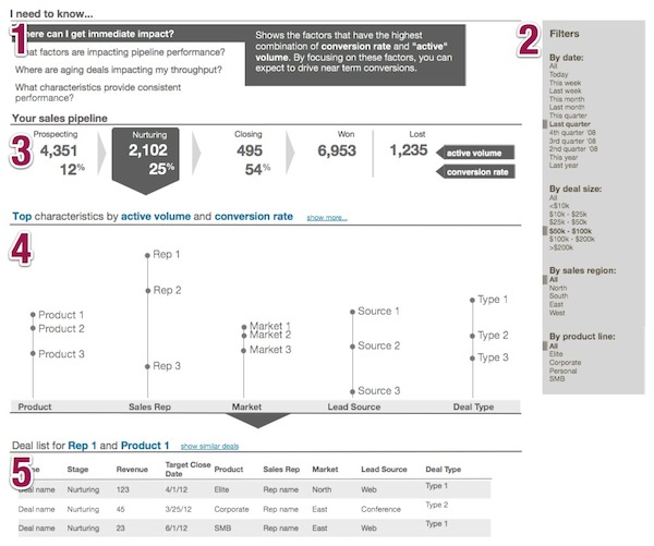
The dashboard flows from top to bottom and has five main parts:
- Question-based navigation;
- Filters to narrow the scope of your analysis;
- Summary metrics built around the stages of your sales pipeline;
- Top (or bottom) performers visualization to emphasize what factors are driving success (or failure);
- Detailed table showing individual leads or deals.
Let's look at some of these pieces in a bit more detail:
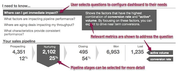
Zooming into the top section, we'd want to direct users to key and common questions. Once selected, the question would configure elements in the dashboard (primarily the sales pipeline key metrics) to lead the user to answers. For expert users, these questions could act like customized short-cuts. Novice users get help focusing on the important issues and can learn from best-practices.
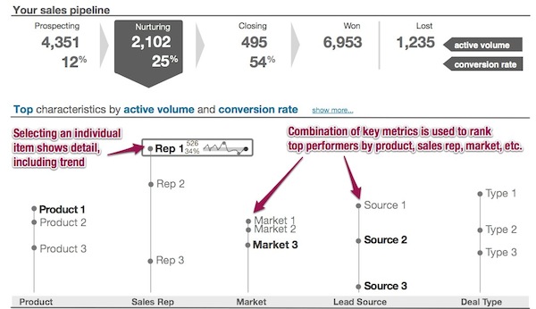
The top performers visualization highlights the factors that are most aligned with success of the pipeline. These factors may be the product being sold, the sales representative who is selling it, or the source of the lead. The vertical position of each top item is based on the selected key metrics. The same visualization could be flipped around to show the characteristics that are leading to the poorest performance.
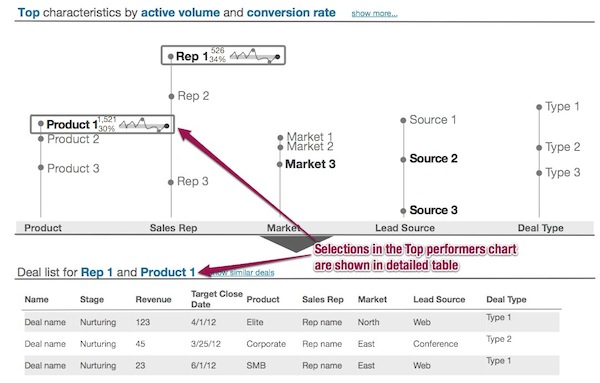
Finally, selecting elements in the visualization would refine the data in the table of deals/leads at the bottom to give the user to the specific items to act on.
By no means is this a perfect and comprehensive dashboard for sales data. But I haven't seen anything as directed and functional. If you have, I'd love to see it.
Update: I just came across InsightSquared, and like some of the views they offer for sales data (e.g. sales pipeline visualization, sales trending)