
Juicebox delivers…
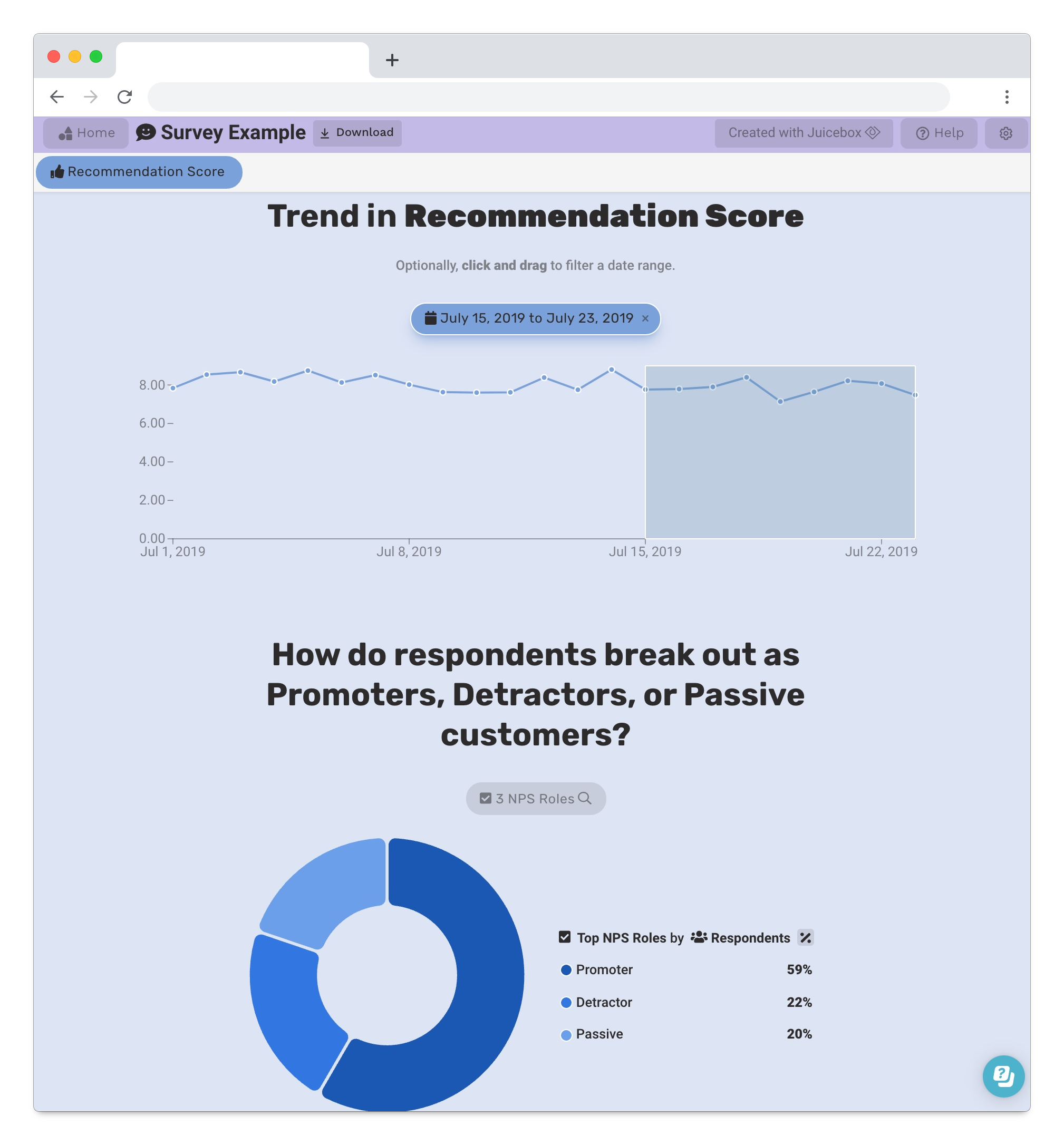
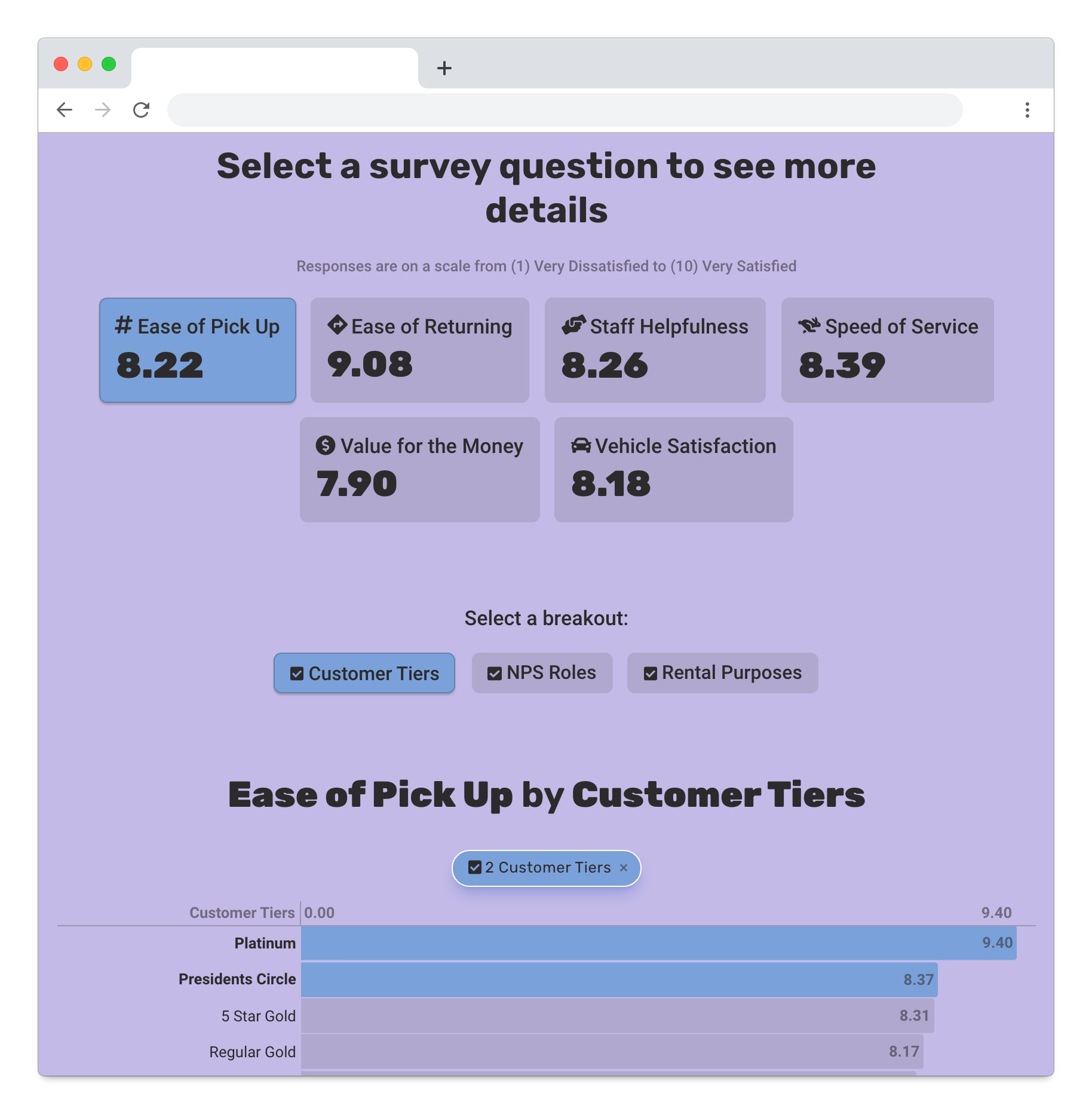
Interactive Survey Reports
You’ve done the hard work of conducting your survey, but how do you ensure your clients take action?
Juicebox provides the fastest path to creating beautiful, interactive reports that summarize and explore survey results.
Load your data and start designing from a template in minutes

Explain your insights with charts, descriptions, and images

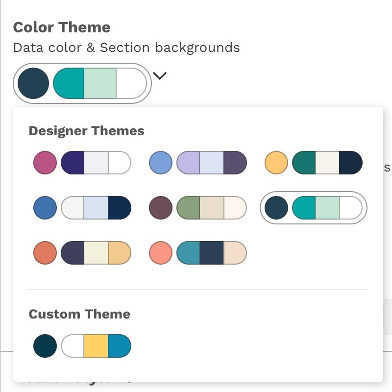
Customize your visual presentation to fit brand guidelines
Top 5 reasons your current survey reporting is failing you…
Displaying one question at a time doesn’t tell a strategic story
Inability to filter or drill into the results leads to more questions than answers
The ugly, old-school design doesn’t help you look like a pro
Too time-consuming to refresh the report in tools like Excel or PowerPoint
Pie charts
Our customers love how Juicebox combines ease of use with powerful outcomes:

The best choice for Diversity Reporting
No other tool combines data presentation, ease-of-use, and powerful analytical features.
🧭 Dynamic narratives to guide your audience to insights. Juicebox enables drill-down analysis and interactive data exploration automatically.

🎨 Built-in design so your data always looks professional. Now you can make beautiful apps that will impress your audience.
🌠Combining images, narrative text, and interactive visualizations delivers a complete data storytelling experience — not a collection of charts.

🏎Pre-build templates give you a jump-start on creating your perfect presentation, fast.
