A Fantasy Visualization for Fantasy Football

At the height of my fantasy football obsession, I probably checked the score on my match-ups more than 50 times a week. As NFL football fan, you have lots of time to do such things -- if you have fantasy players in all four game times (Thursday night, two Sunday games, and Monday night), you have around 13 hours of televised games a week.

This year I quit my fantasy football league. I'm not saying it is because the fantasy football site we used didn't present the data in an interesting way, but an awesome visualization might have made a difference for me. With such a dedicate audience, Yahoo!, ESPN and the rest would be wise to create an great way to track the performance of your team versus an opponent. Here is a blueprint:

fantasy_football_visualization.png

This visualization would answer the important questions as I obsessively dissect the scoring:

  • How am I trending in my match-up? That is, am I on pace to win? Most fantasy football systems have built prediction engines to project out results, but these results aren't shown in a chart.
  • How are individual players contributing to the scores? The trend lines show when and how a player is scoring. Rolling over the points in the line would reveal the big plays that are helping or hurting your cause.
  • What confidence can I have in the projected outcome? The dark parts of the chart are actual points earned whereas the lighter blue is projections. As your column chart "hardens" into dark blue, you can have confidence in the final tally.

As I pointed out recently, Fantasy Football has done an amazing job of making more people data literate. Why not finish the job with a great interface for team owners to spend their weekends cursing over?

Fantasy Football is Teaching Data Fluency


Fantasy football season is here again (along with the actual NFL season). I thought it a good time to share a section from our upcoming book Data Fluency, scheduled to be published in October through Wiley and with Nathan Yau of FlowingData as editor. In this excerpt, we suggest that Fantasy Football has taught an enormous audience to understand the language of data:

It may not be a stretch to say more Americans have learned about data and statistics through fantasy football than every college statistics course in the country. Each week, some 19 million NFL football fans spend their Sundays meticulously setting team line-ups based on statistical projections, historical patterns, and analysis of week-to-week variance. The couch potatoes who once relished on-field hits and in-game strategies now spend an average of more than eight hours a week diving into the data of the sport.

For the uninitiated, fantasy sports let fans play the role of team owners and managers by picking players for their own fantasy team and making weekly roster decisions. As the action plays out each week on the field, fantasy owners collect points against other competitors within their fantasy leagues. To win, fantasy owners quickly realize that success often depends on studying player and team performance data closely.

Here are a few ways that NFL fantasy players incorporate data into their thinking:

Variation in Player Performance

The best fantasy owners understand the nature of week-to-week variance and its relationship to earning points. For example, touchdowns generally earn a fantasy owner six points; but touchdowns occur rarely and can fluctuate wildly. In contrast, the number of touches players receive may be a better indicator of how much the team is using them and their opportunity to provide the owner with points. Because consistent performance matters, successful owners often focus on players with more stable predictors of success (for example, touches) versus more sporadic events (for example, touchdowns).

Rankings Can Be Misleading

Fantasy football cheat-sheets offer rankings of players in every position. These ranking mask the differences and dispersion of expected performance. For instance, the top running back may be expected to perform 20 percent better than the second rated running back, who in turn is only expected to score 5 percent more points than the third through sixth rated running back. The data shows that players often cluster into tiers of performance. This statistical understanding was publicly explained by Boris Chen who stated that “players within a tier are largely equals. The amount of noise between the ranks within a tier and actual results is high enough that it is basically a dice roll in most situations.” This concept has been widely adopted by fantasy owners as a player drafting strategy. 

The Only Constant Is Change

The worst fantasy football owners are stuck in the past and pick players and teams that they have relied on in the past to generate points. That is, they fail to update their assumptions about the best teams, players, and trends. Following the data closely reveals when certain players have gone past their prime and when teams that once had high-scoring offenses can no longer put up big points. Clinging to past success may be a formula for disaster because the only constant in fantasy football is change.

Context Fills Out the Picture

Data viewed in isolation can be deceiving. Say, for example, that your top wide receiver scored only one-half the number of points that he scored on average in a season. Is this a new and troubling trend? Should you trade? A little research might reveal that he matched up against one of the league’s top cornerbacks, or his quarterback was knocked out of the game, or perhaps he tends to perform poorly in cold weather, away games. These environmental factors make a difference with respect to outcomes. Performance data cannot be understood in isolation—context matters.

So how did fantasy football create legions of fans who have developed a specialized dialect of data fluency? It has been a combination of education, effective data presentation, common data conventions, and incentives. Fantasy football owners have been taught how to use data to their advantage through the efforts of the NFL, ESPN, Yahoo!, and a cloud of other websites dedicated to football analyses. Organizations like Football Outsiders built new media businesses around data modeling and projections of player performance. 

Leading online fantasy football sites like ESPN and Yahoo! have been aggressive in pushing data and data visualizations to their users. These sites include trend charts for every player, drive charts, player comparison graphics, and predictive models for estimating game outcomes.

The educated fantasy football community is also highly engaged with the sport. The community loves football! The fantasy league has provided a whole new (and rewarding) dimension to its fandom. No longer is it tied down to rooting for a single team—instead, the whole league becomes fodder for its attention as it picks and chooses players from each of the 32 NFL teams. In addition, the fantasy football industry has coalesced around consistent formats for leagues, points, and key metrics. Terms like PPR, running back by committee, waiver wire, and flex are well understood, facilitating conversations among league owners. And with $1.18 billion bet in fantasy football leagues annually and a passionate fan base, fantasy owners have huge incentives to make informed decisions. When money or bragging rights are on the line, individuals invest time and energy into developing the skills and abilities to become data fluent.

In short, these factors have brought data fluency to the masses. Millions of fans have learned how to read charts, grasp basic data concepts, and allow deeply embedded data to inform how they make decisions—all critical skills associated with quadrant one in our framework. 

Visualization techniques we all knew at 4 years old

A few years ago my niece sat down at the table with me and drew a picture. Here it is:

An afternoon drawing by my niece. Marker and Paper.

Whether you play with $100k dashboarding tools or the latest and greatest open source reporting solution, they have no secret sauce in the visual thinking department that wasn’t already exhibited when you were 4 years old and drew something for your uncle. 

Let’s walk through 6 principles of visual comprehension I observed after she drew it. The 6 aren’t meant to be all encompassing nor the only way to interpret these visual principles, but they are fundamental aspects of what makes data visualization so special. I like to think of them as parts of the grammar for speaking visually.

Let's see what each principle would say...

Things that are enclosed by a shape will be seen as a group.
— Enclosure

First, she drew me. Yes, that’s me to the right. She started with my eyes, nose, and mouth. Then she grouped those items through the principle of enclosure to say, “Here’s James’ big head and all those facial features belong inside it.” 


Young children learn to read the face first, so this becomes much of your identity to them at an early age. In fact, the rest of my entire body is represented by two lines. Somehow my big head does need to move around after all. 

Young children learn to read the face first, so this becomes much of your identity to them at an early age. In fact, the rest of my entire body is represented by two lines. Somehow my big head does need to move around after all. 

Things that are connected are part of the same group.
— Connection
 

Thankfully, she also acknowledged my hair. It’s not floating in mid-air, but touches the enclosure of my head to say, “While not inside, these things in the group of things that make up James." 

Things that are near each other belong to a group.
— Proximity

Next she drew her face and body next to me — her way of saying, “We have a relationship. I like hanging out with him.” Perhaps, if I was that weird uncle in the family she would have been on a corner of the page, but instead this proximity indicated that we are in the group friends and family. 

Things that are aligned are perceived as a group.
— Continuity

Not only did she draw herself close to me but also on the same vertical plane. She's a rather grounded girl, so, instead of drawing her floating about, she emphasizes that we’re both in the group of things that obey the laws of gravity and stand on the floor. 

Some other objects around us have the freedom to fly about. They’re just principles after all; not laws.

Some other objects around us have the freedom to fly about. They’re just principles after all; not laws.

We strive to perceive shapes as complete.
— Closure

When drawing her ears (with earrings, of course), you can see how the circles were sure to be complete through the overlapping beginning and ending of those lines. This assurance of closure says, “My little ears can definitely support big girl earrings.”  

Things that share color, size, or shape belong to a group.
— Similarity

I imagine she drew the cactus floating above us because it has a visual similarity to her hair (which she drew after my hair). This is her saying, “What else could I draw that would belong on this page? I’d like to draw a cactus. That feels right.” 

Lest you doubt it is a cactus, I asked her at the time and, no doubt about it, it is obviously a cactus. The swirling thing to the right is also obviously a snail.

Lest you doubt it is a cactus, I asked her at the time and, no doubt about it, it is obviously a cactus. The swirling thing to the right is also obviously a snail.


One thing I’ve learned is that design or visual comprehension principles make more practical sense looking backwards. We all have various beliefs or observations of the world that have been internalized and are unique to us. We probably don’t even know what many of them are — just as I’m fairly confident my niece hadn’t studied the laws of gestalt grouping from the early 30’s when she sat down to do this drawing. When you want guiding principles to guide a new product, look back at what is most natural and pervasive. 

We all were born with this visual grammar, and they have been incorporated in all sorts of data visualizations and products in recent years. One hope of mine is that we’ll start seeing data products that allow us to not just see the data, but see through it to those “aha” moments, where people are seen and lives are truly impacted, where insights are revealed as effortlessly and confidently as drawing a picture on a blank page.

Customer Flashcards: Customer Analysis Using Pictures and Patterns

Some recent work in online training reminded me of this concept that we discussed almost eight years ago. It is an analysis-visualization approach that I still believe is underutilized.

The Value of Film Study

In business as in sports, behind-the-scenes analysis is the foundation for on-the-field success. That is the promise of business intelligence – and the reality of film study in the National Football League (NFL).

NFL coaches and players spend hours analyzing film to identify the strengths and weaknesses of their opponents. Coaches scour video for opponents’ tendencies and use this knowledge to build their game plan. For players, film study gives them understanding that lets instinct take over on the field. Consider some of the techniques involved:

  • Get granular: Examine raw data such as where players are positioned, who gets the ball from different formations, what plays are called at different field positions, and even the technique used by individual players. 
  • Use your eyes: Rely on your brain’s ability to recognize patterns; look for unusual actions and note when they occur.
  • Group common patterns: Record these patterns by player, by formation, by down and distance. These patterns are the building blocks of analysis, letting the coach ask questions like: Does a formation give clues about the play being called?
  • Build strategy from the bottom up: Finally, use this deep understanding of the opposing team’s tendencies as the foundation for the game plan.

This type of approach is different from most business analytics. Imagine if an NFL team depended solely on statistics and reporting tools to build their game plan. Football teams wouldn’t see much success if they only looked at average yards per carry and which players on the opposing team touched the ball most.

Slicing and dicing statistics doesn’t help much when deciding on a game plan. Business intelligence tools can explain the size of the problem (how good is the opponent?) and trends (what are their preferred offensive weapons?). These same tools do not, however, provide real perspective on customer behaviors or insights that give your organization data-driven direction.

Customer Flashcards: Making Pictures

How do we bring the value of film study to business intelligence? The solution we've developed is inspired in equal parts by Edward Tufte and Malcolm Gladwell.

Tufte is an expert at information presentation and design. One approach he has popularized is small multiples: placing sets of identically structured graphics on a single view to show different instances of the same data, as illustrated below.

This example of small multiples compares the annual deaths by assault per capita across countries. The size of this problem in the United States is evident.

This example of small multiples compares the annual deaths by assault per capita across countries. The size of this problem in the United States is evident.

Small multiples enhance comparison and reveal the scope of variation. By using the same dimensions and scale, small multiples also relieve the viewer from relearning the data graphic’s structure.

We extend this technique to understand customer behaviors by combining usage data, marketing touchpoints, service calls, and other interactions to create a simple graphic that shows many aspects of a single customer’s behavior. Here are a few examples from our work:

Visual representation of credit card accounts. The blue line is the account balance; yellows are purchases and cash advances; green is payments; the grey background is credit line; red bars show delinquency. Notice full vs. gradual pay-down of accou…

Visual representation of credit card accounts. The blue line is the account balance; yellows are purchases and cash advances; green is payments; the grey background is credit line; red bars show delinquency. Notice full vs. gradual pay-down of account, building credit lines, transaction inactivity.

Four examples of individual students progressing through an online curriculum. Vertical axis is the lessons in order; horizontal axis is time. The grey line shows the “optimal” progression over time. Notice steady vs. erratic progress, breaks in pro…

Four examples of individual students progressing through an online curriculum. Vertical axis is the lessons in order; horizontal axis is time. The grey line shows the “optimal” progression over time. Notice steady vs. erratic progress, breaks in progress, and out of order lessons.

These pictures are intriguing, but are they useful? In his book Blink, Malcolm Gladwell introduces the idea of thin slicing: "the act of relegating the decision-making process to the adaptive unconscious by focusing on a small set of pertinent key variables, as opposed to consciously considering the situations as wholes over much longer periods of time." He explains how people become experts at quickly evaluating the relevant data and arrive at a rapid understanding of a situation.

We want to give businesspeople a sense of their customers in a blink of an eye. To do so, customer flashcards need to be intuitive and easy to learn. Success is the ability to show these pictures to anyone in the organization – from senior executives to front-line customer service reps – and have them grasp what they are seeing with just a few minutes of explanation.

Finding the Patterns

Customer flashcards, thousands of them, are raw material for analysis. They are the game tapes of business film study. Like NFL coaches, the next step is to put your visual pattern recognition abilities to work. As Stephen Few put it recently:

"When used effectively, visualization extends the reach of traditional business intelligence to new realms of understanding – not as one means among many, but often as the only effective means available. I believe that information visualization will enable the next significant leap in BI’s evolution."

Think of the game Memory you used to play as a child, turning over one game card after another looking for matching pairs. Now imagine flipping through hundreds of customers, opening your mind to the patterns that emerge. You could spot common behaviors, note irregularities, and build a close-up perspective of customers' actions. It is an exercise that every business executive should try: sit in a quiet, windowless room and look at visual representations of customer behaviors one at a time, deducing what their behavior implies about their needs. The results are eye-opening; customers are screaming out their needs through their behaviors. By seeing and appreciating these behaviors, a business has an opportunity to build a customer intimacy that too often gets lost.

Putting Customer Flashcards to Work

Finding new patterns can be interesting, but how do you quantify them? In our work, we develop pattern recognition algorithms to capture the behaviors that are first identified by eye. Behaviors are then tagged – each customer can be tagged with multiple behaviors. With this new quantification of customers, you are positioned to take action.

The value from customer flashcards can be both strategic and tactical. Here are a couple examples from our experience:

  • A car rental company was able to tailor its offerings based on behavioral segmentation of customers. We visualized individual customer car usage, including where, when, and how long customers were driving. The customer flashcards revealed different types of trips (e.g., errand running around town, long trips) and different customer relationships (e.g., loyal repeat customers, trialers). These dimensions provided a rich landscape for ideas to match specific customer needs with promotions, pricing, and targeted marketing. 
  • In the credit card business, understanding cardholder risk is a key to profitability. To whom do you extend more credit? Which cardholders bring in steady interest income without fear of bankruptcy? Traditionally, credit card companies have built complex scoring models to segment customers based on their credit history and a snapshot of credit risk. Customer flashcards added a new and nuanced tool to these operational decisions. Trending of purchases, balances, balance transfers and available credit revealed a number of interesting behaviors. For instance, some cardholders were making big purchases on credit, then gradually paying down this debt over a series of months. Just as they prepared to pay off their balance, these cardholders would treat themselves to another big ticket item. Visualizing behaviors made this “sawtooth” activity obvious and gave the bank an ability to treat these customers with proper appreciation.

For those responsible for embedding business intelligence into the fabric of the organization, customer flashcards provide an immediately accessible and visually appealing way to engage senior executives. In addition, visual representations can create a common language for describing customers. The customer images let employees in different functions consider problems in the context of real, data-derived understanding.

Finally, we have found that customer flashcards are effective at unearthing data irregularities or process failures. When something doesn't look right in a picture of behavior, there is often something wrong with data quality, or with an internal process.

Reestablishing Customer Intimacy

Chris and I grew up in Lincoln, Vermont, a town of 900 people tucked away in the Green Mountains. At the center of this no-stoplight village is a general store. Vaneesa, the proprietor for more than three decades, greets her friends and neighbors at the counter everyday. She has grown to know each of their habits and needs and can tailor her stock and service in response. Everyone in town appreciates it.

This type of customer intimacy has long been lost as companies scaled beyond personal relationships. In an attempt to rebuild this bond, companies pile customer data – a digital representation of customers – into customer relationship management and business intelligence databases. Storing this information does little to get your business closer to understanding customer needs. Traditional data analysis falls short by aggregating behaviors and depending on the business to ask the right question. Surveying, another approach to staying in touch with customers, is hampered by customers’ imperfect knowledge of their own needs and by their limited memory of their own actions.

On the football field, a shared understanding and a targeted game plan are keys to victory. It’s the same in business. Customer flashcards can give you a new perspective on your customer data and help you succeed by knowing more.

Three-and-a-half lessons learned from network diagrams

Once a month here in Atlanta, we invite a few folks from the data community together to discuss the "data value chain" and sharpen each other's thinking in the area of using data better. In a recent gathering we were discussing the merits and challenges of network diagrams. The stake I firmly planted in the middle of the table was this: for the vast majority of problems that folks have to deal with, network diagrams don’t help. Ever.

Ok, so maybe that was a little harsh. And as we discussed it, I had to soften my position. We concluded that there are most definitely situations where network diagrams can be successfully used. Here’s what we uncovered.

When most people think about network diagrams, this is what first pops into their heads:

Simple Network Diagram


It’s great for showing the hierarchy that would otherwise only be represented in some sort of over-bloated frankenstein of a table. And I think it works pretty well for a situation with a finite number of nodes that represent physical elements that can readily be counted such as “number of routers.” This is our first lesson:

Lesson Learned #1: If you can reasonably count the nodes, a network diagram can reasonably add clarity about relationships.

So, the concept of a network diagram feels like it makes tiered data more accessible. But let’s look at more complex relationships. Take your LinkedIn network. There are lots of layers of relationships that it seems a network diagram would seem to make sense of. In case you missed it, a couple of years ago, LinkedIn Labs made network maps available to LinkedIn members in their InMaps. Here’s mine:

LinkedIn map


It is beautiful. They’re using a Gephi-inspired in-house development to lay out the nodes, chose the colors and stuff (if you’re interested in more on this topic, check out the Quora post - oh yeah, that guy Sal Uryasev who worked on creating inMaps is a former Juicer. Nicely done, Sal!).

I love, love, love the groupings. In my opinion, this is the most useful part of the layout. At this number of nodes, it’s not the individuals that are meaningful, but rather how those nodes group together. The approach Sal et al. used nicely summarizes a good portion of my career in about 5 large chunks such as “7 years on the roller coaster” at a dot com, and “Todo: attend a reunion” for connections I made while at Georgia Tech (the labels are mine - wouldn’t that be cool if InMaps could do that?).

But, as far as network diagramming goes, you’ll see that they’re just plotting the first-generation relationships (of which I have 500-ish) and it’s still fairly dense. Imagine what would happen if second-generation+ relationships were added (there are supposedly 11 million “in my network”). Yuck. So here is our next lesson:

Lesson Learned #2: Network diagrams with many nodes are most useful when showing aggregated groupings and relationships.

And the corollary this quickly brings us to:

Lesson Learned #2.5: When many nodes are aggregated into a few relationships, network diagrams can be used as a presentation medium. Otherwise, stick to exploration.

Ok, we have time for one more lesson. Here’s another example offered by a small company you might have heard of:


If you think about it, this is nearly the perfect problem for a network diagram to solve: making it easy for a person to find images similar to the one they’re looking at. But, this offering, inspite of it’s well crafted-ness, went nowhere.

Why? Well, one reason might be because those of us who are visual pundits would love to see these complex relationships simplified by just the right visual representation. But the fact remains that for the vast majority of people out there, advanced visualizations are just not enticing enough -- and too complex feeling -- to incite broad use. There, I said it. So, finally:

Lesson Learned #3: Even for relationships that “normal people” can easily understand, network diagrams aren’t easily traversable by “normal people.”

So, there you have it. Three-and-a-half lessons we’ve learned with network diagrams. Apply them to your next network display challenge and see how they work for you. If you need some technology to help you, check out the wikipedia article on network diagramming tools. Let us know if you find any that reveal other lessons to you.

The Best Product Manager: Hustler, Designer, Hacker

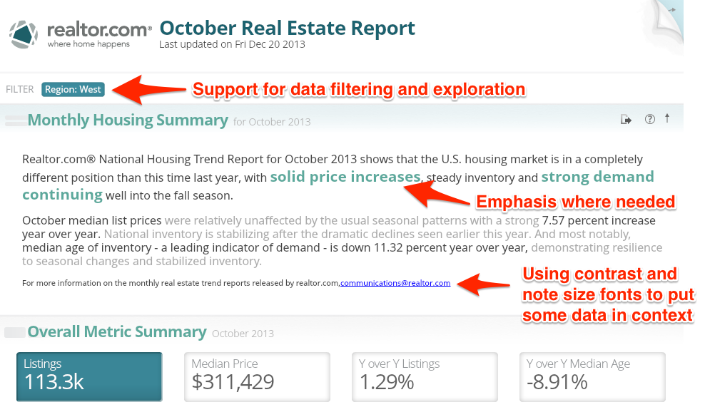
Much of what makes a great product manager is empathy and a desire to serve others. Tulsi demonstrates these qualities better than most I’ve come across.  As you will see below, her passion for design as part of product management is only surpassed by that for her customers, products and causes.  Oh, and there is usually much laughter involved. Enjoy and feel free to reach out to her at http://about.me/tulsid.

Even after years of product management experience at several companies, I still get frustrated when folks frequently say “So, you are a Project Manager”. I usually respond with a vehement “No!” and go on to describe what it is I actually do everyday.

With this in mind, let’s begin this discussion by describing what a Product Manager is.  A (good) Product Manager is the champion of the customer and the market: part product visionary and part liaison officer between external and internal needs, pressures, and limitations.

As Catherine Shyu, Product Manager at Send Grid puts so nicely:

“Much of a Product Manager’s responsibility is to juggle multiple streams of conversation and move them towards closure.”

Successful disruptive and innovative brands like Basecamp, Airbnb, Fab, and many others have proven that features alone don’t improve the sales. Instead the infusion of design and love into the products is what creates real customer engagement and advocates. That’s why many of the companies mentioned have consolidated Product Management and Design into single roles or departments. Now the Product Management role is evolving even further.

In the words of Gary Tan

“The ideal startup team consists of: a designer, a hustler, and a hacker.”

The most successful Product Managers I’ve worked with and learned from seem to embody the qualities of all of these three roles. Just consider what these roles bring to the table:

DESIGNER

This role can seem as nebulous as the Product Manager’s, so it’s no wonder they’re coalescing. Whatever the type of designer, success is based on the ability to emphatize,  perceive deep customer needs, and anticipate customer behaviors.

That’s why Product Managers with design and usability skills are able to create experiences rather than the features, simplify the interactions, and sketch and wireframe ideas to tell stories that others can understand.

HUSTLER

Contrary to any negative (and possibly cheeky) connotations, the hustler knows the market, knows how to sell, and knows how to work with what they have to turn a profit. In other words, she knows how to connect products with customer and market needs. The hustler’s skills can help a Product Manager think beyond product design to the critical marketing and sales activities that will make products and companies thrive.

HACKER

Hackers can think creatively, come up with solutions quickly, and iterate through problems they encounter along the way. They are also curious about technology and how things work. Hacker instincts help Product Managers communicate well with engineering teams, and work lean to get the best possible outcomes with the least possible time and resources.

The bottom line: the days of the traditional product manager are gone. Lines are naturally blurring around the Product Management role and discipline, and that’s a good thing! The better you are at blending these three roles, the more equipped you will be at juggling the responsibilities that are on today’s product manager. So, hustle, design, and hack your product into shape. And then tell somebody what you do!

Many thanks to @Imusicmash and @apmcinnes for their comments and feedback.

Explore Sochi Olympic Medal Results

We’re huge sports fans and the Winter Olympics in Sochi is just the beginning of a busy and exciting 2014 sports year. If you’re like us you may not have a few hours a night to hang out with Bob Costas, so we created an interactive summary dashboard of medal results. You can view results by country or event and drill down to the individual athlete if needed. Come back often to see the updated results. Enjoy!

Keep an eye out for visualizations we plan to do for March Madness, MLB Spring Training, NFL Combine, and the FIFA 2014 World Cup.

Extreme Makeover: realtor.com Edition

Have you ever watched one of those miracle-home-improvement shows where they take a house that is a good foundation, but that has been neglected for a bit too long? Nothing’s better than real world practical examples. So, we thought we’d take that approach and apply it to an existing report from the real estate industry and do a little makeover to see if we could make a dramatic improvement. You be the judge.

We found a particular report on realtor.com and we said to ourselves "Self: this data shows a lot of potential!" We really loved it for a few reasons: There is a lot of great information, over 100 different markets, expert commentary and pretty interesting to anyone owning a home or investing in real estate in the U.S. Even still, it feels lacking. What if instead of just making the data available, this report answered some specific questions on the minds of homeowners and investors as well as provided it to them in an easy way to consume this rich information?

Selecting a real estate example wasn’t completely random for us.  With friends and family at Colliers, TelesIntelligence, Berkshire Hathaway Home Services and Keyes, we know there are a lot of opportunities to make real estate data more valuable.

Here is the link to realtor.com’s existing report. Our version of the report can be found here. We downloaded the .csv file that they make available and took it from there. We applied some Juice design principles and help the data answer some specific questions.

Our approach was threefold:

  • Make the report more readable and attractive
  • Offer the reader more guided exploration
  • Offer visualizations that permitted comparisons across markets

Before we did anything we did do a little transformation on the data. We added a dimension for region and broke out city and state into separate columns. This permits another layer of data exploration.

Below are some screenshots of our report makeover.   You can see, and interact, with the makeover version here.

First, we gave the commentary section of the report a little help. Using the Simple Font Framework, we improved the titles, highlighted some of the key trends, downplayed some of the contextual information. Just below that we provided some overall metrics, so that users could compare markets to the U.S. overall averages.

Next, we posed questions that we thought the audience might be most interested in knowing and then applied a visual that would answer that question. In the case of the map the user can toggle the metrics between the month to month and the year over year change in median price. As you notice Maryland stands out on the map, while finding this on the original report takes a little effort.

As with most decisions, homeowners and investors can’t rely on just a single measure to inform their opinion. The leaderboard visualization below allows the reader to view rankings across multiple metrics. In the highlighted example below we compared Denver, Colorado to Seattle, Washington.

The finished version (found here) also provides some additional visualizations and a global filter at the top, but you get the idea. Not brain surgery or something we would use to make actual real estate investments; however a quick 60 minute makeover to call out some of the beauty trapped in this data.

So, what do ya think? Worthy of the Extreme Makeover moniker?

Reading Visualizations for Beginners

A skilled author of data presentation will choose the right visualization to emphasize a message. The data, chart, and supporting descriptions will work in harmony to point out what is interesting. The reader simply goes along for the ride. Unfortunately this is the exception more than the rule. Many data products are a muddled mess of chart choices, obscure labeling, and arbitrary layout. In essence, the author has passed responsibility to their audience to find the meaning.

If you are to carry this burden of rooting out the insight in a data visualization, you need to know where to look. The best place to start is by focusing on the unexpected. Does the world work the way you think it does? Or does the data show you something that challenges assumptions of expected values? Let's take a look at a few ways to find the unexpected.

Unexpected distributions

Pie charts are designed to show how something breaks into its constituent pieces. The slices add up to the whole, and the volume of each slice indicates its piece of the pie. The primary insight offered in a pie chart comes from slices that are smaller or larger than you would expect. One weakness of the pie chart is that to discover slices that are bigger or smaller than expected, the reader needs to compare the actual chart to what they imagined it might look like. For example, in this pie chart the reader might be surprised to find that confections are nearly half their diet by volume (that’s not healthy eating).

My Diet
My Diet

Unexpected patterns or relationships

Plotting data in a scatterplot or bubble chart is a way to show relationships between two or more variables. The pattern of the points may express a correlation that is either expected or surprising. Furthermore, outliers from this pattern are interesting because they break the mold.

scatter_1
scatter_1

Source: Data from Natural History Magazine, March 1974

This scatterplot shows animal size versus weight. The data indicates a positive relationship between size of the animal and its top speed. Bigger is faster, but with a lot of variation. The cheetah is an outlier with an unusually high ratio of speed to body mass. That's interesting. (Also, it’s good to see that humans are faster than bears. Unfortunately, a careful reading of the underlying data reveals that the human data point is Usain Bolt, world record holder in the 100 meter sprint.)

Unexpected trends

Trends across time are another common place to look for insights. Line charts can make obvious the deviations compared to expected patterns or trends. Like the pie chart, the reader needs to overlay their assumptions on the shape of the lines. Do you expect there to be an upward trend? Should the values remain steady over time, or is it normal to see substantial fluctuations?

EKG
EKG

Cardiologists use Electrocardiograms (aka EKGs) to trace the electrical activity from the heart. A healthy heart demonstrates familiar patterns in the lines; changes to these patterns indicate problems. An experienced cardiologist can see abnormal heart rhythms, chamber enlargement, and signs of impaired blood flow through changes in the shape of the lines.

Comparisons

Data without context may offer little meaning. But adding a comparison value—whether an industry benchmark, an organizational goal, or a regulatory standard—brings values into focus. Comparisons across time periods can communicate improvement or regression. Direct comparisons can show how two or more entities rank compared to each other. Numerous specialized data visualizations have been designed to enable quick comparison, including bullet charts, “stop-lighting,” and leaderboards.

Leaderboard and Matchup

This dashboard compares bank brands by a series of survey questions. Rankings and side-by-side comparison make it obvious who is performing better for each brand performance measure.

Find a starting point

A dashboard, report, or data visualization can feel like an ocean of information competing for your attention – like a Where’s Waldo™ puzzle. Rather than trying to take in the whole picture at once, it’s a good idea to focus your attention on a small piece of the picture. Focusing on a single element can help you grasp the nature of the data, the dimensions and metrics being displayed, and eventually how a small piece fits into the whole. Take the following data visualization comparing hospitals by patient experience as an example.

Hospital Comparison 1

There is a lot going on here. The bubble chart shows three separate metrics about each hospital. The meaning, size, and positioning of the bubbles requires a new reader to carefully review the axes and legend to get his bearings. The connection between the bubbles and the bar chart on the right is not immediately obvious.

It’s a lot easier to tell the story of a single bubble.

Hospital Comparison 2

The highlighted bubble represents a hospital, and the three metrics used to size and position the bubble are shown in the tooltip. In fact, the connection to the bar chart becomes obvious as Russell Hospital is identified as one of the largest hospitals by bed size. This particular data point may not be the most interesting or unexpected in this chart, yet now you how a much better sense of what the data product is trying to convey about hospitals.

Turning Data into Words

It is often said that you know you have become fluent in a foreign language when you dream in the language. Short of this inflection point, language students have to translate the words back into their native tongue. And so it is with data. Without instant recognition of the meaning of a data visual, it can be useful to convert the information into a language in which you are familiar.

Take the example above: to understanding the message in the data, you might translate a data point into a descriptive sentence such as “Russell Hospital has 730 beds, tied with three other hospitals” or “Russell Hospital’s patience experience score is near the top of all hospitals shown.” This is a way of capturing and testing your understanding of what you are seeing in the data.

By breaking a complex data product into its smallest pieces and finding something comprehensible, you will start to understand both what the author is trying to show and how to read the content.

Data Storytelling, The Pixar Way

Pixar's Rules for Storytelling -- as shared by Emma Coats, Pixar’s Story Artist -- are almost as relevant for communicating with data as they are to filmmaking. Whether you are a creator of data-rich presentations, infographics, or data visualizations, here's an abridge list of the most relevant Pixar principles for data storytelling: #2 You gotta keep in mind what's interesting to you as an audience, not what's fun to do as a writer. They can be very different.

#3 Trying for theme is important, but you won't see what the story is actually about til you're at the end of it. Now rewrite.

#5 Simplify. Focus. Combine characters. Hop over detours. You’ll feel like you’re losing valuable stuff but it sets you free.

#8 Finish your story, let go even if it’s not perfect. In an ideal world you have both, but move on. Do better next time.

#11 Putting it on paper lets you start fixing it. If it stays in your head, a perfect idea, you’ll never share it with anyone.

#12 Discount the 1st thing that comes to mind. And the 2nd, 3rd, 4th, 5th – get the obvious out of the way. Surprise yourself.

#13 Give your characters opinions. Passive/malleable might seem likable to you as you write, but it’s poison to the audience.

#14 Why must you tell THIS story? What’s the belief burning within you that your story feeds off of? That’s the heart of it.

#17 No work is ever wasted. If it’s not working, let go and move on – it’ll come back around to be useful later.

#22 What’s the essence of your story? Most economical telling of it? If you know that, you can build out from there.