
Have you ever watched one of those miracle-home-improvement shows where they take a house that is a good foundation, but that has been neglected for a bit too long? Nothing’s better than real world practical examples. So, we thought we’d take that approach and apply it to an existing report from the real estate industry and do a little makeover to see if we could make a dramatic improvement. You be the judge.
We found a particular report on realtor.com and we said to ourselves "Self: this data shows a lot of potential!" We really loved it for a few reasons: There is a lot of great information, over 100 different markets, expert commentary and pretty interesting to anyone owning a home or investing in real estate in the U.S. Even still, it feels lacking. What if instead of just making the data available, this report answered some specific questions on the minds of homeowners and investors as well as provided it to them in an easy way to consume this rich information?
Selecting a real estate example wasn’t completely random for us. With friends and family at Colliers, TelesIntelligence, Berkshire Hathaway Home Services and Keyes, we know there are a lot of opportunities to make real estate data more valuable.
Here is the link to realtor.com’s existing report. Our version of the report can be found here. We downloaded the .csv file that they make available and took it from there. We applied some Juice design principles and help the data answer some specific questions.
Our approach was threefold:
- Make the report more readable and attractive
- Offer the reader more guided exploration
- Offer visualizations that permitted comparisons across markets
Before we did anything we did do a little transformation on the data. We added a dimension for region and broke out city and state into separate columns. This permits another layer of data exploration.
Below are some screenshots of our report makeover. You can see, and interact, with the makeover version here.
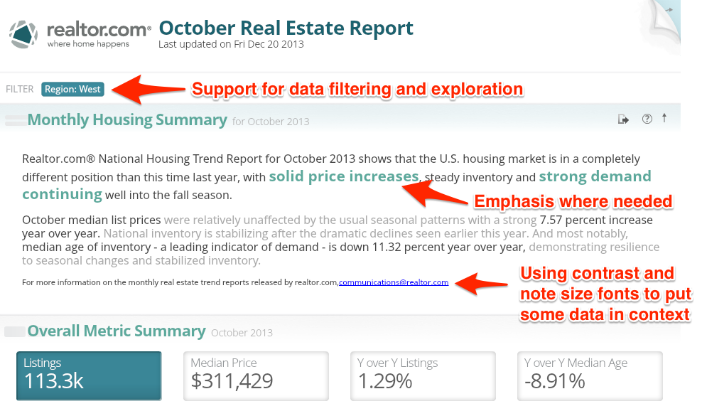
First, we gave the commentary section of the report a little help. Using the Simple Font Framework, we improved the titles, highlighted some of the key trends, downplayed some of the contextual information. Just below that we provided some overall metrics, so that users could compare markets to the U.S. overall averages.
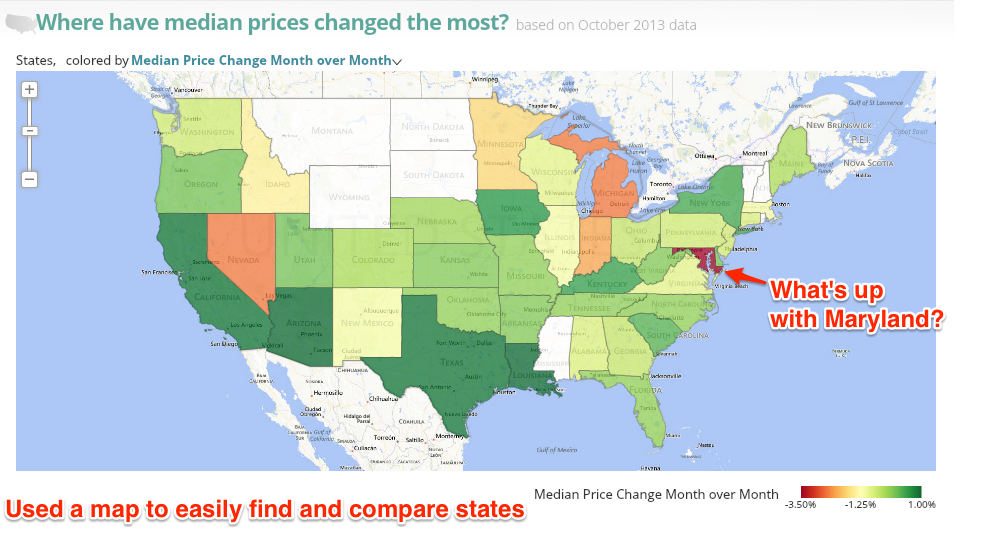
Next, we posed questions that we thought the audience might be most interested in knowing and then applied a visual that would answer that question. In the case of the map the user can toggle the metrics between the month to month and the year over year change in median price. As you notice Maryland stands out on the map, while finding this on the original report takes a little effort.
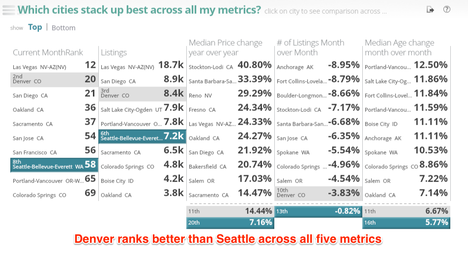
As with most decisions, homeowners and investors can’t rely on just a single measure to inform their opinion. The leaderboard visualization below allows the reader to view rankings across multiple metrics. In the highlighted example below we compared Denver, Colorado to Seattle, Washington.
The finished version (found here) also provides some additional visualizations and a global filter at the top, but you get the idea. Not brain surgery or something we would use to make actual real estate investments; however a quick 60 minute makeover to call out some of the beauty trapped in this data.
So, what do ya think? Worthy of the Extreme Makeover moniker?