
Spotify Wrapped for Everyone: How All Sorts of Organizations Are Using the Year in Review
First it was “Orange Juice, not just for breakfast anymore,” and now it is, “The Year in Review, not just for consumer tech giants anymore.”
A Colorado electricity provider, a nonprofit drilling water wells in rural Africa, and the Australian federal government — each of them has picked up the concept of a Year in Review to build a stronger connection with their most important audiences.
The personalized year in review has expanded beyond its origins. What started as a clever engagement mechanic for consumer tech platforms (Spotify, Apple, fitness trackers) has become a powerful tactic for all sorts of organizations. The playbook is straightforward: take the data you're already collecting, reflect it back to each person in a way that's specific to them, and builds stronger engagement.
The data is already there. No organization on this list built a new data collection system to make this happen. The shift was in how they chose to use it, turning records of activity and transactions into a story about the individual in those records. And they are framed to tell the recipient "here's what you accomplished" rather than "here's what we did."
Five Diverse Examples
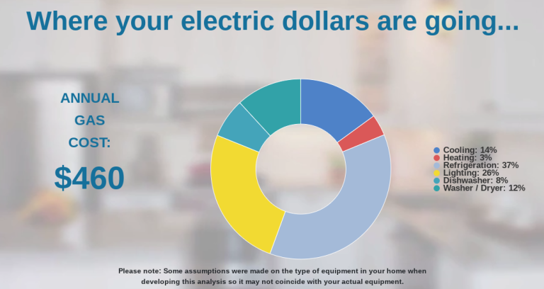
Xcel Energy
Every year, Xcel sends its Colorado customers a personalized video showing their annual energy consumption broken down by appliance category — refrigeration, heating, lighting — with specific dollar estimates for what changes would save them. The company analyzes each household's usage patterns individually, and reports a 60% email open rate. Most people think of the utility company as a monthly bill. Xcel found a way to make customers genuinely interested in their own power consumption.
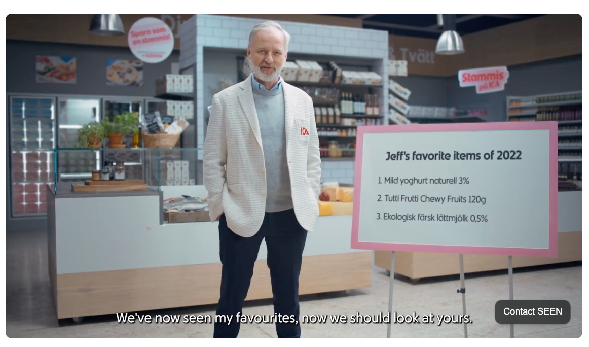
ICA (Swedish Grocery Store)
Sweden's largest grocery chain sent roughly 2 million personalized videos to members of its loyalty club, each one featuring a beloved character from ICA's long-running TV ads personally presenting the customer's year in shopping. The video featured their most-visited stores, most-purchased products, category totals, and total savings earned as a member.
A post-campaign survey found that 85% of customers rated the communication favorably. One member's response on social media captures the impact of personalization: "My name, my stores, my products — wow." The thing that makes it distinctive is that ICA wrapped the data in character and storytelling, not just stats. The format felt like a personal message, not a report.
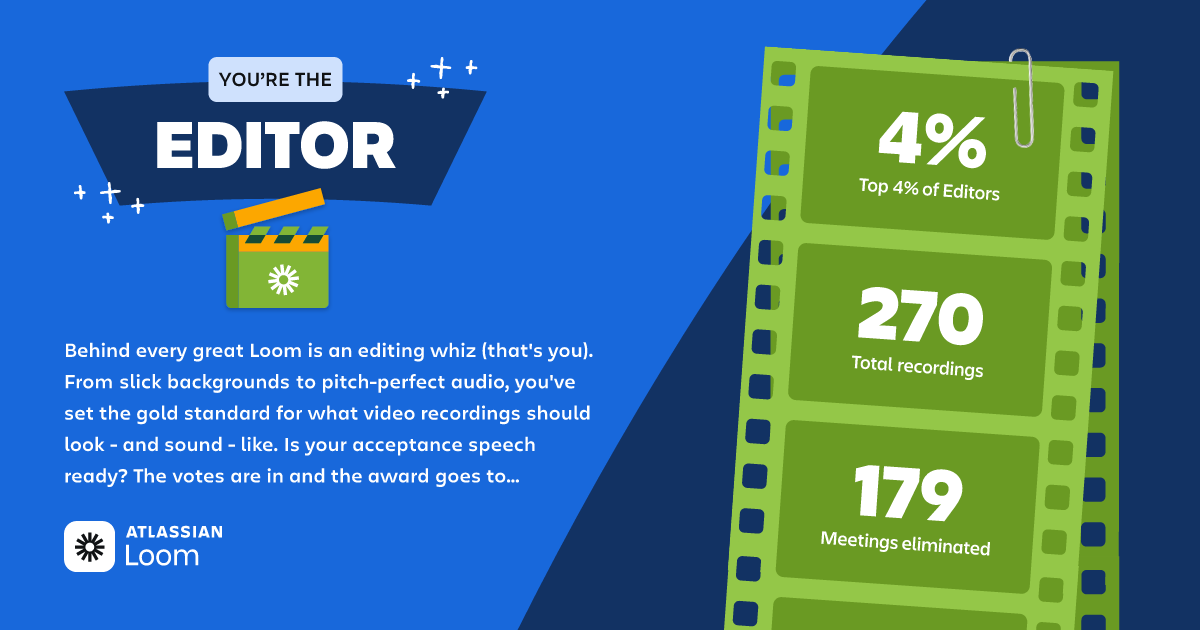
Loom
The video messaging tool sends users an annual "Rewind" that quantifies their year in concrete terms including meetings replaced, time saved, videos recorded as well as a personality type derived from how they actually use the product.
In 2024, Loom users collectively recorded 88 million videos and reduced the need for an estimated 202 million meetings. Each individual user sees their piece of that. It's a value communication and a retention play disguised as a celebration, and it lands right before renewal conversations begin.
Charity: Water
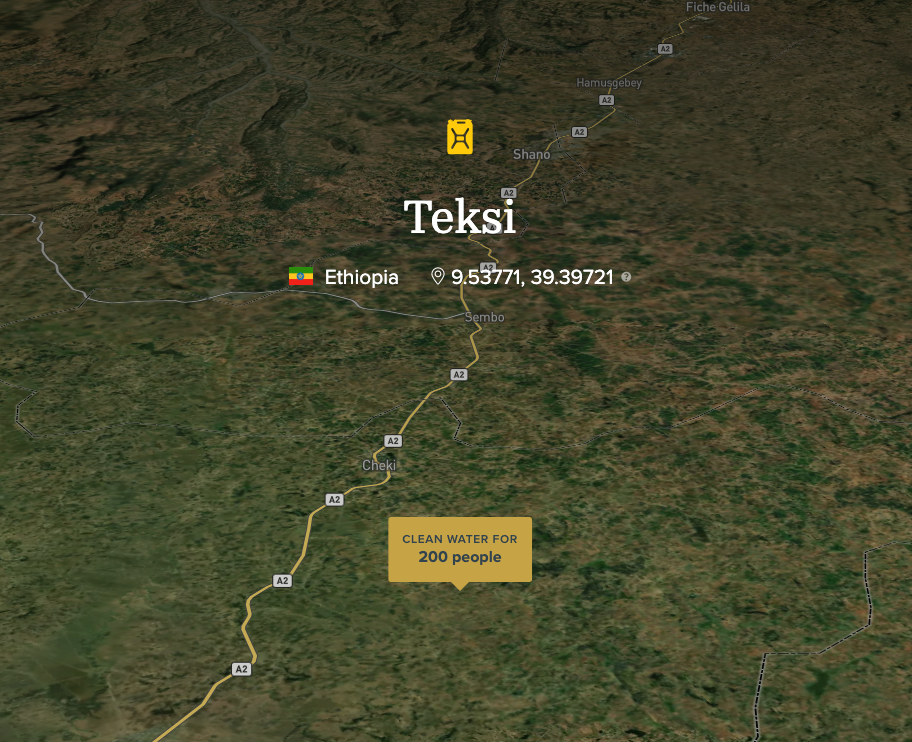
Example Charity:Water impact report: https://www.charitywater.org/projects/441-99#
Every donor receives something most nonprofits have never thought to send: GPS coordinates and photographs of the specific water project their contribution funded. It is more than an aggregate impact report or a thank-you letter with aggregate statistics. These project-specific webpages show the actual well, in the actual location, built with the donor’s contribution.
Charity: Water reports a 30% increase in donor engagement and 25% larger average donations after implementing these personal impact reports. This may be one of the simpler examples of a personalized impact report, yet it delivers a powerful emotional message.
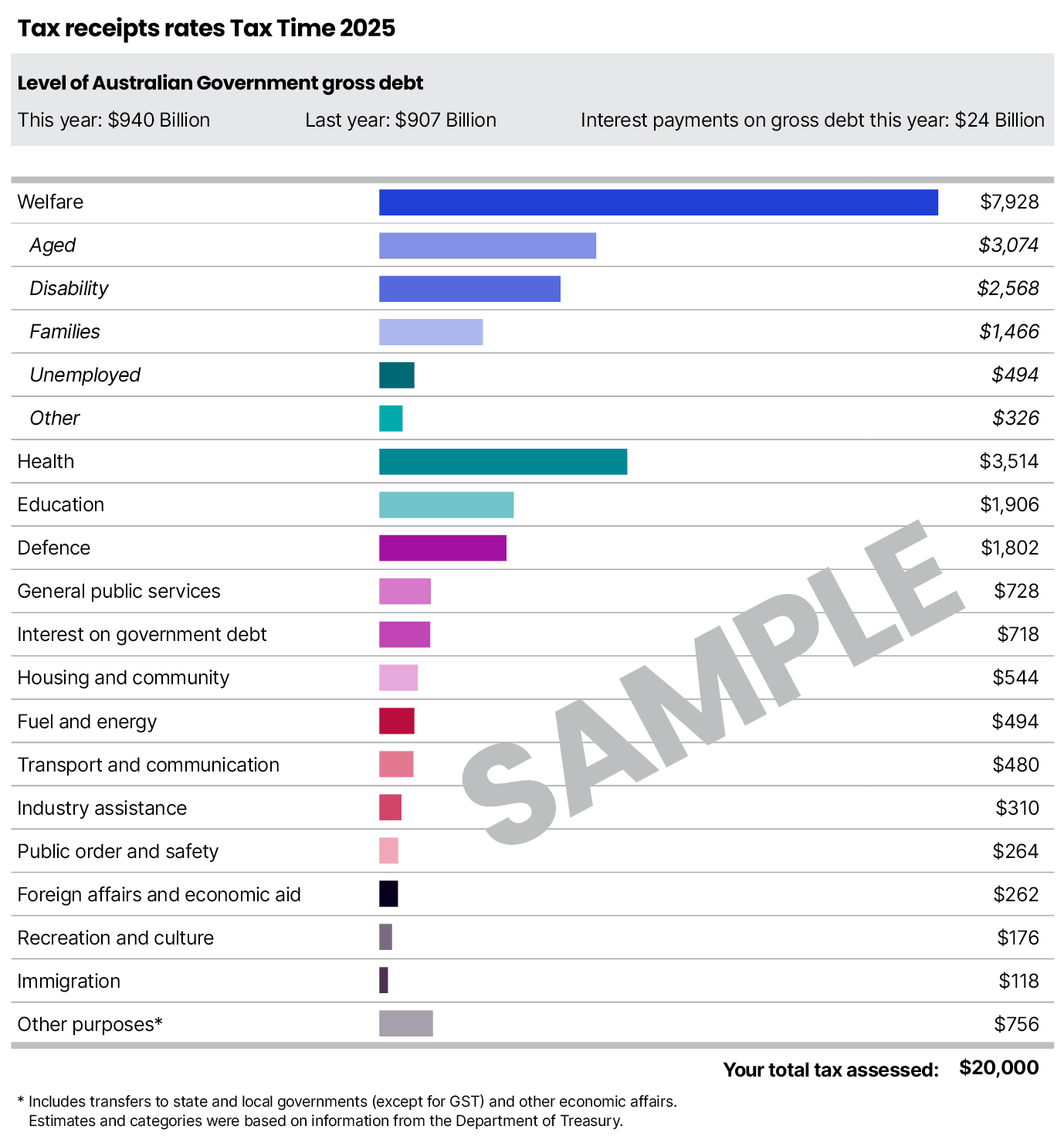
The Australian Taxation Office
Since 2015, every Australian taxpayer with a liability above $100 receives a simple breakdown alongside their notice of assessment to show how their specific tax dollars were allocated.
The “receipt” has no animation, no AI, and makes do with a single table. However, when this examples was posted to Reddit a few years ago, it went caught the attention of frustrated taxpayers across the globe. A government agency accidentally went viral by doing something radical and simple: treating citizens as stakeholders who deserve to know what their money accomplished.
What We Can Learn
A few things stand out when you look at this list as a whole.
The data almost always already exists. No organization here built new infrastructure to make this happen. Xcel had smart meter data. Charity: Water had project coordinates. The investment was in the decision to use it differently, not in collecting something new.
The "you" framing is what makes these land. Every example that works centers the recipient's story, not the organization's. The Australian Tax Office doesn't say "the government spent $X on health." It says "you contributed $420 to health." That shift in subject is enormous.
Scale doesn't change the mechanics. ICA delivers to millions of users. Charity: Water does it for individual donors. The underlying idea is identical: connect the person to their own data, and frame it as a story about what they did. The execution may differ, but the principle doesn't.
At Juice Analytics, making data communication actually land is what we do. Forward is our answer to the question of how any organization can give its customers, members, or donors a year-end moment worth receiving — personalized, at scale, without rebuilding your data infrastructure to get there.
The examples above prove the model works. The question is who does it next.