
-
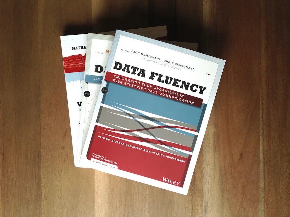
We literally wrote the book on Data Fluency
Data fluency starts by teaching the skills, mindset, and habits that bring data into decision-making. It requires overcoming the “last mile problem,” bridging the gap between data analysis and the minds of decision-makers.
-

Ready to Tell Data Stories?
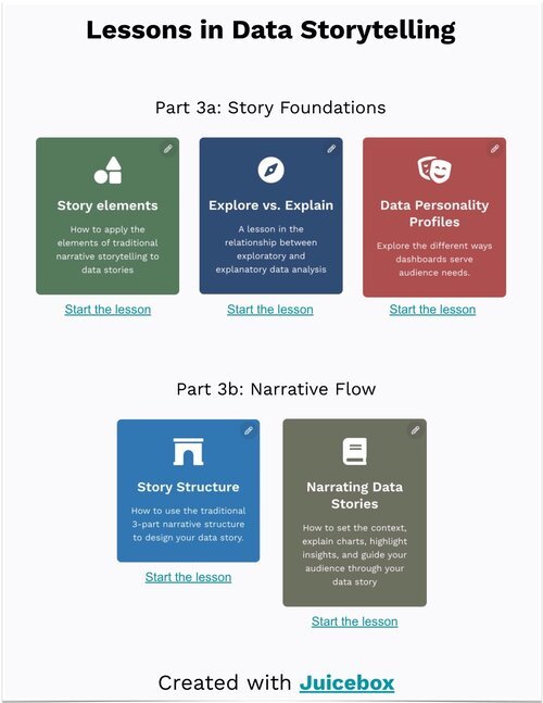
Get our FREE Data Storytelling Lessons to learn how to deliver impact and change minds with data. Each lesson includes the techniques, mindset, tips, and tricks you’ll need to impress co-workers and clients.
Take an important step in differentiating yourself in the modern, data-rich workplace.
-

The Complete Guide to Designing Dashboards
Download our classic guide for making dashboards people love to use. From layout and flow to visualization choices, this white paper is your best starting point...
Insights from our blog
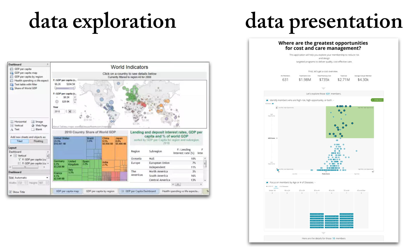
Data exploration means the deep-dive analysis of data in search of new insights.
Data presentation means the delivery of data insights to an audience in a form that makes clear the implications.
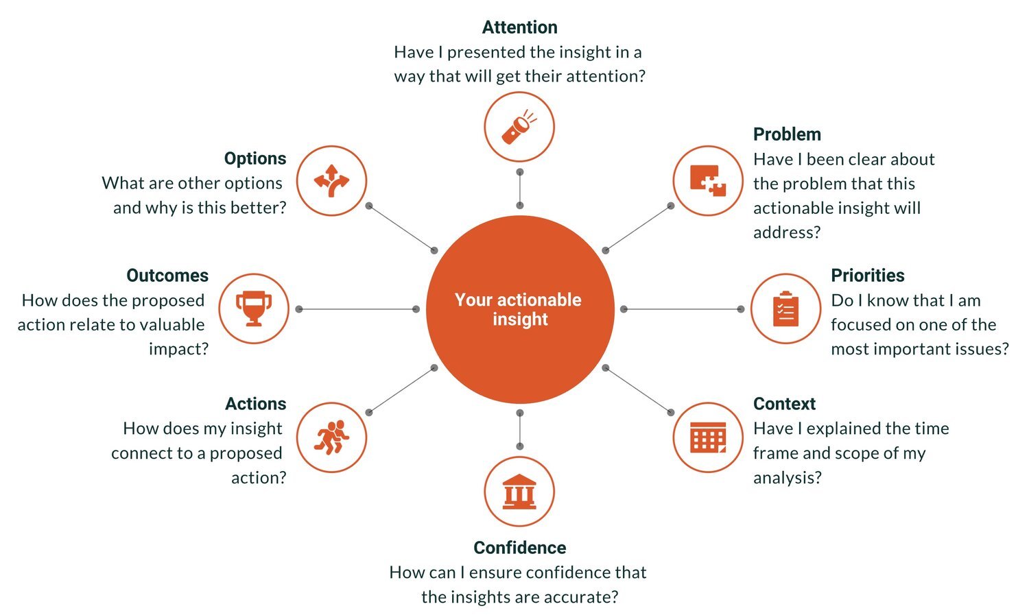
“Actionable insights” is the Holy Grail of analytics. It is the point at which data achieves value, when smarter decisions are made, and when the hard work of the analytics team pays off. Actionable insights can also be elusive — a perfectly brilliant insight gets ignored or a comprehensive report gathers dusts on a shelf.
Explore how customer reporting falls short and why modern data products deliver real value. This updated guide walks data professionals through ten crucial differences, from design and delivery to monetization and user‑focus.
Learn the 12 timeless rules of effective data storytelling—refreshed with modern guidance for today’s data professionals.
Are you looking to upgrade your Data Storytelling skills? There are many options for learning. We’ve compiled an updated list of resources, including free training, online courses, and workshops from top experts. If you just want to get a sense of what makes a good data story, you can start with our list of the best data storytelling examples.
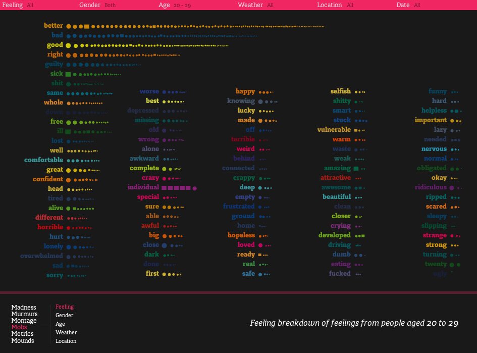
This collection of world-class data stories demonstrates how to combine data visualization, interactivity, and classic storytelling. Each of these examples shows the importance of a clear message, supporting data and analysis, and a narrative flow to engage the reader.
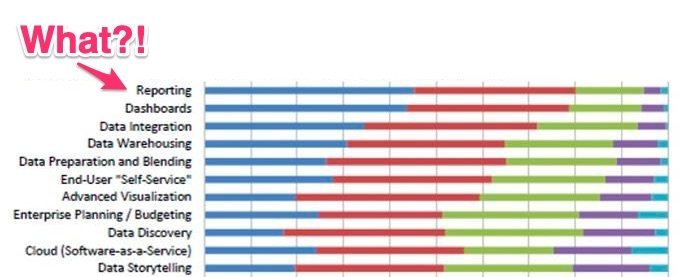
Customer reporting is one of the most under-appreciated touch-points that service and solution companies have. Whether it is a weekly status update or a performance dashboard, reporting can be an opportunity to demonstrate expertise and value.
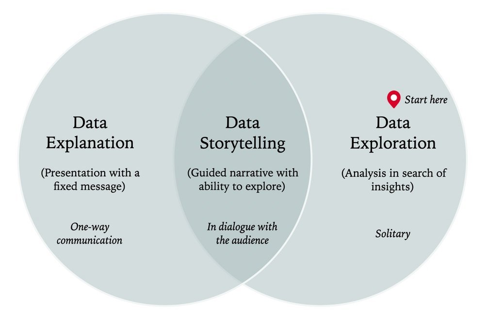
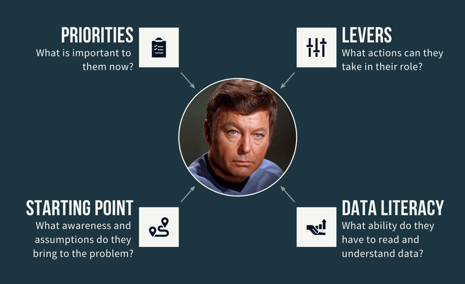
How to get started with data storytelling? For the beginner — and even for the experienced data analyst or data scientist — data storytelling can be a vague, disorientating concept.

With the popularity of our list of 20 Best Data Storytelling Examples, we thought it worth finding some more data stories for inspiration. The good examples in this list demonstrate how to combined data visualization, interactivity, and classic storytelling. They show the importance of a clear message, supporting data and analysis, and a narrative flow to engage the reader.
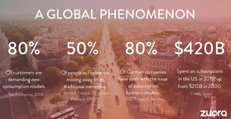
Andy Raskin calls the following Zuora presentation “the greatest sales deck I’ve ever seen.”
Why’s it so great? It explains how a changing world will lead to winners and losers, and gives the customer a tease of how they can become a winner with the magic of the product.

Putting data on a screen is easy. Making it meaningful is so much harder. Gathering a collection of visualizations and calling it a data story is easy (and inaccurate). Making data-driven narrative that influences people...hard.
“Actionable insights” is the Holy Grail of analytics. It is the point at which data achieves value, when smarter decisions are made, and when the hard work of the analytics team pays off. Actionable insights can also be elusive — a perfectly brilliant insight gets ignored or a comprehensive report gathers dusts on a shelf.

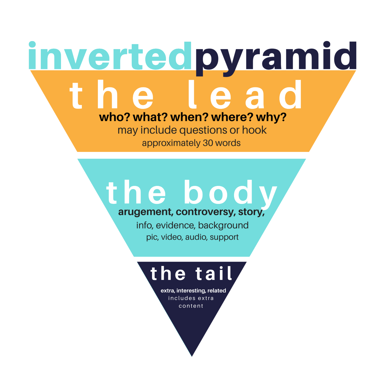
Data Storytelling is a powerful way to present data in ways that influence your audience. It is a skill that combines elements of artistic expression and structured methods. In this article, we will start by learning from the mindset of a leading storytelling organization, Pixar. Then we will discuss how to structure data stories to guide your audience through data.

Presumably, your data is not meant to distort, yet we can gather from this short scene some practical communication tips to improve data-informed discussions.
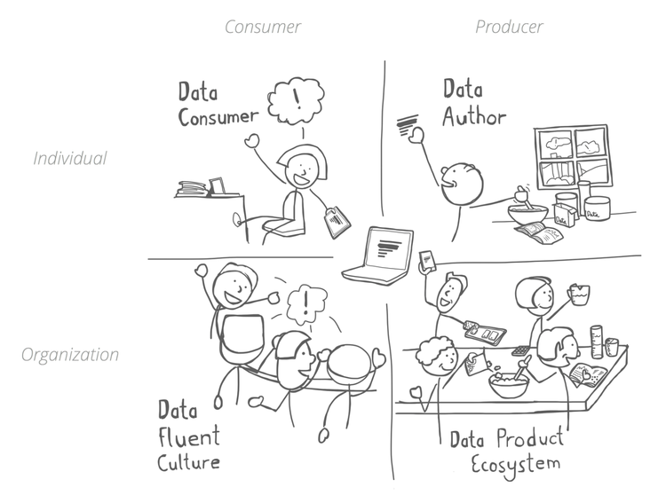
Data alone isn’t valuable—it’s costly. Gathering, storing, and managing data all costs money. Data only becomes valuable when you start to get insights from it and apply those insights to actions. But how do you empower your organization to do that?
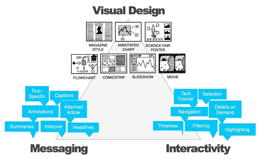
Before you send off that data story or presentation, check out these eight guidelines to see if it is ready for prime-time.
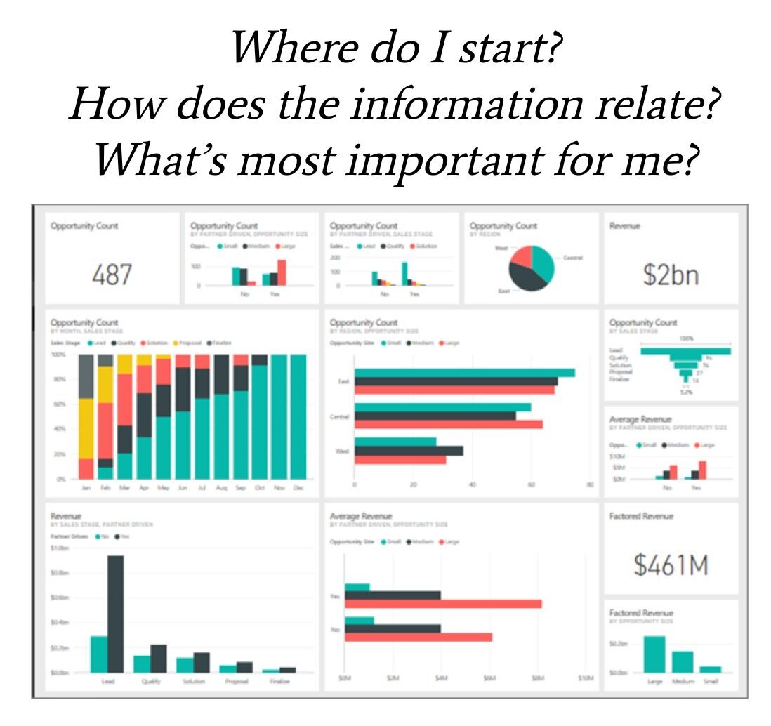
Are you ready to learn how to be a data storyteller, but don’t have enough time to review the many great resources? Or maybe you don’t have the time to attend a world-class data storytelling workshop?
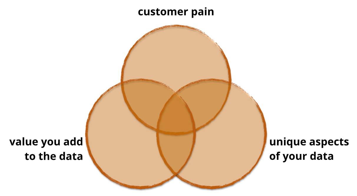
At Juice, we’ve helped our clients launch dozens of data products that generate new revenue streams, differentiate their solutions in the market and build stronger customer relationships. Along the way, we’ve learned a lot about what works and doesn’t. In this series I’ll take you through what you need to know to design, build, launch, sell and support a data product.
Data exploration means the deep-dive analysis of data in search of new insights.
Data presentation means the delivery of data insights to an audience in a form that makes clear the implications.
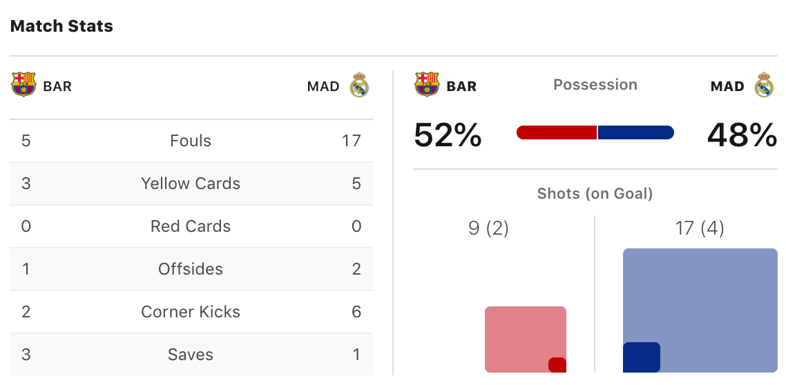
The title comes from Ronald Reagan, sometimes known as “The Great Communicator.” If he knew anything, he knew that simplicity was foundational when reaching a broad audience.
That doesn’t stop people from finding ways to overcomplicate their data visualizations. Take this example from The Data Viz Catalogue. It is called a Radial Bar Chart.



Often customer data products or applications go awry because of poor requirements. While customers can describe a billing workflow or a mobile app feature, explaining how data should be used is less clear. Merely documenting a wish list of reports, fields and filters is a recipe for low adoption and canceled subscriptions.