Hilburn's Law of Data Intentionality identifies the existence of a positive correlation between the intentionality of data collection and and the intentionality of data communication [citation needed].
When a person or organization makes deliberate and purposeful choices about the data gathered, the person or organization tends to place similar weight and effort into the presentation of that data. The negative relationship is also true. Data that is not well-considered or valued is typically presented in ways that show little consideration of a specific message or purpose.
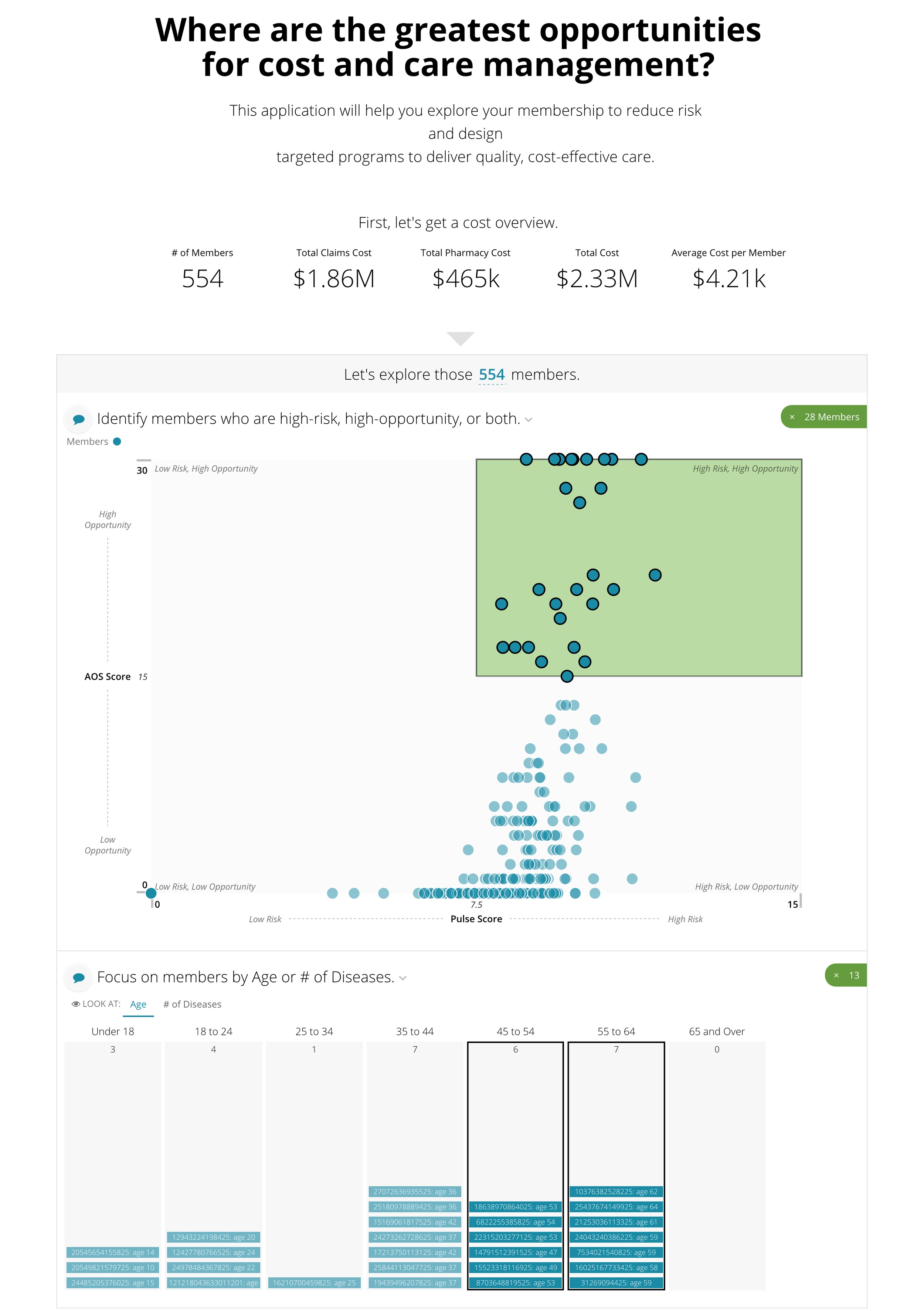
The following diagram represents this relationship between intentional data collection and intentional data presentation.
The four quadrants represented above can be explained as follows:
(A) LOW intentionality of data collection and presentation.
It is common for large volumes of data to be gathered without premeditated thought about how the data will be used. As a result, the presentation of this data often lacks a specific purpose. An example of this scenario is web analytics platforms that gather a broad array of measures about visitors to a website without a focus on a specific hypotheses or behaviors. This general dashboard or analytics tool approach asks the data audience to find their own intentionality within the data.
Web Analytics Dashboard
(B) HIGH intentionality of data collection but LOW intentionality of data presentation.
We must also consider the exceptions that prove the rule. In this quadrant are the researchers who have invested time, money, and effort into gathering valuable data but neglect to carry that effort forward into data presentation to their audience. Some syndicated research studies, for example, are presented as long written reports with appendices of data tables. Healthcare analytics start-ups and data scientists can find themselves in this quadrant when they lack the time, resources, or training to properly communicate their hard-earned insights.
(C) HIGH intentionality of data collection and presentation.
This quadrant represents the scenarios when there is consistent and persistent effort to extract value from data. Data experts consider what data they want to collect, the message they find in their cultivated data, and to who they want to communicate the results. Creators of market or customer surveys, consultants, and analytics businesses often fall into this category.
(D) LOW intentionality of data collection but HIGH intentionality of data presentation.
Finally, this quadrant is another uncommon scenario. Data visualization students and practitioners will sometimes use standard data sets (e.g. US Census data, import-export data) as an easily accessible raw material for elaborate data presentation.
It is important to note that every situation calls for its own level of effort, intentionality, and purposefulness, so there are legitimate reasons why someone would choose to invest or not invest in either intentional data collection or presentation.


