Healthcare

New Ebook: 5 Strategies for Getting Started with Workforce Analytics

Picture this: you're an HR executive in a top healthcare organization. You love your job, and you're committed to providing the absolute best patient care possible. But with increased demands and a tightening resource base, doing so is becoming more and more challenging. How are you supposed to provide more when you're being given less?

Thankfully, there's a solution. Workforce analytics can provide invaluable insight into healthcare organizations that can have a direct impact on patient care and satisfaction. However, getting started with workforce analytics can be a confusing process. That's where we come in.

For years we've been working with healthcare organizations to address these very issues using workforce analytics. We've got some of the best minds in the industry tackling the same problems you face, and now they're sharing what they've learned about workforce analytics in our newest ebook. It will walk you through what workforce analytics are and the steps you can take to implement workforce analytics in your organization right away.

5 WA 3D.jpg

So if you're feeling ready to get started with workforce analytics, download the ebook for free now! 

Turning Healthcare Workforce Data from a Challenge into an Asset

“Since people are a huge investment, the hospital needs to make sure that it’s hiring and retaining the best people. Once hired, though, how does a HR leader keep an enterprise view of the workforce, and how do they identify problem areas quickly?”

It’s a tricky question, and it’s the one we set out to solve when we created our latest product, Blueprint.

If you’ve been paying close attention to the Juice blog, you might have noticed we’ve been talking about Blueprint quite a bit lately (see here, here, and here). Each one of these posts has featured a different aspect of Blueprint, depicting a small sample of its various features and demonstrating its ultimate purpose: to provide HR leaders with an easily accessible enterprise view of their workforce in order make better data-driven decisions.

Michael Dean, Juice’s Director of Business Development, sat down recently with HealthStream to further discuss Blueprint’s features, provide more information about who might most benefit from it, and share some examples of Blueprint in action. Download the latest issue of PX Advisor, HealthStream’s online magazine dedicated to improving the patient experience, to learn more about how Blueprint might be the perfect fit for your organization.

Done with reading and want to get an up-close look at Blueprint for yourself? We’d love to show it to you! Send a message to info@juiceanalytics.com or set up a demo below.

Image Source: http://www.healthstream.com/resources/px-advisor/pxadvisor/2017/02/10/winter-2017

Taking Your Organization’s Pulse with Workforce Analytics

What is the first thing that comes to mind when you hear the word “healthcare”? Is it an image of an industry dedicated to patient health? Or do visions of budget cuts and federal mandates dance in your head? My bet is on the latter.

Whether you’re a healthcare employee or not (and whether you like it or not), you’re still a part of the healthcare industry. And we can all probably attest to associating “healthcare” with an industry encumbered by increased demands and limited resources, instead of one that is focused on the health and wellness of patients.

Whatever your political and personal stance, I think we can all agree that patient care should be at the forefront of the industry’s focus. But with increased demands and a tightening resource base, how can this be accomplished?

It’s a basic economics principle – the only way to do more with less is to change the way things are being done. This means challenging the traditional approach. One CIO article went as far as to compare healthcare to Blockbuster, suggesting that the industry is in need of a “Netflix-type” level of disruption. Unfortunately, trying to compare the model intricacies of healthcare delivery with video rentals is like comparing the complexities of the human body with that of a VHS tape (one is a little more complicated).

However, I think we knew where the article was going with this analogy, and that the takeaway is the need for a new approach. But with a multitude of different interventions and efforts currently intertwined and underway, the question is, “Where does one start?” For an industry in need of determining which piece of the puzzle to focus on, it would make sense to consider where the largest investment lies. For healthcare? That’s staffing.

Hospitals invest millions annually in financial and clinical IT systems, but tend to spend much less on "the people side of the business.” Staffing expenses currently make up over 54.2% of a hospital’s overhead costs, and staff-related expenses can cost upwards of 70% of an organization's total costs – easily the largest expense line item on the books. Furthermore, healthcare employment is projected to grow 29% by the year 2022 according to the Bureau of Labor Statistics. That’s twice as fast as the expected overall employment growth!

Perhaps the most important reason to focus on staffing practices is that they have been shown to have a direct impact on patient satisfaction and outcomes, with considerable amounts of research linking staffing variables to patient outcomes. In other words, happy workers equal happy patients equal happy profits.

Fortunately, what we’ve learned through the development of our analytics platform, Blueprint, is that it does not take a whole lot of complex workforce data to begin measuring staffing areas that are directly tied to quality of care and cost management. Below is an example of some of the strategic areas on which Blueprint focuses. Give these data-driven efforts the attention and resources they deserve, and you’ll be moving towards better clinical and financial outcomes.

  • Turnover Calculations - Replacing a valued healthcare employee can cost up to 250% of the employee’s salary. According to an NSI study, 83.9% of healthcare respondents don’t record the costs of employee loss. With the report finding that the vacancy rate for nurses is expected to grow, hospitals need to do all they can to keep retention high to avoid a lapse in patient care quality and a need to increase clinical workloads even more.
     
  • Retention and New Hires - Mentioned above, retention can provide the continuity of care that plays a large role in clinical care and patient satisfaction. Furthermore, employees with less than one year of tenure make up nearly 25% of all healthcare turnover nationally(!) 

    Try tracking turnover in groups by tenure such as 0-3 months, 3-6 months, 6-12 months, >1 year, etc. Reporting the data in cohorts will make it easier to pinpoint where in the lifecycle the attrition is occurring.
     
  • Managerial Span of Control - According to studies, smaller spans of control are linked to higher rates of employee retention – and the alternative being true with wider spans of control.

    Use supervisor/employee data to compare the number of direct reports by hierarchy level. Spans of control should be similar for supervisors in the same hierarchical level, with the exception of differences in direct report skill level, experience, and tasks performed.
     
  • Staffing Ratios - Staffing ratios define the relationship between your revenue-producing employees and the staff needed to support them. According to the Agency for Health Research and Quality (AHRQ), the risk of nurse burnout increases by 23% and dissatisfaction by 15% for each additional patient. However, when hospitals have accurate staffing, nurse burnout and dissatisfaction can drop significantly. Studies suggest that the higher the ratio of support staff per FTE physician, the greater the percentage of medical revenue after operating cost. Health systems with higher nurse employment had a 25% lower chance of receiving penalizations for readmissions through HRRP than those that had lower nurse staffing levels.
     
  • Leverage Your Internal Resource Pool - With an enterprise view of your staffing needs, it’s easier to make strategic staffing decisions for the entire organization, enabling you to find that sweet spot between optimal care delivery and labor cost management.

    Begin by analyzing data that represents staffing by facility, specialty, and department, while considering patient needs and the corresponding staffing data across the organization. Monitor staffing distribution and find opportunities for reallocation (as opposed to hiring/terming) with staffing surpluses and shortages.
     
  • Strategic Staff Allocations - Employ known enterprise concepts, such as economies of scale by identifying opportunities where you have a concentration of facilities in a given geographic area. Also, back-office, phone clinical roles and administrative functions, such as billing and purchasing, can be streamlined with centralization efforts that leverage economies of scale.

    When faced with healthcare’s “do more with less” dilemma, it is an opportune time to rethink how we approach labor cost containment and quality of care improvement strategies.

In the midst of healthcare reform and quality care initiatives, healthcare systems have an opportunity to place patient care back in the forefront of the healthcare delivery model. By recognizing that the missing link between quality of care and cost containment is the healthcare workforce, they will be doing just this. After all, people are at the heartbeat of healthcare -- patients and staff.

Let us help you keep your finger on the pulse of your organization and visualize your data in way like never before. Interested in learning more about a one-stop-shop for workforce analytics? Send us a message to get a preview of Blueprint.


A Blueprint to Insight

It's often easy for me to take for granted the insights I regularly receive from data. Whether that be from tracking a run with my Fitbit, looking at likes and views on social media, or using Google Maps to help me avoid traffic. Working for a company that has the word "Analytics” in its name means that I spend a lot of time in data, and working for a company as creative as Juice means I get the opportunity to truly enjoy navigating data as a visual experience.

I have mentioned our new product Blueprint a couple of times already, but I wanted to share some of the insights we've been finding in hospital and health system data and how that data affects internal decisions. According to a study from Becker’s Hospital Review, a hospital's workforce accounts for 54.2% of a hospital's overall operating costs. These people are a huge investment, and so the hospital needs to make sure that it's hiring and retaining the best people. It can be quite the undertaking to make sure that the Emergency Department has staff with enough experience to adequately do the job, or that hospital supervisors are retaining top talent.

As we have been digging into some of these different facilities' workforce data, we have started to come across varying insights that have turned out to be valuable to hospital leadership. For instance, Blueprint can show a Chief Operating Officer where she has the opportunity to consolidate. There are often multiple people who are spread out across a facility which could be consolidated into one or two units, reducing overhead. For a larger hospital system with multiple facilities, Blueprint can allow a leader to compare facilities across their enterprise. With this information they are able to compare by important metrics and ratios like staff-to-supervisor ratio, or staff to provider ratio across all their facilities.

Turnover, often a primary concern for HR, is another hot spot with which Blueprint helps provide insight. Recently, Blueprint was able to help a pilot customer that manages over 40 senior living communities locate the departments and managers with the most turnover. As we have continued to discuss Blueprint with HR leaders, they have expressed the need to be able to tie turnover to root causes like compensation or employee engagement. Since Blueprint is designed to take a large number of staff and find further subsets, it can act as a funnel to get you to the group of people you are looking to take action on. I was talking to an HR Director at a hospital yesterday who was saying that she has a hard time tracking the number of interns they have at any given time and what departments they are in. Using Blueprint, we were able to find that information within a matter of a couple of clicks.

By taking the HRIS data of a hospital and health system and categorizing it in a meaningful way, we feel as if we have stumbled onto something truly valuable. The finish line being helping hospitals and health systems build a successful Blueprint for their organization.

Want to know more about Blueprint and how it could help your organization? Drop us an email. We'd love to hear from you.


Driving Healthcare Data Culture Forward

Last week, Juice Analytics participated in the Health 2.0 Atlanta panel, a co-hosted event by the Data Science and BI Society of Atlanta and Health 2.0 Atlanta. The focus was on analytics and healthcare and it was a great event. There was so much interest, they had to move the event to a larger venue! That tells me two things - (1) people want to get more out of their data and (2) Healthcare is behind and they really want to catch up. Two of my favorite “tweetables” of the night, said by Jason Williams, VP of Analytics and Strategy at McKesson, backed up those assumptions.

Getting more out of your data

The first “tweetable”  was something we see at Juice all the time: “Nobody wants analytics, people want answers.” This relates back to people wanting more out of their data. Right now many people simply have data - and that’s it. But people want more than just a bunch of charts and numbers on a screen, they want insight. They want to be told where the problem is and given insight into how to fix it. If you’re simply delivering data either in a spreadsheet or just a series of charts, you’ve missed the mark. And for the record, this problem isn’t specific to healthcare. It’s all over.

Catching up in Healthcare and the path forward

My other favorite “tweetable”, originally said by W. Edwards Deming, was “In God we trust; all others bring data.” To get buy-in on a problem and solution, you need the data to support your position. The problem is that not everyone is ready to embrace data. As the quote alludes to, it’s all fine and well to think or believe you know the answer, but data helps you actually know the answer. Sure there can be a human element involved, but being informed with data to back up decisions is useful and important. In order to move data in healthcare forward, there needs to be a culture around data. It needs to be ingrained in an organization as useful and be included in everyday conversation.  

Embracing a data culture in healthcare will become even more important as we move into the future of what healthcare could look like. Much like Google Maps on your phone adjusts your course based on a wrong turn or an accident on the highway, it was said that healthcare will begin to use data in much the same way. Healthcare data should and will move in the direction of being event driven and using data to adjust as things are happening, rather than being reactionary. I don’t know about you, but that sounds exciting and full of promise! But to get there, you first need a good data culture.

The event was not only a great success, it was insightful - which is what we love! It would seem that to begin to move your healthcare organization forward, there are two things to focus on. One would be providing insight, not just data. The other is to promote a culture of data that is widely adopted within the organization. Without that, having insight won’t matter since nobody will want to use it.

To learn more about creating a data culture in your organization, check out Data Fluency: Empowering Your Organization with Effective Data Communication, written by Juice Analytics founders Zach and Chris Gemignani.

To learn more about how we help our healthcare clients provide data insights and succeed, check out our case studies or get in touch.


Create Healthcare Data Products for Your Customers

Take a look around these days, and you'll notice that we're surrounded by data products. There's an emerging market for them, and consequently consumer-focused companies are delivering new data products everyday. With the explosion of data as infrastructure in the field of healthcare, it's an especially ripe territory for data products.

Here's a webinar that Juice CEO and founder Zach Gemignani recently held on creating healthcare data products. Watch and learn the three key factors to data monetization success, the most important parts of data product design, examples of healthcare companies that have successfully launched their own data products, and more.

Like what you see and want to know more? We want to hear from you. Schedule some time to talk with us about data product opportunities, or send us an email at info@juiceanalytics.com. 

Not Knowing Where To Start

Books, movies and music all have a beginning. Data, when presented or shared, often does not have an intuitive starting point.  The challenge of not having a clear beginning is that when you see a dashboard littered with a dozen competing charts it’s easy to disengage. Tables of raw data can be even worse. Dashboards or reports are often designed to deliver everything and the kitchen sink.         

Here are a couple of examples of dashboards that miss the mark in terms of telling their audience where to start.  In both of these cases the user has to be familiar with the data and know how to read the information correctly.  Beginner or infrequent users will struggle to understand the value of this data.  Without guiding them, the users can lose interest and choose to avoid using the information altogether.

               http://www.dashboardzone.com/health-metrics-dashboard-from-idashboard

               http://www.dashboardzone.com/health-metrics-dashboard-from-idashboard

              http://www.informationbuilders.com/products/webfocus/operational_dashboard

              http://www.informationbuilders.com/products/webfocus/operational_dashboard

Good dashboards or reports start with a high-level summary and then let users progressively and logically drill into more complex details and context. They are also simple and uncluttered. They use white space and have a clear visual hierarchy.   Here are a few of alternative examples to get the wheels turning.                        

Even this more advanced interactive visualization, called a TreeMap, offers clarity on where to start and how to use it.

To have your audience follow your story it’s important to get them started on the right path.  Think Steven Covey’s, Begin with the End in Mind.  Just like a story your audience is along for the ride.  Carry them from initial explanation to a new, shared understanding.   Only then will they begin to value the effort you put into assembling and presenting the information you’ve given them.

For a demo of our product, Juicebox, schedule an appointment.

Find out more on effective data visualization from our book, Data Fluency. Excerpted here with permission from the publisher, Wiley, from Data Fluency: Empowering Your Organization with Effective Data Communication by Zach Gemignani, Chris Gemignani, Richard Galentino, Patrick Schuermann.  Copyright © 2014.


4 must-do’s to get the most out of your benchmarks

We all joke about “keeping up with the Joneses”. This timeless expression is synonymous with the human tendency to compare ourselves to others. Following the rise in suburbia, neighbors continue to “one-up” each other as a way to establish  socioeconomic dominance. This neighborly competition plays out in categories like who has the best kept lawn, the newest car, and whose kid won first place in the spelling bee.

Just like we compare ourselves to our neighbors, businesses benchmark to see how they stack against the competition. In most cases a benchmark is an industry average, peer group or an index (like the DJI or NYSE). Displaying these benchmarks clearly helps your business identify areas for improvement and goal setting.

For example, how does Volkswagen stock compare to the BMW and DJI over the last 3 months?

benchmark_trend.png

Motivate your audience

More importantly, benchmarking is used to inspire action. The social pressure to be better (much like the Joneses) catalyzes when you see how you stack against your peers. When your company can see where you are in the standings, everyone works harder to get that one-up.  

Are you using benchmarks effectively in your business?  Here are some must-do’s to get you started.

Item #1: Start with the right metrics

Choose a relevant metric and the right benchmark. Users want benchmarks that are relevant to them. They want to compare themselves to the most similar set. Provide flexibility to define relevant comparisons for the user.

Depending on the action you want to inspire or the goals to set, select the metric that aligns. Then decide whether to compare to an industry, a region or a peer group.

Item #2: Make it easy to find yourself and your peers

When designing the display, think about making it as easy as possible for the audience. Will they be able to see within seconds where they stand? Users love benchmarks because it puts their performance in context. Can they easily identify where their peers are? Don’t make them work to figure it out, or the benchmark becomes ineffective even if the data is accurate.

benchmark.jpg

Item #3: Clearly label your benchmarks

Benchmarks are often not well defined. It can refer to the average of all entities in the data. It can refer to top performers only. Label clearly. If you aren’t sure about your labels, ask a group of users to interpret what they see. You might be surprised at how different all the answers are.

Item #4: Include a large enough benchmark group

Sometimes you need to be careful about cutting your comparison set too thin.  Now’s your chance to share your BIG Data and everything you know about the industry and customers. It’s not enough to say you're 5% below the national average, but to show your audience that it’s based on 10 years worth of data, or millions of survey responses, etc.. Show the depth of your data!

Need more help? Check out the benchmarking functionality within Juicebox where there are several visualizations focused on benchmarking and comparisons.  

Click here to schedule a 30 minute demonstration.

Happy benchmarking!

Guest Post: Did You Answer the Question?

Earlier in the week Ken and I were discussing the importance of asking the right question and the very next day Kathy's blog post showed up so I had to share it.  If you're not familar with Kathy, she and the team at Rowell & Associates are talented healthcare experts that share our passion for the effective visual display and sharing of information.  In addition to her unique combination healthcare knowledge and data visualization, she is very funny.  In the spirit of full disclosure it is very hard for a Yankee Fan (me) to compliment a Red Sox Fan like Kathy; however Kathy is the exception.  Enjoy her post and if you're in healthcare check out her site. My husband Bret and I had a lively exchange the other morning about the previous night's Red Sox game. I'd gone to bed while he stayed up late watching the last few innings, so when I woke up, the first thing I asked was, "Who won?"

My question stimulated the following exchange:

"The Red Sox lost." "I didn't ask you who lost. I asked you who won." "It's the same thing." "No, it isn't." "Fine. The Los Angeles A's won. Now run far, far away, and leave me alone."

Most of this constitutes marital sport in my house, but part of the friction stems from real human frailty to which we all fall prey occasionally. Perhaps we fail to listen to or clarify the question at hand, and as a result answer incorrectly or ineffectively. We might think we know far better than the other person what (s)he really wanted to ask; so we answer that question ("Who lost the game?") instead of the one that was actually spoken ("Who won?").

The banter with Bret about the precise nature of my baseball question was inconsequential (especially since it occurred before my first cup of coffee). Our efforts to communicate healthcare data accurately and effectively are anything but. Here's what I mean.

My colleague Janet and I have had an ongoing conversation about the data and other information on PatientCareLink (PCL). We have been exploring its site, especially the section on hospital staffing plans, and we keep circling back to this: what question does the information shown answer?

First, we reviewed PCL's Mission Statement: "To deliver transparent quality and safety information from hospitals and home care agencies to patients and other healthcare stakeholders." Since this gave us a clear idea of what the group was trying to accomplish, we let it guide us as we reviewed the site and sought to answer one crucial question: do PCL data and information as they are currently displayed tell patients precisely how safe the hospitals and home health agencies listed are, and what quality of care each provides?

Here's one -- very revealing -- example of what we found.

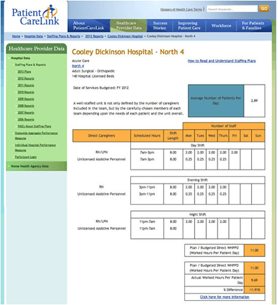
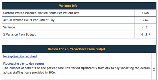
We looked at Cooley Dickinson Hospital's Adult Surgical Orthopedic Unit Nurse Staffing Plan for 2012 compared to the actual nursing staff levels during that year, trying to answer this question: could we tell, by comparing the Plan and actual nursing levels for the year, if this Unit provided high-quality, safe care to Orthopedic patients?

Cooley Dickinson Hospital's Adult Surgical Orthopedic Unit Nurse Staffing Plan for 2012

We could not. The most we could decipher from this graphic was that the intended complement for the unit was 11 nurses, and that most days there were actually about 10. The following drilldown seems to explain this variance:

Drilldown
Drilldown

This tells us the reason for the staffing variation (although we don't know why staffing hours from 2006 are referred to here) -- but it still doesn't answer our core question. Are ten nurses enough to ensure safety and high-quality orthopedic care? And what defines such care for this patient population, anyway?

We kept digging, zeroing in on this hospital's Fall Rate for the time frame closest to (though not precisely congruent with) the Staffing Plan data. (Please disregard the 3-D display: the folks who designed it haven't come to my workshops or read my newsletters yet.)

Fall Rates
Fall Rates

Aside from the different time frames noted above, Unit Types are not aligned with those reported in the Staffing Plan. After careful examination of the data, and although we have approximately 50 years of industry experience between us, Janet and I could not say for sure whether any of the falls on the Adult Surgical Unit (3) and the Adult Med-Surg Combined (53) involved orthopedic patients. Some of them may have, but that is only a guess.

Stay with me just a bit longer: it gets more interesting.

Hospitals whose data are displayed on the PCL site can if they wish enhance their presentations via a written narrative. Here is part of what this hospital submitted: "Cooley Dickinson has been ranked in the top 5 percent of all U.S. hospitals in patient safety by HealthGrades®, the country's leading independent health care ratings organization, for three consecutive years. HealthGrades® has also recently named Cooley Dickinson #1 in Massachusetts for joint replacement outcomes."

By this stage of the game Janet and I were mentally exhausted from combing the site for useful data (and desperately in need of a good cocktail). We had begun by asking one apparently simple question, then set out to answer it: could PCL's data and information tell us how safe and how good the care provided by its member hospitals and home health agencies was?

Nothing PCL offered even came close to answering this simple, vital question. At best, we could see data posted by certain healthcare institutions, and read what they had to say about that information; but our question -- created with the guidance of PCL's own Mission Statement -- was (and remains) unanswered, indeed unaddressed.

Here's the point: data and information are helpful only to the extent that they answer the questions that people actually ask -- not the ones you think they should have asked. This means that the data you gather, analyze, and display must be designed and presented with those questions constantly in mind, using symbols and words that make the answers crystal-clear and unequivocal: no jargon to baffle, no fancy graphics to befuddle.

Janet is working on a bit of a re-design of this information, so stay tuned. Me? I'm working on new ways to annoy my husband -- just for love of the game.