
Bridging the Last Mile of Data: Why Communication Is the Real Analytics Challenge
For over 15 years, we’ve been living a paradox in the world of analytics.
On one hand, organizations have made massive investments in data infrastructure, cloud platforms, and BI tools. There’s no shortage of dashboards, reports, and models. Yet on the other hand, we keep hearing the same complaints:
“We can’t get people to use the data.”
“Our organization still doesn’t feel data-driven.”
“We’ve built so much… but nothing’s sticking.”
The problem isn’t in the data. It’s in the last mile—the critical gap between data analysis and human understanding. Bridging that mile is what transforms raw information into action. And it requires something we’ve undervalued for too long: communication.
This post explores the key breakdowns in the last mile, and how data professionals can fix them using better data visualization, storytelling, and product thinking.
The Analytics Investment That’s Missing
Most organizations don’t suffer from a lack of data. The real friction comes when trying to get that data in front of people in a way that clicks — where it actually influences decisions and drives behavior.
A recent BARC survey found that only 25% of employees actively use BI or analytics tools. That number has barely moved in the past seven years. Think about that. Despite all the dashboards, the insights aren’t landing.
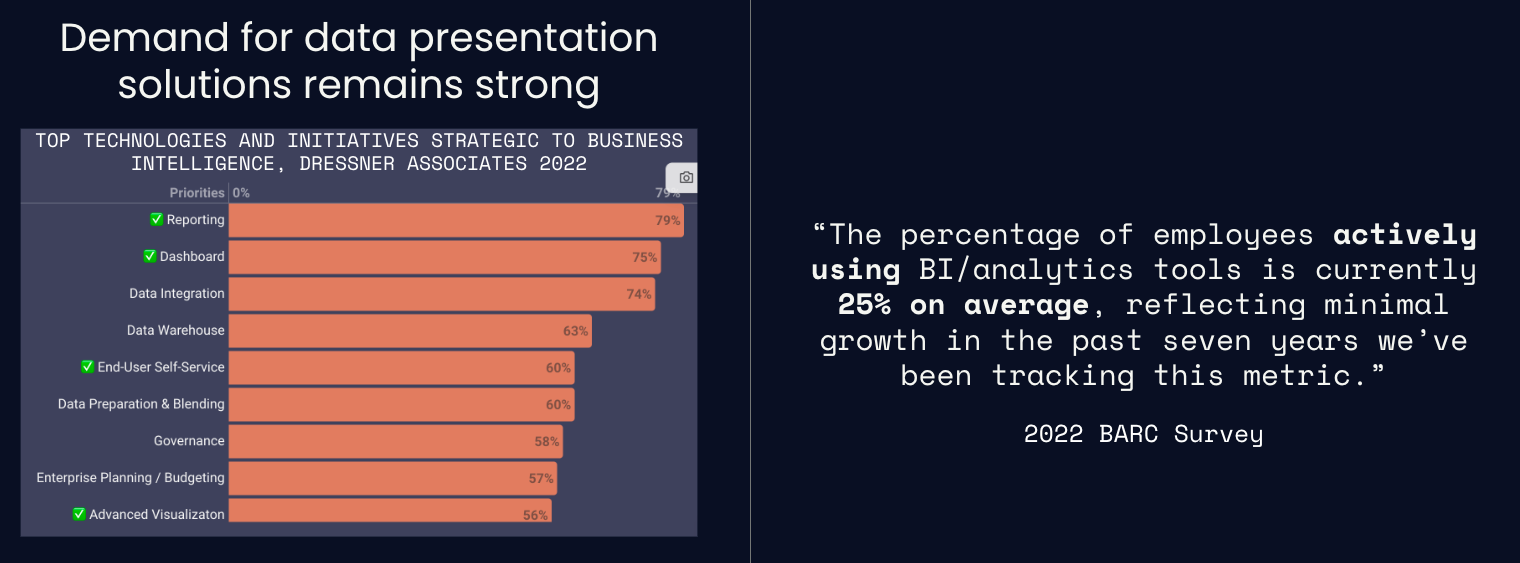
The “last mile” isn’t a technology failure. It’s a human problem.
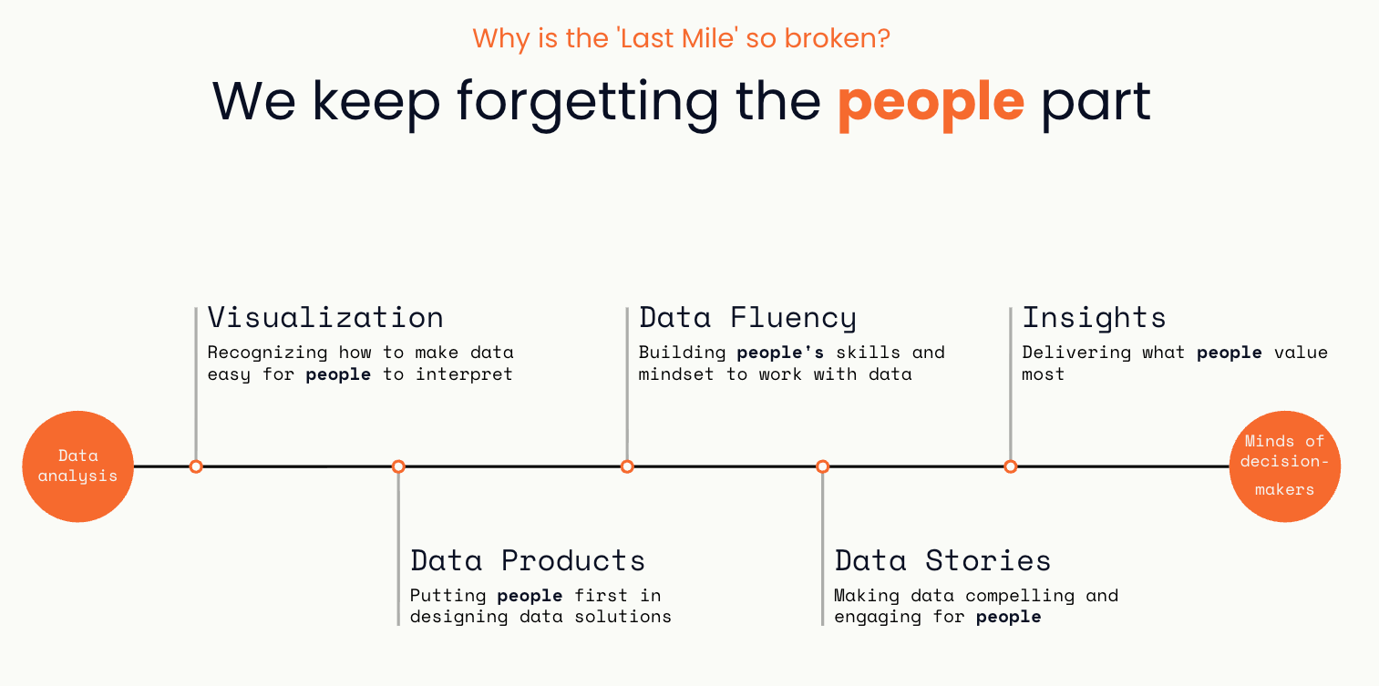
Five Breakdowns in the Last Mile
Through our work at Juice Analytics and conversations with hundreds of data teams, we’ve identified five major gaps that keep data from reaching its potential.
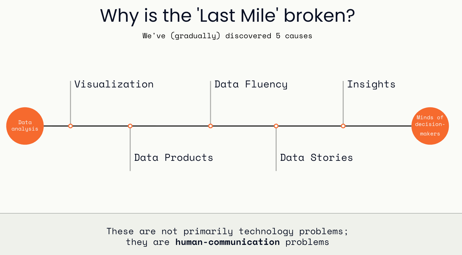
1. Data Visualization: When Charts Hurt More Than They Help
We often hear that a picture is worth a thousand words. But in data visualization, a confusing picture can cost you the entire conversation. Common issues include:
Overly complex charts that require explanation
Distracting visual noise (“chart junk”)
Lack of labels, context, or takeaway messages
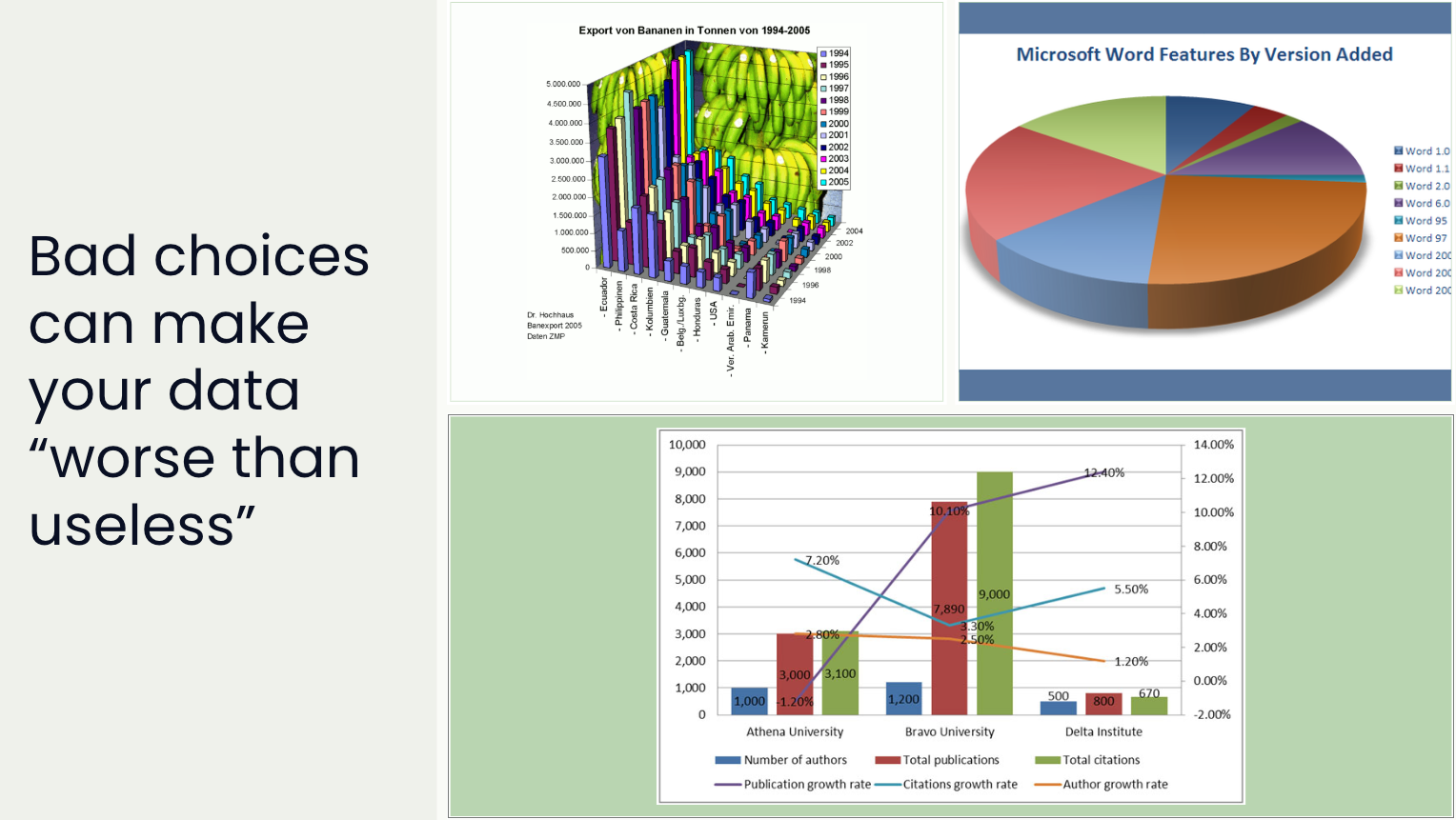
The fix? Keep visualizations simple and direct. Remove clutter. Always include clear text explanations. If a chart needs verbal explanation to make sense, it’s probably the wrong choice.
🔗 Recommended read: 10 Ways to Improve Your Data Visualizations
2. Data Products: Not Just Reports, but Real Solutions
Traditional dashboards summarize data. But data products guide users toward specific actions. They reduce noise, deliver only what’s needed, and provide contextual insights like comparisons and benchmarks.

According to DJ Patil (former U.S. Chief Data Scientist), a data product is something that facilitates an end goal through the use of data.
The shift from report to product means thinking like a designer and marketer:
Who is the user?
What decision are they trying to make?
What action does this insight unlock?
Data products also create business value by:
Attracting new customers through insight-based demos
Enhancing sales with data-driven pitches
Improving retention with customer-facing analytics
Monetizing new data offerings
🔗 Learn how we design data products with customers in mind
3. Data Fluency: Building Skills to Bridge the Gap
You can’t expect people to act on data they don’t understand.
Data fluency is about empowering more people, not just analysts, to read, interpret, and question data. It’s not just training on tools. It’s building a mindset:
Confidence to ask data-driven questions
Comfort in interpreting visualizations
Language to talk about data clearly
This is especially critical for leaders. If your executives can’t comfortably engage with your dashboards, they won’t use them to steer strategy.
🔗 Recommended: Data Literacy Fundamentals from dataliteracy.com
4. Data Storytelling: Turning Insights Into Narratives
Traditional reports tend to “let the data speak for itself.” The problem is that data has a quiet voice—unless we give it structure and flow.

Data storytelling combines narrative, visual design, and contextual framing to guide your audience to a clear, memorable conclusion.
What makes a great data story?
Audience-first: Tailored to the decision-maker’s needs
Structured: A beginning, middle, and end
Actionable: Leads to a clear insight or recommendation
Emotional: Connects with the stakes of the decision

🔗 Recommended read: Juice’s guide to effective data storytelling structure
5. Data Insights: The Smallest Unit of Value
Data insights are the atomic unit of analytics value. They are small, portable, and lead to action.
Yet too many dashboards ask users to find the insights themselves. That’s like giving someone a grocery store when they want a sandwich.

What makes insights “sticky”? Chip and Dan Heath’s Made to Stick framework offers guidance:
Simple
Unexpected
Concrete
Credible
Emotional
Story-driven
When designing insights, focus on surprising patterns, clear framing, and immediate relevance. Deliver them when users have the time and context to act on them.
🔗 Read more on creating sticky data insights
Stop Forgetting the Human Side
The last mile of data isn’t just about better dashboards. It’s about helping humans understand and act on data. That requires:
Clear visualizations
Purpose-built data products
Widespread data fluency
Engaging storytelling
Action-ready insights
These are communication challenges. Design challenges. Empathy challenges.
But they are fixable.
Final Thought: Build the Bridge, Don’t Just Deliver the Data
If your analytics work ends with handing off a dashboard or spreadsheet, you're leaving the job half done. The real value comes when the audience sees the insight, connects it to their world, and makes a better decision because of it.
So here’s the call to data professionals everywhere:
Let’s stop building warehouses no one visits.
Let’s start building bridges people can walk across.
Need help identifying the bottlenecks in your own last mile? We’ve developed a structured approach to data product design that starts with audience empathy and ends with actionable stories. You can check it out here.