
Data Exploration vs. Data Presentation: 6 Key Differences (2026 Update)
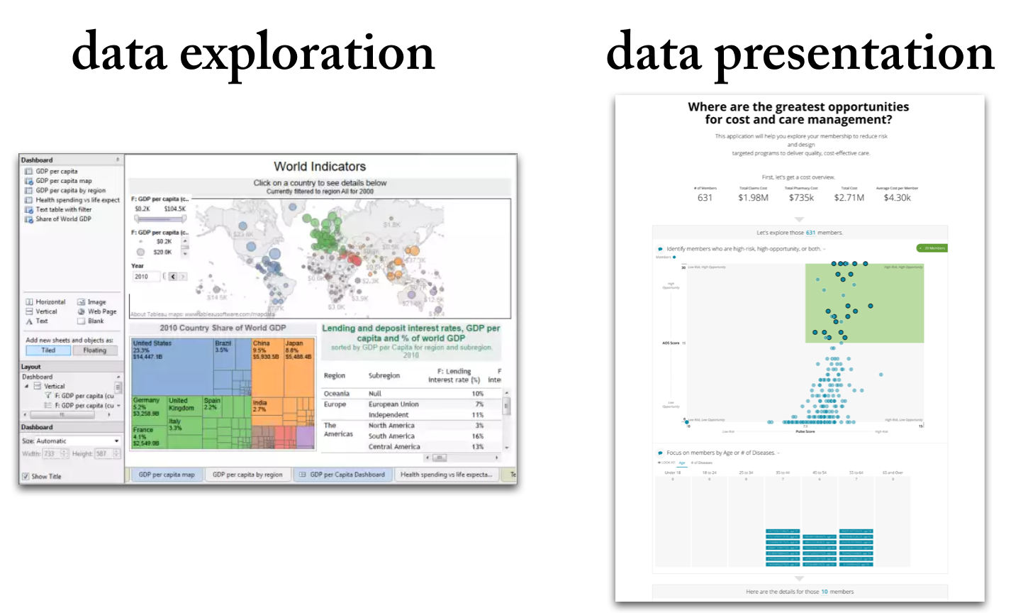
Data exploration means the deep-dive analysis of data in search of new insights.
Data presentation means the delivery of data insights to an audience in a form that makes clear the implications.
12 Rules for Data Storytelling (Updated for 2026)
Learn the 12 timeless rules of effective data storytelling—refreshed with modern guidance for today’s data professionals.
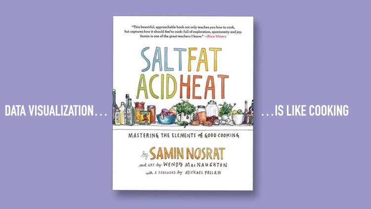
Are You Cooking or Baking with Your Data?
Some data teams cook. Others bake. The best do both. Learn how to balance agility and consistency in your data storytelling, visualization, and products.

Bridging the Last Mile of Data: Why Communication Is the Real Analytics Challenge
Why the biggest challenge in data isn’t technology — it’s communication. Learn how data professionals can bridge the last mile with better storytelling, products, and insights.

The Strategic Edge: Data Storytelling in Sales Presentations
Learn how sales teams can use data storytelling to build trust, connect with buyers, and win deals. A 2026 guide to replacing static charts with persuasive narratives.
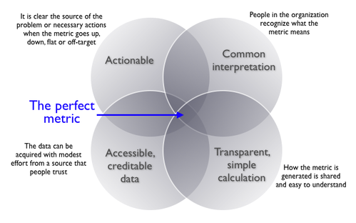
Choosing the Right Metric: A 2026 Guide to Smarter Analytics and Data Storytelling
Choosing the wrong metrics can lead to misleading insights and poor decisions. This post outlines a practical, three-step framework to help you select the right metrics for identifying problems, measuring performance, and guiding action. You’ll also learn the four key traits of effective metrics and how to avoid common pitfalls—plus real-world examples, expert insights, and links to trusted resources.