This collection of world-class data stories demonstrates how to combine data visualization, interactivity, and classic storytelling. Each of these examples shows the importance of a clear message, supporting data and analysis, and a narrative flow to engage the reader.
Want to learn more about data storytelling? We’ve compiled a grand collection of data storytelling learning resources. Or if you’re ready to build your own, try Juicebox.
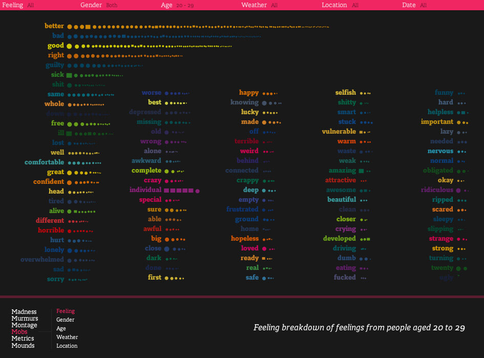
We Feel Fine by Jonathan Harris
“An interactive website…that searches the internet every 10 minutes for expressions of human emotion on blogs and then displays the results in several visually-rich dynamic representations.”
An extraordinary early data story (it runs in Java) that inspired a generation of data visualization professionals.
The Physical Traits that Define Men & Women in Literature by Erin Davis (The Pudding)
Davis has created a beautifully-illustrated exploration of the different words used in literature to describe characters by gender.
The interactive website uses clever tactics to engage the reader — I particularly liked the quiz at the beginning. The combination of specific, personal examples and analytical research brings home the wide and discouraging discrepancies embedded in everything we read.
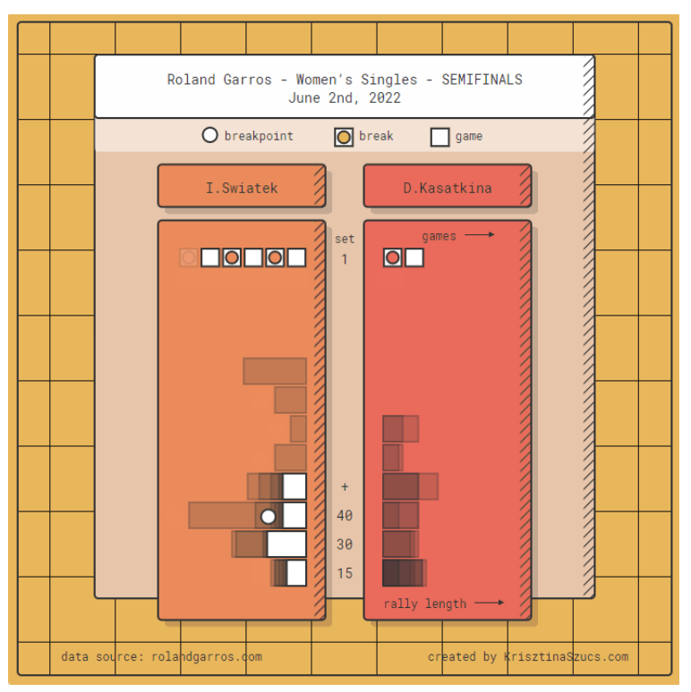
Animated Sport Results by Krisztina Szucs
More vignettes than stories, these brilliant animated visualizations show the progress of sporting events through a visual shorthand created by Szucs.
There are multiple visualization types for different scoring systems. Each one delivers a beauty and energy that better reflects the action of a game than a traditional box score — and displays information to help you understand the flow of the contest.
Buy or Rent by The Upshot
An interactive calculator that lets the user answer a basic and important financial question.
This tool is a classic demonstration of The New York Times’ design aesthetic, simple and direct user experience, and editorial clarity.
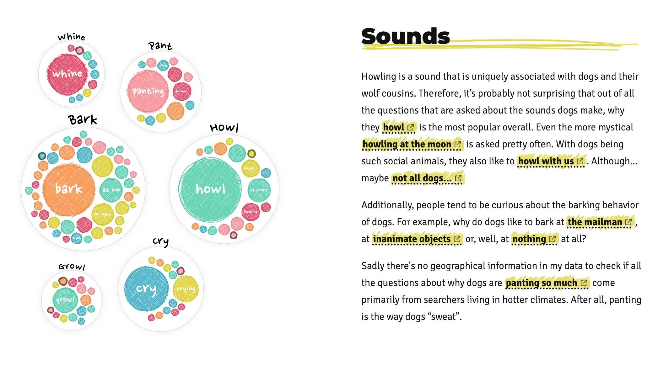
Why Do Cats and Dogs…? by Nadieh Bremer and Google Trends
A delightful romp through Google Trends search data about the behavior of dogs and cats. This data story combines guidance with customized exploration and beautiful visual design. Four Treats!
Fry Universe by Chris Williams
It is time to tackle the eternal question: What is the best form of fried potato?
This light-hearted visual journey explains how the ratio of fried surface area to un-fried surface area can make for very different eating experiences.
Ready to create your own interactive data story? We’ve created the fastest path to beautiful data storytelling. Try it now!
US Gun Deaths by Periscopic
This visualization shows “stolen years” due to gun deaths. It is a masterclass in connecting your audience with the emotional message by gradually revealing the data.
Explorable Explanations by Bret Victor
User experience and information design guru Bret Victor delivers a meta-data story to show how to “enable and encourage truly active reading.” This work from 2011 was ahead of it’s time — as is most of Victor’s imaginative, inspirational work.
Cicadas, A Data Story by Kayla Brewer
We are taken on an educational journey about Cicada ‘Brood X’ and the emergence of these insect swarms (“small fly bois bring big noise”). Harvey demonstrates how creativity and a public data set can be transformed into an exploratory data story using Juicebox.
30 Years of American Anxieties by The Puddling
“What 20,000 letters to an advice columnist tell us about what—and who—concerns us most.” This data story provides big picture views by topic and demographic integrated with specific examples that bring the data to life.
Data Stories aren’t just for data journalists anymore. Create your own interactive, mobile-friendly, professionally-designed data story with Juicebox.
Redistricting as Mini Golf by The Washington Post
Not all data stories need to show a lot of data. This example leans on a fun, interactive premise to show how re-drawing districts (i.e. gerrymandering) can impact politics. By playing the game, you learn about the different political strategies and how contorted the districts can become.
Visualizing 500,000 Deaths from Covid-19 in the US by National Geographic
“What does the loss of so many lives look like? Here are some ways to envision what 500,000 really means.” A powerful example of how to make your data relatable through comparison to familiar subjects.
Can You Live on the Minimum Wage? by The New York Times
“This calculator shows the hard choices that have to be made living on the smallest paychecks.”
The simple beauty of this data story is in its ability to convey a message through user choices. It doesn’t take long to realize that the answer is “no.”
OECD Better Life Index by Moritz Stefaner
“This Index allows you to compare well-being across countries, based on 11 topics the OECD has identified as essential”
One of the all-time data visualization designs with clever choices for representing the data (‘blooming flowers’) along with flexibility for user control.
How to Forecast an American’s Vote by The Economist
“We have built a statistical model to estimate the odds of how each respondent will vote in next week’s mid-term elections.”
The Economist takes a complex voter model and makes it both easily accessible and fun to explore.
How Many High School Stars Make It in the NBA? by The Pudding
“Every year the top high school basketball recruits get hyped up. How often do they pan out?”
This data story teaches its readers a novel data visualization, then uses it again and again to show different angles on the data.
A Disappearing Planet by ProPublica
“Animal species are going extinct anywhere from 100 to 1,000 times the rates that would be expected under national conditions.”
This analytic explorational lets the user dive into the data all the way down to individual species.
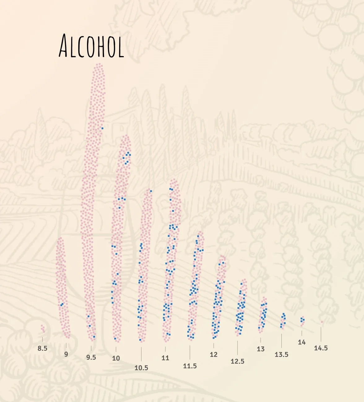
Wine & Math by The Pudding
A fun and engaging story that is a very palatable delivery mechanism for a statistical model to predict a wine’s quality by its properties.
This data story does an excellent job of setting the context and explaining predictive modeling before diving into the results.
Which 2020 Candidates Have The Most In Common … On Twitter? by FiveThirtyEight
FiveThirtyEight, known for its election coverage, shows how the Twitter followers of Democratic candidates overlap. The data story includes creative visualizations, another hallmark of this design team.
Bussed Out by The Guardian
“Each year, US cities give thousands of homeless people one-way bus tickets out of town.”
An elegant and deeply researched story about homelessness integrates insightful visualizations alongside stories of individuals.
The Rhythm of Food by Google News Lab / Truth & Beauty
“How do we search for food? Google search interest can reveal key food trends over the years.”
Another beautiful data story by Moritz Stefaner introduces the reader to a creative seasonal view of food consumption, then provides flexibility to explore.
The Stories Behind a Line by Federica Fragapane
“A visual narrative of six asylum seekers' routes. They travelled from their hometown to Italy. This project wants to tell their stories through the data that shaped their personal travelling line.”
Multiple modes of viewing the data provide different perspectives on the individual journeys.
Can You Stay Within the World’s Carbon Budget? by The New York Times
“This climate simulator lets you explore more than 8,100 climate scenarios.”
Once again, the NYT design team delivers an interactive lesson with data.
Happy Data by Giorgia Lupi
“Hopeful views of the world through data and drawings.”
Unlike the other examples, Lupi delivers a collection of short data “vignettes” that mix data and images to deliver a people-first message.
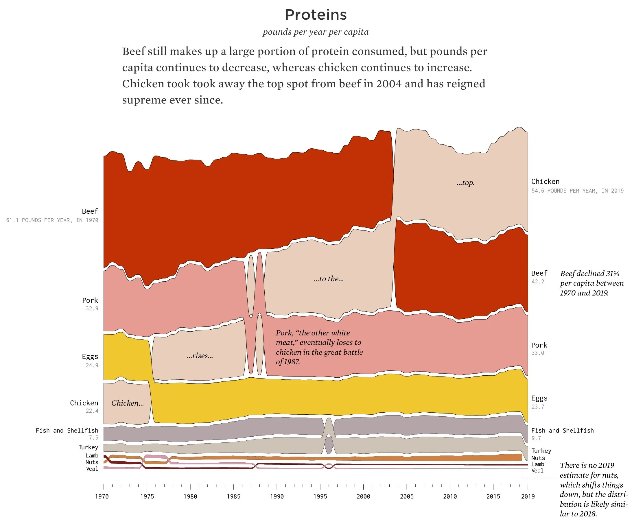
Seeing How Much We Ate Over the Years by Nathan Yau
“How long will chicken reign supreme? Who wins between lemon and lime? Is nonfat ice cream really ice cream? Does grapefruit ever make a comeback?”
Nathan Yau, a true treasure of the data visualization community, asks and answers these fun food questions. His visualizations are equally fun, and carefully crafted to highlight insights.
For even more examples, check out 11 More Examples of Good & Bad Datta Storytelling.

