

Christmas is a special time of year. We all have our favorite aspects of the season. In the spirit of Christmas and the Christmas carol, the 12 days of Christmas, here are the Juice team’s 10 favorite visualizations.
You will recognize some of these as your own favorites, but some are exclusive to the Juicebox platform. To learn more about the visualizations exclusive to Juicebox and Juice design schedule some time with us.
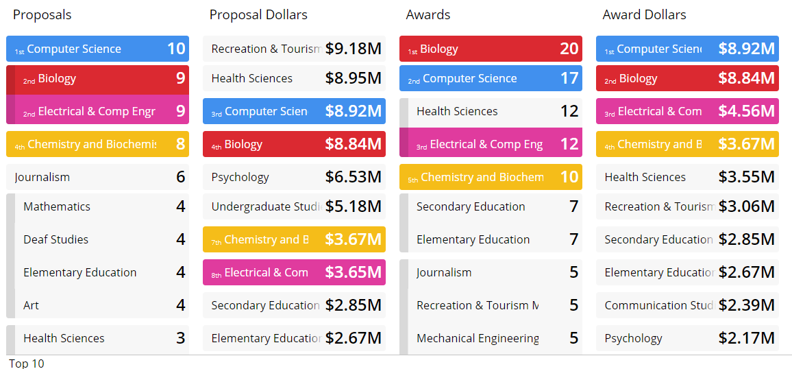
Leaderboard
An exclusive Juicebox visualization. Leaderboards are a great way to look at a dimension or group across multiple rankings. Who really is best on the team? Its never one metric and a leaderboard lets you compare across multiple metrics. Here’s a video showing a leaderboard in action from a few years ago.

Flower
A very engaging way to compare performance across locations, such as hospitals or schools. Each entity is represented as a flower and every metric is represented by a petal. We were inspired by the work of Moritz Stefaner.

Ranked List
Its not just a horizontal bar chart, but an interactive way to see a top ranking as well as a way to explore a long list. The Juicebox way of letting a user explore a long list is unique. Easy to understand because of its familiarity while delivering a lot of interactivity for exploration. Here’s an example from our Notre Dame application.

Sankey
This visualization isn’t exclusive to Juicebox, but well-loved by clients because of its easy way to explore changes over time among groups. Our version is much easier with more options than the Tableau version with its dynamic generated polygons.

Distribution
This is exclusive to Juicebox despite its less than creative name. The data is binned to show distribution of values while also emphasizing the individual items (by showing details on roll-over) that make up the “bars.” A really easy, yet powerful way for users to explore their data.

Orbit
A variation on the bubble chart that shows relationships. This breaks some data visualization rules, but is helpful for exploring hierarchy and avoiding too much overlap. Like a bubble chart it uses size and color to convey information.

Scatter Plot
The scatter plot is a common visualization for data exploration. Juicebox adds panels and panel colors to better help the user understand the values that are good or bad. By clicking on a panel, the user can focus on a specific group of items for action.

Map
We love using maps as a filter for other visualizations. Additional encoding with dynamic labels further adds to a user’s understanding of the information.
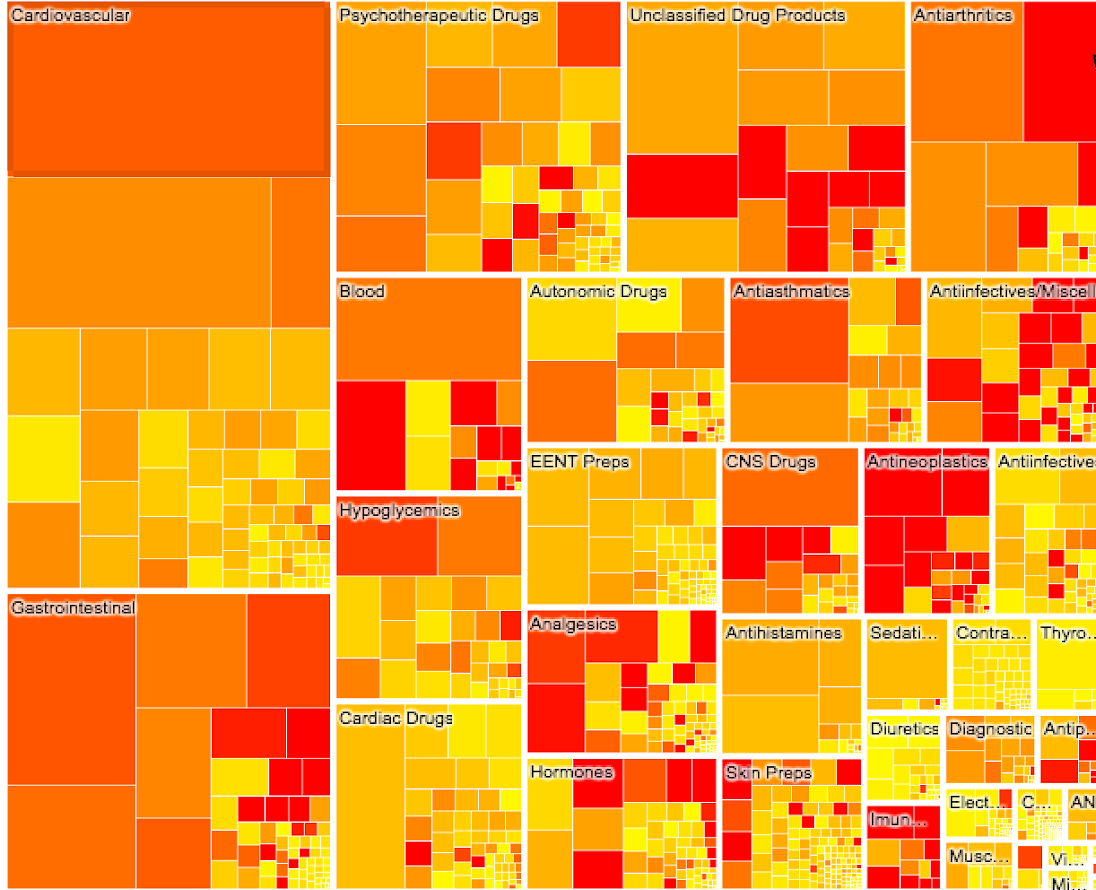
Treemap
We’ve been doing TreeMaps since 2009 so they hold a special place for us. This is still one of the best ways to show hierarchical data that has values that can be aggregated.

Key Metric
While not quite a visualization, almost every data story starts with a quick summary of metrics, often with a comparison to goals or benchmarks. A key metric visual sets the foundation for what a user will get in their dashboard or application.

Lollipop
The Lollipop is another good way to show comparisons among groups. Lollipop is our preferred way of sharing metrics when the metrics can be compared along a common scale. This is a good alternative to a bullet chart.