
Less is often more when designing your data visualizations. Here are ten lessons we've learned about how to better communicate with data. The key: give readers less information to absorb.
1. Reduce chart junk. Edward Tufte taught us this fundamental lesson. Eliminate elements on a chart that aren't contributing to comprehension.
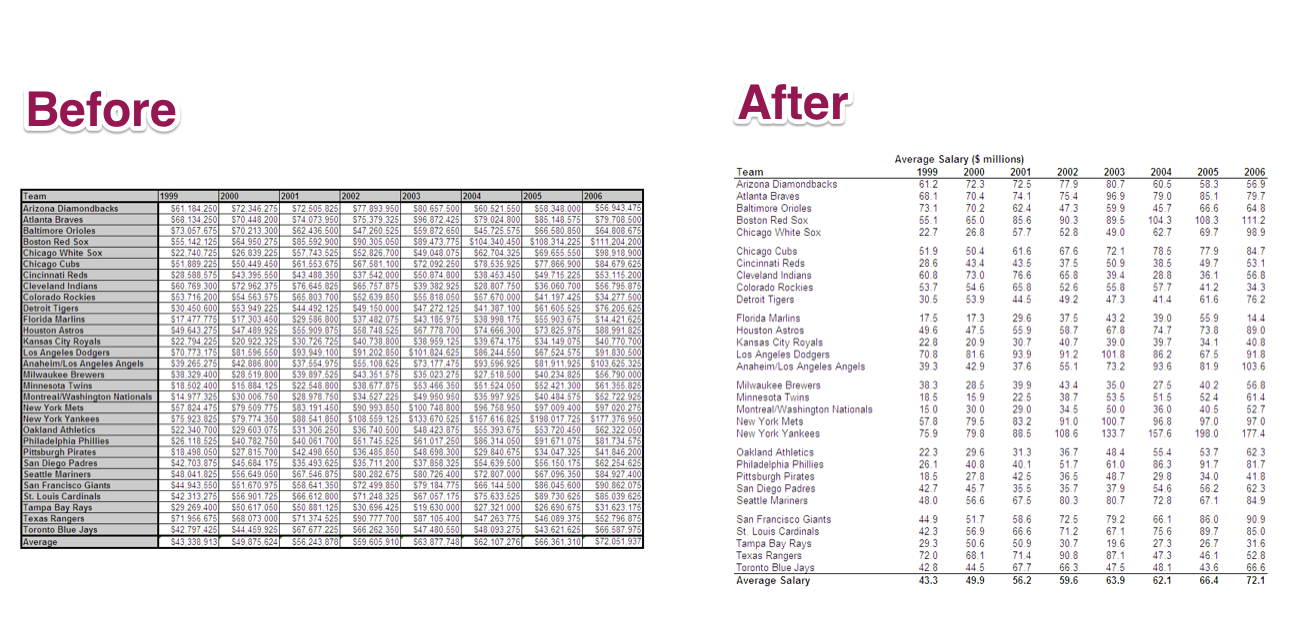
Even tables have chart junk.
2. Reduce color. Instead of using a rainbow of colors, pick an emphasis color and use color with clear purpose and consistent meaning.

Way too much color! http://www.fusion41.com/visuals/
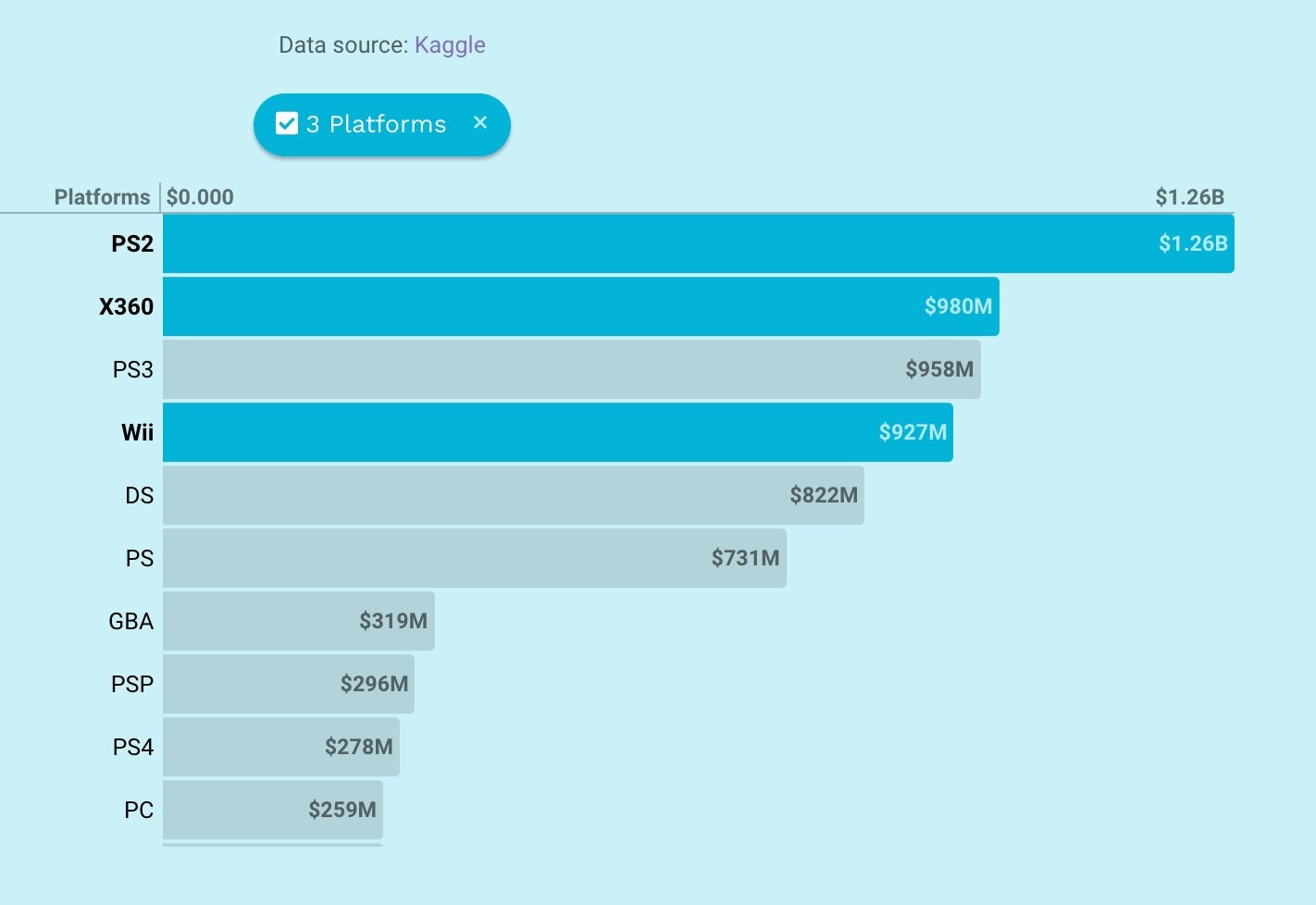
Bar charts don’t need multiple colors if the bars are labeled
3. Reduce jargon. Consider how your audience speaks in their everyday work. Are there more natural ways of expressing your points? Replace the business-speak with direct, clear terminology that anyone can understand. If there is space, write out abbreviations and acronyms as well.

www.forbes.com/special-report/2012/annoying-business-jargons-12.html
4. Reduce pie charts. Pie charts are seldom the most effective way to show your data. They can often be misleading or difficult to interpret. That said, there are situations with simple data where a pie chart is a viable option. Storytelling with Data has a helpful tutorial on how to get the most from pie charts.
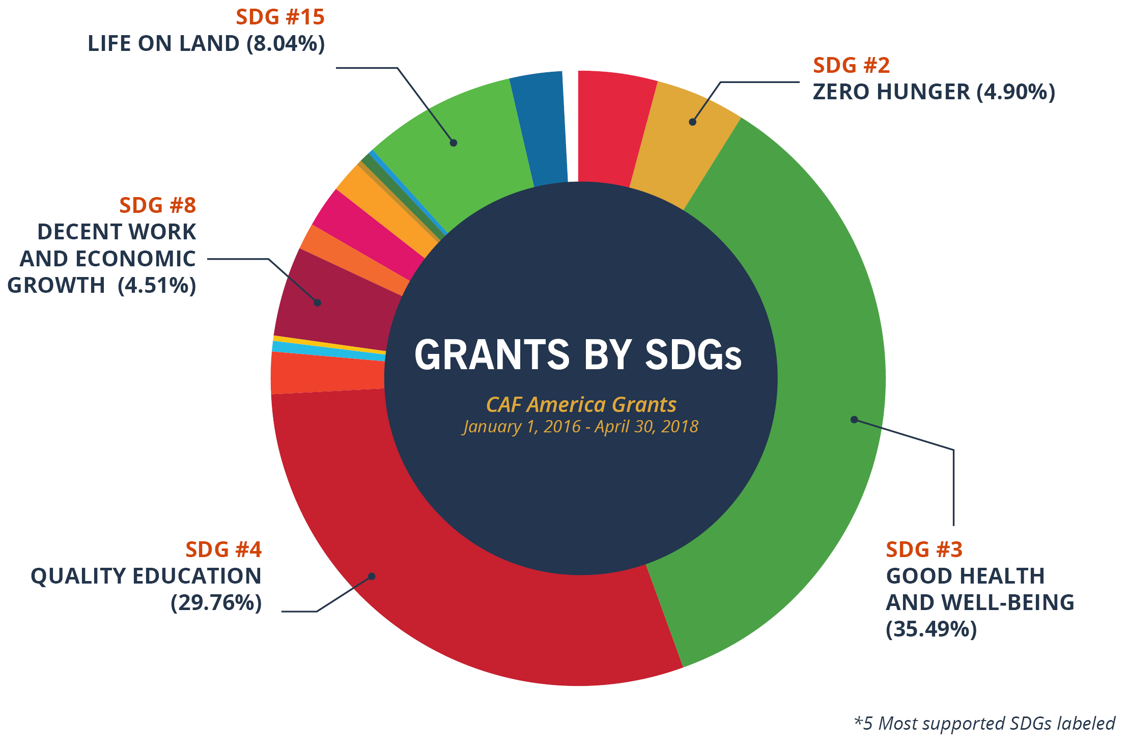
Pie charts can be hard to label and impossible for your audience to interpret, like this one from https://www.cafamerica.org/sdgs/sdgs-pie-chart/
5. Reduce unnecessary precision. Provide enough precision in your number formats to tell the difference between values and shorten numbers to make the values more readable (e.g. MM, k).

Too much precision is going to overwhelm your reader.

Less precision in the number labels can make your chart easier to read.
6. Reduce metrics. "Data isn’t like your kids. You don’t have to pretend to love them equally." -- Amanda Cox, New York Times. Most organizations are tempted to show as many metrics as possible, but it becomes impossible to understand and focus on everything at once. Create constraints to show only the metrics that matter most.
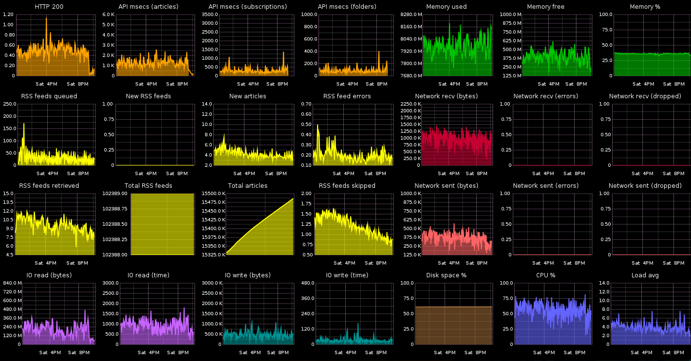
Beautifully rendered, but dense dashboard via http://blog.jupo.org/2013/08/29/devops-eye-for-the-coding-guy-metrics/
7. Reduce density. It is a rare instance that all the relevant information needs to be crammed on the same page. Give your readers some whitespace to help them focus and comprehend the content.

A typical dense dashboard.

A useful way to reduce clutter is to only reveal details when the user selects the metric they care about.
8. Reduce dimensions. Individual visualizations quickly become difficult to interpret when many dimensions are shown simultaneously. A chart showing three or more measures about each data point will stress your audience’s ability to find and understand patterns. If necessary, gradually "build" the visualization by adding complexity to ensure your audience can follow along.
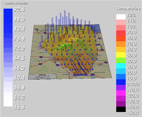
Temperature, humidity, geography, flows of something, heights of something, ...I give up.
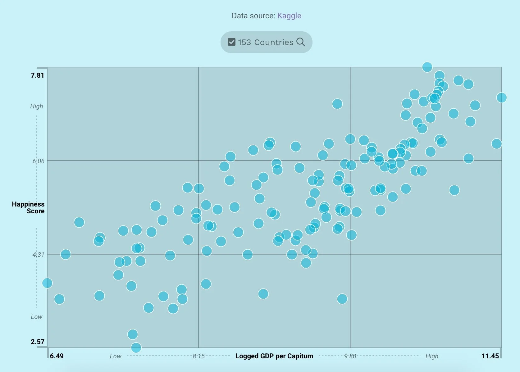
A scatterplot shows data in two dimensions. Much more than this becomes hard for readers to find patterns.
9. Reduce quantity of messages. It can be tempting to try to tell numerous stories about data at the same time. Try to tell them one at a time to help each one land with the audience. One of our favorite examples are the weather sites that answer a single question: “Do I need an umbrella?”

doineedanumbrella.com
10. Reduce chart types. It can be tempting to use different types of charts as a way to add variety to a report or dashboard. In the process, you are putting a burden on your audience to learn how to interpret each new chart. Once you’ve taught your audience to interpret a chart, they will become fluent in that visual language.

Different types of charts are used even though the information structure is very similar
At Juice, we want to make it easy for anyone to create data visualizations that look great and communicate effectively. That’s why we created Juicebox.


