

Description
People using your application may have all different types of backgrounds and understandings of data and visualizations. It is important to keep this in mind when designing. If you will have a mix of novice and advanced users, it is important to think about how that will affect the application’s workflow and the data presentation. You don’t want to overwhelm and confuse the novice user, but you want to include appropriate features for the advanced user.
Choosing the right chart for the information you have and using the simplest appropriate visualizations, especially if you will have novice users, are two important things to consider. Simpler options would include things like a standard bar chart, pie chart, map or trend chart. More advanced options would be a bubble chart, treemap, heatmap, parallel coordinates or sankey chart, among others. Of course if you will have more than one level of user, there are some options to keep in mind to make the application most useful for everyone.
One thing to do is to use common language. Someone that is more familiar with the data or data field may understand the jargon associated with it, but novices can easily be confused by language that is confusing or misleading. Instead of technical or specialized terms, stick to standard and common language.
You can also make a more complicated visualization usable for a novice by clarifying with annotations, tooltips or other using other ways to provide instruction. For example, this interactive from The New York Times uses a stream graph. This would be considered a more advanced visualization, which the The New York Times is known for. But as a newspaper, they must also make their graphics accessible to the general reader. To make this chart more friendly for the general reader, they added keys and explanations as to how to read the chart on the right. Someone that doesn’t need that help can easily ignore it, but it’s there for those that need it.
Another option would be the use of drill down. Often it’s possible to have a more simple data up front, and reveal more detailed information and visualizations upon clicking and drilling down. This type of data flow would make it easier for a novice user to see how the data relates and not get too much information too soon, but it’s also easily accessible for the advance user.
Customization is also an option, though not used often. As users get more familiar with the data and interface, controls could be added that would allow for deeper exploration and more advanced visualization and control.
Examples
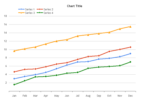
Beginner charting example: Chart Chooser line chart
Advanced charting example: NY Times stream graph

Resources
Can Familiarity Trump Usability
Related Principles
Provide instruction
Explanation before information
Clarify with annotations
Allow customization