presentation

Data is the Bacon of Business: Lessons on Launching Data Products

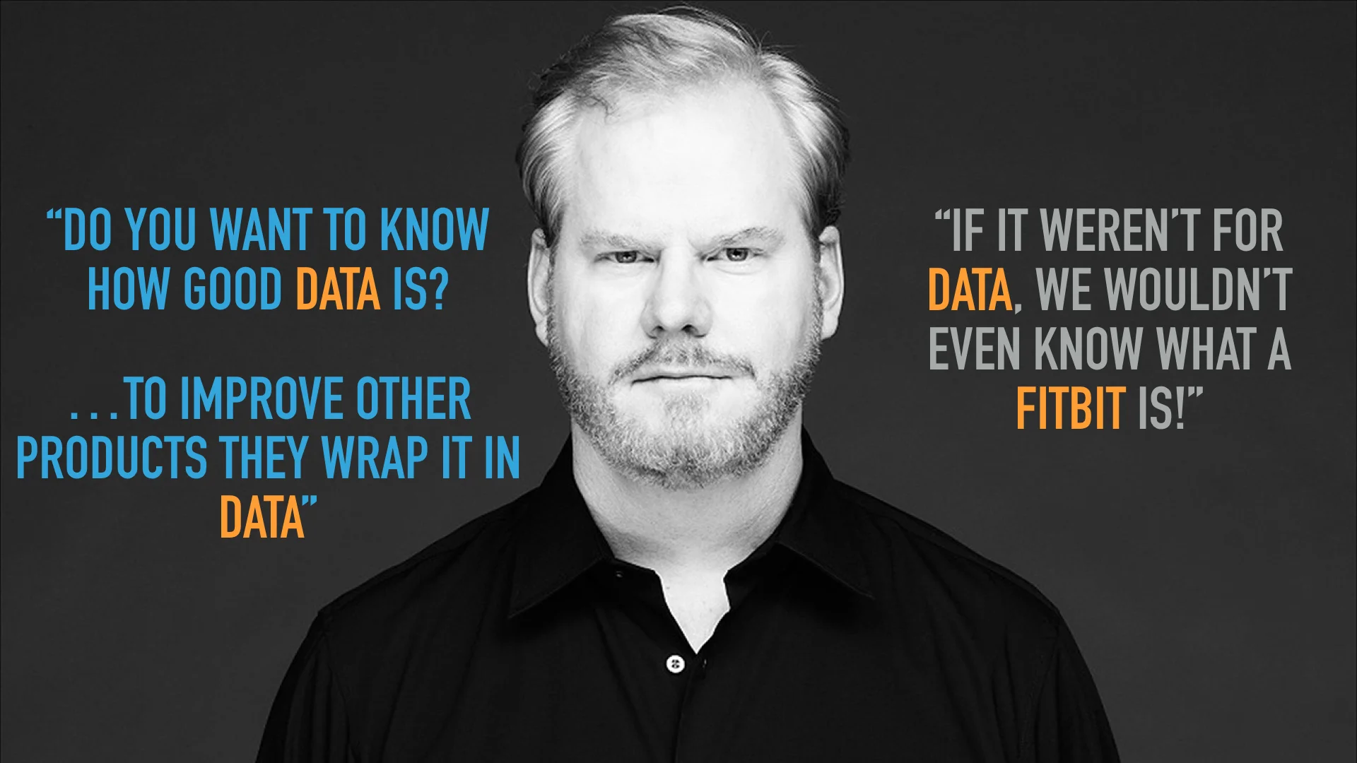
Last week was the 4th annual Nashville Analytics Summit. The event has grown from 150 participants three years ago to 470 this year. I took the opportunity within this friendly analytics community to share our latest thinking at Juice. Last year I spoke about "Beyond Data Visualization: What's Next in Communicating with Data”. This year my talk was entitled “Launching Data Products for Fun & Profit”. I started with a simple premise: Data is the bacon of business. I’ll let Jim Gaffigan explain:

His logic works for data, too.

We've had a front-row seat as our clients have transformed their data assets into revenue-generating data businesses. But launching successful data products isn't simple. And it is a far cry from your typical reporting or self-serve BI solutions — the insight-free data delivery vehicles of the past. I’ve posted the slides from my talk here:

Here are a few highlights:

  • Data products are happening now. Big technology companies are making massive investments in pursuit of better data sources for their products. IBM spent billions for The Weather Channel to enhance Watson Analytics. Google bought Waze for crowd-sourced traffic data. Microsoft wanted LinkedIn’s “economic graph” so badly they spent $26 billion.
  • The best data product stories start with a visionary leader. Our clients aren’t just thinking about fancier visualizations. They want to transform their businesses by making their customers smarter and more successful through data.
  • My friend Oli Hayward of Hall & Partners provided some valuable lessons from launching a world-class market research analysis portal. He explained the need to start by selling to internal audiences and targeting only the most innovative clients (we’re in the same boat there).
  • Data is an imperfect reflection of reality. When you present data to customers, prepare to discover exactly how imperfect it is. Which led me to this joke...

If you’d like to hear more about our lessons learned from dozens of data product launches, send us a note at info@juiceanalytics.com.

Automated Presentations (Slide Factory 2.0)

Much has changed since our original post in 2009, yet much remains the same.  There's been a variety of solutions, like Prezi, SlideRocket and even some home grown Python integrations, aimed at improving PowerPoint and presentation automation. However, its still challenging for a non-developer to produce a good-looking, effective PowerPoint deck with automatically updated charts.

The best way to tackle this challenge -- for the moment -- is to simplify the problem. While a utopian solution may not be available (sorry),  here's a way to break down the problem and get a partial win.

Think of the presentation automation challenge as one of three distinct challenges. 

  1. Delivering Presentations @ Scale
  2. Automating Chart Updates
  3. Improving PowerPoint Chart Availability

Delivering Presentations Scale

When you want to deliver high-quality slides or share information as a story for a large audience, like all your customers, this is what Juice refers to as Presentations @ Scale.   It manifests itself in organizations when there are multiple dedicated resources manually producing PowerPoint slides for clients. This is because a report doesn’t provide enough contextual information and narrative structure (flow) as can be delivered through slides. Some examples where organizations deliver Presentations @ Scale are:

  1. Quarterly account reviews produced by ad agencies;
  2. SLA reviews by technology providers;
  3. Quarterly reviews by insurance providers to human resources leadership.

While customers value the effort and details, the energy to produce these documents is expensive. Its not uncommon for Juice to hear about organizations with teams of 5 to 10 people dedicated to creating customer PowerPoint slides.

The opportunity to improve frequency and reduce the cost associated with delivering Presentations @ Scale lies in web-based solutions where customers can consume the information as an interactive web page vs. static slides. Here’s an recent example from the New York Times that offers a taste of a scrolling presentation or story.

It offers the easy to consume format, valuable data displays with a lot of descriptive text. Juicebox, is intended to solve exactly this kind of problem. Click here to see a quick video of Juicebox in action to get a flavor of delivering slide quality information across many customers.

Automating Chart Updates

The most popular or frequent PowerPoint automation challenge is automatic chart updates. There are an increasing amount of programatic solutions for this problem; however the options below require decent technical skills to set up and maintain. It's still a surprise that no solution has come to the forefront or solved this yet. Here are some of the technical options to check out, which require VBA skills at a minimum to automate chart updates. In addition to the ones below, Lea Pica has some product and tools on her resource page worth checking out.

  1.  Microsoft PowerPoint VBA - Some guidelines and tips for Office 2013 
  2. PowerPoint VBA FAQs - Some helpful tips on PowerPoint VBA (a little dated).
  3. PowerPoint 2010 Chart Programming - Registration required, but some good VBA answers here.

Improving PowerPoint Chart Availability

Probably the option least talked about or referred to directly are PowerPoint’s chart limitations.   Prior to 2011 the chart options were very limited. In most cases now, this represents enterprises that are still behind on their Microsoft Office upgrades and are limited by the few chart options in these earlier versions. There are some really elaborate integrations of PowerPoint using Python available now. Just search YouTube and you'll find a bunch.

Please share any other solutions that are out there in the market place that solve one or more of the presentation automation challenges. In the meantime, check out the Juicebox demo or request a personal demonstration by clicking here.   


Meet Juice and Connect More Visually

One thing we really like doing here at Juice is meeting and talking with folks who are interested in the practical application of visualization techniques to make their jobs and businesses better. We know a lot of you out there feel the same. So, we’re planning meet-ups in three cities over the next few months -- Atlanta, Washington, D.C. and Boston. In addition to giving those of you in these areas a chance to get together in one place at the same time, it will give us a great excuse to share some data visualization knowledge that we think will benefit you and enhance your skills.

Each Juice Tour event will start with a meet-and-greet followed by a presentation focused on some basic rules for effectively communicating data - where we will provide you with some easy-to-use principles that you will walk away with, leaving you to become far more proficient at presenting your data forward no matter who your audience.

Afterwards, you will have an opportunity to meet one-on-one with Juice in free mini-problem-solving sessions where we can talk specifically about your visualization problems and offer suggestions to help you work through them.

If you’re interested, register here and let us know your name, email and your location. We’d like to gauge your level of interest in the Juice Tour -- starting with Atlanta, Washington, D.C. and Boston. If you’re not in these areas, but are interested in the Tour, please let us know that, as well. (If these go really well, who knows, maybe we’ll expand to include other cities, too.)

We look forward to hearing from you! (Oh, and did I mention, it’s free?)

Are you using information effectively?

Have you noticed that sometimes it’s hard to get your point across? Do you find you’re trying to do the right thing with your information, but the organization just won’t cooperate?

We think this is happening too often in the companies the Juice Community lives and works in. And we want to do something to change it.

We want to better understand if we’re helping you be more effective in your workplace as an information evangelist. To make this possible, we’d like to ask (yea, even beg) you to complete a short 10 question survey about how information presentation is making progress in your company and if you feel alone or supported by the info-viz pundits out there.

But you might ask "what’s in it for me?" Well, to begin with, we’re going to demonstrate how to summarize qualitative survey information. You’ll get some great examples of how to apply non-traditional charting styles to problems within your organization.

However, we can’t do it alone; we need you to complete the survey. And if we don’t get enough respondents, the results won’t lend themselves to what we have planned.

So what are you waiting for? Fill out the survey here and help us help you help us. And what does Gilligan’s Island have to do with information presentation? Well, you’ll just have to take the survey to find out!

Update: The survey is now officially closed. Thanks to all who responded. We’ll have the results out in a few days.

Analytics Roundup: Better presentations

Feltron Eight Nice example of an optional, but much more interesting annual report could be formatted.

The Steve Jobs 90 Minute Keynote in 60 Seconds - Mahalo GREAT summarization of the Job MacWorld 2008 keynote—from 90 minutes to 60 seconds. This demonstrates a good example of how to summarize a great deal of information.

Presentation Zen: 6 Presentation tips from a Steve Jobs keynote 6 good presentation points based on Steve Jobs 2008 MacWorld keynote

Canva Presentation Templates Great examples of presentation templates.

Analytics Roundup: TIps for showing, sharing, communicating

Developer’s Guide - Google Chart API - Google Code
Beautiful stuff, particularly the Venn diagram.

Align Journal - BI Worst Practices
We often see articles on BI "Best Practices" here is an article telling us what NOT to do.

flot - Google Code
Attractive Javascript plotting for jQuery.

ongoing · On Communication
Interesting blog post about how different forms of communication rank for immediacy, lifespan, and audience reached.

The Excel Magician: 70+ Excel Tips and Shortcuts to help you make Excel Magic : Codswallop

SlideShare
Source for presentation ideas.

Persuasive Presentations

Back in my consulting days at Diamond Technology Partners, I was known for my ability to bend PowerPoint to my will and fashion epic presentation-stories from lovingly-crafted slides. There was a term used when a client wanted a good looking presentation; they would ask if it could be "Zachified." Ah, the false glory.

Now I realize I was merely an amateur in designing presentations that could entrance and persuade an audience. I was going on instincts without much thought to the types of evidence, structure, and flow that would convince my audience.

Last week I had lunch with a man who has made a living from teaching others how to create effective presentations. His name is Andrew Abela and his blog is Extreme Presentations. Andrew has developed a thorough framework and training approach. He has a Doctorate and is a professor at Catholic University, so you know he brings an academic seriousness to the messed-up world of flufferpoint:

def (Withrop Hayes): A presentation that attempts to distract from the lack of substantive content or evidence with use of screenbeans, clip art, and other stock pictures or illustrations. A.k.a. clipterfuge (Todd Moy), clusterpoint (Cathy), The Macy’s Data Day Fluff Parade (Jamel).

Andrew gave me a quick backstage pass to his training methodology. Here are a few highlights:

1. Like a fool, I asked whether he preferred the sparse Lessig method or the more traditional, content-rich method. False choice. It all depends on the situation, just don’t use the wrong approach at the wrong time. Andrew makes the distinction between "ballroom style" and "conference room style."

"Ballroom style presentations, like most typical PowerPoint presentations, are colorful, vibrant, attention-grabbing, and (sometimes) noisy. They typically take place in a large, dark room, such as a hotel ballroom. Conference room presentations are more understated: they have less color and more details on each page. They are more likely to be on printed handouts than projected slides, and they are more suited to your average corporate conference room. The single biggest mistake that presenters make is to confuse the two idioms, and particularly to use ballroom style where conference room style is more appropriate. I would estimate that upwards of 90 percent of all PowerPoint presentations use ballroom style, yet most of the time our presentation conditions call for conference room style."

That’s from an article he shared with us called Achieve Impact through Persuasive Presentation Design (PDF)

2. It is important to mix data-based evidence with anecdotes. People need both of these types of information to persuade both the mind and heart (my interpretation).

3. Anticipate your audience’s objections and build them into your storyline. What is better than having exactly the right slide next when someone raises a concern?

4. Good presentations require a lot of thought about their design. Andrew has defined five dimensions of an "Extreme Presentation": logic, rhetoric, graphics, politics, and metrics.

His blog offers a couple useful tools:

  • A framework for choosing the right chart
  • Slides that pass the squint test : "A good way to test whether your page is laid out properly is to apply what designers call the "squint test." Squint at the page, so that all the text is blurred and illegible. Do you get anything about the page without having to read the text? If you can see that the page is showing a process or two or three alternatives or a bunch of things converging, then your page passes the squint test."

Analytics Roundup: Visualization goodies

The Problem With Presentations
Don’t let presentation software keep you from getting your story across,

Webfoot’s Mapeteria: Map Colouring
Want to make a choropleth thematic map (i.e. coloured based on your data) for Canadian provinces, U.S. states, or French départements?

The Econ 101 Management Method - Joel on Software
Instead of having smart people figure out how to train their frontline customer service workers to serve customers well and profitably, they make up metrics that sound good and let the low wage, high-turnover customer service people come up with their own.

The rise and fall of IT | Perspectives | CNET News.com
Scrap IT? A well-reasoned argument for scrapping the term "IT."

Gallery of Data Visualization

Summize - Summarized product reviews
A nice visualization for showing rankings.

The Extreme Presentation(tm) Blog: Choosing a good chart