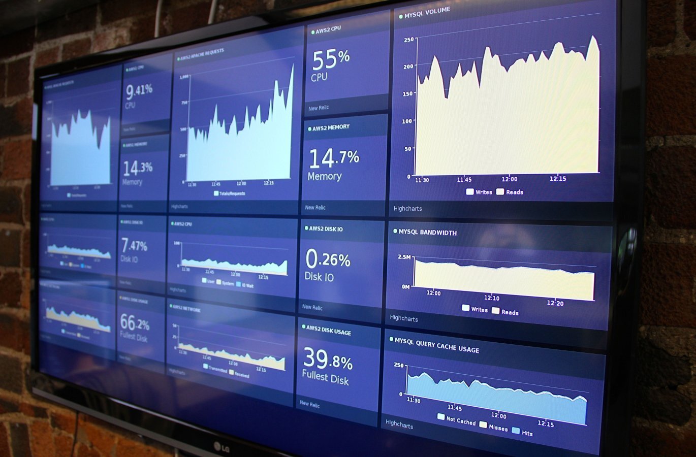
interface

Important Dialogue

You hear what I’m saying twinkle toes?

There are many exclusive conversations going on in the world. Making sense of these conversations can be intriguing however may not be the most productive and satisfying process when you have a specific goal or specific information you would like to retrieve. Many interfaces often speak this ’I’m-a-computer-do-it-my-way" language, without introducing a visual language and workflow that maintains a holistic and ergonomic view of people’s goals, strengths, and weaknesses. And the way you build interfaces that engage and speak people rather than speaking computer, isn’t putting make-up and jingle bells on yesterday’s interface through wiz-bang graphics or merely adding features. Interfaces should maintain clear intentions with a non-exclusive language that stays true to their audience.

Put these methods into practice:

  • know how to dialogue with people, as people and not computer users (Donald Norman also has recently been advocating this. Word usage is important)
  • stay abreast of capital (money-making!) design decisions that speak people
  • embrace the cross-pollination of ideas. Since people are everywhere, take advantage of learning from new fields you don’t frequent.

In a design nut shell, this is about creating interfaces people love to use. When you see something you love using, seek to understand the fundamental reasons why that is so you can implement these in the future. Often you’ll find its the culmination of many design decisions creating a consistent language people understand and love.

Let’s put this into practice by looking at a how potentially foreign information space complimented a workflow for people that is more natural and less exclusive. Hopefully, as we dissect a few notable design decisions, you’ll be more comfortable with identifying and repurposing some fundamental principles. Adobe Lightroom 3 Beta is a professional photo editing program I downloaded recently. I noticed the Adobe team touted an improved "Import Dialogue box." Since, generally, all import dialogues seemed to be created equal, I was interested in how they handled this process.

Old Import Dialogue interface: [lightwindow href="http://media.juiceanalytics.com/images/LR-oldDialogue.jpg" title="Lightroom 2 Import Dialogue"] [/lightwindow]

Click on the images below to take a look at the redesign and my annotations on it, and then I’ll describe how certain annotations support fundamentals of improved information design that can be appropriately applied on future interfaces.

Lightroom 3 Beta Import Dialogue - minimal, basic view: [lightwindow href="http://media.juiceanalytics.com/images/LR-closed.jpg" title="Lightroom 3 Beta Import Dialogue - basic view"] [/lightwindow]

Lightroom 3 Beta Import Dialogue - maximized, advanced view: [lightwindow href="http://media.juiceanalytics.com/images/LR-open.jpg" title="Lightroom 3 Beta Import Dialogue - advanced view"] [/lightwindow]

Without being exhaustive, let’s look at some culminating design decisions associated with general design principles. To clarify, right now we are training an informed design language that will aid us in creating future interfaces with less fluff and more decisions truthful to the content and workflow.

Content promotes context. The content medium for information / data in this application is photography, and this part of the photography workflow is specific to importing, therefore, a structure is laid intuitively that matches this context. Concept supported by: flow of the header elements, dimming background, dark / desaturated palette that compliments the overall goal of focusing on altering the pixels of your photography.

Attention balance. Build a meaningful hierarchal language that emphasizes the content where decisions are made. Hierarchy of text styles or graphics match hierarchy of function or ramifications. Concept supported by: header text specifying the decision is brightest, purposeful icons, inverted preset tab, vignettes and blurring, highlighted mouseovers.

Intention balance. Some interfaces may only need to support casual or advanced use, but this process specific to importing photos now supports both, making it the most beneficial upgrade feature. Interfaces should support peoples’ intentions and maintain context while seamlessly transitioning between them. Concept supported by: expand / contract dialogue arrow, minimal information preview of selected photos, minimized and advanced views.

How is this interface now less exclusive? As people dialogue with this portion of the software, they have fewer hoops to jump through to accomplish the same goals and the new process preserves the context of the content and workflow. Naturally, there are many design fundamentals to build a language around. It can take some work making sense of everyone’s tidbits, top-ten lists, quotable quotes, and pattern libraries, but with a little intentional thought we can get more proficient, personally and collectively, at a common language that moves design forward in a methodical, tangible nature.

Start small. Identify design decisions out there grouped in these three fundamentals to get you started and post examples for the Juice community love if you feel so led. It will sharpen you toward purposeful reasoning on the drawing board and during concept presentation time.

Five Features of Effective Filters

I’ve developed a bit of a penchant (obsession?) for decomposing the pieces of analytical applications and framing the good and the bad characteristics. So far I’ve taken on treemaps, real-time dashboards, alerts, composite measures, success metrics.

Next up the poor, neglected, and taken-for-granted filter. For such a common and essential component, it seems rare that designers take a moment to consider how to make the best possible filtering mechanism. Here are the five elements I consider critical to a good filter selector along with examples from exemplary interface designs.

  1. Selections

  2. Impact

  3. Context

  4. Persistence

  5. Short-cuts

Selections

Good filters make it obvious to users what has been selected. That might seem like an obvious necessity but consider what happens when you filter in an Excel list. The filter section, even if it is a single item, is immediately hidden from view.

We Feel Fine

Jonathan Harris’ frequently referenced We Feel Fine visualization offers one of my favorite filtering examples. Notice how the selected items are highlighted and the non-selected items are de-emphasized. The bar at the top clearly shows what has been selected, even after the filter selector is "put away."

Impact

The best filtering mechanisms also give instant feedback about the impact of your filters. This can be as simple as a subtle indicator that the filters are being applied. Even better, as demonstrated in the The New York Times’ Rent or Buy site, the graph animates in real-time as filters are applied. This creates a very tangible connection that helps the user understand the impact of the filtering choices.

NY Times Rent or Buy

Context

Filters should provide information around the items being selected. What does it look like? How many are there? Take the simple font selector in Office applications: Isn’t it a no brainer that the names of the options are shown in the actual typeface? Here are a couple other fine examples of context:

Click Shirt

Click shirt is Bret Victor’s brilliant t-shirt design interface. In it, he offers an elegant filter implementation where all the selections show images of what you are about to select.

Elastic Lists

Elastic lists is one of the most innovative approaches to filtering. The height of individual blocks in the selectable stack shows the frequency of the items, an embedded sparkline shows the trend, and brightness indicates "weight of the metadata value compared to the overall distribution" (a bit too ambitious/confusing, in my view).

Persistence

Given the importance of filters to most information applications, it is surprising how often the interface makes them hard to find. As I mentioned in an earlier post, the failure of many analytical and reporting applications is that "they assume users know precisely what they need before they’ve begun the analysis." Filtering shouldn’t be a one shot deal; the functionality should always be accessible.

Kayak, a travel site, integrated the selection filters into the results so users can easily change their trip criteria without having to start a new search.

Kayak

Short-cuts

Finally, filters should make it easy to apply common selections (All, None) or complex sets (My Saved Filters, Northwest Region).

Moodstream by Getty Images recognizes that users aren’t always going to want to configure a bunch of filters individually. The presets wheel solves this problem by offering a series of pre-defined "filter sets."

Moodstream

Finally, I’d be remiss if I didn’t mention the sophisticated and powerful filtering functionality delivered in Tableau. In addition to providing filtering by selecting graphs (i.e. in context filtering), the application allows for multiple selector types, wild-carding, conditional filters, top/bottom filters, and on and on. If you want a comprehensive catalog of potential ways to offer filtering, watch the Filter Data video here.

Breaking Free of the One-Page Dashboard Rule

Conventional wisdom says that an executive dashboard must fit on a single page or screen. The argument hinges on a pair of assertions about this constraint: it provides necessary discipline to focus on only the most critical information; and it enables the audience to see results "at a glance."

The "discipline" argument is made forcefully by Avinash Kaushik (among others).

"if your dashboard does not fit on one page, you have a report, not a dashboard...This rule is important because it encourages rigorous thought to be applied in selecting the golden dashboard metric."

I buy wholeheartedly into the value of constraints. However, defining a useful constraint as a "rule" assumes there is only one viable means to achieve the desired ends. Confining visual real estate is but one way to focus your thinking. There are others: How about limiting yourself to five key measures? How about demanding that a dashboard can be understood in 3 minutes by a new user? How about only presenting exceptions?

The argument that a one-page dashboard necessarily provides an view of your business "at a glance" is more self-deceiving. Well-known information-ista Stephen Few uses this rationale in his definition of a dashboard:

A visual display of the most important information needed to achieve one or more objectives; consolidated and arranged on a single screen so the information can be monitored at a glance. PDF

I check my speedometer "at a glance". I "glance" at a Heads-up Display (HUD) on a video game showing how much energy my character has remaining. These displays communicate but a single number that is already hovering on the corner of my consciousness. If we follow this advice literally, we’d show:

Assuming one page gives you quick, easy comprehension is like assuming all red cars are fast. That’s simply not true. It must be duly noted, however, that all red cars are cool.

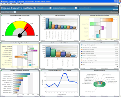
More often, people follow the one-page dashboard rule off a cliff like these folks.

executive_ dashboards.png

There are real problems with this definition:

dashboard_at_a_glance.png
  • In reality, the one-page rule leads to jamming information into the available space.

  • When everything must fit on a page, there isn’t room to describe the connections between information or fashion a story from the data.

  • A good dashboard raises more questions than it can answer. Sticking to a static piece of paper limits any ability to find or present explanations.

Don’t get me wrong: A one-page dashboard is often an effective way to create "a visual display of the most important information needed to achieve one or more objectives." But with streaming video, interactive visualizations, podcasts, Kindles, smart phones, video projectors...is it really necessary to limit ourselves to 8.5" x 11" piece of paper. Or might we open ourselves up to some more creative solutions to sharing the numbers; a short movie, a few slides, a short text narrative, or 140 characters.

I’d like to use this definition instead and will be back soon with some ideas on how to make your dashboards clear and concise.

11 Parallels Between Architecture and Interface Design

I had a fascinating discussion with my sister-in-law, a real-life professional Architect, about the parallels between her work and the type of interface design we do at Juice. In both cases, design requires looking at the problem from many perspectives, blending art and science, creativity and time-tested principles. Sure, she had to go to graduate school for three years and is part of a rigorous apprenticeship system. But when you consider the ways we approach and solve problems, there are a number of common threads:

  1. Start with the context. For Architects, a project begins with a site analysis to evaluate the available space, direction of the sun and wind, characteristics of surrounding buildings, street patterns and other environmental factors that need to co-exist with the building. The parallel in interface design is considering the context of users: What is their typical workflow? What other data and reporting are they working with? What decisions will be made from viewing the data? What is their skill level?

  2. Decipher client needs The ultimate job of the architect and interface designer is to translate vague but strongly-held desires of the client into a practical reality. There are straightforward functional requirements: “I need a house with three bedrooms upstairs.” And there are more subtle demands: “The application needs to be simple enough for anyone to use.”

  3. Evolved toward reality. It wasn’t hard to find parallels in the ways that we approach the process of designing. Like interface design, the architectural design process evolves from the most abstract (blocks of wood) to more realistic representations (drawings and models). The more realistic the format, the more time intensive and the more clearly the concept and details can be communicated. At Juice, we are particularly fond of prototyping analytical applications because it gives our clients an opportunity to engage with the interface and data directly.

  4. Build a narrative. Like any piece of art, a building needs a core story that characterizes its essential qualities. In our interface designs, we call these design principles. These are the basic truths that we want to permeate the application. Here’s an example of design principles for a reporting application design:

    a) You’re one click away from what you need; b) Allow lightweight, temporary ways of paying attention to something; c) Alerts are so important that they are always visible

  5. Connected whole. I shared with my sister-in-law a description of how many dashboard vendors are essentially selling functional pieces without offering guidance on how they fit together. She remarked: “if you designed a building that way, you’d end up entering into the bathroom.” I’ve seen dashboards that feel about like that. Architecture has had many decades to recognize the primacy of the cohesive whole. Interface design, particularly when it comes to the presentation of data, hasn’t come nearly so far.

  6. Multiple relationships. Designing a building requires thinking about the problem from many different perspectives, and ensuring that the answers work together. Architects need to consider how functional spaces relate to each, how the spaces flow together, and how the spaces relate to the site. Interface design requires thinking about how the presentation of information links together, how users navigate between this information, and how the results fit into the broader user workflow.

  7. Multiple scales. Architectural and interface design requires viewing the problem at multiple scales. There is the high-level view of how a building fits into its site locations all the way down to the design of specific rooms and spaces. Each of these scales needs to be in harmony.

  8. Facilitate flow. A good design supports intuitive pathways within the structure. The design accounts for the most common use cases and makes solving these use cases obvious. In our work, we always want users to have a sense of where they are and where they can go.

  9. Iconic elements. My sister-in-law described iconic elements as the center-point of the building design and narrative. They encapsulates the personality and essence of the design. I hadn’t previously thought of interface design in this respect, but I will in the future. In our work, there is frequently a single element, whether it is a data visualization or navigational structure, that is the core of the application.

  10. Visual vocabulary. The “vocabulary” of the building represents the materials (e.g. wood, metal, glass) and other visual elements that compose the common aesthetic for the design. The analogy for us is the UI style guide where we define the color palette, typography, and other treatments that make up the look-and-feel of the interface. An effective UI style needs to align with the narrative and design principles described above.

  11. Upholding and breaking rules. There are many conventions and expectations that shape the design of a building or an interface. These rules exist for many valid reasons, and we agreed that it is important to acknowledge and respect them. However, my sister-in-law noted that her professors would often challenge students to “break the rules to make them stronger.” There are times to challenge convention, in particular with your iconic elements, to push the design beyond the ordinary and formulaic.

At the beginning of our discussion, I was surprised to learn that a few of my sister-in-law’s Architecture classmates had gone on to do interface design. Given the similarities in the thought process, it may not have been a big transition.

Measure the Internet, Map the Internet

One area we’ve been paying particular attention to recently has been the internet traffic for different web site categories. Our friends over at comScore Inc. collect a wealth of information for “measurement of the myriad ways in which the Internet is used and the wide variety of activities that are occurring online.” Nice alliteration, guys.

Using some of the data they’ve allowed us to share with you, we had the bright idea to stuff it into our most favoritest charting type, the treemap. And what’s better than a chart? Answer: an interactive chart with a toggle button.

You’ll need to know a few things to really Juice the data:

  • The map is based on unique visitors by site for August 2007 and November 2007.
  • Red means a decrease in unique visitors over that three month time period and green means an increase. Black means there is no change.
  • You can click on the category headers to zoom into each category. Click on the category header again to zoom back out.
  • We provide two views of the data: the default shows just the top ten sites in each category. However, for nearly all categories, sites outside the top 10 account for over 50% of the visitation in the category (the exceptions were Search, Portals, and Auctions where the top players dominate traffic). A checkbox adds “All Others” and gives you a better sense of the size of each category. You can toggle these two views using the checkbox just below the map.
  • Due to some confidentiality restrictions that we’re under regarding the raw data, we couldn’t show other metrics that would really make this visualization sing—but I bet if you contacted comScore, they’d be glad to discuss with you.
  • A few tech notes. The treemap is adapted from Josh Tynjala’s capable open-source Flex Treemap component. Site images are provided by Amazon.com’s Alexa site thumbnail service.

So, without further ado, take a gander at our latest liberated data:

http://internetmap.juiceanalytics.com/

There’s so much information here, you won’t have any trouble drawing your own conclusions, but here are a few conversation starters:

  • Notice that there was a distinct increase in retail web visitors leading up to the holiday seasons.
  • Surprise! eBay owns auctions
  • Not too good of a showing for those online gambling sites; travel either.
  • Sports traffic is up… but not for the MLB.com site. Oh yeah, baseball season is over.

Enjoy.

Disclosure: comScore is a client of Juice Inc.

New Year’s Resolution: Tufte and the iPhone

Edward Tufte has produced a illuminating video tour of the user interface of the iPhone. The video illustrates Tufte’s struggles to come to grips with the difference between dynamic screen resolution and the resolution of printed paper. Tufte is prone to grandiose pronouncements, like this one:

All history of improvements in human communication is written in terms of improvements in resolution: to produce, for viewers of evidence, more bits per unit time, and more bits per unit area. Slideware is contrary to that history. Trading in reductions in resolution for user convenience or for pitching may be useful in mass market products or in commercial art, but not for technical communications. The solution is not to rescue slideware design; the solution is to use a different, better, and content-driven presentation method. On this solution, see our thread PowerPoint Does Rocket Science—and Better Techniques for Technical Reports — Tufte Nov 10 2006

Somehow, I don’t think the importance of the Gutenberg Bible related to it showing “more bits per unit area.” Quick, count the “bits per unit area.”

Gutenberg bible courtesy of Wikipedia
Illustrated bible courtesy of Wikipedia

It didn’t take bits per unit area to revolutionize communication in the past and it won’t in the future either. The iPhone is a tremendously engaging information device and points the way forward for information displays. Here’s what the iPhone does well:

Maximize screen real estate: Controls are only visible when needed, fading away gently when you are concentrating on content. Tufte furiously neologizes, calling this “computer information debris.” Control junk is more apt, more terse, more Tuftian.

Direct manipulation: As Tufte says: information is the interface. Filtering and choosing should take place in the context of direct manipulation. A good essay on the possibilities of direct manipulation can be found here.

Fun: Above all, information can be fun and engaging to navigate. Tufte condemns Apple’s stock ticker for having “cartoony” and PowerPoint-like displays and offers an improved version (with 5 digits of precision). Apple’s cheery display offers a more entertaining, usable interface for day-to-day usage.

With our empathy for the day-to-day troubles of the business person seeking insight in data, it’s frustrating listening to Tufte. He is clearly an academic, with academic interests and academic timeframes. As much as his work is respected and inspirational within business circles, he makes little effort to enable his message to be implemented.

Good Tufte: Clutter and overload are not an attribute of information, they are failures of design. If the information is in chaos, don’t start throwing out information, instead fix the design.

Bad Tufte: “…the conclusion of sparkline analysis in Beautiful Evidence, where the idea is to make our data graphics at least operate at the resolution of good typography (say 2400 dpi).” http://www.edwardtufte.com/bboard/q-and-a-fetch-msg?msgid=0002NC&topicid=1 *Ed: At least 2400 dpi? Orly?

Mostly right Tufte: “Thus the iPhone got it mostly right.”

Mostly wrong Tufte: “Adobe Illustrator is a big serious program that can do almost anything on the visual field (other than Photoshop an image). Most of my sparkline work was done in Illustrator. Fortunately all graphic designers and graphic design students have the program and know how to use it, so find a colleague who knows about graphic design.” http://www.edwardtufte.com/bboard/q-and-a-fetch-msg?msgid=0000Jr&topicid=1&topic=Ask%20E%2eT%2e

It is heartening to see Tufte engage and connect his mental frameworks to our modern, screen-oriented, graphics-accelerated, not graphics-designed world. But the future of information design and interaction belongs to the iPhone, not the printed page.

Beauty in the Details

The design process is about whittling away distractions, making the obscure feel obvious, making the obvious feel implicit, and doing it without anyone noticing. To the untrained eye, your best work looks like you’ve done no work at all. If you’ve done a stellar job, then your design will feel utterly obvious. —Neil Mix from Paradox of Elegance blog post.

Neil goes on to say that "it’s easier to see the flaws than it is to see the elegance." That may be true, but a careful look at the best interfaces reveals the little and beautiful elements that make all the difference. These small features might not determine whether someone uses a piece of software, but they will determine if the user enjoys their stay:

Designer Bret Victor, who we first wrote about here, has developed a desktop widget for the SF-area train schedules. He allows users to change their query right in the description of an object—notice the red text.

Magic Ink widget

While we are fawning over Bret’s handiwork, here’s another cool feature he built into his Click-Shirt site for customized design of t-shirts. This bar at the bottom of the screen tracks the history of changes as the user designs a shirt. Each time I make an edit, I get a visual breadcrumb trail to easily see my history and backtrack.

Click Shirt

Google Finance stock charts have a nifty little device that lets you change the time range you are looking at. You can change both the size and the start of the time window using one adjustable object. Not to mention the embedded alert markers.

Google Finance stock chart

Some elegant touches are more subtle. Check out the search toolbar in Firefox. When I start typing, it fills out search terms both from my history (above the line) and from common searches (below the line).

SearchToolbar

The Safari browser for Windows offers a new approach for finding words in a web page. The browser greys the screen and highlights the target word. And you can to tab through the various instances of the word with the orange highlighting.

Safari Finder

And while we are on the subject of Apple: sometimes the difference between clunky and good is simply about the quality of the images. A while back I wrote a break-up letter to PowerPoint—one reason was that the Mac-alternative called Keynote does a much job with the look of default charts. The chart on the right feels more professional, in part due to the anti-aliasing of the image. (Joel on Software has an interesting post about anti-aliased fonts here.)

PPT chart
Keynotechart

Finally an infographic from the New York Times called the Sector Snapshot. The beauty of this presentation of information is in the careful use of contrast and skill at keeping the focus on the numbers.

NYT sector

The Google Analytics relaunch

Google Analytics has been rebuilt and the result redefines the frontiers of doing analytics on the web. Avinash Kaushik has the definitive early review.

Google Analytics v2

I had the privilege of attending the launch and playing with the early release. Here are a few things I noticed.

  • Speak my language: Google has put a lot of effort into replacing specialized terms with everyday ones. This makes the application usable by a broad base of people and is one way to fight GUI Jock-itis.
  • Speed kills: The interface is easily reconfigurable and fast. I’ve long argued that interface speed is a substitute for configuration options. I’m curious to play with the tool and get a better sense if this is true.
  • Flex rules: Much of the componentry for viewing data in Google Analytics is built in Adobe Flex. This is similar to Google Finance, and not at all like GMail or Google Reader, which use the GWT. We believe this has profound implications for analytical tools on the web and will dig into this in later posts.

    Dashboard Storytelling

    Everyone wants a dashboard and the promise of a world in which the intricacies of your business are clearly laid out on a single page. Dashboards can make running your business as easy as driving a car, where slight adjustments and careful attention to warnings mean smooth sailing on the road to success.

    I’m not so convinced. For someone who is, check out the mysterious Dashboard Spy. He/she has a massive collection of dashboard screenshots and describes these precious morsels as "simple to understand and impressive to look at, these scorecards are becoming ’must-haves’ for all enterprises."

    If we already live in a dashboard-centric world, we might as well do them right. I see at least three areas where dashboards need improvement: depth, information display, and storytelling.

    Depth. Stephen Few makes a worthwhile distinction between dashboards and something he calls "faceted analytical displays" (FADs):

    • A dashboard is a visual display of the most important information needed to achieve one or more objectives; consolidated and arranged on a single screen so the information can be monitored at a glance.
    • A faceted analytical display is a set of interactive charts (primarily graphs and tables) that simultaneously reside on a single screen, each of which presents a somewhat different view of a common dataset, and is used to analyze that information.

    We might consider dashboards a static version of FADs (or we could consider FADs a versatile dashboard). If that’s true (and I’m sure Stephen will step in to correct me), then who wants a plain dashboard? Why build something that only raises questions but doesn’t give the user any ability to drill down, explore, tweak parameters, or otherwise try to answer those questions?

    Information display. Like most reporting, dashboards suffer from poor information design. Here’s our list of blogs that preach the right way and highlight the offenders. Here are two particularly misguided design approaches that I’ve seen recently...

    Just because it is called a dashboard doesn’t mean you need to take the concept literally (via Dashboard Spy)

    Just because you can make it shiny doesn’t mean you should. Crystal Xcelsius not only vigorously embraces pie charts, but they add a "reflective kidney bean" to further derail the information display.

    Storytelling. Most dashboards are loose affiliations of charts—a hodgepodge of graphics on the same topic intended to offer a full view of a situation. It is the same problem so many people run into in creating PowerPoint presentations.

    You want the information to easily slide into the viewer’s brain and stick when it gets there. The best dashboards have story-like features such as:

    • Set the stage. What is the context? Who are the characters?
    • Focus on only the important elements and themes; don’t try to be a comprehensive account of everything that happened. Ruthlessly cut extraneous content.
    • Offer recognizable characters to spare the reader’s precious attention. There is a high cost to asking readers to learn from scratch. For dashboards this means terms, metrics, graphics, and metaphors that are familiar within the organization.
    • Create flow and cohesiveness from chapter to chapter. Themes and characters reappear chapter after chapter. A good dashboard isn’t a bunch of disjointed charts, but a logical flow from one analytical examination to the next.
    • Levels of detail. Some elements of the story span the entire experience; other details provide the insights and seasoning to keep your interest.

    Here’s a good example of a dashboard (perhaps FAD) from Visual I-O that has many of these storytelling elements.

    In contrast, the following dashboards (courtesy of Dashboard Spy) don’t attempt to explain anything to the reader:

    If you’ve seen a worse dashboard, sent it our way and we’ll put together a gallery of the worst of the worst. Please redact any company-specific information.

    Help Save Your Local GUI Jock

    We all know at least one GUI Jock. That one guy who knows how to, say, run a complex query on the content management system, or export data from the annoying sales database front-end or actually get new data into what qualifies as "the system" where you work. He is a master of tools that appear obscure, but are in fact just a pain in the neck. He is not writing firmware for the space shuttle; he is changing the background gradients in your marketing dashboard.

    The GUI Jock is a paradoxical figure. Indispensable and yet undervalued, he owes his livelihood to the ferocity of the beast he tames. The sheer number and complexity of pull-down menus, check-boxes, obscure options, software bugs, and poor user interface choices created by an external software vendor. The GUI Jock conquers them all—he is a human compiler who receives requests in the loose and informal language of the outsider and compiles them to the standards demanded by expensive enterprise software.

    But how did he find himself in this position? Ironically, he may have fallen into this unfortunate role by being good at a few ad hoc requests which he likely completed under the assumption that he would soon be moving on to more interesting work. But now he is stuck in a trap that he helped build and of which others are afraid. He is there to fall on the grenade that is lousy software, poor documentation, and bad process so the rest of the organization can go about its job without another hassle. The GUI Jock suffers so we do not.

    What can be done?

    In my experience the GUI Jock is usually not happy with his lot. If you know him you are probably aware that he can be a grouch and he has probably sighed in your presence more than once (if you don’t know him, he might be you). But can we set him free?

    A typical response is training. Grab a conference room for a few hours, set up a projector and show the junior staff just how to hold that chair while taming the beast known as the "InsiteDynaMetrix CollaboStream(tm)". The juniors sit and nod, happy to have such a big block of their day accounted for. In my experience, the success rate of this approach is woefully low. It can backfire, basically serving to train attendees to know who exactly the GUI Jock is and that they should funnel all relevant requests directly to his inbox.

    To protect itself, the organization demands that the GUI Jock stay in his role. He is the only person who will save himself. He has a few options:

    • Sucker a new employee into the role. New employees are eager to please and crave the recognition of value that comes with being a GUI Jock. They are also too naive to see the quicksand.
    • Increase the friction for people who lean on him. Ask for forms to be filled out, demand detailed requirements, and delay in delivering results. With enough process, these people may decide to serve themselves.
    • Apply to graduate school.