data applications

Too Many Buttons: Gaming and The Would-Be Data Analyst

The official GIPHY channel for Saturday Night Live. Saturdays at 11:30/10:30c! #SNL

Have you watched a teenager play Xbox? It is kind of magical. The dizzying action on screen is a tribute to the uninterrupted connection between his mind, fingers, and controller.

Now and then, my son will twist my arm to play FIFA. My poor soccer team stumbles around the pitch. I have two things I know how to do — pass and tackle — which leads to a lot of yellow cards and few goals. I don’t find it fun. And I am certainly not able to express myself through the game.

I’d love to battle head-to-head. But I’ve been left behind, and I’ve given up trying to catch up. Fortunately, it just gaming — I have better ways to spend my time.

But what if we were talking about my professional career?

If your job touches data, this is how it can feel. I talk to people all the time who feel left behind. They know what they should be doing to bring data into their organization. They have a vision for how data should be presented and shared. Yet the actual working with data feels like mastering the 12+ input devices on an Xbox controller (“Dad, just hit L-B to switch players!”)

https://support.xbox.com/

https://support.xbox.com/

The complexity of being in-the-game keeps rising. Your controller — let’s call it Tableau or PowerBI — keeps getting more buttons. The experienced data users gain new moves, new tricks. Great for them; not good for the noobs. This is where we’ve lost the thread in the analytics industry:

  1. A lot of analytics isn’t about more complexity, more features, or even bigger data. Many organizations are stuck in the starting gate just trying to do the basic things right. Show me some metrics, let me explore the drivers, and let me talk with other people about what we are seeing.

  2. Complexity creates a steeper learning curve for the new data users. We aren’t inviting new people in; we’re catering to those already in.

Casual gaming was the answer in the gaming world. Invite people who don’t identify themselves as “Gamers” to enjoy a low-barrier distraction. Games like Among Us explode in popularity when accessible game play combines with fun game dynamics.

When there are fewer buttons, I’m back in — playing a game and bonding with my son. Now I only lose because of my limited skills at deception, not because I’m a clumsy button masher.

For more on what we can learn from gaming.

Making a Map Visualization in Juicebox

We designed Juicebox to be the easiest way to present your data. It offers the power and flexibility to create data stories that combine exploration while emphasizing your message. But sometimes you just need to share something simple — like a map that shows the location of a bunch of companies and sizes them by revenue.

I want to show you how easy that is to do in Juicebox. This video tutorial will take you through the process of creating a Juicebox map in less than 5 minutes.

The sample data set can be found here: https://docs.google.com/spreadsheets/d/1CQ5C61yb9hb9ZAiVELtcrnAgLc5C93-zFogTAhJyuwM

(The data is originally sourced from Kaggle.com.)

The finished application can be accessed here: https://www.juiceboxdata.com/a/map/map

Juicebox map.png

Maker Tools for Information Workers

We are makers in our work. Whether designing a marketing campaign, creating a presentation, or building a spreadsheet, information workers spend a lot of time creating stuff. And we want better tools to do all that making.

How far have these tools come?

In some cases, the complex desktop tools have been replaced by nimble, web-based (and often less feature-rich) options. For example, consider how easy it has become to make a promotional webpage with Wix or Squarespace. These platforms are easy to get started, come with professionally-designed starter templates, and require no technical expertise. Or think about the process to create a top-quality survey with the elegant interface of Typeform.

It is interesting to look across common maker activities, and consider how far we’ve come in moving toward a next generation of solutions. We can also see where the old generation continues to maintain a foothold.

MakerTools.png

What about data presentations? You know: all those data-dense PowerPoint presentations and Excel spreadsheets that are used for quarterly business reviews, investor reports, research summaries, financial updates, marketing and sales reporting. It is the dark matter of data in your organization.

What’s going to make that stuff easy, in the same way that Squarespace made websites easy and Canva is making visual design accessible to anyone?

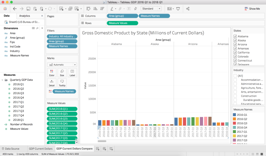
This is not it…

Exploring-alternative-views-in-Tableau-1024x601.png

This is not it…

what-is-desktop_01.png

This is not it…

qlik-sense-cloud-interface.jpg

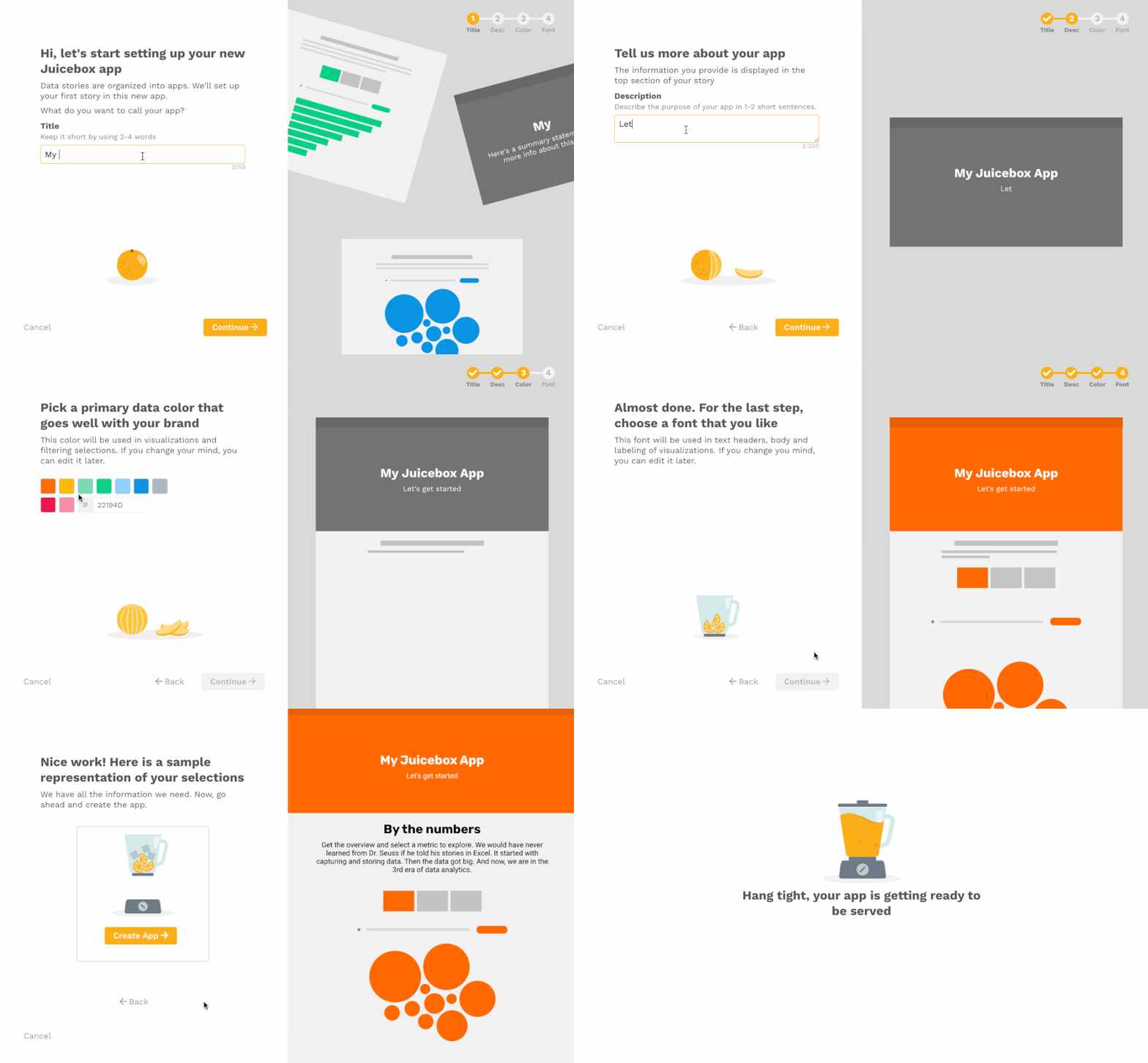
We think it should look a lot more like this:

Juicebox is the new maker tool for data presentations.

Getting Data Product Requirements Right

Often customer data products or applications go awry because of poor requirements.  While customers can describe a billing workflow or a mobile app feature, explaining how data should be used is less clear. Merely documenting a wish list of reports, fields and filters is a recipe for low adoption and canceled subscriptions.

To ensure that data requirements are relevant and the solution is useful to customers (profitable too) consider the expression Walking a Mile in their Shoes.   The original expression, which has evolved and used in different forms is before you judge a man walk a mile in his shoes.  Collecting good requirements is less about a laundry list of charts and metrics, but an understanding of how information can transform the business from how it exists today.

In 2017 I had the opportunity to work on an insurance industry project for the first time.  The challenge was to deliver the industry’s first insurance agency analytics solution.  The product team showed us their competitor’s dashboards and suggested we replicate them. The support team demanded more ad-hoc reporting functionality on top of the Crystal Reports report writer.   Customers wanted an embedded BI tool to make themselves more data-driven. Needless to say all parties were miffed when we accommodated none of their requests.

What we did was contrary to what everyone expected.  We didn’t talk about the data (at least not in the beginning) or ask them their report wish list, but strived to understand the drivers of success and behavior within an insurance agency.  To walk in their shoes, we scheduled agency office visits, had discovery meetings with executives, observed workflow and documented data usage.  In the discovery meetings we asked questions related to the end user’s data experience, how and when information was being used and what decisions were made using data.

Here’s a sample of our questions.

Data Consumers (Users)

  1. How well does the user understand the data?

  2. How much expertise do they have in the industry?

  3. What were some examples industry best practices?

  4. Are customers looking for data or insights?

  5. Does the end user trust the data?

Data Consumption

  1. What are some examples of business processes being influenced by data insights?

  2. What are the top 3 questions each audience wants to answer? 

  3. When is data being used and how, e.g. daily, weekly, monthly, in account reviews etc.

  4. How is information currently be displayed and disseminated?

Decision-Making

  1. What are the current metrics that measure business success?

  2. What are the key decisions made every day?

  3. What are the decisions not made or delayed because of missing data?

  4. What are the top data conversations had or that need to be improved?

  5. What are the metrics that drive top line revenue?

  6. What business processes will be impacted by this new information?

  7. What are some example actions that might be taken as a result of insights? 

Data

  1. What are the relevant time intervals that information will be updated, distributed and reviewed?

  2. What are the most relevant time comparisons, prior week, prior month, prior year? 

  3. Are these dashboard(s) meant to be exploratory or explanatory in nature?

  4. What offers the most relevant context to the end user?

Getting users to adopt 20 new reports or a single new dashboard can be challenging when habits are already in places. Your best bet for successful data product adoption is to improve existing workflow and/or meetings using the newly uncovered insights.  In the case of the insurance project customers already had access to 300 reports before we created their new analytics solution. 

As it relates to the insurance project our first phase developed three new data applications.

  1. Daily Cash Flow Application (printed) 

  2. Weekly Sales Meeting Dashboard (TV Monitor) 

  3. Monthly Carrier Marketing Meeting Presentation (2 Desktop Dashboards)

These solutions or apps solved specific problems and fit into their existing workflow.  In each case we developed a data application based on industry best practices.  

Just “knowing your audience” isn’t enough to get data requirements right.  Walking in their footsteps means understanding how their business works and how the right insights can impact it.  Some of the other benefits from this approach are:

  • Quantifiable Returns - It was easier to talk about the benefits of a data product when tied to a process where time or effort saved can be measured.

  • Increased Credibility - By taking the time to walk with customers we establish credibility.

  • Improved Stickiness - Tying new applications to existing processes not only aided in adoption, but made them harder to turn off over time with increase usage.

Much of what was discussed above can be found in the Juice design principles, resource page or in Data Fluency; however the quickest way to find our more is to schedule a case study review.  Click the button below, send us a message and indicate your industry.  We’ll walk you through a successful case study in a relevant industry and answer your questions.


Trust the Process

My son and I are really excited about the new NBA season. We are Atlanta Hawks fans, so we’re not too optimistic about this year. We know the team is young and has decided to undertake a rebuilding process. Our mantra for this season is the now familiar “trust the process”.

If you’re not aware of the phrase “Trust the Process” comes from the Philadelphia Sixers rebuilding efforts over the past couple of years. What’s most interesting to me is that the formula for team success is much broader now. It is no longer just about having great players, but free agency positioning, analytical prowess, superior facilities and developing long-term successful franchises.

It's all about the process now.

I find the same can be said for delivering customer data and dashboard solutions.

Much of the historical focus when deploying data applications (customer dashboards, embedded analytics, etc.) has been on selecting the right tool. However, despite so many more great tools and increased investment in the BI space, successful implementation rates have not improved.

In a research piece by Dresner Advisory Services from May of this year, they highlight the fact that successful BI implementations are most often tied to having a Chief Data Officer (CDO). This makes a lot of sense because the CDO is just like an NBA team’s general manager. They bring accountability and experience as well as a process to make customer data solutions successful.

Here are some elements that make process so valuable to delivering data applications and solutions.

  • Launch Dates - A process is the best way to mitigate against missing the launch date. The existence of checklists, status updates, and documentation offer a means to anticipate risks that cause delays. Remember that delays to the product launch or release directly impact revenue and reputation. Missing product launch dates is not something that goes unnoticed.

  • Customer Credibility - When delivery dates are missed, requirements miss the mark or dashboard designs don’t serve their audiences product confidence is lost. Its not only the customer’s confidence that we need to be concerned about, but also the sales and marketing teams. Once we lose the trust of these audiences it takes time to regain it, not unlike sports teams who fail to deliver winning teams over many years (see: New York Knicks).

  • User Engagement - When there is no process that means there’s no planned effort to understand the audience and deliver the dashboard design. If users can’t understand the data you’re sharing with them, a cancelled subscription is a near certainty.

  • Applications, not Dashboards - The best dashboards are purpose-driven applications. Tools don’t deliver purpose. The process undertaken to understand and solve a real problem delivers a purposeful solution.

  • A Complete Platform - A dashboard solution is only a means of displaying data. A process defines ALL the requirements. Having a process recognizes that a complete solution is needed which includes security, user administration and application performance optimization.

Much like NBA success, a successful customer dashboard implementation isn’t about picking a product (player), but sustained success over many years of increased subscription (tickets) revenue, fan engagement and loyalty. The path forward for distributing and delivering on valuable data applications is all about your process.

In the event that you don’t have a process or a CDO leading your efforts, click here to learn about the Juicebox Methodologies. It's our way to design and deliver successful, on-time applications as well as wildly loyal fans. Trust the process. It works.