
Description
To gradient or not to gradient, that is the question. Thankfully, there is much less subjectivity to this principle than most people think. How many times have you seen a bar chart that looks like similar to this?
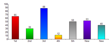
One particular design element it got wrong (amongst others) is the vertical gradients starting from a darker hue at the bottom of the bar to a lighter version of the hue at the top. This illustrates the first aspect of this principle:
Gradients are great for sequential rates.
For example, if you’d like to show ordered values from 0% to 100% visually, it may be perfectly appropriate to use a gradient. If you are showing a single metric value, it’s almost never appropriate because you are presenting distracting visual changes that carry no meaning.
Many will say, “But my bar charts are boring without them.” To which I would say, “Then either you are showing boring data, or the overall styling of the interface is poorly designed.” Don’t let data readings suffer at the expense of bad design. This brings up the 2nd aspect of this principle:
Calm gradients mimic reality.
An information purest usually won’t touch a gradient with a ten foot pole. However, the simple reason they can be helpful is they communicate something inherent to the world we live in: light and shadow. It’s this natural metaphor that makes gradients useful for defining interface elements and providing overall structure for how things are visually grouped. An appropriate example may be giving a slight drop shadow to a tool tip that would appear “above” the interface. The definition is natural because it mimics what natural light does from one thing being in front of another. Also note, however, that excessive and pronounced use of gradients mimic cartoony, unrealistic imagery and promote further distraction.
Examples
Poor usage:This interface uses a lot of gradients. So many are used in what seems to be an attempt to highlight things that everything is screaming for your attention and you don’t know where to go first. And many of the gradients are quite drastic, such as the yellow to green gradient on the “Generator” button. A gradient doesn’t need to be that drastic to add some dimension and interest. The dark grey gradient at the top is nice and subtle.
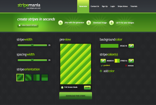
Source: http://www.stripemania.com/
Good usage:This website interface uses gradients, color and drop shadows well to differentiate sections and highlight. The gradients that are used are subtle and create some dimension. The drop shadows are varied and give a sense of depth.

Source: http://www.colorschemer.com/
Resources
Color Brewer 2.0
Related Principles
Color has meaning
Remove junk, increase data-to-ink ratio