
Quick tip
Generally, limit your interface to 2 emphasis colors to direct the eye. Use grey values for structural elements to define space and establish rhythm on the grid.
Description
Didn’t your momma always tell you to limit your colors? Well, she should have. Here’s why. We naturally make visual associations between things of the same color. Our brain naturally says, “Color has meaning. Perhaps these things of similar color are grouped somehow.” The problem is when you start adding useless colors to an interface, this muddies our natural ability to see color correlations. Usually, these tie-dye interfaces appear from the infamous effort to “spice things up” or “make it pop.” The intentions are innocent, but the resulting colors get in the way of clear decision making.
We want to reserve emphasis color to draw the eye to the most important things on a page. Good design is the culmination of many small decisions composed into clear and purposeful communication. Use colors to purposefully move people through a work flow while drawing their attention to information they care most about.
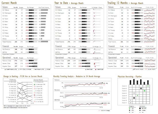
Examples
Poor usage: distracting background colors, pointless coloring in charts

Good usage: 2 emphasis colors – red and green, de-emphasis grey values
Resources
Choosing Colors for Data Visualization
Related Principles
Color has meaning
Accommodate color blindness
Use grid based visual rhythm
Emphasize the interesting
Guide attention
Remove junk, increase data-to-ink ratio