
Description
More often than not, dashboards get lit up with color like an over-dressed Christmas tree. The color is applied indiscriminately and adds little to the meaning of the dashboard. Appropriate use of color requires restraint. In our dashboard designs, we typically start by using only grey, then we gradually add color where it conveys useful information.
Color can draw your eye to what is important and tie together similar things. For example, if we increase color brightness, it will attract attention and make a point seem more important. Similarly, use of the same color hue can be used to connect things that are related.
Color can communicate emotion and feeling. For example, red can be associated with positive feelings like excitement and desire, but also with negative feelings of danger and alarm. One common use for color in data visualization is using red for negative/loss (like a loss of money) and green for positive/gains. If you were to have a green arrow pointing down to show loss and a red arrow pointing up to show gains, that would be confusing.
The meaning of color differs by culture. For example, in the U.S., white is the color worn by brides to symbolize purity. In China, white symbolizes mourning and death, and red is the color for brides and celebration.
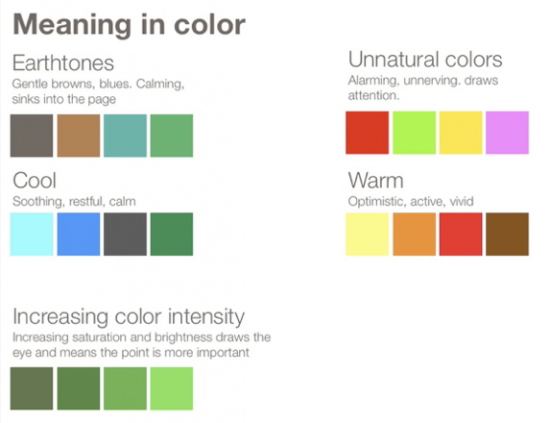
Colors can be broken into high-level dichotomies such as “earth-tones” versus “unnatural” colors. We perceive earth-tones as calming (Edward Tufte has said that these are the kinds of colors you want to use if you just want to use color very gently on your page). In contrast, unnatural colors jump out at your audience, making them ideal for showing an alert.
Color to display data
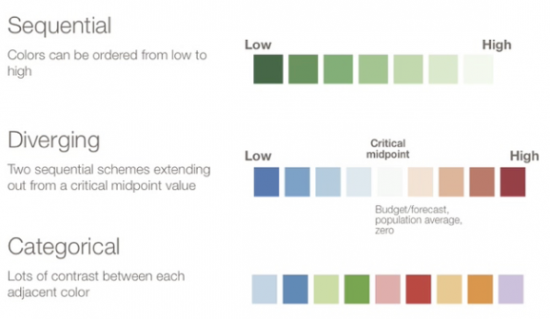
When you are using color in your graphs to represent data, there are three types of color schemes to consider:
Sequential when you are ordering values from low to high.
Divergent when the values are ordered and there is a critical mid-point (e.g. an average or zero).
Categorical when data falls into distinct groups (e.g. countries) and therefore requires contrast between adjacent colors.
Examples
Poor usage: With red being such a bright, powerful color that can create strong positive feelings of passion and desire or strong negative feelings of alert or alarm, it is generally a color used more sparingly. The use of red here doesn’t really support the content and its overuse becomes overwhelming to look at for long periods. Also, color should be used to highlight things or separate sections of information. Because the red is so prevalent and bright, it becomes unclear where to start when you first look at the page.
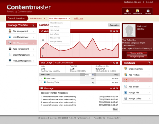
Good usage: Mint.com’s mobile application uses red to alert overspending or a loss, green to show good money usage or a gain, and yellow to warn that you are getting close to overspending.

Mint.com mobile app
Resources
Choosing Colors for Data Visualization
Cymbolism.com
Chart Makeovers
The science of picking colors
Related Principles
Limit color
Typography has meaning
Accommodate color blindness
Use gradients appropriately