
(With enough visualization methods to warrant a periodic table, it can be confusing to know what to use and when—and which visualizations are even worth considering at all. This series of posts is intended to introduce you to the visualization approaches that we find most useful, practical, and audience-friendly.)
What is a parallel coordinates chart?
Parallel coordinates is a visualization technique used to plot individual data elements across many performance measures. Each of the measures corresponds to a vertical axis and each data element is displayed as a series of connected points along the measure/axes.
Jon Peltier’s chart of baseball players below offers a simple example in Excel.
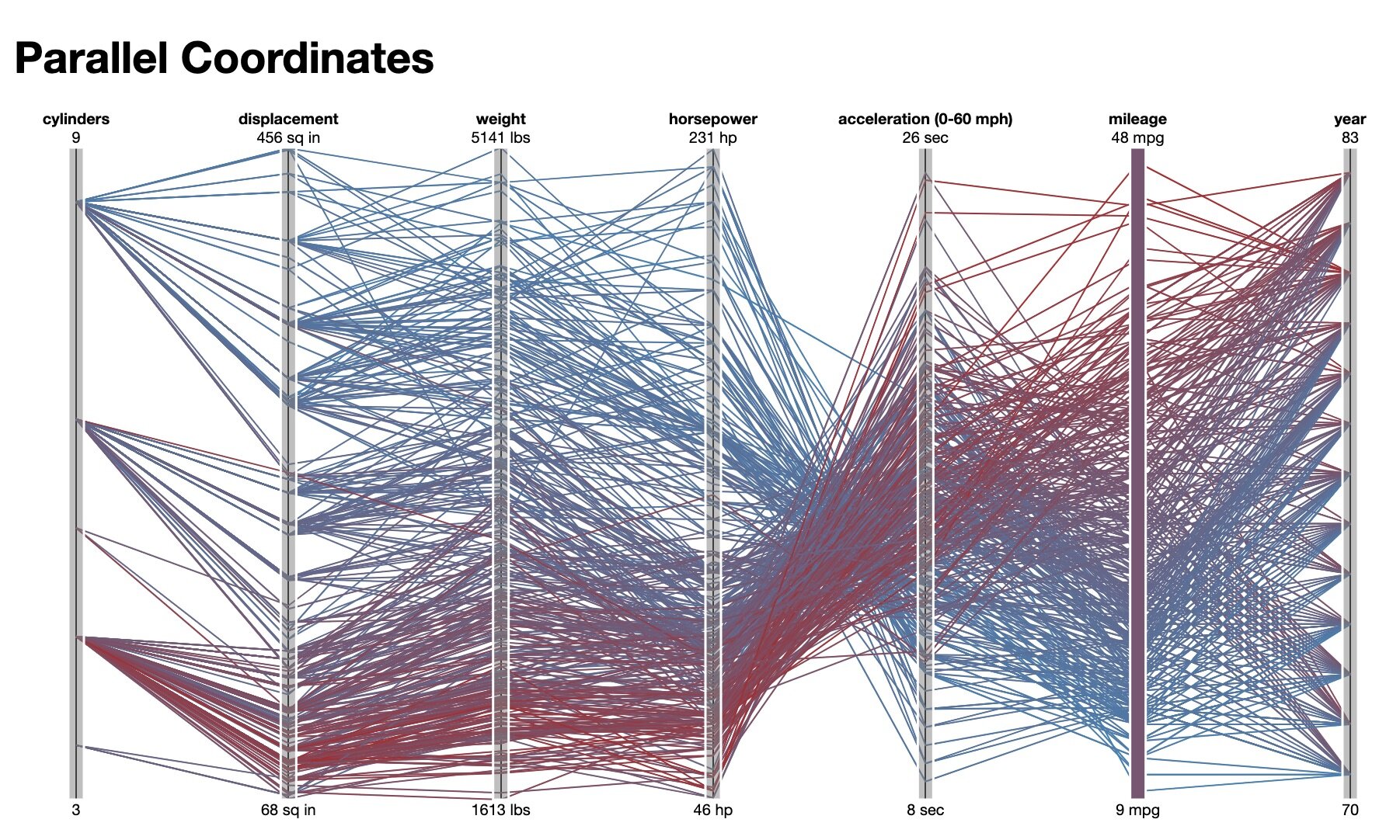
An example of vehicle performance across multiple measures from the Data Viz Catalogue.

Each line corresponds to a player with performance plotted across four characteristics. Two players have been highlighted to compared values.
Parallel coordinates was invented by Alfred Inselberg in the 1970s as a way to visualize high-dimensional data. These charts are more often found in academic and scientific communities than in business and consumer data visualizations. This isn’t too surprising as parallel coordinate charts can become very dense and difficult to comprehend. Stephen Few has a typical reaction (PDF):
The first time that I saw a parallel coordinates visualization, I almost laughed out loud. My initial impression was "How absurd!" I couldn’t imagine how anyone could make sense of the dense clutter caused by hundreds of overlapping lines. This certainly isn’t a chart that you would present to the board of directors or place on your Web site for the general public. In fact, the strength of parallel coordinates isn’t in their ability to communicate some truth in the data to others, but rather in their ability to bring meaningful multivariate patterns and comparisons to light when used interactively for analysis.
Mr. Few’s final point is right on: with the application of interactive highlighting, filtering, and roll-over detail, parallel coordinate charts can reveal interesting stories in your data.
What problem does this solve?
For most standard charts, there are only so many measures you can effectively show. A typical progression of charts by measures goes like this:
2 measures: Scatterplot
3 measures: Bubble chart
4 measures: Bubble chart with colors
5 measures: Bubble chart with colors and animation
And now you’ve pretty much made an indecipherable graphic. That’s where parallel coordinates can help in showing many measures, limited only by horizontal space.
Like all good visualizations, parallel coordinates can also show both the forest and the tree. The big picture can be seen in the patterns of lines; individual lines can be highlighted to see detailed performance of specific data elements.
What alternatives are there to parallel coordinates?
The most direct alternative to a parallel coordinates chart is a “leaderboard.” Leaderboards also show the performance of many individual items across multiple performance measures. However, leaderboards simply rank the items rather than plotting them precisely on each axis. Here’s an example:

At Juice, we’ve become big fans of the Leaderboard because it offers a couple benefits beyond parallel coordinates:
Direct labeling of the individual items (and their values) makes it easier to read
While ranking is less precise, seeing the top 10 performers for each measure can be a good fit for the audience’s needs.
To learn more about Leaderboards, check out this interactive example. Or make your own:
What to watch out for when using parallel coordinates?
With its power to visualize data across multiple measures, why aren’t parallel coordinate chart more popular? Here are a few of the issues:
Large data sets create a lot of visual clutter. More from S. Few: "Most of us who have used parallel coordinates to explore and analyze multivariate data would agree that meaningful patterns can be obscured in a clutter of lines, especially with large data sets."
The order of the axes impacts how the reader understands the data. Relationships between adjacent measures are easier to perceive than between non-adjacent measures.
As the axes get closer to each other it becomes more difficult to perceive structure or clusters.
Depending on the data, each axis can have a different scale, which is difficult to display and for the reader to absorb.
Lines may be mistaken for trends or change in values even thought they are only used to show the connected relationship of points.
Parallel coordinates in practice
Protovis: In this example, hundreds of cars can be quickly compared by filtering along any dimension. Click and drag along the red rule for a given dimension to update the filter.

Junk Charts revised a New York Times graphic to come up with this take on a parallel coordinates chart:
Do it yourself in Excel
Jon Peltier comes through again with a fine Excel tutorial.
Do it yourself with other tools
Macrofocus uses parallel coordinate visualizations extensively in their products (InfoScope, SurveyVisualizer)
"GGobi is an open source visualization program for exploring high-dimensional data"
"FluxViz is a simple cross-platform tool that uses parallel coordinates for the visualization of high-dimensional spaces"
More resources
Multivariate Analysis using Parallel Coordinates (PDF)


