
Better Know a Visualization: Small Multiples
(With enough visualization methods to warrant a periodic table, it can be confusing to know what to use and when—and which visualizations are even worth considering at all. This series of posts is intended to introduce you to the visualization approaches that we find most useful, practical, and audience-friendly.)

What is a small multiple?
Small multiples are a visualization concept introduced by Edward Tufte. He described them as:
"Illustrations of postage-stamp size are indexed by category or a label, sequenced over time like the frames of a movie, or ordered by a quantitative variable not used in the single image itself."
Small multiples use the same basic graphic or chart to display different slices of a data set. Small multiples can show rich, multi-dimensional data without trying to cram all that information into a single, overly-complex chart. Small multiples go by many names, including Trellis Chart, Lattice Chart, Grid Chart, and Panel Chart. I would even argue that sparklines are a simpler, smaller cousin of small multiples.
What problem does this solve?
Small multiples offer a few valuable features:
They allow for the display of many variables with less risk of confusing your audience. Trying to display three or more variables in a single chart is a challenge Stephen Few calls overplotting (PDF).
The reader can quickly learn to read an individual chart and apply this knowledge as they scan the rest of the charts. This shifts the reader’s effort from understanding how the chart works to what the data says. That’s a worthy goal in all data presentation.
Small multiples enable comparison across variables and reveal the range of potential patterns in the charts.
Here’s a great example of “NASA’s Kepler mission has discovered more than 1,000 confirmed planets orbiting distant stars.” (NYT).

What to watch out for when using small multiples?
Like any visualization, there are many ways to mess up and undermine the value of the data presentation:
Placement of the small multiples charts should reflect some logical order, e.g. dimensional matrix, geography, or time. This helps the user quickly find the charts that are interesting to them.
Small multiples should share the same measures, scales, size, and shape. Changing one of these factors undermines the ability for people to re-use their understanding of the chart.
The simplicity of the chart is critical. Users should be able to process information across many of these charts. The following small chart from the New York Times works as an individual graphic; when shown in "postage stamp" size across 20 cities, this chart is too data-dense.
Small multiples in the practice
New York Times’ analysis of Amazon rain forests

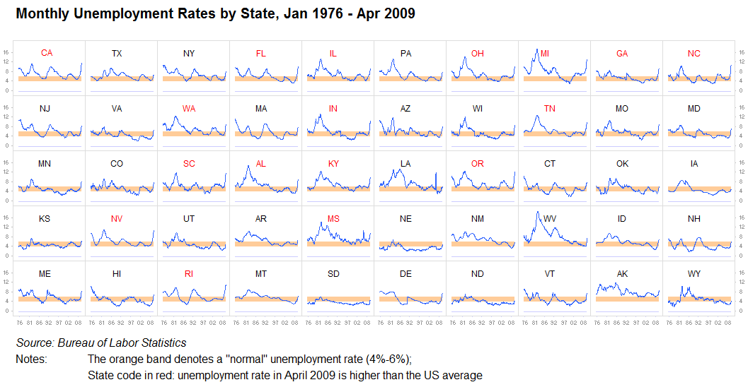
Jorge Camoes’ small multiple graphic for unemployment data

FiveThirtyEight uses small multiples to show life expectancies by State.

Do it yourself in Excel
Jon Peltier creates small multiples in Excel
Vaishali Shende shares a short video to show you how to create small multiples in Excel
Do it yours with other free tools
Tableau Public. Nobody has small multiples more baked into their DNA than the folks at Tableau.
Flourish provides chart grids to show small multiples.
More resources
Junk Charts’ posts about small multiples
FlowingData provides more examples of small multiples