
A skilled author of data presentation will choose the right visualization to emphasize a message. The data, chart, and supporting descriptions will work in harmony to point out what is interesting. The reader simply goes along for the ride. Unfortunately this is the exception more than the rule. Many data products are a muddled mess of chart choices, obscure labeling, and arbitrary layout. In essence, the author has passed responsibility to their audience to find the meaning.
If you are to carry this burden of rooting out the insight in a data visualization, you need to know where to look. The best place to start is by focusing on the unexpected. Does the world work the way you think it does? Or does the data show you something that challenges assumptions of expected values? Let's take a look at a few ways to find the unexpected.
Unexpected distributions
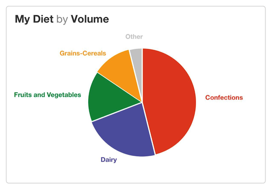
Pie charts are designed to show how something breaks into its constituent pieces. The slices add up to the whole, and the volume of each slice indicates its piece of the pie. The primary insight offered in a pie chart comes from slices that are smaller or larger than you would expect. One weakness of the pie chart is that to discover slices that are bigger or smaller than expected, the reader needs to compare the actual chart to what they imagined it might look like. For example, in this pie chart the reader might be surprised to find that confections are nearly half their diet by volume (that’s not healthy eating).
Unexpected patterns or relationships
Plotting data in a scatterplot or bubble chart is a way to show relationships between two or more variables. The pattern of the points may express a correlation that is either expected or surprising. Furthermore, outliers from this pattern are interesting because they break the mold.
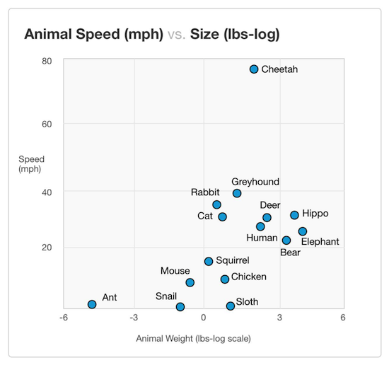
Source: Data from Natural History Magazine, March 1974
This scatterplot shows animal size versus weight. The data indicates a positive relationship between size of the animal and its top speed. Bigger is faster, but with a lot of variation. The cheetah is an outlier with an unusually high ratio of speed to body mass. That's interesting. (Also, it’s good to see that humans are faster than bears. Unfortunately, a careful reading of the underlying data reveals that the human data point is Usain Bolt, world record holder in the 100 meter sprint.)
Unexpected trends
Trends across time are another common place to look for insights. Line charts can make obvious the deviations compared to expected patterns or trends. Like the pie chart, the reader needs to overlay their assumptions on the shape of the lines. Do you expect there to be an upward trend? Should the values remain steady over time, or is it normal to see substantial fluctuations?

Cardiologists use Electrocardiograms (aka EKGs) to trace the electrical activity from the heart. A healthy heart demonstrates familiar patterns in the lines; changes to these patterns indicate problems. An experienced cardiologist can see abnormal heart rhythms, chamber enlargement, and signs of impaired blood flow through changes in the shape of the lines.
Comparisons
Data without context may offer little meaning. But adding a comparison value—whether an industry benchmark, an organizational goal, or a regulatory standard—brings values into focus. Comparisons across time periods can communicate improvement or regression. Direct comparisons can show how two or more entities rank compared to each other. Numerous specialized data visualizations have been designed to enable quick comparison, including bullet charts, “stop-lighting,” and leaderboards.
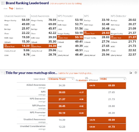
This dashboard compares bank brands by a series of survey questions. Rankings and side-by-side comparison make it obvious who is performing better for each brand performance measure.
Find a starting point
A dashboard, report, or data visualization can feel like an ocean of information competing for your attention – like a Where’s Waldo™ puzzle. Rather than trying to take in the whole picture at once, it’s a good idea to focus your attention on a small piece of the picture. Focusing on a single element can help you grasp the nature of the data, the dimensions and metrics being displayed, and eventually how a small piece fits into the whole. Take the following data visualization comparing hospitals by patient experience as an example.
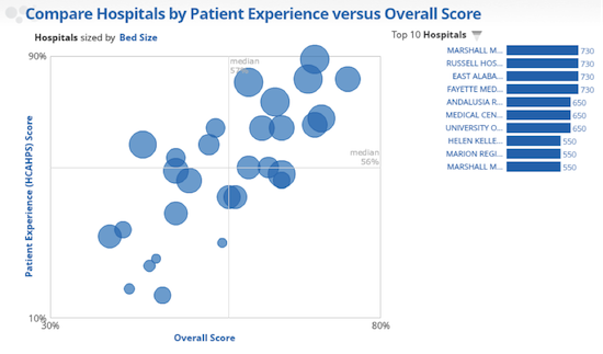
There is a lot going on here. The bubble chart shows three separate metrics about each hospital. The meaning, size, and positioning of the bubbles requires a new reader to carefully review the axes and legend to get his bearings. The connection between the bubbles and the bar chart on the right is not immediately obvious.
It’s a lot easier to tell the story of a single bubble.
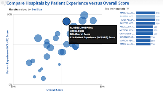
The highlighted bubble represents a hospital, and the three metrics used to size and position the bubble are shown in the tooltip. In fact, the connection to the bar chart becomes obvious as Russell Hospital is identified as one of the largest hospitals by bed size. This particular data point may not be the most interesting or unexpected in this chart, yet now you how a much better sense of what the data product is trying to convey about hospitals.
Turning Data into Words
It is often said that you know you have become fluent in a foreign language when you dream in the language. Short of this inflection point, language students have to translate the words back into their native tongue. And so it is with data. Without instant recognition of the meaning of a data visual, it can be useful to convert the information into a language in which you are familiar.
Take the example above: to understanding the message in the data, you might translate a data point into a descriptive sentence such as “Russell Hospital has 730 beds, tied with three other hospitals” or “Russell Hospital’s patience experience score is near the top of all hospitals shown.” This is a way of capturing and testing your understanding of what you are seeing in the data.
By breaking a complex data product into its smallest pieces and finding something comprehensible, you will start to understand both what the author is trying to show and how to read the content.