Consider data set extremes

Description

There are a few ways to think of data set extremes. The most obvious seems to be actually looking at the outliers of a data set. Whether you have a little or a lot of data, chances are there will be some data points that aren’t nicely lined up with everything else. You may have one big cluster and then a few others that throw everything off, including scale. It’s important to consider those outliers when thinking about your design or chosen visualization. How will you handle them? Will you not include them in some views, but have other views where they can be seen?

Another important part of data extremes are the amount of granularity in your data and what you actually want to show. If showing an amount of time all the way down to the seconds is available, ask yourself if it’s really valuable for your purposes before including it. Also look at the length of time over which your data expands and how you choose to show that. If you show data from a long period of time in a small amount of space, the amount of granularity that someone will be able to see may be minimal.

Comparisons are also quite important. If you have two charts that are being compared, but the minimum and maximum numbers are quite different, scaling the axis’ appropriately so they can be accurately compared is vital for quick and easy comparison. If the axis’ are not to scale comparatively, people may actually misread the data at first glance.

Other types of extremes to consider are text based extremes. If you have some lists that will be really long and others that will be short, how should you handle that? Word labels will vary in size and you may have some that are really long. Think about the approach to that. Should you show part of the label and have the full label show upon rollover? Or should you have the label jump to two or three lines, if necessary? Is there a better solution? Each scenario is different, so think about what works for what you are doing.

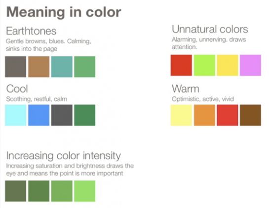
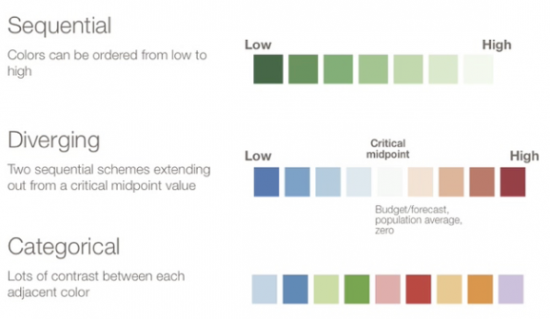
Also, be sure to account for perceived color differences if you are choosing colors to represent your data. The more categories you have, the more tricky this can become. If you think two colors may be a little close, find different colors. You may know that they are different, but others may not seen those differences if they aren’t pronounced enough.

Examples

Poor Usage
This Network of Data Visualization references does indeed have lots of useful information; however, the enormity of the data in combination with a network diagram leads to your classic hairball example of mismatched design and purpose. There is an attempt to remedy this with a fisheye interaction, but it manages to both not solve the problem and add difficulty actually making selection.

Data-visualization-references-network-625x350-e1339614209637.png

Good usage:
Gapminder World examples one good consideration to deal with its extremes by presenting an optional toggle directly on the axis to switch between a linear and logarithmic scale.

Gapminder-World-1-e1339614385775.jpg

Related Principles
Communicate true scale
Time contextualizes
Choose the right chart
Focus with filters

Rarely use 3D

Description
Often people will try to make charts look more interesting. Though this is a worthy effort, it can lead to graphics that emphasize interface verse information. Moreover, this effort can undermine the worth of data, which should be interesting enough. 3D effects is the most common technique, but should actually rarely be used. Only if the use of 3D will actually enhance your understanding of the data – not just make it cool and fun to explore – should it be considered. In most cases, the use of 3D can actually distort the information and make it more difficult to read and understand clearly.

Some situations where communicating information in 3D may be appropriate: the data dimension in fact exists within 3D space (geography), or for highly advanced scientific visualizations where the z-axis could show another variable. But again, before using 3D consider if it really does anything to actually enhance understanding. Just because something exists in 3D space doesn’t mean it’s most easily understood that way as a data visualization.

Examples
The chart below is attempting to show the difference between what people actually make (income) versus what they take on in debt in order to achieve the “American Dream.” However the use of 3D severely hinders a quick and easy understanding of the actual data. Without looking closely, it is difficult to compare the height of one bar to another, and the little figures on top of the bars certainly doesn’t do anything to help. You can’t even see the top of the home mortgage bar with the house on top of it. And what value do the figures add anyways? Without them, would you not understand what a mortgage is? Or what marriage is? Even the text is written in the 3D space on the bars, making that difficult to read as well. There is so much going on in this bar chart that is takes much more time to figure out than necessary.

american-dreams-to-debt-solutions-1.png

The visualization by Time Magazine is showing population in the U.S. At quick glance, it is easy to see that New York City has the largest population (that is if that label were displayed – though is it on rollover). From there though, the comparisons become difficult. The question is whether this is more easy to understand that a standard flat map of the U.S. with cities/counties/etc colored by population. The other question is who is your audience and what information do they care about? If something general like what you can get from this map is all they want, then it would serve its purpose. If they are looking for more detailed information, this would not be the map for them.

time.png

The map below is from The New York Times and shows subprime mortgage foreclosures. Again, does the use of 3D enhance the understanding of the information? Considering it’s very difficult to see the differences in height, some 3D bars may be hiding other bars and the shadows from the bars make distinguishing the colors of the bars difficult, I’d say not. Perhaps a map like the 2 below would have been more effective. Maybe not as cool and eye-catching, but certainly it would show the data more clearly.

foreclosures.png

The chart from GOOD Magazine below shows the most frequently used words in two different books, but it is not effective. I believe it’s supposed to be a bar chart, but the use of 3D for the bars makes it impossible to accurately compare them. Without the numbers in the callout boxes, this chart would actually read incorrectly. For example, look at the two Bush bars. Without looking at the numbers in their callouts, they actually look the same when in fact they are not.

On-Words-Concordance.jpg

Related Principles
Minimize illusions
Communicate true scale
Use simplest appropriate visualizations

Use gradients appropriately

Description

To gradient or not to gradient, that is the question. Thankfully, there is much less subjectivity to this principle than most people think. How many times have you seen a bar chart that looks like similar to this?

bad-gradient-bars.png

One particular design element it got wrong (amongst others) is the vertical gradients starting from a darker hue at the bottom of the bar to a lighter version of the hue at the top. This illustrates the first aspect of this principle:

Gradients are great for sequential rates.

For example, if you’d like to show ordered values from 0% to 100% visually, it may be perfectly appropriate to use a gradient. If you are showing a single metric value, it’s almost never appropriate because you are presenting distracting visual changes that carry no meaning.

Many will say, “But my bar charts are boring without them.” To which I would say, “Then either you are showing boring data, or the overall styling of the interface is poorly designed.” Don’t let data readings suffer at the expense of bad design. This brings up the 2nd aspect of this principle:

Calm gradients mimic reality.

An information purest usually won’t touch a gradient with a ten foot pole. However, the simple reason they can be helpful is they communicate something inherent to the world we live in: light and shadow. It’s this natural metaphor that makes gradients useful for defining interface elements and providing overall structure for how things are visually grouped. An appropriate example may be giving a slight drop shadow to a tool tip that would appear “above” the interface. The definition is natural because it mimics what natural light does from one thing being in front of another. Also note, however, that excessive and pronounced use of gradients mimic cartoony, unrealistic imagery and promote further distraction.

Examples
Poor usage:This interface uses a lot of gradients. So many are used in what seems to be an attempt to highlight things that everything is screaming for your attention and you don’t know where to go first. And many of the gradients are quite drastic, such as the yellow to green gradient on the “Generator” button. A gradient doesn’t need to be that drastic to add some dimension and interest. The dark grey gradient at the top is nice and subtle.

Source: http://www.stripemania.com/

Source: http://www.stripemania.com/

Good usage:This website interface uses gradients, color and drop shadows well to differentiate sections and highlight. The gradients that are used are subtle and create some dimension. The drop shadows are varied and give a sense of depth.

Source: http://www.colorschemer.com/

Source: http://www.colorschemer.com/

Resources
Color Brewer 2.0

Related Principles
Color has meaning
Remove junk, increase data-to-ink ratio

Color has meaning

Description

More often than not, dashboards get lit up with color like an over-dressed Christmas tree. The color is applied indiscriminately and adds little to the meaning of the dashboard. Appropriate use of color requires restraint. In our dashboard designs, we typically start by using only grey, then we gradually add color where it conveys useful information.

Color can draw your eye to what is important and tie together similar things. For example, if we increase color brightness, it will attract attention and make a point seem more important. Similarly, use of the same color hue can be used to connect things that are related.

Color can communicate emotion and feeling. For example, red can be associated with positive feelings like excitement and desire, but also with negative feelings of danger and alarm. One common use for color in data visualization is using red for negative/loss (like a loss of money) and green for positive/gains. If you were to have a green arrow pointing down to show loss and a red arrow pointing up to show gains, that would be confusing.

The meaning of color differs by culture. For example, in the U.S., white is the color worn by brides to symbolize purity. In China, white symbolizes mourning and death, and red is the color for brides and celebration.

Meaning-in-color-e1328906744180.png

Colors can be broken into high-level dichotomies such as “earth-tones” versus “unnatural” colors. We perceive earth-tones as calming (Edward Tufte has said that these are the kinds of colors you want to use if you just want to use color very gently on your page). In contrast, unnatural colors jump out at your audience, making them ideal for showing an alert.

Color to display data
When you are using color in your graphs to represent data, there are three types of color schemes to consider:

  • Sequential when you are ordering values from low to high.

  • Divergent when the values are ordered and there is a critical mid-point (e.g. an average or zero).

  • Categorical when data falls into distinct groups (e.g. countries) and therefore requires contrast between adjacent colors.

gradient-values-e1328906861195.png

Examples
Poor usage: With red being such a bright, powerful color that can create strong positive feelings of passion and desire or strong negative feelings of alert or alarm, it is generally a color used more sparingly. The use of red here doesn’t really support the content and its overuse becomes overwhelming to look at for long periods. Also, color should be used to highlight things or separate sections of information. Because the red is so prevalent and bright, it becomes unclear where to start when you first look at the page.

poor-usage1-e1328906992445.png

Good usage: Mint.com’s mobile application uses red to alert overspending or a loss, green to show good money usage or a gain, and yellow to warn that you are getting close to overspending.

Mint.com mobile app

Mint.com mobile app

Limit Colors

Quick tip
Generally, limit your interface to 2 emphasis colors to direct the eye. Use grey values for structural elements to define space and establish rhythm on the grid.

Description
Didn’t your momma always tell you to limit your colors? Well, she should have. Here’s why. We naturally make visual associations between things of the same color. Our brain naturally says, “Color has meaning. Perhaps these things of similar color are grouped somehow.” The problem is when you start adding useless colors to an interface, this muddies our natural ability to see color correlations. Usually, these tie-dye interfaces appear from the infamous effort to “spice things up” or “make it pop.” The intentions are innocent, but the resulting colors get in the way of clear decision making.

We want to reserve emphasis color to draw the eye to the most important things on a page. Good design is the culmination of many small decisions composed into clear and purposeful communication. Use colors to purposefully move people through a work flow while drawing their attention to information they care most about.

Examples
Poor usage: distracting background colors, pointless coloring in charts

colorful2-e1328733354167.jpeg

Good usage: 2 emphasis colors – red and green, de-emphasis grey values

Meridian-e1328733594890.png

Resources
Choosing Colors for Data Visualization

Related Principles
Color has meaning
Accommodate color blindness
Use grid based visual rhythm
Emphasize the interesting
Guide attention
Remove junk, increase data-to-ink ratio

Provide instruction

Description

When providing instruction with an application, there are a couple things to consider:

  • The amount of instruction you need to convey
  • How often someone will need to reference that information

The amount of instruction you need to convey
If there is a large amount of instruction that needs to be given, there are a couple ways of achieving this. One is the fairly common use of a “Help” or “?” button. Users can click on these buttons only if and when they need help. Sometimes a button like this may even be sprinkled throughout an application next to the thing it is explaining. The benefit of this method of instruction is that it is unobtrusive to someone who is already familiar with the application and how to use it, but it is also easily accessible to someone who is unfamiliar.

Another way of communicating a large amount of instruction, such as a quick overview of how to use an application, is to have tutorial based instructions. This could be through the use of a video that plays the first time a user enters the application, or through the use of text boxes that pop up and guide the user as they use the application so that instructions are given within context. However, if a method of instruction such as this is used, it should only be used upon first visit otherwise it becomes very intrusive. There should also be a way for the user to exit the tutorial instructions if they no longer need them and return at will.

If you are trying to convey a small amount of instruction such as what an icon or button is for, a “Help” button that takes you to a different page or section or a video tutorial is not going to be necessary. In that case, a tooltip that brings up a few words of instruction would probably suffice. This method is very common and useful. It’s simple, yet informative and it is unobtrusive to someone who is familiar with the application and doesn’t need instruction.

There are times when instructions can also be written and on screen at all times. The use of this should be very limited though. You don’t want to clutter the application up with unnecessary text. An example of when to use written instructions would be something like in the image below (to the right of each input area). If there are input text fields and people need guidance and/or direction as to how things needs to be formatted and what they are needed for, those can be permanently on the screen if necessary.

Screen-shot-2012-02-22-at-2.32.46-PM-e1329939805502.png

How often someone will need to reference that information
If the instructions you are providing will need to be referenced often, first ask yourself if there is a better way to design what you are asking people to do. If the way to use something can’t easily be remembered or understood after using it once or twice, there could be a problem with the design.

If it’s not a problem with design and it’s information that may need to be referenced often, it’s best for it to be easy to get to and have small amounts of text. That type of information can be in hover over text boxes or popup text boxes. If it’s instruction that will only need to be accessed occasionally or only by some people, the “Help” section would probably be the best place for it so that it is out of way but still easy to find.

Examples
Poor usage:
Avery printing template software – Having just selected a template, there is literally no indication as to how return to pick a different one.

Screen-shot-2012-02-22-at-2.46.48-PM.png

Good usage:
First activation of the task bar seamlessly explains is purpose.

Screen-shot-2012-02-22-at-2.49.31-PM.png

Good usage:
A temporarily empty view is prime real estate for invitational instruction.

Screen-shot-2012-02-22-at-2.53.49-PM-e1329940477132.png

Good usage:
Google iphone app – Direct overlays for global interface instruction are lightweight and intuitive.

Screen-shot-2012-02-22-at-2.57.00-PM.png

Good usage:
IRUNRUN iphone app – Walkthroughs are good for custom, directed introductons to set your mind right.

Screen-shot-2012-02-22-at-2.58.24-PM.png

Related Principles
Provide next steps
Consider data comfort and expertise
Suggest related items
Contextual help

Encourage exploration

Description

An important aspect of encouraging exploration for the user is to maintain a certain amount of flexibility and customization, including multiple options, entry points to information and views. A more linear type of design would have specific questions and specific ways to get there. In a design meant to be explored, there should be some general questions the user would want answered and some kind of goal, but in what order they answer certain questions and how they get there should be flexible. This also allows the user to find unexpected information that could lead to further exploration. If the purpose or goal of the information is not immediately understood, it could be helpful to give some presets or suggested routes to find valuable information.

The way that filters are set up in a flexible design is also important. They allow for exploration of the big or detailed picture. They should be readily available to be changed and allow for experimentation by being directly manipulated and giving immediate feedback. Without immediate feedback, users will be less likely to spend time exploring.

Examples

Good usage:
Death of a Terrorist: A Turning Point? – A straightforward visualization in concert with an autoplay comment view and direct manipulation makes this example by the NY Times an excellent lightweight example of good exploration.

Death-of-Osama-Bin-Laden_-How-Significant-a-Moment-NYTimes.com-1-e1337798556430.jpg

www.wefeelfine.org – This is all about open-ended exploration. The purpose is simply observatory.

wefeelfine.png

The World’s Best Countries – A consistent central visual with nice animation a direct filtering.

Interactive-Infographic-of-the-World_s-Best-Countries-The-Daily-Beast-1-1-e1337798696998.jpg

Related Principles
Focus with Filters
Allow direct manipulation
Give instant feedback

Design Principles

text-designPrinciples-t.png

Here is our list of time-tested principles of thought for designing all-star applications. It's a rubric of sorts for judging the well-rounded-ness of an application. Not all applications need all principles applied; however, all can benefit from being interrogated:

Could my application be improved by implementing this principle?Should I improve this aspect of my data presentation?

It's not easy to think like a designer, but behind these fundamentals is a wealth of potential for you and your business. Even though this is a work in progress, our thinking is to go ahead and put the list out there to show the breadth of where we're going.

Let us know what principle name you'd like to see next by adding a comment below!

GUIDANCE

INTERFACE DESIGN

MEANINGFUL COMPARISONS

  • Clarify relationships

  • Provide reference points

  • Time contextualizes

  • Provide overview and summaries

  • Coordinate linked views

  • Promote causality

  • Provide sufficient dimensions

  • Promote patterns

AUDIENCE-CENTRIC

SIMPLICITY

LEAD TO ACTION

  • Track changes

  • Give instant feedback

  • Share findings

  • Present actionable info

  • Cultivate transparency

  • Facilitate collaboration

  • Task specific execution

  • Export data and analysis

  • Solve a problem

  • Communicate progress

  • Provide next steps

FOCUS