

Getting Data Product Requirements Right
Often customer data products or applications go awry because of poor requirements. While customers can describe a billing workflow or a mobile app feature, explaining how data should be used is less clear. Merely documenting a wish list of reports, fields and filters is a recipe for low adoption and canceled subscriptions.
10 Differences between Customer Reporting and Data Products
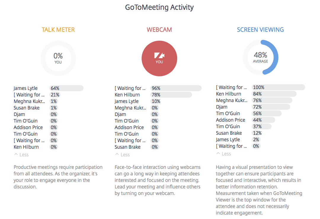
We’ve been talking a lot about how innovative companies are realizing the need to enhance their solutions with more customer-facing data products. For example, GoToMeeting launched a new feature called “Insights” where they send you engagement summary information from your meetings. Here is one from a recent Juice Lunch & Learn:

Reports vs. Presentations: A Tale of Two Data Sources
Have you ever thought about why you deliver a presentation versus sending a report? Let’s face it – reports are easier. They don’t require coordinating schedules or reserving meeting spaces and preparing information for reports is far less labor intensive than pulling together the content required for a quality presentation.
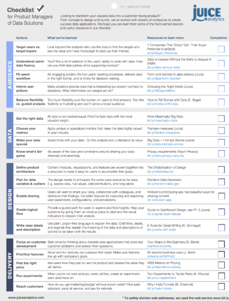
A Checklist for Creating Data Products
“Data is the new oil.”
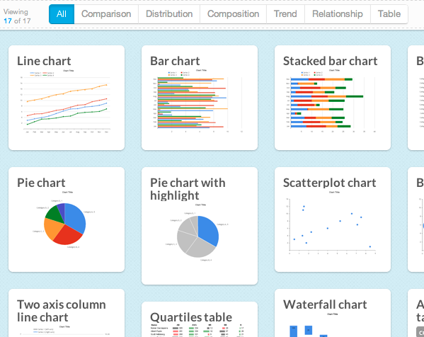
Introducing Chart Chooser -- V2!
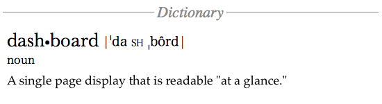
Breaking Free of the One-Page Dashboard Rule
Conventional wisdom says that an executive dashboard must fit on a single page or screen. The argument hinges on a pair of assertions about this constraint: it provides necessary discipline to focus on only the most critical information; and it enables the audience to see results "at a glance."
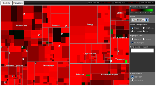
10 Lessons in Treemap Design
In the information visualization world, treemaps are on the rise…and justifiably so. Treemaps simultaneously show the big picture, comparisons of related items, and allow easy navigation to the details.