
How to Choose a Data Visualization Tool
Picking the right visualization tool requires tough choices to find the best fit for your needs. There is no single data visualization solution that is best for all types of users or for all situations. In this guide, we’ll help you sort through the trade-offs to find the data visualization tool that will help you be successful given your goals, skills, and resources.
Below are the five factors you should consider, followed by a list of many of the top solutions grouped into categories.
(1) Flexibility vs. Easy to Use
Visualization tools focused on flexibility have robust feature sets that provide complete control for configuration, fine-grained adjustments of visualization design, and more advanced analytical capabilities.
Best for: Experienced data analysts, developers
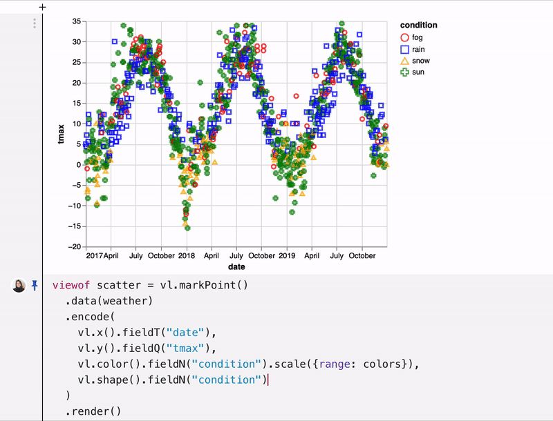
Coding-based configuration in Observable
A focus on easy-of-use allows non-technical users to get started quickly. However, there may be a sacrifice in control over details, customization, and functionality. The best tools make good default choices.
Best for: Non-technical users, business users

Drag-and-drop configuration in Juicebox
(2) Visual Analytics/Exploration vs. Data Storytelling/Explanation
Visual analytics tools improve the speed and capabilities of data analysis. The visualizations reveal patterns so the analyst can pursue additional and deeper insights into the data.
Best for: Data analysts and data scientists working multiple data sets.

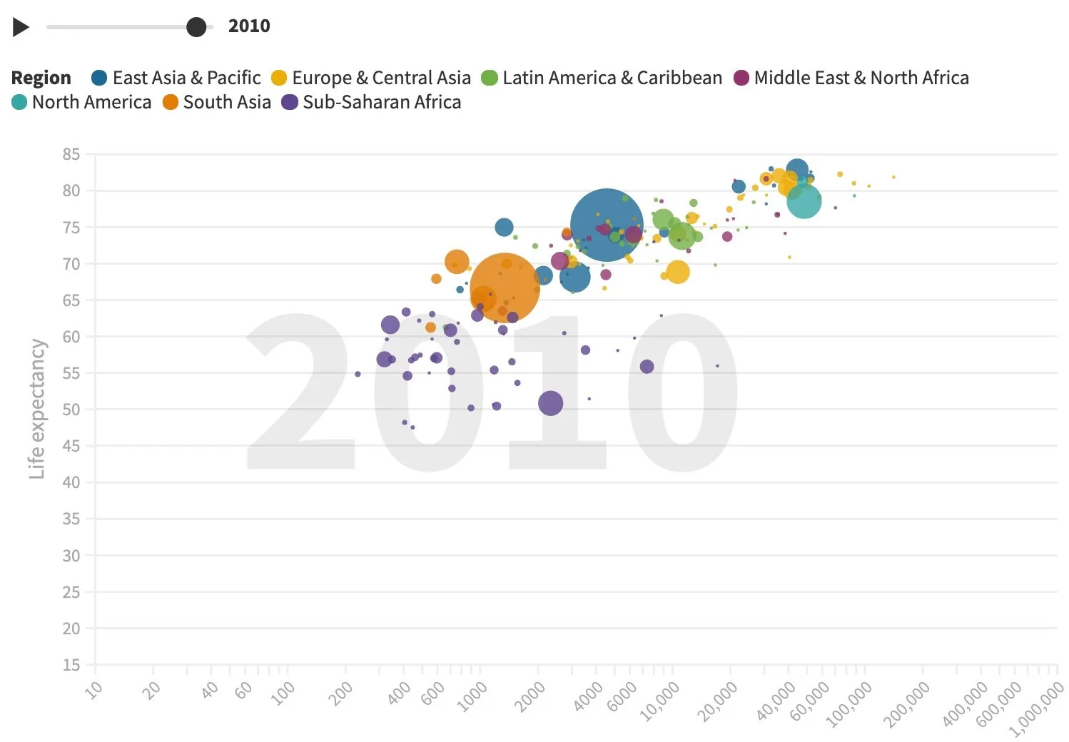
Tableau is a leader in visual analytics
Data storytelling tools focus on the communication of data between people. The user wants to convey a message or insights to a target audience. The data can be combined with data and images to tell the full story.
Best for: Business users, consultants, subject matter experts.
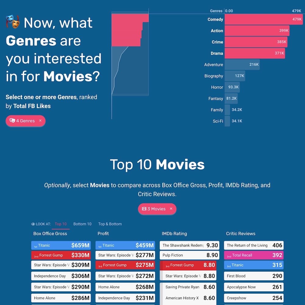
Juicebox is focused on data storytelling
(3) Independent Visualizations vs. Applications/Dashboards
Independent visualization tools are designed to create one chart at a time. Each chart is an independent “island” with a single data set. Often these charts are embedded as part of a separate website.
Best for: Data journalists, students, public relations and marketing
Flourish generates stand-alone advanced visualizations
Application and dashboard creation tools create an application or dashboard as the basic unit. In this case, you are creating a collection of visual components that function together to cover a broader array of information.
Best for: Internal reporting/dashboards, consultants presenting results

Datapine is a tool for creating dashboards
(4) Broad Data Platforms vs. Focused Visualization Tools
Complex data platforms will emphasize visualization capabilities as an entry point for new users. These platforms may include a wide array of capabilities for data management, governance, and modeling.
Best for: Technology teams looking for a single solution to cover all their data needs.

GoodData provides end-to-end business intelligence capabilities
Solutions focused on visualization tend to stick to what they are good at. In particular, these solutions don’t attempt to be the “single source of truth” for data in an organization.
Best for: Individuals and teams with access to data sources.

Datawrapper is focused on creating data visualization components
(5) Cost to Get Started
Free with limitations on volume of use or advanced features.
Best for: Users interested in exploring capabilities using data that may be sensitive.

Piktochart offers a free tier with some usage limitations
Free for public visualizations and may also have functional limitations.
Best for: Users who aren’t concerned about sharing their data publicly (e.g. students)
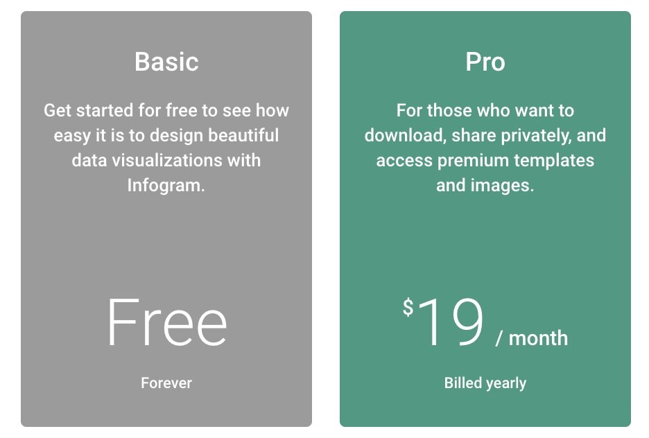
Infogram requires a paid plan to share privately
Trial access is full-featured but for a limited time.
Best for: Users looking to test the solution with expectations to move to a paid license.

Toucan Toco offers a free trial to try it out
What are your data visualization tool options?
We’ve categorizes many of the most popular and successful visualization tools to help you narrow your search. In each case, the ✔︎ bold text indicates how the tools in that category tend to focus based on the factors above.
Data Storytelling Tools
(1) Flexibility vs. ✔︎ Easy to Use
(2) Visual Analytics/Exploration vs. ✔︎ Data Storytelling/Explanation
(3) Independent Visualizations vs. ✔︎ Applications/Dashboards
(4) Broad Data Platforms vs. ✔︎ Focused Visualization Tools
(5) ✔︎ Free with Limitations vs. Free for Public Data vs. Free Trial
Independent Visualizations
(1) ✔︎ Flexibility vs. Easy to Use
(2) Visual Analytics/Exploration vs. ✔︎ Data Storytelling/Explanation
(3) ✔︎ Independent Visualizations vs. Applications/Dashboards
(4) Broad Data Platforms vs. ✔︎ Focused Visualization Tools
(5) Free with Limitations vs. ✔︎ Free for Public Data vs. Free Trial
Infographic Tools
(1) Flexibility vs. ✔︎ Easy to Use
(2) Visual Analytics/Exploration vs. ✔︎ Data Storytelling/Explanation
(3) Independent Visualizations vs. ✔︎ Applications/Dashboards
(4) Broad Data Platforms vs. ✔︎ Focused Visualization Tools
(5) ✔︎ Free with Limitations vs. Free for Public Data vs. Free Trial
(1) ✔︎ Flexibility vs. Easy to Use
(2) Visual Analytics/Exploration vs. ✔︎ Data Storytelling/Explanation
(3) Independent Visualizations vs. ✔︎ Applications/Dashboards
(4) ✔︎ Broad Data Platforms vs. Focused Visualization Tools
(5) Free with Limitations vs. Free for Public Data vs. ✔︎ Free Trial
Data Platforms
(1) ✔︎ Flexibility vs. Easy to Use
(2) ✔︎ Visual Analytics/Exploration vs. Data Storytelling/Explanation
(3) Independent Visualizations vs. ✔︎ Applications/Dashboards
(4) ✔︎ Broad Data Platforms vs. Focused Visualization Tools
(5) Free with Limitations vs. Free for Public Data vs. ✔︎ Free Trial
(1) ✔︎ Flexibility vs. Easy to Use
(2) ✔︎ Visual Analytics/Exploration vs. Data Storytelling/Explanation
(3) Independent Visualizations vs. ✔︎ Applications/Dashboards
(4) Broad Data Platforms vs. ✔︎ Focused Visualization Tools
(5) Free with Limitations vs. ✔︎ Free for Public Data vs. Free Trial