
TedTalks
TED founder Chris Anderson shared an informative guide to giving presentations in his recent HBR article ("How to Give a Killer Presentation"). His advice is hard-won and audience-tested. For those of us who create data-focused presentations his instructions tie to many of the same challenges we face when designing a dashboard or creating a report. There is one big qualification: TED Talk presenters regularly spend six to nine months preparing for their moment in the TED spotlight. You and I don't have that luxury -- or perhaps we should feel lucky?
Anderson starts by highlighting the power of stories:
"We all know that humans are wired to listen to stories, and metaphors abound for the narrative structures that work best to engage people. When I think about compelling presentations, I think about taking an audience on a journey."
I love the notion of a presentation as a journey. Unlike the presentations Anderson is referring to where presenters memorize their script word for word, data-rich presentations often need to be flexible to fit needs and questions of the audience. I equate it to playing the role of a safari guide.
"If you frame the talk as a journey, the biggest decisions are figuring out where to start and where to end. To find the right place to start, consider what people in the audience already know about your subject—and how much they care about it."
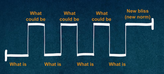
This reminds me of Nancy Duarte, in her book Resonate, who talks about helping the audience bridge the gap between what is and what could be.
duarte-resonate
"The most engaging speakers do a superb job of very quickly introducing the topic, explaining why they care so deeply about it, and convincing the audience members that they should, too."
With data, we often feel a need to be objective and unemotional in sharing it -- but it is at a high cost in effectiveness. If you watch any TED Talk, it is clear how much point of view and passion is added to the basic content, and how effectively this stirs the audience.
"The biggest problem I see in first drafts of presentations is that they try to cover too much ground.
Much of the early feedback we give aims to correct the impulse to sweep too broadly. Instead, go deeper. Give more detail."
Too many data reports attempt to cover every conceivable question. It is better to try to be a data gourmet than a data gourmand.
"Of course, it can be just as damaging to overexplain or painstakingly draw out the implications of a talk. And there the remedy is different: Remember that the people in the audience are intelligent. Let them figure some things out for themselves. Let them draw their own conclusions."
It is a powerful trick to be able to lead your audience to water, but not push their noses into it. Ultimately you want to inspire action. Most people are more inspired to take action on something they 'discovered' than something they were told. It is just basic parenting.
"Many of the best talks have a narrative structure that loosely follows a detective story. The speaker starts out by presenting a problem and then describes the search for a solution. There’s an “aha” moment, and the audience’s perspective shifts in a meaningful way."
And so too it is in data visualization. Better to deliver the "Aha" than the "Wow."
For more on data storytelling check out our giant list of resources for data storytelling and our 30 days to data storytelling learning guide.