
Yesterday we kicked off our O’Reilly Strata Visualization Contest and today we thought it might help to get the creative juices flowing to talk about a visualization that didn’t take complex or expensive tools to create some really interesting results. For those of you who have been following Juice for a while, you know that we’re huge fans of the work that the New York Times Visualization Lab does. Rarely do they address a topic that we don’t think significantly improves our understanding of a topic.
Well, a couple of years ago, we were compelled to attempt to replicate a particularly interesting NYT visualization called the OECD Business Cycle Clock... using Excel.
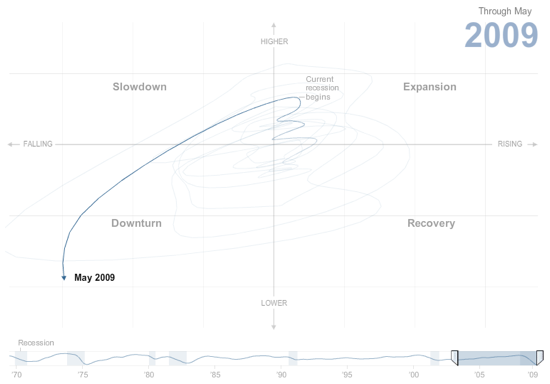
“That’s crazy!” you say. “Couldn’t be done” you say. Well, for all you doubters out there, take a look at this blog post.
So, when you’re trying to figure out how to create that amazing viz that will win you a trip to New York City and admission to the Strata conference, keep in mind that you don’t have to be a wizard at developing with Flex, Protoviz, or D3 to create some really nice looking results. You might just need to start with Excel. There are plenty of Excel samples on our site, and you can check out Jorge Camoes’ site as well for more great examples.
Good luck!!
(As a footnote, I have to point out that it’s our opinion that the hard part of this visualization is not dependent on the technology used to implement, but rather the design thought required to lay out the solution to begin with - kudos to the NYT design team for that inspiration! Remember to start with the end in mind and you're sure to create something much more about the results and less about the tech.)