
Earlier in the week Ken and I were discussing the importance of asking the right question and the very next day Kathy's blog post showed up so I had to share it. If you're not familar with Kathy, she and the team at Rowell & Associates are talented healthcare experts that share our passion for the effective visual display and sharing of information. In addition to her unique combination healthcare knowledge and data visualization, she is very funny. In the spirit of full disclosure it is very hard for a Yankee Fan (me) to compliment a Red Sox Fan like Kathy; however Kathy is the exception. Enjoy her post and if you're in healthcare check out her site. My husband Bret and I had a lively exchange the other morning about the previous night's Red Sox game. I'd gone to bed while he stayed up late watching the last few innings, so when I woke up, the first thing I asked was, "Who won?"
My question stimulated the following exchange:
"The Red Sox lost." "I didn't ask you who lost. I asked you who won." "It's the same thing." "No, it isn't." "Fine. The Los Angeles A's won. Now run far, far away, and leave me alone."
Most of this constitutes marital sport in my house, but part of the friction stems from real human frailty to which we all fall prey occasionally. Perhaps we fail to listen to or clarify the question at hand, and as a result answer incorrectly or ineffectively. We might think we know far better than the other person what (s)he really wanted to ask; so we answer that question ("Who lost the game?") instead of the one that was actually spoken ("Who won?").
The banter with Bret about the precise nature of my baseball question was inconsequential (especially since it occurred before my first cup of coffee). Our efforts to communicate healthcare data accurately and effectively are anything but. Here's what I mean.
My colleague Janet and I have had an ongoing conversation about the data and other information on PatientCareLink (PCL). We have been exploring its site, especially the section on hospital staffing plans, and we keep circling back to this: what question does the information shown answer?
First, we reviewed PCL's Mission Statement: "To deliver transparent quality and safety information from hospitals and home care agencies to patients and other healthcare stakeholders." Since this gave us a clear idea of what the group was trying to accomplish, we let it guide us as we reviewed the site and sought to answer one crucial question: do PCL data and information as they are currently displayed tell patients precisely how safe the hospitals and home health agencies listed are, and what quality of care each provides?
Here's one -- very revealing -- example of what we found.
We looked at Cooley Dickinson Hospital's Adult Surgical Orthopedic Unit Nurse Staffing Plan for 2012 compared to the actual nursing staff levels during that year, trying to answer this question: could we tell, by comparing the Plan and actual nursing levels for the year, if this Unit provided high-quality, safe care to Orthopedic patients?
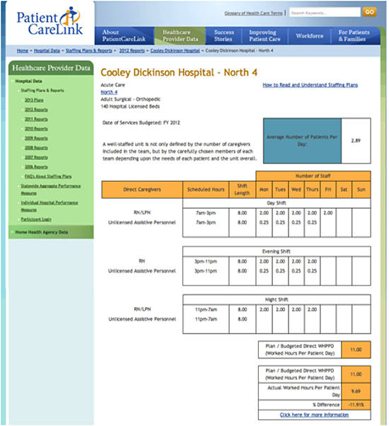
We could not. The most we could decipher from this graphic was that the intended complement for the unit was 11 nurses, and that most days there were actually about 10. The following drilldown seems to explain this variance:
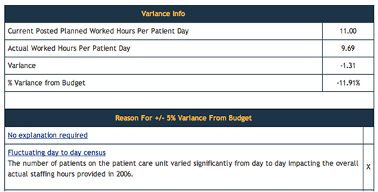
This tells us the reason for the staffing variation (although we don't know why staffing hours from 2006 are referred to here) -- but it still doesn't answer our core question. Are ten nurses enough to ensure safety and high-quality orthopedic care? And what defines such care for this patient population, anyway?
We kept digging, zeroing in on this hospital's Fall Rate for the time frame closest to (though not precisely congruent with) the Staffing Plan data. (Please disregard the 3-D display: the folks who designed it haven't come to my workshops or read my newsletters yet.)
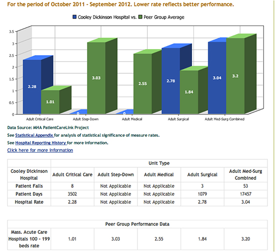
Aside from the different time frames noted above, Unit Types are not aligned with those reported in the Staffing Plan. After careful examination of the data, and although we have approximately 50 years of industry experience between us, Janet and I could not say for sure whether any of the falls on the Adult Surgical Unit (3) and the Adult Med-Surg Combined (53) involved orthopedic patients. Some of them may have, but that is only a guess.
Stay with me just a bit longer: it gets more interesting.
Hospitals whose data are displayed on the PCL site can if they wish enhance their presentations via a written narrative. Here is part of what this hospital submitted: "Cooley Dickinson has been ranked in the top 5 percent of all U.S. hospitals in patient safety by HealthGrades®, the country's leading independent health care ratings organization, for three consecutive years. HealthGrades® has also recently named Cooley Dickinson #1 in Massachusetts for joint replacement outcomes."
By this stage of the game Janet and I were mentally exhausted from combing the site for useful data (and desperately in need of a good cocktail). We had begun by asking one apparently simple question, then set out to answer it: could PCL's data and information tell us how safe and how good the care provided by its member hospitals and home health agencies was?
Nothing PCL offered even came close to answering this simple, vital question. At best, we could see data posted by certain healthcare institutions, and read what they had to say about that information; but our question -- created with the guidance of PCL's own Mission Statement -- was (and remains) unanswered, indeed unaddressed.
Here's the point: data and information are helpful only to the extent that they answer the questions that people actually ask -- not the ones you think they should have asked. This means that the data you gather, analyze, and display must be designed and presented with those questions constantly in mind, using symbols and words that make the answers crystal-clear and unequivocal: no jargon to baffle, no fancy graphics to befuddle.
Janet is working on a bit of a re-design of this information, so stay tuned. Me? I'm working on new ways to annoy my husband -- just for love of the game.