5 Dos and 5 Don'ts for a ‘Year in Review’ Worth Sending
Done well, a Year in Review is one of the most effective customer communications you can send.
Done poorly, it confirms to customers that you don't actually know them.
The gap between the two isn't a technology problem. It's a craft problem, one that requires as much attention to tone, timing, and fallback logic as it does to data and design.

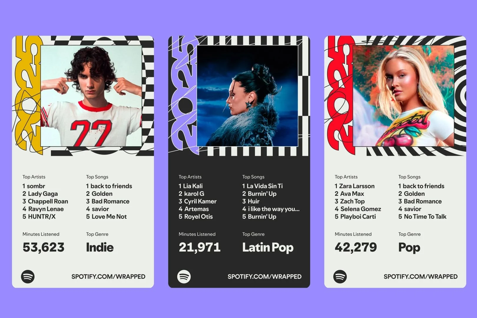
Spotify Wrapped for Everyone: How All Sorts of Organizations Are Using the Year in Review
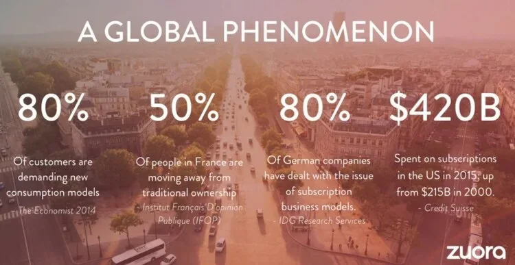
The personalized year in review has expanded beyond its origins. What started as a clever engagement mechanic for consumer tech platforms (Spotify, Apple, fitness trackers) has become a powerful tactic for all sorts of organizations. The playbook is straightforward: take the data you're already collecting, reflect it back to each person in a way that's specific to them, and builds stronger engagement.
How 'Year in Review' Personalized Data Storytelling Became a Business Strategy
Spotify didn't invent the use of personalized data with customers. Companies had been personalizing things for years. What Spotify pioneered was creating a moment, an annual ritual of a customer receiving their own story, packaged as something worth sharing.
The Dashboard Was Never the Destination
In the abstract, people are eager for the insights that may come from the dashboard. In our busy world, people often don’t have the time for the learning and exploration that a dashboard requires. Asking a school administrator, physician, sales person, or manager to step back and take the time to act as an analyst is the fantasy of a candy cabin in the woods.
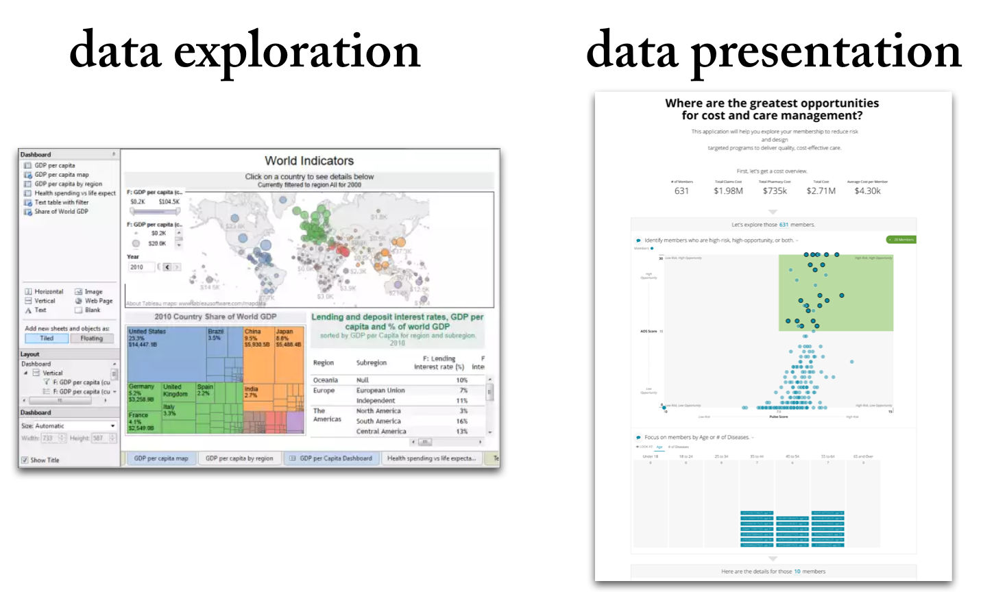
Data Exploration vs. Data Presentation: 6 Key Differences (2026 Update)
Data exploration means the deep-dive analysis of data in search of new insights.
Data presentation means the delivery of data insights to an audience in a form that makes clear the implications.
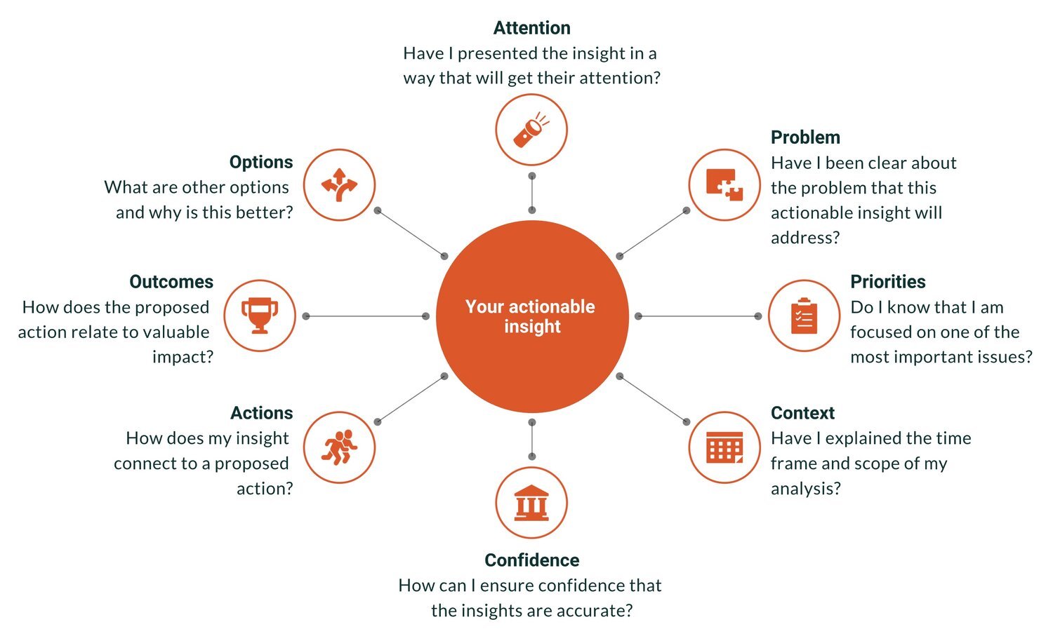
From Insight to Impact: How to Make Data Actually Drive Action
“Actionable insights” is the Holy Grail of analytics. It is the point at which data achieves value, when smarter decisions are made, and when the hard work of the analytics team pays off. Actionable insights can also be elusive — a perfectly brilliant insight gets ignored or a comprehensive report gathers dusts on a shelf.
10 Key Ways Data Products Can Outperform Traditional Reporting in 2026
Explore how customer reporting falls short and why modern data products deliver real value. This updated guide walks data professionals through ten crucial differences, from design and delivery to monetization and user‑focus.
12 Rules for Data Storytelling (Updated for 2026)
Learn the 12 timeless rules of effective data storytelling—refreshed with modern guidance for today’s data professionals.
Are You Cooking or Baking with Your Data?
Some data teams cook. Others bake. The best do both. Learn how to balance agility and consistency in your data storytelling, visualization, and products.

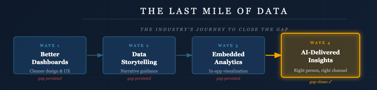
Bridging the Last Mile of Data: Why Communication Is the Real Analytics Challenge
Why the biggest challenge in data isn’t technology — it’s communication. Learn how data professionals can bridge the last mile with better storytelling, products, and insights.
The Strategic Edge: Data Storytelling in Sales Presentations
Learn how sales teams can use data storytelling to build trust, connect with buyers, and win deals. A 2026 guide to replacing static charts with persuasive narratives.
Turning Raw Data Into Gold: A Modern Checklist for Data Product Managers
Learn how to turn raw data into customer‑ready solutions. This updated checklist for data product managers focuses on data storytelling, product design and analytics.
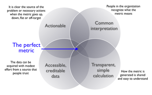
Choosing the Right Metric: A 2026 Guide to Smarter Analytics and Data Storytelling
Choosing the wrong metrics can lead to misleading insights and poor decisions. This post outlines a practical, three-step framework to help you select the right metrics for identifying problems, measuring performance, and guiding action. You’ll also learn the four key traits of effective metrics and how to avoid common pitfalls—plus real-world examples, expert insights, and links to trusted resources.
Why We Need to Tell Better Customer Success Stories

Roger Federer is a Master Data Storyteller
We know Roger Federer is a genius on the tennis court. Now we know he has a touch of genius for data storytelling.

Juicebox Is Now a Databricks Validated Technology Partner
We’re excited to announce that Juicebox is now a Databricks Validated Technology Partner. In fact, we’re currently one of only two patners featured under the Analytics & Business Intelligence use case in the Databricks Technology Partner Directory.
This validation recognizes Juicebox for its performance, scalability, and seamless integration with the Databricks Data Intelligence Platform. Find out more here: Explore Juicebox for Databricks
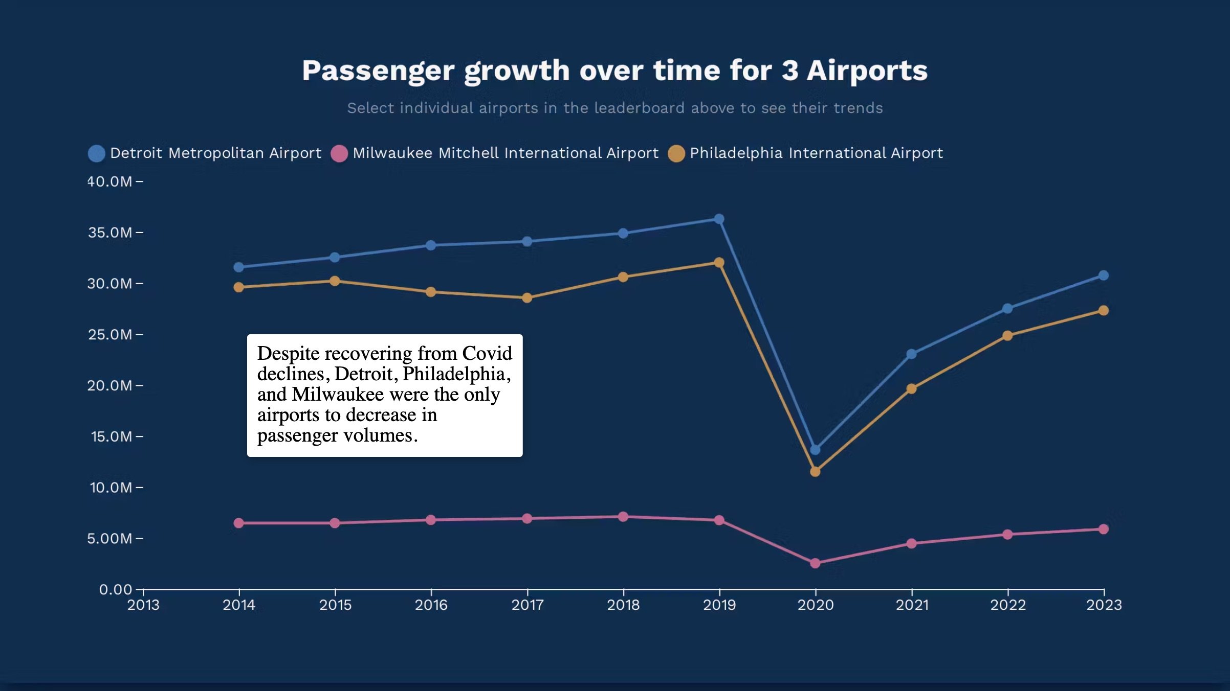
Insights into Airport Traffic
Teaching Data in the Classroom with Interactive Storytelling