The Ultimate Business Driving Machine

What do you do when you’d rather be out driving your BMW rather than sitting in your corner office? Make a business dashboard that looks like your car dashboard, of course. You’ll want to have lots of tachometers, temperature gauges, and traffic lights. It’s the ultimate business-driving machine.

It isn’t controversial to complain about the ineffectiveness of “gauges” for data visualization. In fact, even some of the worst offenders admit that gauges aren’t ideal:

Dr. Robert Alison of SAS in showing off a new easy graph procedure for creating gauges says:

“I know, I know … gauges have lots of drawbacks in dashboards. But hey, the other philosophy is 'give the customer what they want' … and try to make it work as well as possible. So, as far as gauges go, these are pretty decent.”

Here’s the example he uses to show off “one of the sharper-looking dashboards I’ve seen”

SAS dashboard

The folks at Business Object’s Xcelcius admit that gauges shouldn’t always be used in their article entitled “The Use (and Misuse) of Gauges”.

That doesn’t stop them applying a triple-coat of carnauba wax while neglecting their rule to always label the endpoints.

Xcelsius gauge

In the end, they primly note: “Despite some recent bad press, a gauge isn’t inherently a poor graphic.” Bad press, is it. If only gauges had better PR.

In my opinion, warning about potential misuse isn’t firm enough. Gauges shouldn’t be used except under the most severe threats from a client offering enough money to buy absolution.

Stephen Few, a man who doesn’t mince words on information visualization, says:

“If you squint really hard, you can barely make out some of the values. But who cares, because if you’re an executive who likes to pretend that you’re driving a car while sitting at your desk rather than actually managing your business, then having a dashboard that is truly informative doesn’t really matter.”

Charley Kyd says:

“Using dashboard gauges for management reporting typically is a mistake. Gauges hide information that managers need and consume significant space in a report.”

Let’s break down the problems with gauges:

Gauges hide trends. For all the focus on how a value is performing, you’d think people would care about the historical trend.

Circles aren’t good for showing differences. Like pie charts, circular gauges aren’t the best way to show size or changes in values—bars are a more straightforward, if less sporty, approach.

Space eaters. Often gauges are used to show a single value. All that decoration for a single value must send Tufte into a tizzy. Attempts to cram two values into a gauge can be confusing. How do you read this one?
Two value gauge

Difficult to read. The values can be obscured by all the attractive accoutrement:
Black gauge

Ranges can be tricky. By the analogy to a car dashboard, gauges are expected to have a static minimum and maximum value. What happens when a value goes beyond the pre-set range. Here’s an example of the “right way” from Xcelsius with the label: “This gauge shows a retail store’s progress against a daily revenue target.” We can only presume the maximum value is $45,000. What happens if I go beyond $45,000?
Xcelsius revenue gauge

Traffic lights are contradictory. I may be getting nitpicky, but I can’t both have my traffic light look like the real thing (red on top, green on bottom) and abide by basic data visualization assumptions (better is higher).
Traffic lights

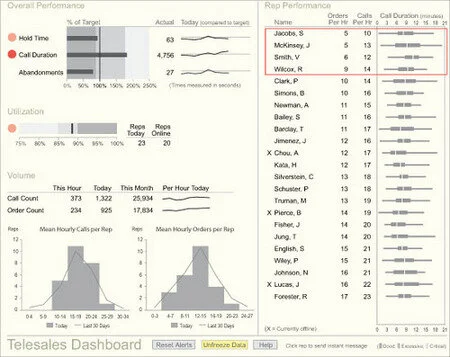
Lastly, there are so many better options. Here’s a beautiful data display (courtesy of Mr. Few) that could have been done with gauges, but mercifully was not.
Good dashboard

This work is licensed under a Creative Commons Attribution-Noncommercial-Share Alike 3.0 United States License. All source code is released under a BSD License unless otherwise specified.

10 comments | Show all comments only the last 5 are shown


November 16, 2007
Loren said:

I agree that gauges consume valuable real estate space and may not be an ideal option for displaying numerical information. However, gauges can be revealing when they are combined with sliders, dials, and other interactive components; as they help to visualize hidden relationships in the underlying mathematical model.

-- Loren


November 16, 2007
Chris Gemignani said:

Loren, it is better to use basic bar charts or lines if you want to "visualize hidden relationships in the underlying mathematical model". Bad is bad no matter the source of the number you're displaying.

If you're trying to illustrate the working of a model embodied in a spreadsheet you're better off designing more sophisticated displays that can show how multiple values covary. XY charts and animation leap to mind.

Stephen Few has a nice article here on visualizing change: http://www.perceptualedge.com/articles/09-27-07.pdf


November 16, 2007
Andy said:

Presumably the point of using gauges is that they are "understandable" and familiar to people not confident with proper charts, so I am often struck how little resemblance there is from BI dashboards to the real thing.

I imagine that some car makers but considerable effort into designing their dashboards to give a small amount of very important information genuinely "at-a-glance". In my (admittedly cheap) car this is done with one large speedometer and a small fuel gauge with the other information in warning lights that only come on if there is a problem, plus an odometer and clock.
But then, when I drive my car I mostly look out of the windscreen towards the road!

I've also seen a few rows of 4 traffic lights at complex multi-lane motorway junctions, and its one of the things that make motorway driving intimidating for some people.

But I have to admit to using Jon Peltier's speedometer chart (in the past).


November 16, 2007
Ken said:

All the confusion on gauges on dashboards is definitely a result of the automotive context. It made me think about a few years ago when I was looking at buying a Saab. The coolest feature of these cars is the Night Panel display. At night, the only gauge that is illuminated is the speedometer.
<img src="http://z.about.com/d/cars/1/7/F/j/ag_07saab93_nightpnlon.jpg" width="100" alt="Saab gauge">
Then if there is an issue with another system, illumination is added to that system's indicator. This was inspired by the Saab aircraft designs.

Too many aircraft pilots have flown into the ground because they were too enthralled with the overload of "useful" information showing up on the instrument panel. I wonder how much this is happening in businesses today?


November 17, 2007
Brett said:

Hi Guys,
I wasn't sure where to put this so here is some website feedback:
I really like the site and the content that it contains is amazing, so much in fact that i have spent a long time now reading all of the posts going back through time. But there are a few navigational bugs...
When you access the posts directly through a url such as: http://www.juiceanalytics.com/writing/#Year#/#Month#/#ArticleName#/ the navigation using the categories (or filters) of author and date do not give valid pages. Using the author navigation list leads to a url such as: http://www.juiceanalytics.com/writing/#Year#/#Month#/#ArticleName#/author/#AuthorFirstName# which gives a page not found message.
The behaviour of the categories when not viewing a page directly appends some sort of query to the url eg: from http://www.juiceanalytics.com/writing/topics/analytics/ clicking on Zach as the author appends ?author__first_name=Zack to the url it filters just perfectly.

The screencast links from all apart from 1 of the previous posts (when they are hyperlinks, not embedded) don't seem to work.

The navigation seems to be completely missing from a couple of pages such as:
http://www.juiceanalytics.com/writing/2006/12/square-pie-screencast/
http://www.juiceanalytics.com/writing/2007/07/recreating-ny-times-cancer-graph/
the next and previous links point to both pages from either side but they are then both dead ends!!

Once again an awesome site and thanks for sharing!

Your name

Email (optional, will not be shared)

Type the word "juice" (required to confuse the spammers)

Your comment


Add a comment