
Monetize Your Data with White-Labeled Analytics Products.
Juice is your end-to-end solution to design, develop, and deploy with confidence.

Transform Your Data into Revenue
Juice is a full-service partner for creating revenue-generating analytics solutions. With our expertise and proprietary platform, we turn your data into valuable products that drive growth. Here's how we stand apart:
Rapid Time-to-Market
Launch new analytics solutions in under 90 days. Our streamlined process accelerates your journey from concept to market.

Seamless Integration
Deliver white-labeled analytics products that blend seamlessly into your platform, maintaining your brand's look and feel. Manage user access and permissions effortlessly with API-driven control.
Cost-Effective Growth
Minimize up-front investment with our shared-risk model, designed to scale with your success. Eliminate ongoing operating expenses, focusing instead on growing your business with new, high-margin products.
Unmatched Expertise and Proven Success
Leverage our decades of experience in designing and launching customer-facing analytical products. We are trusted by industry leaders across industries including research, healthcare, advertising, and manufacturing who have monetized their data with Juice.
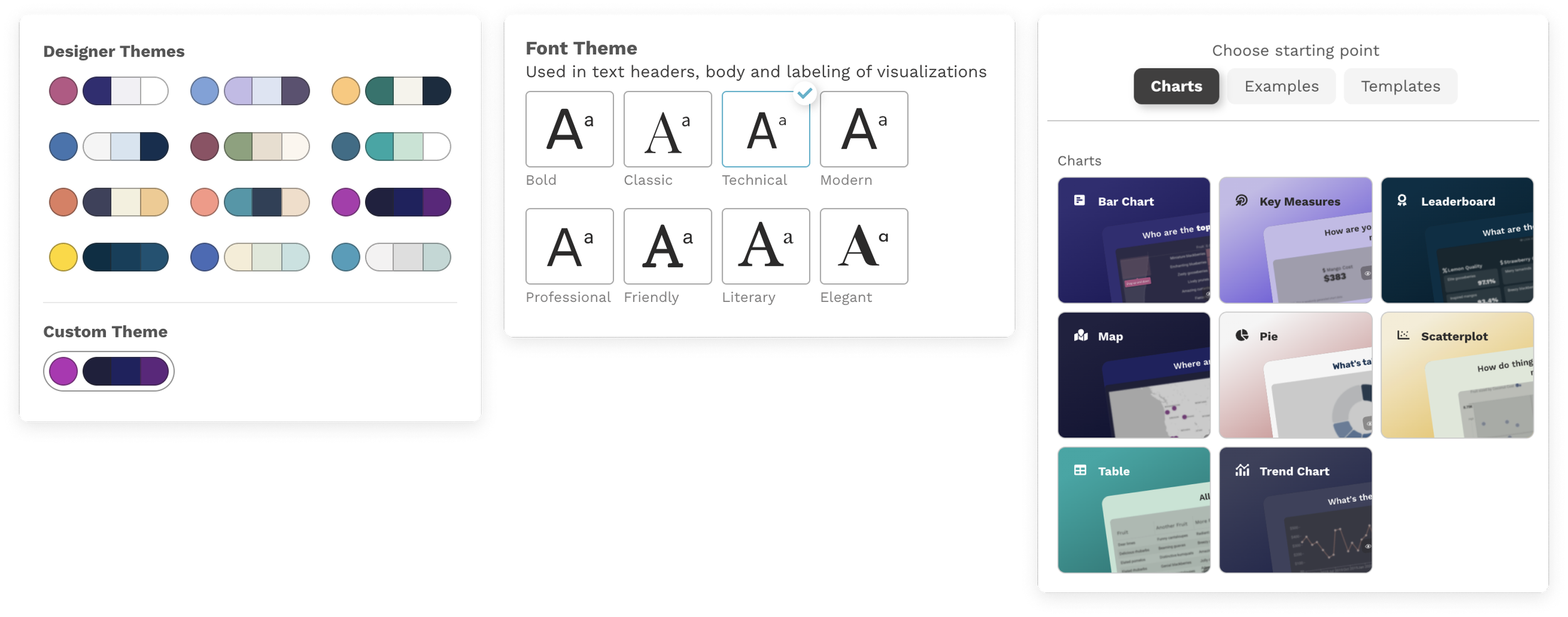
World-Class Products
Differentiate in your market with visual, interactive solutions that prioritize the end-user experience, offer a modern, intuitive interface, and “wow” your customers in sales discussions.
See ya later, boring data
Bring us your data. Let us show you what we can create.
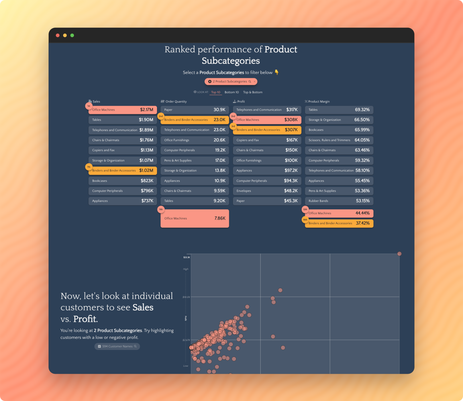
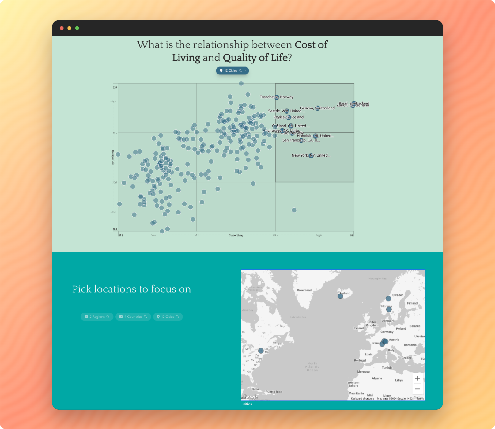
Industry Benchmarking
Do you have unique data that provides a broad perspective on your target industry? Be a thought-leader with data products that set the standard for measurement and comparison of industry performance.
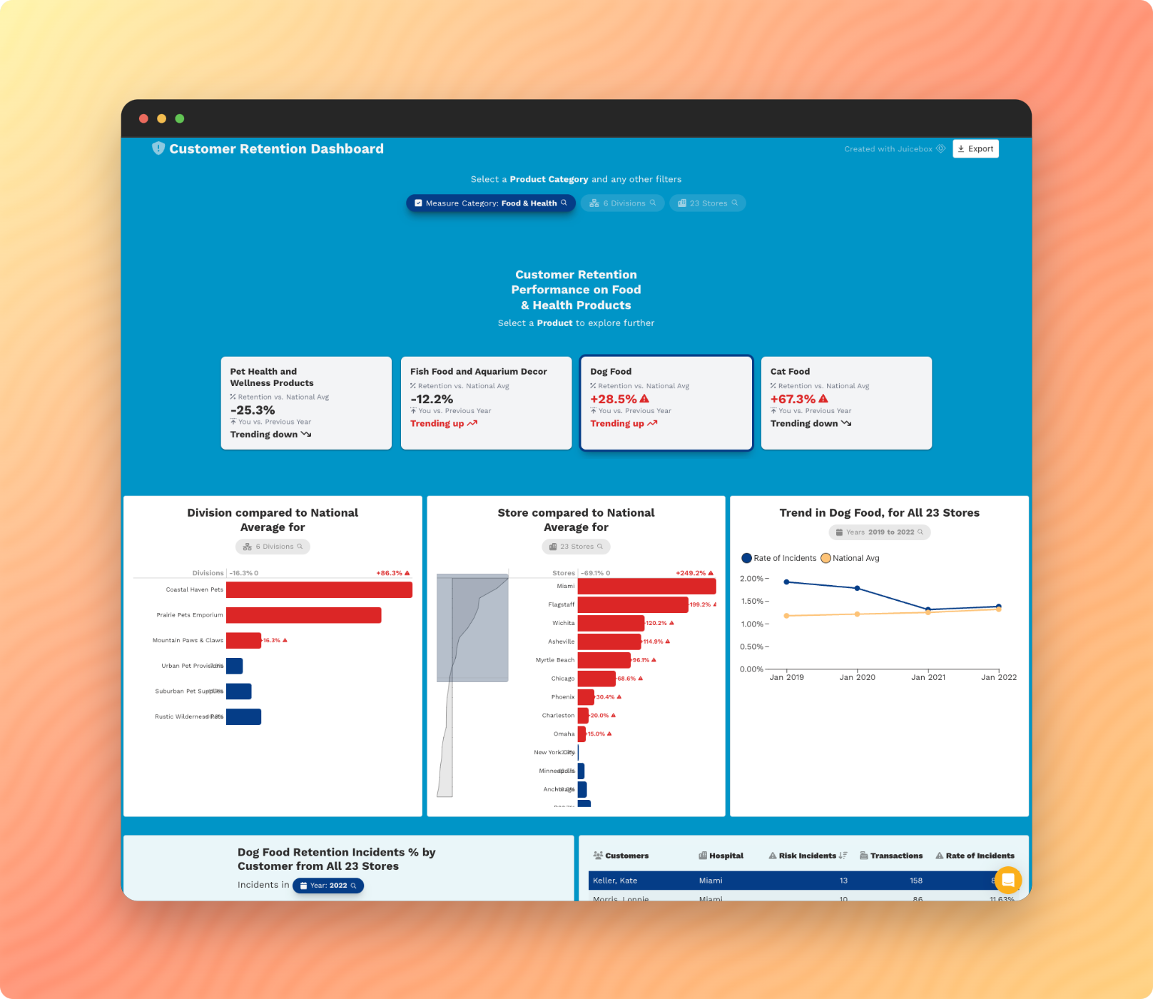
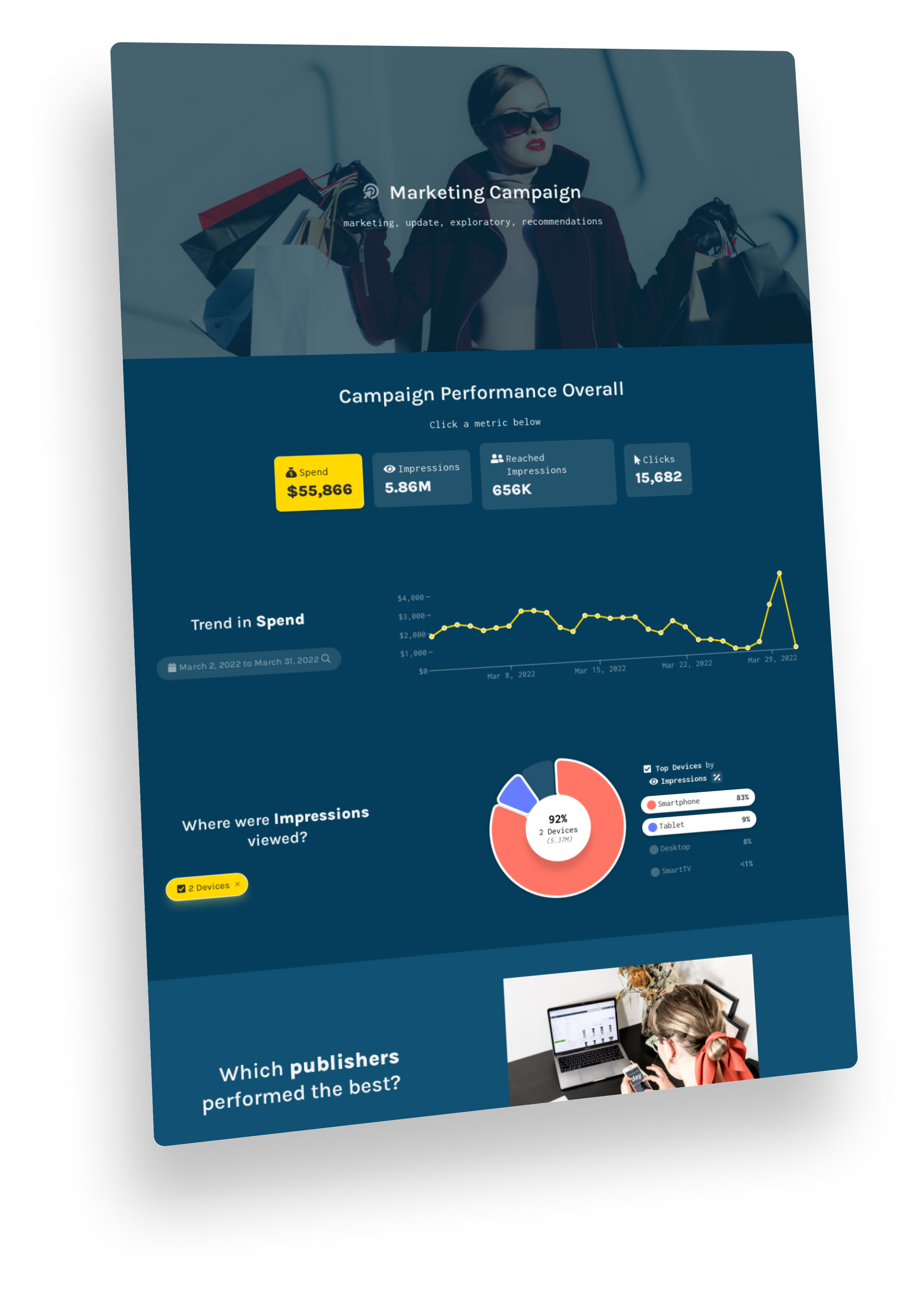
Performance Dashboards
Do your customers need a better way of seeing their own data from your platform? We design engaging analytical solutions that will drive user engagement and provide an up-sell solution for customers.
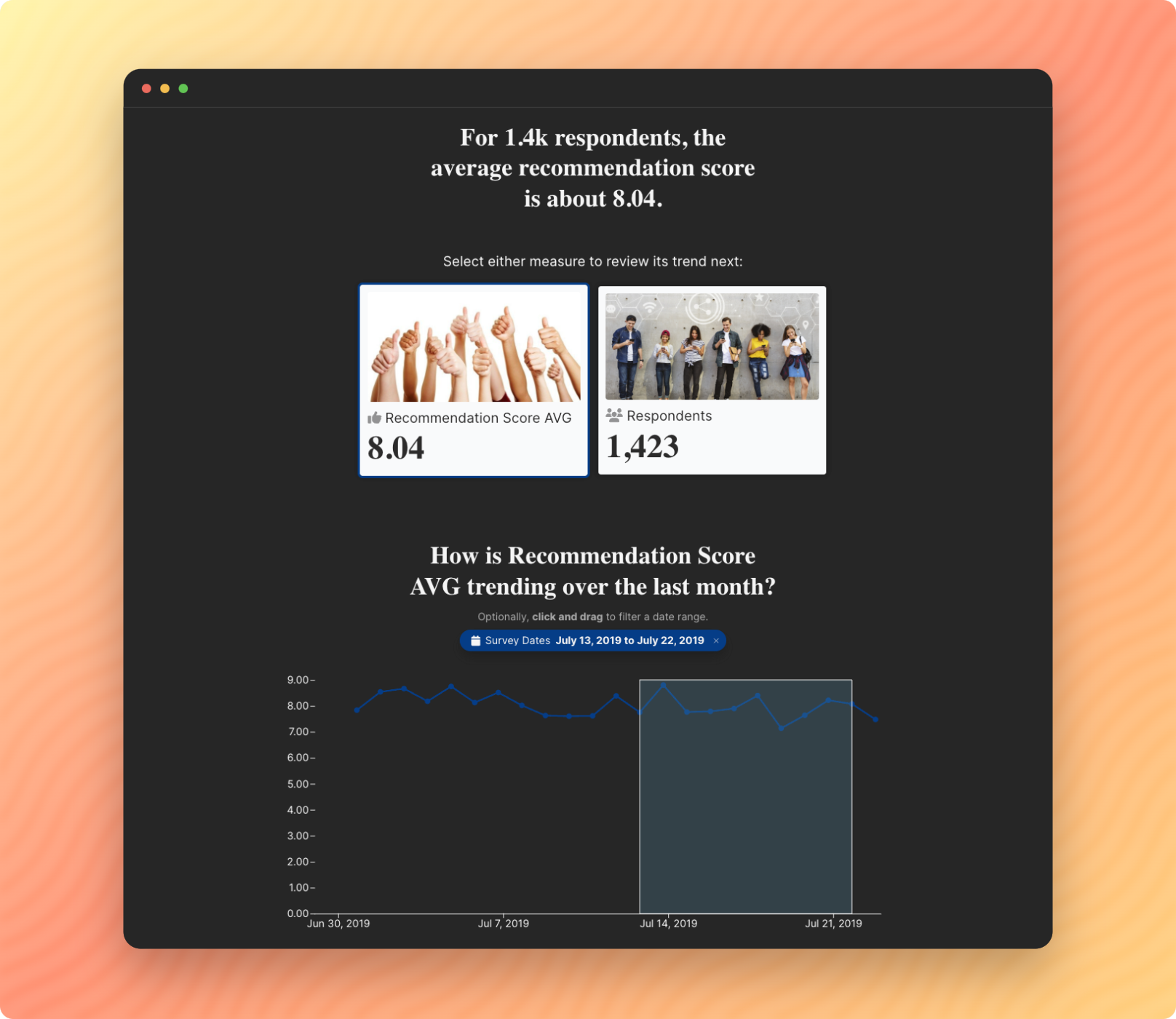
Predictive Models
Do you have a predictive model that can help customers make smarter decisions? Juice has the team and tools to package your insights into a data product that sells!
Data-Driven Sales Enablement
Could you deliver a more compelling data-driven story in your sales process? Our interactive, mobile-friendly solutions give your sales team a powerful new way to communicate your value proposition.
Join hundreds of satisfied clients

“Whether teaching students or consulting with non-profit leaders, I emphasize the importance of telling a story with data. Juicebox is the best tool I’ve seen to do this. It is easy to learn and delivers beautiful data presentations.”
Belmont University: Teaching Data Storytelling Skills

“Juice has just gotten better and better and better in their ability to help people like me create stories with data.”
Torch Enterprises: A Mission-driven Nonprofit Tells Its Story with Data

“Juice has allowed our team to distill otherwise unwieldy data for our clients into consistent, reliable, and actionable insights. It makes a huge difference in our client meetings.”
Markalon: Marketing Performance Reporting for Clients

Brace your audience for impact
Earn attention. Tell better data stories. Explain less.