New Years Resolutions to be a Better Data Product Manager

It is the the New Year, my favorite time for New Year’s resolutions. Time to look inward to see how we can change ourselves to change your world.

If you’re responsible for a data product or analytical solution, you might consider a little self-reflection in pursuit of a better solution for your customers. Here are a few places to start:

annie-spratt-54462-unsplash.jpg

Empathy

the ability to understand and share the feelings of another.

When it comes to data products, you’ll want to foster empathy for the users of your data. More likely than not, they have concerns such as:

  • Your data may replace their power in the decision-making process.

  • They don’t have the data fluency skills to properly interpret the data and what it means for their decisions.

  • They are afraid of changes that will impact how they do their work.

Appreciating and acknowledging these fears is a first step in building trust with your users.

zach-reiner-631836-unsplash.jpg

Learn to flow

“I would love to live like a river flows, carried by the surprise of its own unfolding.” — John O’Donohue

We all a little guilty of wanting to make others bend to our view of how things should work. This year, you may resolve instead to “flow like water.”

Data products should enhance how people make decisions, giving them the right information at the right time. This is best accomplished when the data product can fit into the existing workflows so you are augmenting the user’s role rather than trying to change it.

holger-link-699972-unsplash.png

Patience

“Wise to resolve, and patient to perform.” — Homer

Patience is accepting that progress takes baby steps. This is a critical skill to help manage your data product ambitions. The possibilities for analytical features can seem limitless — there are so many questions that should be asked and answered.

Beware this temptation. You’ll want to find the most impactful data first to allow your users to learn what they can learn. Before you try to do it all, have the patience to gather feedback and plan your next release.

nikhita-s-615116-unsplash.jpg

Growth mindset

“People believe that their most basic abilities can be developed through dedication and hard work.” — Carol Dweck

Analytics is best served by a growth mindset, the belief that taking on a challenge (and sometimes failing) with expand one’s mind and open up new horizons. Useful analysis begets questions, which leads to more analysis and even better questions.

As a data product manager, you want to encourage this growth mindset in your customers, encouraging and enabling them to expand their understanding of their world.

tobias-mrzyk-569902-unsplash.jpg

Inclusive

“We are less when we don't include everyone.” — Stuart Milk

Every year I tell myself I need to be better at meeting new people and keeping up with old friends. It’s a good ambition if you are leading efforts on a data products. It takes a diverse set of roles to get the support and commitment in your organization. Have you gotten legal on board? How about IT security? Does marketing and sales understand the value of your data product and who you are trying to target? You may need to change the way people think about making use of data to build company-wide support for your solution.

10 Visualizations of Juicebox

Christmas is a special time of year. We all have our favorite aspects of the season. In the spirit of Christmas and the Christmas carol, the 12 days of Christmas, here are the Juice team’s 10 favorite visualizations.

You will recognize some of these as your own favorites, but some are exclusive to the Juicebox platform. To learn more about the visualizations exclusive to Juicebox and Juice design schedule some time with us.

leaderboard.png

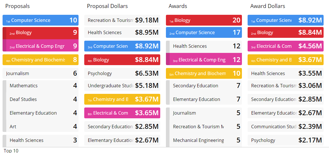
Leaderboard

An exclusive Juicebox visualization. Leaderboards are a great way to look at a dimension or group across multiple rankings. Who really is best on the team? Its never one metric and a leaderboard lets you compare across multiple metrics. Here’s a video showing a leaderboard in action from a few years ago.

 
Flower

Flower

A very engaging way to compare performance across locations, such as hospitals or schools. Each entity is represented as a flower and every metric is represented by a petal. We were inspired by the work of Moritz Stefaner.

 
rankedlist.png

Ranked List

Its not just a horizontal bar chart, but an interactive way to see a top ranking as well as a way to explore a long list. The Juicebox way of letting a user explore a long list is unique. Easy to understand because of its familiarity while delivering a lot of interactivity for exploration. Here’s an example from our Notre Dame application.

 
sankey.png

Sankey

This visualization isn’t exclusive to Juicebox, but well-loved by clients because of its easy way to explore changes over time among groups. Our version is much easier with more options than the Tableau version with its dynamic generated polygons.

 
Distribution

Distribution

This is exclusive to Juicebox despite its less than creative name. The data is binned to show distribution of values while also emphasizing the individual items (by showing details on roll-over) that make up the “bars.” A really easy, yet powerful way for users to explore their data.

 
Orbit

Orbit

A variation on the bubble chart that shows relationships. This breaks some data visualization rules, but is helpful for exploring hierarchy and avoiding too much overlap. Like a bubble chart it uses size and color to convey information.

 
Scatter

Scatter Plot

The scatter plot is a common visualization for data exploration. Juicebox adds panels and panel colors to better help the user understand the values that are good or bad. By clicking on a panel, the user can focus on a specific group of items for action.

 
Map

Map

We love using maps as a filter for other visualizations. Additional encoding with dynamic labels further adds to a user’s understanding of the information.

 
Treemap

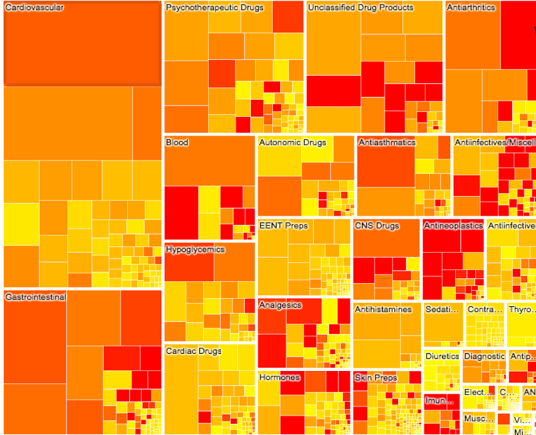
Treemap

We’ve been doing TreeMaps since 2009 so they hold a special place for us. This is still one of the best ways to show hierarchical data that has values that can be aggregated.

 
key_metrics.png

Key Metric

While not quite a visualization, almost every data story starts with a quick summary of metrics, often with a comparison to goals or benchmarks. A key metric visual sets the foundation for what a user will get in their dashboard or application.

 
Lollipop

Lollipop

The Lollipop is another good way to show comparisons among groups. Lollipop is our preferred way of sharing metrics when the metrics can be compared along a common scale. This is a good alternative to a bullet chart.

Three Types Of Context To Make Your Audience Care About Your Data

The following scene is one of the most pivotal moments in the Game of Thrones series.

As a loyal viewer, this scene represents a turning point for Tyrion. He has reached a breaking point after a lifetime of conflict with his father. His speech is the moment that he sets out on a different path, a path that ultimately leads to (spoiler) the murder his father and (unsurprisingly) a deep schism with his family.

For a new viewer, it is a courtroom confession in costume.

Your experience of entertainment is entirely different based on the context you bring. It makes a world of different to know: Why we are here in this room? Who are these characters? What are their motivations?

Context is the foundation that gives a scene something to build on. Context makes your audience care.

It is the same thing when you design a dashboard, report, or analytical interface (with less beheading and back-stabbing). Lack of context — the set-up that explains the background and motivation for the data — may be one of the primary reasons why dashboards and reports fail to connect to audiences. And it may be the reason you can’t get your colleagues to open that spreadsheet you just sent.

How do you make someone care? You want to anticipate and answer a few inevitable questions:

  1. Why does this data matter to me?

  2. What am I about to see?

  3. What actions can I take based on this data?

Let’s explore these three elements of context with a few examples.

1. Why does this data matter to me?

Context should make it clear why the information is important. At Juice, we always start designing a data story by defining the audience we want to reach. It is best if we can be specific about the kind of person and role that they play in their organization. This person has things they want to accomplish that will make them successful. A good design takes all of that into account.

When it comes time to show the data, there is no reason to be secretive about who should be engaging with the data and why it is designed for them. As an example, take the following introduction to an analytical tool the New York Times’ Buy or Rent Calculator.


2. What am I going to see?

"Tell them what you are going to tell them, tell them, then tell them what you told them."

This famous piece of advice is often ignored by dashboard and report designers. A title isn’t enough; you should explain the scope of the content and, ideally, how the different elements fit together. Is there a structure or framework that undergirds your choice of metrics? Explain this visually before tossing your audience into the deep water.

One way that we’ve found to deliver this context is to provide an automated step-by-step tour of the content. You’ve undoubtedly experienced this approach when to try a new mobile app. The app designers walk you through the workflow and explain features. If done well, you’ve helped new users wrap their head around what they are going to see.

The following example prominently features a descriptive legend showing how to read the glyphs.

You may also want to consider ways how to help the user understand the interactions of your data interface or even show them the types of insights they can glean from the data. Here’s a great example showing survey data about the challenges women face in different countries.


3. What actions can I take on this information? 

Finally, effective context setting explains exactly how the data can guiding your audience to smarter actions. Your report or dashboard should lead to actions, not just show interesting data. It should point to what comes next.

The following example shows data about inequality in travel visas by country. For an individual, the actionable question is: For my country, where can I easily travel to? Data products are inherently personal so you want to highlight this in your context.


Context along a timeline

In summary, we can think about these three essential elements of context along a timeline. You want to explain for your audience:

1) Looking backward, what brought you to viewing this data?

2) Now, what should you see when they engage with the information?

3) Looking forward, what action can come from exploring the data?

2018 Data and Visualization Gift Ideas

We’re continuing our tradition of the annual data gift guide. These are some of our favorite books and gift ideas for the data scientist, designer or analyst in your life.

While you’re here take a look at the Juicebox product page to see what it looks like unwrapped.

Happy Holidays!

Screen Shot 2018-11-20 at 19.53.04.png

New Books We Love

Books we read in 2018

Data Fluency Image.jpg

Classic Data Books

We’re a little biased in this category, but these are the books on our desks that we refer to all the time.

Data Fluency - Thinking about changing how your team or organization works with data?This is the book for you.

Storytelling with Data - This one already feels like a classic. It provides simple, clear guidance on chart usage and storytelling. Hard not to reference it in the midst of a project.

Weapons of Math Destruction: How Big Data Increases Inequality and Threatens Democracy - This is the book that keeps us grounded. Despite how much we think data is delicious and fun its serious too.

The Man Who Lied to His Laptop: What We Can Learn About Ourselves from Our Machines - A seminal read on learning about interactions between humans and machines.

Visualize This: The FlowingData Guide to Design, Visualization, and Statistics - Nathan Yau’s book that teaches us something new every time we pick it up.

The Truthful Art: Data, Charts, and Maps for Communication - We love all of Alberto’s books, but this one is our favorite. Wonderful examples throughout the book.

Screen Shot 2018-11-20 at 17.16.50.png

Art & Posters

Infographics, Maps, Data Art & More

Data Viz Game.jpg

Data Nerds

This is a term of affection during the holidays.

Trust the Process

My son and I are really excited about the new NBA season. We are Atlanta Hawks fans, so we’re not too optimistic about this year. We know the team is young and has decided to undertake a rebuilding process. Our mantra for this season is the now familiar “trust the process”.

If you’re not aware of the phrase “Trust the Process” comes from the Philadelphia Sixers rebuilding efforts over the past couple of years. What’s most interesting to me is that the formula for team success is much broader now. It is no longer just about having great players, but free agency positioning, analytical prowess, superior facilities and developing long-term successful franchises.

It's all about the process now.

I find the same can be said for delivering customer data and dashboard solutions.

Much of the historical focus when deploying data applications (customer dashboards, embedded analytics, etc.) has been on selecting the right tool. However, despite so many more great tools and increased investment in the BI space, successful implementation rates have not improved.

In a research piece by Dresner Advisory Services from May of this year, they highlight the fact that successful BI implementations are most often tied to having a Chief Data Officer (CDO). This makes a lot of sense because the CDO is just like an NBA team’s general manager. They bring accountability and experience as well as a process to make customer data solutions successful.

Here are some elements that make process so valuable to delivering data applications and solutions.

  • Launch Dates - A process is the best way to mitigate against missing the launch date. The existence of checklists, status updates, and documentation offer a means to anticipate risks that cause delays. Remember that delays to the product launch or release directly impact revenue and reputation. Missing product launch dates is not something that goes unnoticed.

  • Customer Credibility - When delivery dates are missed, requirements miss the mark or dashboard designs don’t serve their audiences product confidence is lost. Its not only the customer’s confidence that we need to be concerned about, but also the sales and marketing teams. Once we lose the trust of these audiences it takes time to regain it, not unlike sports teams who fail to deliver winning teams over many years (see: New York Knicks).

  • User Engagement - When there is no process that means there’s no planned effort to understand the audience and deliver the dashboard design. If users can’t understand the data you’re sharing with them, a cancelled subscription is a near certainty.

  • Applications, not Dashboards - The best dashboards are purpose-driven applications. Tools don’t deliver purpose. The process undertaken to understand and solve a real problem delivers a purposeful solution.

  • A Complete Platform - A dashboard solution is only a means of displaying data. A process defines ALL the requirements. Having a process recognizes that a complete solution is needed which includes security, user administration and application performance optimization.

Much like NBA success, a successful customer dashboard implementation isn’t about picking a product (player), but sustained success over many years of increased subscription (tickets) revenue, fan engagement and loyalty. The path forward for distributing and delivering on valuable data applications is all about your process.

In the event that you don’t have a process or a CDO leading your efforts, click here to learn about the Juicebox Methodologies. It's our way to design and deliver successful, on-time applications as well as wildly loyal fans. Trust the process. It works.

The Future Belongs to Purpose-Built Apps. We're Betting On It.

“Purpose-built apps”

“Low-code app development”

“hpaPaaS”

“Citizen Data Scientists”

“Data monetization”

Witness the cloud of new buzzwords floating in the air. Let me see if I can knit these concepts together to shed light on their meaning and implications for the future of analytics.

Collectively, these phrases are a reaction to the long-standing challenge of getting more data into more hands. “Democratization of data” can seem perpetually right around the corner (if you’re listening to vendor marketing) or a distant illusion (if you are in most organizations).

At Juice we have a picture that we call ‘The Downhill of Uselessness’. It shows how the usefulness of data seems to decline as you try to reach more users. On the far left, the most sophisticated data analysts and data scientists are happily extracting value from your data. But as you extend to the outer edges of your organization, data becomes distracting noise, TPS reports, and little-used business intelligence tools.

downhill-of-uselessness.png

Three barriers to democratizing data

The struggle of getting data to more people in more useful ways boils down to a few unsolved problems.

First, general purpose platforms and tools (data lakes, enterprise data warehouses, Tableau) can be a foundation, but they don’t deliver end-user solutions.

"Vendors and often analysts express the idea that you can master big data through one approach. They claim if you just use Hadoop or Splunk or SAP HANA or Pervasive Rush Analyzer, you can “solve” your big data problem. This is not the case.”

— Dan Woods, Why Purpose Built Applications Are the Key to Big Data Success

Second, reporting and dashboards deliver information, but often lack impact. In our experience, most data delivery mechanisms lack: 1) a point of view as to what is important; 2) an ability to link data insights to actions in a users’ workflow.

Third, the people who truly understand the problems that need to be solved don't have the technical capacity to craft re-usable solutions. We all have that elaborate spreadsheet that is indispensable to running your business and, frighteningly, only understood by a single person.

A better path forward

Finally, there is a realization that these problems aren’t going away. There needs to be better approach. It will come in two parts:

  1. Focus on creating targeted solutions (applications) that solve specific problems. Apps can integrate into how people work and the systems where actions occur. They attempt to let people solve a problem rather than simply highlighting a problem. And applications are better than general purpose tools because they can bake in complex business rules, context, and data structures that are unique to a given domain.

  2. Give greater impact and influence to the people best know the problems. It has always been unfair to ask technologists to create solutions for domains that they don’t deeply understand.

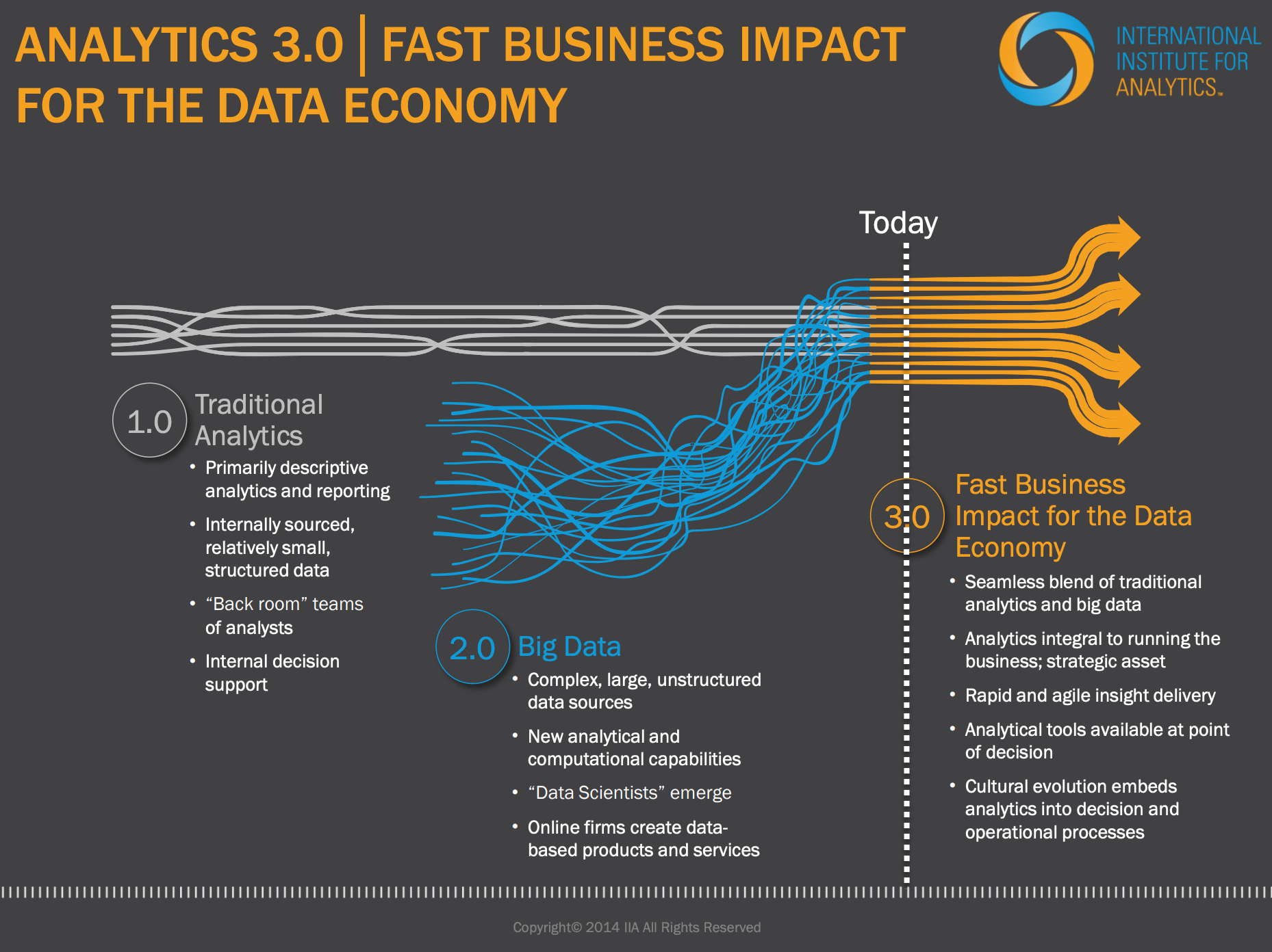
This direction aligns with Thomas Davenport’s view of Analytics 3.0 (from way back in 2013). He postulated that the next generation of analytics would be driven by purposeful data products designed by the teams who understand customers and business problems. (No offense, Tom, but we were griping about ivory tower analytics back in 2007.)

And so emerges a new model and new collection of buzzwords...

Purpose-Built Applications

Solutions that start with the problem and craft an impactful answer. Their success is measured by fixing a problem rather than in terabytes of data stored.

…built using a high-productivity Application Platform as a Service (hpaPaaS)

Cloud-based development environments requiring little coding ability (‘low-code’) — but requiring knowledge about the domain and the problem to be solved.

…to be used by Citizen Data Scientists (CDS).

the people who know the problems most intimately.

At Juice, we may have backed into this trend or cleverly anticipated it. Either way, now I can say that Juicebox is a low-code hpaPaaS designed for CDS to create purpose-built apps. Better yet, we are now fully buzzword compliant.

Is It Time to Jump-Start Your Data Offense?

jack-dempsey-i-was-a-pretty-good-fighter-but-quote-on-storemypic-7ceab.png

Legendary Alabama coach Bear Bryant believed in defense:

“Offense sells tickets, but defense wins championships.”

Legendary boxer Jack Dempsey saw virtue in offense:

"The best defense is a good offense.”

Legendary analytics guru Thomas Davenport takes a more neutral stance in his Harvard Business Review article What’s your Data Strategy?

"The key is to balance offense and defense.”

Davenport goes on to say:

“Data defense is about minimizing downside risk, including ensuring compliance with regulations, using analytics to detect and limit fraud, …and ensuring the integrity of data flowing through a company’s internal systems.

...Data offense focuses on supporting business objectives such as increasing revenue, profitability, and customer satisfaction.

…The challenge for CDOs and the rest of the C-suite is to establish the appropriate trade-offs between defense and offense and to ensure the best balance in support of the company’s overall strategy.”

Balance is fine. But at Juice, we’re all about building data products. That’s an offensive data strategy (we’re with you Jack Dempsey, June Jones, Mike Leach, and Mike D’Antoni).

In practice, most organizations start from a defensive crouch. The relevant question is: when is it important that you shift to a more offensive data strategy?

Davenport shares a few indicators that suggest more data offense is warranted. For example, offensive strategies are often employed at organizations that operating in largely unregulated industry where customer analytics can differentiate. He also sees opportunity for offensive data strategies at that those organizations with decentralized IT environments and where “Multiple Versions of the Truth” are encouraged.

His HBR article even provides an evaluation tool to determine whether your organization has shifted its balance toward offense or defense, giving you a snapshot of where you’ve (organically) evolved. It doesn’t tell you where you should be.

When we think about the dozens of companies we’ve worked with who are launching data products, some common patterns emerge in terms of the characteristics of those organizations. Here are four categories where an offensive data strategy provides like a good fit:

Government, non-profit or public-service organizations

These organizations aren’t necessarily in the “competitive” markets that Davenport describes. Nevertheless, they are sitting on tons of valuable data that can shape conversations and influence the decisions of their constituents. We’ve worked with Chambers of Commerce, Universities, and State Departments of Education that are taking on offensive data strategies.

Data science startups

There are hundreds of start-ups who are building their businesses on offensive data strategies. These companies have mechanisms for collecting data across an industry and are adding value through predictive algorithms, identifying patterns, and ultimately helping their customers make smarter decisions. We’ve working with a couple healthcare start-ups who have proprietary methods for predicting performance of healthcare providers. This is deeply valuable information for health systems and employers, and a purely offensive strategy.

Consultants

We’ve seen a couple different offensive data strategies by consulting firms. First, if they are delivering a project with an analytical deliverable, why not make the deliverable a recurring data solution? Another approach by the most innovative consultants is to view data collection and data products as an opportunity to proactively identify problems for clients. An annual survey of customer brand awareness can be turned into an incisive discussion starter, spurring clients to pursue the next project.

Companies with dominant market shares

If you are a market leader, you may be collecting enough data from your customers to be able to provide benchmarking solutions. In some cases, this offensive strategy is core to the original purpose of the business (e.g. US News & World Report’s surveying of colleges). In other cases, the opportunity to create new data products can be a result of “data exhaust”.

If you find yourself wondering how your data might be turning into a revenue-generating or customer-differentiating solution, you should download our ebook Data Is the Bacon of Business: Lessons on Launching Data Products.

Is Your Data Product Ready for Launch?

Looking to transform your data into a valuable, customer-facing data product?

From concept to design and launch, we've worked with dozens of companies to create successful data products. Our checklist provides seven evaluation criteria to see if your data product has what it takes to succeed.

Does your data product...

  1. Solve a distinct problem?

  2. Meet users where they work?

  3. Guide users to insights and actions?

  4. Make users feel safe and in control?

  5. Bring credibility to your data?

  6. Have the ability to operationalize the solution?

  7. Support customers for success?

Download the PDF here.

Specificity is the Soul of Data Narrative

The folks in the front of the room stared with a forced intensity at (what must have been) the 23rd straight slide showing data about website performance. Their glazed eyes would have been entirely evident if the speaker wasn’t so intently focused on pointing out the change in bounce rate between August and July. In the back of the room, Brian wasn’t able to summon the energy to care. The gentle hum of laptops, dim lighting, and endless onslaught of data practically begged his mind to wander...

specificity.jpg

Specificity is the soul of narrative

This is a frequently-repeated lesson from John Hodgman's excellent podcast Judge John Hodgman. His fake Internet courtroom demands that its litigants share specific information and stories to bring their arguments to life.

Unfortunately, this lesson is often lost when people use data to communicate. Which is not to confuse detail for specificity. Detail — at least in the data communication context — simply means the access to more and more granular data. Specificity requires something more: delivering information that is familiar to your audience, letting them connect with the subject matter at a more personal level. The data is no longer an abstraction, it is something tangible and real.

How do we deliver more specificity in our data stories? Here are three ideas:

  1. Remind your audience of the people behind the data

  2. Begin with an individual story

  3. Explore individual patterns and behaviors

1. Remind your audience that we are talking about individual people or things.

Data is an imperfect reflection of activity in the real world. You want to find ways to emphasize the connection between real people and the data points shown on the screen. A few examples:

Use icons as a subtle reminder that we are talking about people

Use icons as a subtle reminder that we are talking about people

Use images of people to humanize the data

Use images of people to humanize the data

Use individual components (people) to compose the visualizations. A tradition bar chart is transformed into a stack of the individual units.

Use individual components (people) to compose the visualizations. A tradition bar chart is transformed into a stack of the individual units.

In one memorable meeting, I was demonstrating our workforce analytics solution to a prospective client. I was showing the distribution visualization (above) and was careful to roll over individual people to help explain its meaning. As I was highlighting an employee with 40 years of experience at their company, an executive burst out: “Wait a second, that woman was my elementary school teacher.” The data came to life for him that day.

2. Begin with individual stories before showing the big picture.

One of the all-time best specificity-is-the-soul-of-narrative visualizations is the Gun Deaths visual created by Periscope. Take a moment to experience it.

To create emotional impact from the data, the designer starts this visual by showing one gun death at a time.

To create emotional impact from the data, the designer starts this visual by showing one gun death at a time.

Gradually the animation speeds up until the viewer understands the terrifying weight of the many lives cut short.

Gradually the animation speeds up until the viewer understands the terrifying weight of the many lives cut short.

Your data story may be on a more banal topic, but there are still ways to show the individual stories. What does a prototypical conversion in your sales pipeline look like? What is the financial impact of an individual patient going to an abnormally expensive healthcare provider?

3. Provide your audience with the ability to dive into many individual patterns and behaviors.

One compelling anecdote may hook your reader; the ability to see many stories can provide a powerful tool for analysis.

A long time ago we introduced the concept of customer flashcards — visualizations that tell the story of individual people or things, create a language for reading behavior patterns, and the opportunity to flip through many of these visuals. Finding patterns doesn’t have to be the exclusive domain of machine learning — as humans, we are pretty good at seeing and interpreting patterns ourselves. 

Here’s an example from a project we did to see patterns of online learning. Once we found an effective way to show how students took courses, we quickly identified common behaviors that would have been lost in the typical summarization of data. 

flashcards.png

Data storytelling is still finding its fundamental principles and discovering how effectively impact readers. Bringing specificity into these data stories may just be a bedrock principle that we can adopt from a wise Internet judge.

Education Leaders Embrace Data Storytelling

STAT-conference.png

The Data Storytelling Revolution is coming to the K-12 Education world -- in its own unique way. Two days at the annual National Center for Education Statistics STATS DC Data Conference in Washington DC gave me an up-close view of how education leaders were using data to drive policy and understanding school performance. This insiders view was thanks to an invitation by our partners at the Public Consulting Group, one of the leading education consulting practices in the country.

After attending a handful of presentations and hanging out with industry experts, here are a few of my impressions:

Education leaders have a fresh energy about data visualization and data storytelling.

To start with, the conference was subtitled: “Visualizing the Future of Education through Data”. To back this up, the program featured more than a dozen presentations about how to present data to make an impact. There was good-natured laughing and self-flagellation about poor visualizations, and oooh's and aaah's at good visualizations. There was also a genuine appreciation for how important it is to “bridge the last mile” of data to reach important audiences.

IMG_20180730_112920.jpg

Unsurprisingly, Educators understand the need to reach and teach their data audiences.

For many of the attendees, their most important data audiences (teachers, parents, school administrators) are relative novices when it comes to interpreting data. There was a general appreciation that finding better ways to communicate of their data was paramount. The old ways of delivering long reports and clunky dashboards wasn’t going to suffice. The presenters emphasized “less is more” and the value of well-written explanations. I even ran into a solution vendor committed to building data fluency among teachers.  This sincere sensitivity to the needs of the audience isn’t always so prevalent in other industries.

Data technologies and tools take a backseat to process, people, and politics.

On August 20th and 21st, I’ll see you at the Nashville Analytics Summit. When I do, I bet we’ll be surrounded by vendors and wide-eyed attendees talking about big data, machine learning, and artificial intelligence. Not in the Education world. After the lessons of No Child Left Behind and years of stalled and misguided data initiatives, Education knows that successful use of data starts with:

  1. Getting people to buy-in to the meaning, purpose, and value of the data;

  2. Establishing consistent processes for collecting reliable data;

  3. Navigating the political landmines required to move their projects forward.

The Education industry is more focused on building confidence in data, than in performing high-wire analytical acts.

Education has not yet found the balance between directed data stories and flexible guidance.

I sat in on a presentation by the Education Department where they shared a journalism-style data story that revealed insights about English Learners. There website was the first in a series of public explorations of their treasure-trove of data.

Our_Nation_s_English_Learners.png

On the other extreme, the NCES shared a reporting-building engine for navigating another important data set. On one extreme, a one-off static data story; on the other, a self-service report generation tool. The future is in the middle — purposeful, guided analysis complemented by customization to serve each individual viewer. The Education industry is still finding their way toward this balance.

self-service-bi.jpg


Every industry needs to find its own path to better use of data. It was enlightening for me to see how a portion of the K12 Education industry is evolving on this journey.