Education Leaders Embrace Data Storytelling

STAT-conference.png

The Data Storytelling Revolution is coming to the K-12 Education world -- in its own unique way. Two days at the annual National Center for Education Statistics STATS DC Data Conference in Washington DC gave me an up-close view of how education leaders were using data to drive policy and understanding school performance. This insiders view was thanks to an invitation by our partners at the Public Consulting Group, one of the leading education consulting practices in the country.

After attending a handful of presentations and hanging out with industry experts, here are a few of my impressions:

Education leaders have a fresh energy about data visualization and data storytelling.

To start with, the conference was subtitled: “Visualizing the Future of Education through Data”. To back this up, the program featured more than a dozen presentations about how to present data to make an impact. There was good-natured laughing and self-flagellation about poor visualizations, and oooh's and aaah's at good visualizations. There was also a genuine appreciation for how important it is to “bridge the last mile” of data to reach important audiences.

IMG_20180730_112920.jpg

Unsurprisingly, Educators understand the need to reach and teach their data audiences.

For many of the attendees, their most important data audiences (teachers, parents, school administrators) are relative novices when it comes to interpreting data. There was a general appreciation that finding better ways to communicate of their data was paramount. The old ways of delivering long reports and clunky dashboards wasn’t going to suffice. The presenters emphasized “less is more” and the value of well-written explanations. I even ran into a solution vendor committed to building data fluency among teachers.  This sincere sensitivity to the needs of the audience isn’t always so prevalent in other industries.

Data technologies and tools take a backseat to process, people, and politics.

On August 20th and 21st, I’ll see you at the Nashville Analytics Summit. When I do, I bet we’ll be surrounded by vendors and wide-eyed attendees talking about big data, machine learning, and artificial intelligence. Not in the Education world. After the lessons of No Child Left Behind and years of stalled and misguided data initiatives, Education knows that successful use of data starts with:

  1. Getting people to buy-in to the meaning, purpose, and value of the data;

  2. Establishing consistent processes for collecting reliable data;

  3. Navigating the political landmines required to move their projects forward.

The Education industry is more focused on building confidence in data, than in performing high-wire analytical acts.

Education has not yet found the balance between directed data stories and flexible guidance.

I sat in on a presentation by the Education Department where they shared a journalism-style data story that revealed insights about English Learners. There website was the first in a series of public explorations of their treasure-trove of data.

Our_Nation_s_English_Learners.png

On the other extreme, the NCES shared a reporting-building engine for navigating another important data set. On one extreme, a one-off static data story; on the other, a self-service report generation tool. The future is in the middle — purposeful, guided analysis complemented by customization to serve each individual viewer. The Education industry is still finding their way toward this balance.

self-service-bi.jpg


Every industry needs to find its own path to better use of data. It was enlightening for me to see how a portion of the K12 Education industry is evolving on this journey.

Let's Meet Up at the Nashville Analytics Summit

The_Nashville_Analytics_Summit.png

The Nashville Analytics Summit will be on us before we know it. This special gathering of data and analytics professionals is scheduled for August 20th and 21st, and should be bigger and better than ever. From my first experience with the Summit in 2014, it has consistently been a highlight of my year. My first Summit took place at the Lipscomb Spark Center meeting space with about a hundred attendees. Just a few years later, we'd grown to more than 450 attendees and moved into the Omni Hotel.

Mark it on your calendar. I'll give you five reasons why it is a can't-miss event if you work with data:

  1. We've invited world-renowned keynote speakers like Stephen Few and Thomas Davenport. You won't believe who we are planning to bring in this year.
  2. There isn't a better networking event for analytics professionals in our region. Whether you're looking for talent or looking for the next step in your career, you'll meet kindred spirits, data lovers, and innovative businesses. For two years in a row, we have hired Juice interns directly from conversations at the Summit. 
  3. It's for everyone who works with data. Analyst, Chief Data Officer, or Data Scientist... we've got you covered. There are technical workshops and presentations for the hands-on practitioner and case studies and management strategies for the executive. We're committed to bringing you quality and diverse content.
  4. It's a "Goldilocks" conference. Some conferences go on for days. Some conferences are a sea of people, or too small to expand your horizons. The Analytics Summit is two days, 500-something people, and conveniently located in the cosy confines of the Omni Hotel. It is easy to meet new people and connect with people you know.
  5. See what's happening. Nashville has a core of companies committed to building a special and innovative analytics community. We have innovators like Digital Reasoning, Stratasan, and Juice Analytics. We have larger companies making a deep commitment to analytics like Asurion, HCA, and Nissan. The Summit is the best chance to see the state of our thriving analytics community.

Now that you're convinced you can't miss out, you're may wonder what to do next. First, block out your calendar (August 20 and 21). Next, find a colleague who you'd like to go with. Want to be even more involved? We invited dozens of local professionals to speak at the Summit. You can submit a proposal to present

Finally, if you don't want your company to miss out on the opportunity to reach our entire analytics community, there are still slots for sponsors.

I hope to see you there.

Data Monetization Workshop 2018: Key Themes & Takeaways

“Data Monetization is a hot topic because it has two words that everyone loves. We all love data, and who doesn’t want to monetize something?”

These were the words that kicked off the 2018 Data Monetization Workshop to a roomful of attendees and industry experts who had gathered to discuss the question that followed this observation: what does Data Monetization actually mean?

zach presenting.jpg


This question was discussed at length over the course of the half-day event and was the impetus for speaker topics related to using data for social good, how to account for data on a balance sheet, how AI will affect the future of Data Monetization, and more. Here are some of the most important themes and takeaways from the discussions of the day.

What Is Data Monetization?

  • Data monetization is about data value, not data dollars. It’s not about selling customer lists, but about deriving value.

  • Data Monetization encompasses business intelligence and takes a much broader perspective on what can be done with data. Analyzing what options exist outside the enterprise, what products and services can be created using data, and trying to get data into the hands of decision-makers are all components of Data Monetization.

Data for Good

  • Most organizations aren’t trying to sell your personal data; they’re focused on using information to improve city performance, prevent mass shootings, and rescue people from sex trafficking.

  • Nobody owns data. Companies and organizations have rights to data, but in order for progress to be made data must be shared and communicated.

The Dark Side of Data

  • While data offers many beneficial opportunities, there also exists a dark side of data. What complications does something like what happened with Cambridge Analytica have on future opportunities for Data Monetization?

  • Using certain data is not always a question of “Is this legal?” but rather “Is this ethical?” Sometimes data is available but not right to use, which can feel like a restraint at times but leads to being an organization being perceived as trustworthy. It is important to have a solid core philosophy on what data you do and don’t use before it becomes necessary to bring in lawyers and PR teams.

Education, Train, Explain - Data Literacy

  • Poor data literacy is seen across the board. If you don’t read the fine print, you can sign your data rights away. Many problems with the use of personal data are often due to mismatched expectations.

  • People don’t always understand how valuable data is and what an asset they hold. You have to teach people to think in technicolor. Some companies try to exclude information, but more information changes the landscape and provides more context.

  • Creating data products with different derivations is one way to communicate data to different roles (e.g., an analyst versus a CEO). You have to meet people where they are.

  • Being transparent with a product roadmap is a great way to demonstrate to people that data products will look different as time goes on. Users can know what features they can expect and when.

Doing Things Differently and Looking to the Future

  • There are emerging technologies that can help make processes easier. Right now you just have to ask yourself, “How can I do things a little bit differently today?”

Doug Laney Is One Cool Dude

  • Doug Laney was kind enough to join us remotely from his vacation to answer audience questions about his book Infonomics -- of which every audience member got a free copy!

Special thanks to all of the speakers, to MapR for sponsoring the post-workshop networking reception, and to everyone that attended! If you have questions or comments about the Data Monetization Workshop, feel free to reach out to info@juiceanalytics.com.

Related Reading:

4 Steps to getting started with data products

Over the years, we’ve had the pleasure to work with many great individuals and companies and through our work have gained the ability to sympathize with their experiences of what we like to call “going from 0 to 100."

No, we’re not endorsing excessive speeding in your car. We’re talking about going from having nothing but hopes and dreams about delivering engaging analytics (0) to having an interactive data story that your users don’t want to put down (100).

Because we’ve focused our efforts on taking clients from 0 to 100, commonalities or trends for best practices in the data and design experience (read: everything between 1 and 99) have become increasingly clear. Use these four tips to make your introduction to data products a better, more frictionless experience.

1. Know your audience

  • What do the end users you have in mind for the product look like? What questions will users ask of the data? What actions will they take with the answers to these questions? These are all things you should know before beginning to work on data products.

  • Be specific about for whom you are creating a data product. If you try to provide insights for too many types of business roles you run the risk of making it too broad for any role to gather insights from the data.

2. Gather the right data

When putting together the data to be used in your product, it’s important to discern the difference between “more data” and “more records."

  • More data: It’s not always in your best interest to gather the most “data” possible. By doing this, you run the risk of gathering data that you may not use and wasting money in the process.

  • More Records: Gathering “more records” (read: rows of data) is a better strategy as you prepare for your data product. Doing so can alleviate the effects of outliers and unearth trends in the data.

3. If you’re new to the data, begin with an MVP (Minimum Viable Product) and let your users determine what features should be included

Building out all the bells and whistles you think you might need at the beginning the data product’s life can be expensive. Starting with an MVP that is put in the hands of actual end users will help determine what data is actually needed and what design aspects are best for your purposes.

  • Helps with data: Starting with an MVP helps determine the shape and caveats that exist within your data, and allows your users to make decisions about what data is most important to them.

  • Helps with design: By starting with an MVP, all of the questions that you and your users have for the data are answered by the design. Additional features can then be added from that point on in a more cost-effective manner.

4. Be open-minded about visualizations

  • We won’t get into data visualization principles in this section because that warrants a totally separate article, but a simple point here: just because you saw similar data in a pie chart once doesn’t mean that is the only (or best) way to visualize your data.

  • Because your users are the ultimate consumers of the data, let them be the judges of what visualizations will be most effective for them.

Easy peasy, right? We think so, but maybe that’s only because we’ve helped so many customers get from 0 to 100. If you're still not sure what your next steps should be, we’re here to help. Learn more about our 0 to 100 process by checking out the document below.

What's in a Juicebox: Connected Visuals

The ability of an excel novice (i.e. me) to use a pivot table is basically naught. My ability to manipulate data does not exist, and yet I work for one of the most forward-thinking data presentation companies! Nevermind why I was hired, I quickly learned how to use a Juicebox application because Juicebox is designed with the everyday end user in mind. We have tackled the problem of data delivery to both analytical and non-analytical groups. In this post, I want to chat about one of the features that make that possible: connected slices. What is a slice? A slice is a Juice term for a data visualization within a section of Juicebox application.

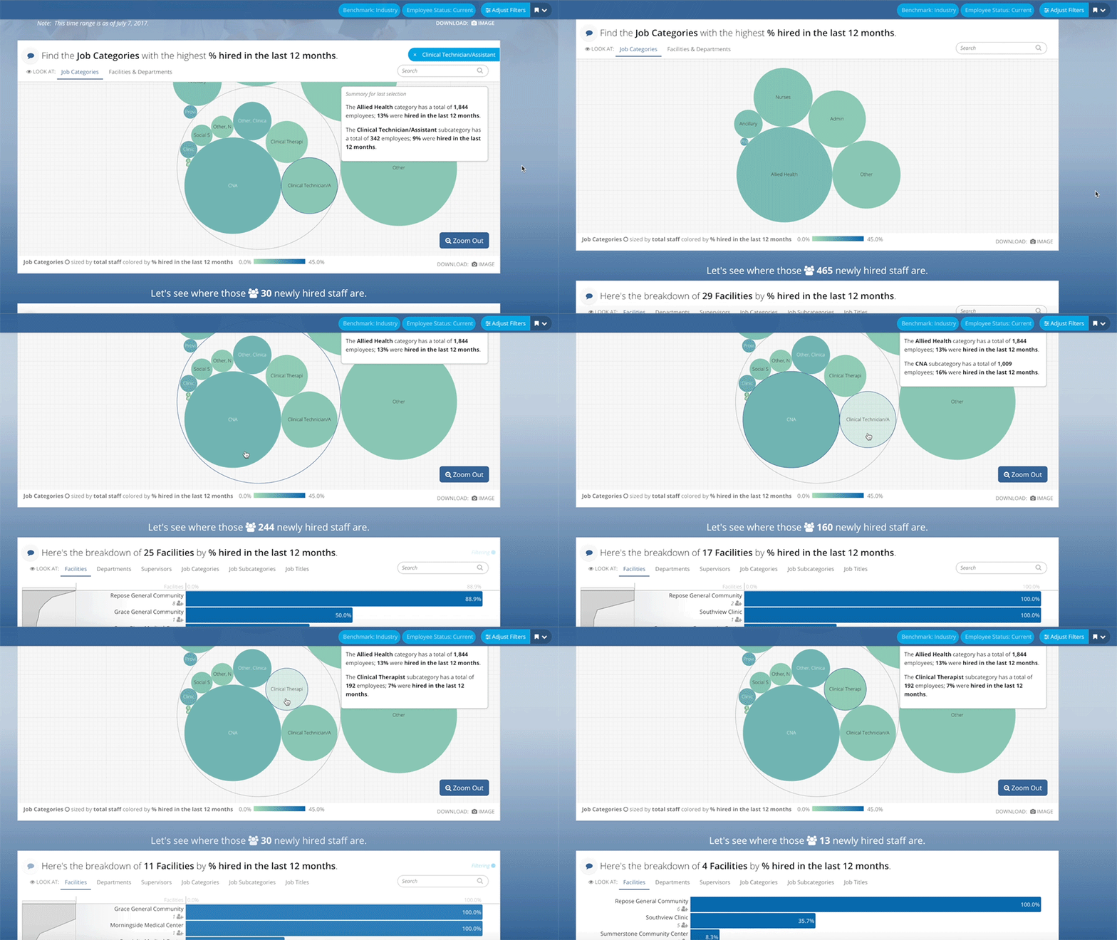
Screen Shot 2018-03-14 at 11.57.23 AM.png

I have mentioned before that Narrative Flow is important to Juicebox. Our applications are web-based and users expect to move and navigate from top to bottom, like when interacting with a webpage. Part of that movement from top to bottom in Juicebox means that as the user is making selections within the application, those selections should not only carry down the page but that they should also inform the visuals that follow.

We strive to be the world's best platform for telling data stories and because of that connecting our visuals together is vital. When someone makes a selection in the topmost slice, it places a filter on the data and the selection they make. This filter helps the user narrow down their selection and drill into the data.

Much of the problems with static reports and dashboards is that they only give the user a top-level view of his or her data. Traditional solutions do not provide the ability to drill further to discover what factors could be driving the data. In essence, today's charts, dashboards, reports, and BI solutions give the user a snapshot and not the whole story. 

Curious to see what else is included in Juicebox? Check out some of these posts highlighting other unique features:

Getting unstuck: Give your data a jumpstart

It’s a predicament that we’ve seen many times over: your data is stuck. You’ve tried some reporting through some Excel pivot tables, or you’ve messed around with a Tableau trial, but felt like there wasn’t enough engaging content to get your users excited. Rationalizing why you can’t get your data to be impactful for your business, you think things like, “maybe my users are talking about the data but I just don’t know about it” or “maybe the data isn’t structured in a way that allows for valuable insights to be extracted from it."

If you’re sitting there thinking that your mind is being read by our artificial intelligence, you’re wrong. It's because at Juice we have seen this scenario played out too many times and we’ve made it our mission to make these issues a thing of the past. What you need to do is give your data a jumpstart.

Here’s our suggested plan of action for getting your data unstuck and giving it the jumpstart it needs:

1. Get your data into a readable structure.

  • The first row of your data should always represent the column’s title
  • Columns should contain the same type of values, respectively

  • Each row should represent a case or a single instance within the data and should contain a date of when that data was collected. This means that two different rows in the data can represent the same entity with data collected for it at different points in time.

  • As a consequence of the rule above, the data should include a row identifier column that can be repeated to indicate that different rows of data are representing the same entities.

  • Make yourself a metadata sheet (also commonly known as “data definitions”) that you and other users of the data can refer to.

Here are some simple example data & metadata using the principles above.  

2. Present your data in hierarchical manner catered to specific audiences.

  • Give your audience a call-to-action, let them know why the data is important and why they should care.

  • Begin with presenting high-level key metrics. Think about what the most important numbers are you to your intended audience(s).

  • Give your audience the option to select a few different categories in which to segment and parse-out those important numbers. Doing this will allow your audience to drill-down in the data to get from a high-level to a granular level.

  • Allow your audience to take the data they have drilled down to with them. This could be one row of data out of the thousands they started with at the high-level.  

Here’s an example of this data presentation flow.

3. Engaging your audience in data discussions

  • This one is self-explanatory: talking about the data with others is the best way to squeeze the value from it.

Here’s an example of effective data discussions.

Sounds like a good plan of action, right? If you're still not sure what your next steps should be, we’re here to help.

We’ll work with you to get your data in a structure that makes it valuable, or even create data for you. We’ll build you a data story with that data that helps you and your users understand the data so that you can turn data insights into business actions. We’ll get your users engaged in data discussions and app design feedback so that you know they’re engaged with the data and you know how valuable they perceive the app to be. So drop us a line, we’re here to help.

6 Cool Companies Who Are Rethinking How We Work

It can be a challenging climb to reshape how people think about solving problems. We encounter this challenge daily as we work to build the best solution for communicating data the world has ever seen. We operate in an arena where good-enough solutions — Excel, PowerPoint, and other visual analytics tools — have left people with deeply-rooted habits and a blasé acceptance of the status quo. That’s not good enough for us, and it isn’t good enough for these six companies that are rethinking how business tools should work:

Slack

slack.png

Slack is the current king-of-the-hill for shaking up the status quo. Sure, we had email, file sharing, and messaging apps before Slack, but we didn’t have single, elegant tool for team collaboration.

What’s cool about it?
Slack made integrations easy from the start. We use everything from ChatOps with our development team to HeyTaco for everyday appreciation of our colleagues. Slack's approach to 'channels' found the right balance for open communication by topic.

Flourish

flourish.png

I only recently stumbled across the excellent visualizations available through Flourish. There are many, many tools for putting data visualizations on a screen; few vendors are so obviously passionate about their craft. 

What’s cool about it?
Flourish is more than another charting library — they are making world-class visualizations accessible. I was particularly impressed by the clever use of animation in those visualizations. At Juice, we appreciate that new users won’t always be able to read a visualization without some guidance. Animation can help draw a user’s attention to the most important information right off the bat.

Kialo

kialo.png

Kialo is “a debate platform powered by reason.” It cuts through the noise of social and online media by removing the worst parts of debating online (trolls, fake statistics, unrelated cat gifs) while strengthening the best.

What’s cool about it?
Kialo creates a structured dialogue with visualization, voting, and commenting. Whether discussing politics or the merits of a new project, Kialo has focused on an overlooked need: a place other than the comments section to examine arguments and consider new viewpoints. 

Typeform

typeform.png

Typeform is "the versatile data collection tool for professionals." It's a thoroughly modern survey-building solution that I’ve enjoyed using for over a year.

What’s cool about it?
Typeform's survey-authoring interface is remarkably intuitive. Adding questions, structuring logical flows, and navigating your survey is silky smooth. Similarly, the end-user experience is beautifully designed with selectors and animations that make it (almost) fun to fill out a survey.

Beautiful AI

beautifulai.png

From the founder of SlideRocket, Beautiful AI is a next-generation solution for creating web-based presentations. They say all you have to do is "think of an idea, choose a template, and get to work."

What’s cool about it?
Beautiful AI has taken a giant leap past a tool like Google Slides. It comes with a collection of smart slide layout templates. Better yet, these slide layouts automatically update as you add more content. The tool also comes with an easy-to-use integration with third-party image libraries so you can incorporate pictures into your presentation.

Toucan Toco

toucantoco.png

A data storytelling solution to build data apps for your business. We may be a bit biased, but that sounds awesome.

What’s cool about it?
While I don’t have hands-on experience with this solution, I love their message. Like Juice, they see the need to:

  • Communicate data to non-analysts with guided narratives ("Address the remaining 99% of your employees”)

  • Create targeted applications that solve specific business problems (“A business need = an app”)

  • Include simple, clear data visualizations ("The comfort of using consumer apps, finally in a business setting”)

Honorable mentions

  • Quid: Quid puts the world’s information at your fingertips, drawing connections between big ideas.

  • Skuid: Accelerate deployment of personalized applications that let your business people drive innovation, without the wait.

  • Trifacta: Trifacta enables anyone to more efficiently explore and prepare the diverse data.

  • Datawrapper: Datawrapper makes it easy to create beautiful charts.

Thinking about changing the way you work? Check out our app trial process. Download the info sheet below to learn more.

Data Fluency Dorks Unite

How we communicate data is broken.

There. I said it.

It may not be nice to hear, but deep down you know it's true. You can see it in the way that data gets delivered to audiences: email attachments no one wants to open, 50-page slide decks filled with never-ending complex charts, and scrolling pages of dashboards with no context around them. It's not only messy, it interrupts the ability to adequately share and communicate important information about data.

So what's the solution? How do we deliver data to audience where they can draw out conclusions and information that is going to be meaningful to them? The answer: data fluency.

Data fluency, or data literacy, is something that we at Juice have been talking about for years (we literally wrote the book on it). We recently sat down with Dalton Ruer, or as he's more familiarly known around the web, QlikDork, to discuss the details of data fluency and how to achieve it. Check out the video below to hear from Juice CEO Zach Gemignani and Global Head of Data Literacy at Qlik Jordan Morrow and learn what having data literate consumers means, how to get good at choosing visualizations and weaving them into engaging stories, what a data fluent culture looks like, and so much more.

You're Invited: Data Monetization Workshop 2018

Juice is proud to announce that it will host the third annual Data Monetization Workshop on Thursday, March 29, 2018 at the Nashville Technology Council’s Tech Hill Commons. Created by local data expert Lydia Jones in 2016, the Data Monetization Workshop brings together some of the top data and analytics practitioners in the country to discuss how to deploy data monetization in a business setting.

This year’s workshop will feature speakers and panelists from companies such as BuildingFootprintUSA, Crystal Project Inc., Dawex, Digital Reasoning, and Uber. The topics covered will be: 

  • The Now: What are the opportunities and business models you should consider to monetize your data? E.g. enhancing existing products, new data products, data marketplaces.

  • The Future: How will emergent technologies such as IoT and AI unlock new opportunities and challenges for data monetization?

Prior to the workshop, attendees will have the option to attend a data storytelling seminar led by Juice Analytics employees. The seminar will showcase Juice’s unique method for quickly and easily creating data stories from a given data set. The workshop will conclude with an open bar networking event.

Attendees in the past have come from Florida, Texas, New York, Georgia, California, Canada, and Australia, and across industries such as healthcare, finance, retail, technology, and government. They are typically members of the C-Suite (including CEOs, CMOS, CFOs, CXOs, and CAOs) as well as data and analytics leaders, data scientists, investors, and data product development leaders, among others.

To learn more about this year's Data Monetization Workshop, visit the link below. Please be sure to register in advance as seating is limited. We hope to see you there!


What's in a Juicebox: Narrative Flow

Do you remember when Facebook first launched its News Feed? I do. I can recall complaining with friends that it was "too stalker-ish" (we were right) and that "no one was going to use it" (we were wrong).

Today it's hard to imagine Facebook without its signature News Feed, but for a long time I did not care for it at all. That's because once people get used to a certain way that things operate on the web, they don't like it when those practices are changed. Not only do they dislike change, but they come to expect certain design practices online. Take for example the horizontal navigation bar found across the tops of web pages: around 88% of websites have its main navigation panel there on every page. Nine times out of 10, that's the first place a user will look when attempting to navigate through a website.

Another piece of design experience that all users expect is vertical narrative flow. Web pages flow from top to bottom and as you want to learn more about a company, product, piece of news, etc. you scroll down.

Juicebox is not unique among BI solution to offer a design layout that flows from top to bottom. Infographics and web pages have taught us that people want to read data the way the same way that they read text. However, Juicebox has a special ability to seamlessly connect the narrative flow, dynamic textual content, and complex filters to give users an effortless experience while navigating data.

interactive-slices.gif

Narrative flow is essential to the experience of Juicebox and our user-centered design. As a user interacts with a Juicebox application, they are continually making decisions about what they would like to see in the data, what relationships are most important to them between segments and tables, and what details they need to make informed decisions. All of these complex interactions are done behind the scenes as Juicebox provides that infographic-type feel in a web-based format.

gif-Narrative Flow.gif

Can you think of a situation where you need to deliver data to an audience of users? Maybe it is customer reporting or a data model that needs a user interface for people who are not data savvy. In recent months we have made it even more easy for you to get started with Juicebox. Through our Guided Design Process you can see your data in Juicebox and give access to 10 users so that they can experience the ease of navigating through your data in a narrative flow. To learn more about Juice's Guided Design Process, check out our resources page.