Data Storytelling

What's in a Juicebox: Narrative Flow

Do you remember when Facebook first launched its News Feed? I do. I can recall complaining with friends that it was "too stalker-ish" (we were right) and that "no one was going to use it" (we were wrong).

Today it's hard to imagine Facebook without its signature News Feed, but for a long time I did not care for it at all. That's because once people get used to a certain way that things operate on the web, they don't like it when those practices are changed. Not only do they dislike change, but they come to expect certain design practices online. Take for example the horizontal navigation bar found across the tops of web pages: around 88% of websites have its main navigation panel there on every page. Nine times out of 10, that's the first place a user will look when attempting to navigate through a website.

Another piece of design experience that all users expect is vertical narrative flow. Web pages flow from top to bottom and as you want to learn more about a company, product, piece of news, etc. you scroll down.

Juicebox is not unique among BI solution to offer a design layout that flows from top to bottom. Infographics and web pages have taught us that people want to read data the way the same way that they read text. However, Juicebox has a special ability to seamlessly connect the narrative flow, dynamic textual content, and complex filters to give users an effortless experience while navigating data.

interactive-slices.gif

Narrative flow is essential to the experience of Juicebox and our user-centered design. As a user interacts with a Juicebox application, they are continually making decisions about what they would like to see in the data, what relationships are most important to them between segments and tables, and what details they need to make informed decisions. All of these complex interactions are done behind the scenes as Juicebox provides that infographic-type feel in a web-based format.

gif-Narrative Flow.gif

Can you think of a situation where you need to deliver data to an audience of users? Maybe it is customer reporting or a data model that needs a user interface for people who are not data savvy. In recent months we have made it even more easy for you to get started with Juicebox. Through our Guided Design Process you can see your data in Juicebox and give access to 10 users so that they can experience the ease of navigating through your data in a narrative flow. To learn more about Juice's Guided Design Process, check out our resources page.

What's in a Juicebox: Discussions

What good is information if it cannot be shared and discussed? One of the founding pillars of Juicebox is communication; we aim to allow users, regardless of their familiarity with data analysis, the ability to easily identify and discuss important data points.

In taking on this challenge of what we call "The Last Mile of Business Intelligence", the question we must constantly ask ourselves is, "How do we make starting a conversation around data as easy as sending a text message?"

In order to solve for this, we have taken the knowledge gained from our 11+ years of designing and creating custom data applications and created an interactive data storytelling platform that helps everyday information workers make smarter decisions. Our goal for Juicebox is to reinvent the way people discuss and communicate data in the workplace and to their customers.

Our Discussions feature within Juicebox does just that by enabling those conversations around data in a method that is intuitive, quick, and effortless, especially compared to traditional processes. In the past when an insight was discovered within a spreadsheet, an analyst would have to send a report to a decision maker and ask him or her to review the finding. Not only was this process clumsy and time-consuming, the analyst and the decision maker were often on different planes in terms of data skill level. With Discussions, those conversing over the data can take a snapshot of the visual, mark it up, and download it in order to ensure the most relevant and important information is being shared. 

If you're interested in having conversations around your data, we would love to talk with you. Send us a message at info@juiceanalytics.com or click below to tell us more about what you're looking for. 

Data Storytelling Workshops, Part 2: Data Story Showcase

This is part two in a series on sharing Juice’s data storytelling method at various workshops around the United States. In part one, we talked about the highlights of teaching business professionals how to build insightful data stories in under an hour. Here we’ll showcase a data story that was built by one of our own Juicers who attended a workshop.

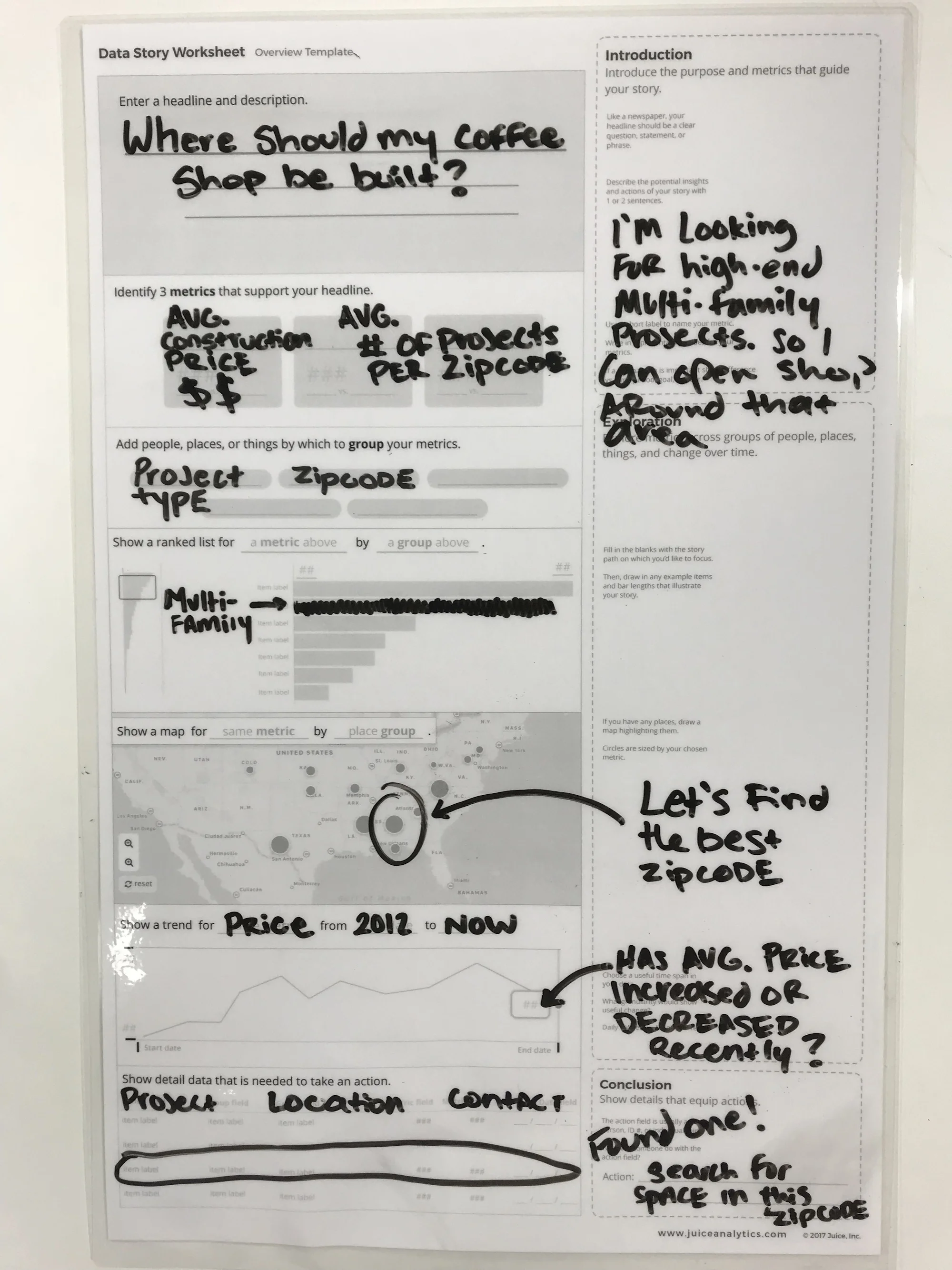
When creating data stories at Juice’s data storytelling workshops, we always start with a set of data from Nashville’s Open Data project. There are an infinite amount of data stories that can be created from a set of data like this that contains information on construction permits, location, cost, and type of building permit. For our data story prototype, we decided we wanted to know where to find construction projects for multi-family housing so that we could determine where to best build a cool new coffee shop.

giphy (12).gif

When creating our data story, it was important to us that we first give it a title. There are many different strategies that you can utilize when coming up with a title, but we decided to start with a simple yet profound question that would ultimately be answered by the end of the data story.

We find that in order to ensure that the data story being created is coherent and focused, it’s crucial to determine how each visualization contributes to the overall goal of the story. In this example, we wanted to have a high volume of people who enjoy a good cup of coffee and would be likely to visit our coffee shop. To display this in our data story, we would zoom into the map to browse areas around Nashville that are sized by the number of multifamily home projects currently underway in a given zip code.

Once we had selected a zip code that had a business-sustainable number of multifamily projects underway, we also wanted to check to see which way the number of projects in that zip code has been trending over the past 5 years. After seeing that the volume of projects in our zip code of interest had been positively trending over the past few years, we would search through the table at the bottom to find the largest one of these projects to build our coffee shop near so that we can maximize our chances for success.

IMG_8506.JPG

Want to know more about our data storytelling process? Send us a message! We're always happy to share our methodology or to answer any questions.


Data Storytelling Workshops, Part 1

The Juice team has been traveling around from conference to conference showcase our method of quickly and easily creating data stories from a data set. We got the opportunity to utilize Nashville’s Open Data project to source the data we used for the workshops. Attendees were divided into several groups and given the option to choose between several personas for whom they would build their data story. By focusing on a particular type of user’s goals, attendees were easily able to create questions that should be answered by the data. These questions or “goals” for their data story were written out on sticky notes by each group member and were shared with the entire group.

Juice Werkshops GIF 1.GIF

Once the goals for their stories were distilled into just 3 questions total, attendees chose metrics and dimensions that would function to best answer the questions that would achieve the goals that their personas wanted from the data story. Making decisions about building effective data stories typically take hours if not days. We were able to accomplish this in less than an hour and saw attendees leave with a full understanding of how a great data story is built for a particular audience or user.

Some workshop moments that were captured can be found in the 30-second video below:

Stay tuned for part two, in which we will showcase a data story that was created by one of our attendees. You won’t want to miss what he created in just under an hour with Juice’s guidance!

If you can't wait and want to see how you can start making your own data stories with Juice, send us a message using the button below.

The Art of Data Storytelling: Structure

This is the second in a series of posts on The Art of Storytelling, a video series from Pixar that shares its storytelling methodology. In this post, we will be examining how the lesson on Story Structure can be applied to data storytelling. For part one on storytelling and character, click here

Introduction to Structure

While traditional storytelling and data storytelling are not identical mediums, there is quite a bit of overlap between the two, and many of the best practices for one can be applied to the other. Take for example the idea of structure when it comes to storytelling. Structure, or in simpler terms, “what do you want the audience to know, and when?” is hugely important when it comes to the practice of data storytelling.

It may seem counterintuitive to consider modeling your data presentations after traditional storytelling structure. After all, storytelling is an inherently subjective act. The storyteller is crafting something that helps the audience learn about a theme that the storyteller finds important, and consequently a moral that should be learned. Applying this to data can seem like enemy territory for analysts who feel that their job in presenting data is to “let the data tell the story.” It’s important to note, however, that the data doesn’t have an opinion on what is important. For example, I was speaking to an HR Analytics team recently and it was clear to me that they wanted to use data to share important lessons with the business. It was less clear that they felt empowered to do so because they felt the data should speak for itself. Data often needs a voice to give it meaning.

When creating the structure of your data stories, keep in mind that it often takes a while to get to the structure that works best for what you are trying to accomplish. That is why it is important to create something ‒ even in a rough form ‒ and get it in front of people who will give you feedback. Does it resonate and connect with the audience ‒ or is it more like the unpopular original structure of Finding Nemo? Without this knowledge, you’re more lost than Dory and Marlin ever were.

Story Beats & Story Spine

An effective way of organizing story structure is by utilizing story beats, the most important moments in your story, and story spine, a pattern into which most stories can fit. While your data story most likely won’t open with “once upon a time…” and end with “and ever since then…” the lesson can still be applied. Using a structure that is broadly familiar to audiences and hitting familiar story beats will help ensure that a data story leverages the hooks that storytelling already has in people. Your audience is looking for certain things in a data story, just like they would in a Pixar film. Who or what are the key players? What’s the conflict? How can it be resolved? Utilizing these when appropriate will make your data stories much more effective.

Act 1

The first act of a film serves to introduce the audience to a protagonist, establish the setting, provide information into how the characters’ world works, and introduce an obstacle that sets the rest of the story in motion.

In traditional dashboards and reports, this information is often missing and leads to users not knowing where to start. If your audience is going to go on a data adventure with you, they should start off by caring about the situation that exists. Data stories should start with a high-level summary that then lets users progressively and logically drill into more complex details and context.

Act 2

Pixar states that the second act of a story as “a series of progressive complications.” My favorite way of describing act two is “the part of the story in which you throw rocks at your characters.” Either way, what happens in the next part of your data story is clear: addressing conflict.

When it comes to data stories, act two is the back-and-forth exploration of the problem. In the traditional story spine they refer to it as “because of that…”; for analytics we call it “slicing-and-dicing.” Throughout act two of your data story you are showing your audience the drivers of problems and identifying any outliers.

Act 3

In traditional storytelling, the third act is the part of the story where the main character learns what she truly needs, as opposed to what she thought she wanted. The character has gone on a transformation along the course of the story, and that is evidenced in the final act.

This is much harder to pull off in data storytelling. In data storytelling, I believe the protagonist is the audience. Much like the main character, the audience needs to be transformed and understand something new and important. A satisfying story is when a problem is fixed and the world is set right in some way. Great data stories deliver that change -- but to do so they need to do more than change the audience’s perspective. They need to make the audience act on, not just discuss, this transformation.

Advice

The best bit of advice from the Pixar storytellers is simple: work backwards. This is how we do it at Juice: we consider what is the endpoint, the change or impact that we want to make on the audience, and then craft the story that can help get us there.

We know that crafting data stories can be a challenging process, and that’s why we’re here to help. If you’d like to talk to us about how we create data stories, send us a message at info@juiceanalytics.com or click the link below.

Q&A with Treasure Data: Everything You Ever Wanted to Know about Data Viz and Juice

This post originally appeared on the Treasure Data blog. 

Tell us at the story behind Juice Analytics. What’s your mission?

My brother and I started Juice Analytics over a decade ago. From the beginning, our mission has been to help people communicate more effectively with data. We saw the same problem then that still exists today: organizations can’t bridge the “last mile” of data. They have valuable data at their fingertips but struggle to package and present that data in ways that everyday decision makers can act on it. Even with the emergence of visual analytics tools, data still remains the domain of a small group of specialized analysts leaving a lot of untapped value.

Our company has worked with dozens of companies, from media (Cablevision, U.S. News & World Report) to healthcare (Aetna, United Healthcare), to help them build analytical tools that make it easy and intuitive to explore data. We published a popular book in 2014 titled Data Fluency: Empowering Your Organization with Effective Data Communication (Wiley) with a framework and guidance to enable better data communication. To bring our best practices and technology to a broad audience, we built a SaaS platform called Juicebox that enables any organization with data to create an interactive and visual data storytelling application.

Why is data visualization so important to an organization’s ability to understand its data?

Data visualization is one of the most useful tools in bridging the gap between an organization’s valuable data and the minds of decision makers. For most people, it is difficult to extract insights or find patterns from raw data. When we tap into the power of visuals to help us recognize patterns, data becomes more accessible to a broader audience.

For many of the organizations we work with, data visualization has the added value of uncovering issues with the data. Once you start visualizing trends and outliers, the weaknesses or mistaken assumptions about your data come to the surface.

What is data storytelling? How can it be useful to marketing professionals?

The term data storytelling has become increasingly popular over the last few years. We know that data is important to reflect reality — but absorbing data, even in the form of dashboards or data visualizations, can still feel like eating your vegetables. We all recognize the power of storytelling to engage an audience and help them remember important messages. People who focus on communicating data — like our team at Juice — feel that there is an opportunity to use some of the elements of storytelling to carry the message. Stories have a narrative flow and cohesiveness that distinguishes them from most data presentations.

However, data storytelling is different from standard storytelling in some important ways. For one thing, in a data story the reader is encouraged to discover insights that matter to them. One analogy I like to use is a “guided safari.” Data storytelling should take the audience to the views of data where new insights are likely to occur, but it is up to the audience to “take a picture” of what is more relevant to them.

In our experience, data storytelling is particularly valuable to marketing professionals. For internal audiences, data storytelling techniques can help you explain the impact of your marketing efforts to your stakeholders. For customer or prospects, data stories can be used to lend credibility to your marketing messages and enable deeper insights of your product.

What are essential tools for data storytelling?

The tools for data storytelling fall into a couple of categories: human skills and technology solutions.

The most critical skill you can have for data storytelling is empathy for your audience. You want to know where they are coming from, what they care about, how data can influence their decisions, and what actions they would take based on the right data. Knowing your audience allows you to shape a story that emphasizes the most important data and leads them to conclusions that will help them. Data storytellers must remember that an audience has a scarcity of attention and a need for the most relevant information.

At Juice, we’ve thought a lot about the capabilities that make data storytelling most effective — after all, we’ve created a technology solution that lets people build interactive data stories. Here are six features that we consider most crucial:

  1. Human-friendly visualizations. Your audience should be able to understand your data presentation the first time they see it.
  2. Combine text and visuals. There are lots of tools for creating graphs and charts. But data stories are a combination of data visuals flowing together with thoughtful prose and carefully-constructed explanations.
  3. Narrative flow. The text and visuals should carry your audience from a starting point (often the big picture of a situation) to the insights or outcomes that will influence decisions.
  4. Connected stories. In many cases, it takes more than one data story to paint the whole picture. Think of presenting your data as a, “Choose Your Own Adventure” book, in which the audience can pick a path at the end of each section to follow their interests.
  5. Saving your place. The bigger and more flexible a data story becomes, the more important it is to let the audience save the point they’ve arrived at in their exploration journey.
  6. Sharing and collaboration. Data stories are often a social exercise with many people in an organization trying to find the source of a problem and decide what they should do about it. Therefore, it is critical to let people share their insights, discuss what they’ve found, and decide on actions together.

Where do you see organizations struggling the most with managing and understanding the data they collect? What should they be doing differently?

A common problem is that organizations don’t truly understand the data they are collecting. Ideally, data is truth— it should allow us to capture and save the reality of historical events, such as customer interactions and transactions. However, more often than not, what the data is capturing isn’t exactly what people imagine. We find it useful when we can get a data expert in the same room as the business folks who will be using the data. A deep dive discussion about the meaning of individual data fields will often reveal mistaken assumptions or gaps in understanding. Working together to build a data dictionary can be invaluable as you continue to use data.

Data exploration is an iterative process. Answering one question will raise a few more. In this way, organizations will eventually identify where they lack understanding of their data. The faster you can iterate on analyzing and presenting data, the sooner you will resolve the issues.

Is all data visualization created equal? What do organizations need to know about finding the right type of visualization to help better understand their story?

Not all data visualization is created equal. There are visualization approaches — charts and graphs — that could be a good fit for your data and message and there are poor data visualization choices that will obscure your data. One mistake that we see is an ambivalence toward finding the right chart for the job. You may have seen dashboards that default to show data as a bar chart, but also give users the ability to pick a variety of other charts types. Why not choose the best chart to convey your data and unburden users from making any more decisions?

There are also well executed and poorly executed data visualizations. Good data visualization emphasizes the data over unnecessary styling, clearly labels the content and directs attention to the most important parts of the data.

From where you sit, how should organizations approach their data management – from collection to storing to analyzing?

We start from the end, then work our way backward. One of the biggest mistakes we see is organizations trying to collect and consolidate all the data they may possibly need in one place. These types of data warehouse projects quickly spin out of control with endless requirements and increasing complexity. It doesn’t have to be that way. Instead, we’d encourage people to start with three simple questions:

  1. What important action do we take today that could be better informed by data? Only include high impact actions where you have the data to answer the question.
  2. How would we present that data to the people who make take those actions? Most of the time it isn’t a data analyst who is going to be acting on the data on a day-to-day basis. Consider the simplest possible view of the data that would enable the end users.
  3. What data is necessary to deliver that view? Now you’ve narrowed down to just the critical data that is going to make an impact.

Once you’ve answered these questions for one specific action, you can go back and do it again for another.

What trends or innovations in Big Data are you following today?

Here are a few of the areas that are interesting to us:

  • Data narratives. Companies like Narrative Science are turning data into textual summaries. Like us, they are looking for ways to transform complex data into a form that is readable to humans.
  • The intersection of enterprise collaboration (e.g. Slack), data communication (e.g. Juice), and business workflows (e.g. Salesforce). Our goal isn’t just to help visualize data more effectively. We want people to act on that data. To do so, data visualization needs to connect to places where people are having conversations and into systems where people make business decisions.
  • Specialized analytical tools. The pendulum appears to be swinging away from do-it-all business intelligence platforms and toward best-of-class, modular solutions. Companies like Looker, Alteryx and Juice aren’t trying to be everything to everyone — but rather serve a specific portion of the data analysis value chain. We’ve found more and more companies that are looking for the best tools for the job, but require mobility of the data between these tools.

Do you have a question about data viz, data storytelling, or Juice that we didn't answer? Send us a message at info@juiceanalytics.com or fill out the form below.

"Choose Your Own Adventure" Data Stories


Before the days of iPads, smart phones, gaming systems, and on-demand TV, children read to keep themselves entertained. I know what you're thinking -- "What?! How could that be possible? Kids hate reading!" False! When I was growing up in the 80’s and early 90’s, one of my favorite modes of entertainment was reading, and I especially loved the “choose your own adventure" genre. I can remember reading with a flashlight under the covers eagerly awaiting the next page to choose what happened to the main character. Even though I was choosing from a set number of options, I still felt in control of the adventure. At Juice, we see multiple parallels with “choose your own adventure” stories and data storytelling.

One of the main challenges when it comes to data storytelling is being able to get both analytical and non-analytical users on the same page. Data always tells a story, and we want to enable people to communicate the story to their audience and ultimately deliver something of value, regardless of their level of data fluency. This means giving users a common language in which to communicate and a platform to do so.

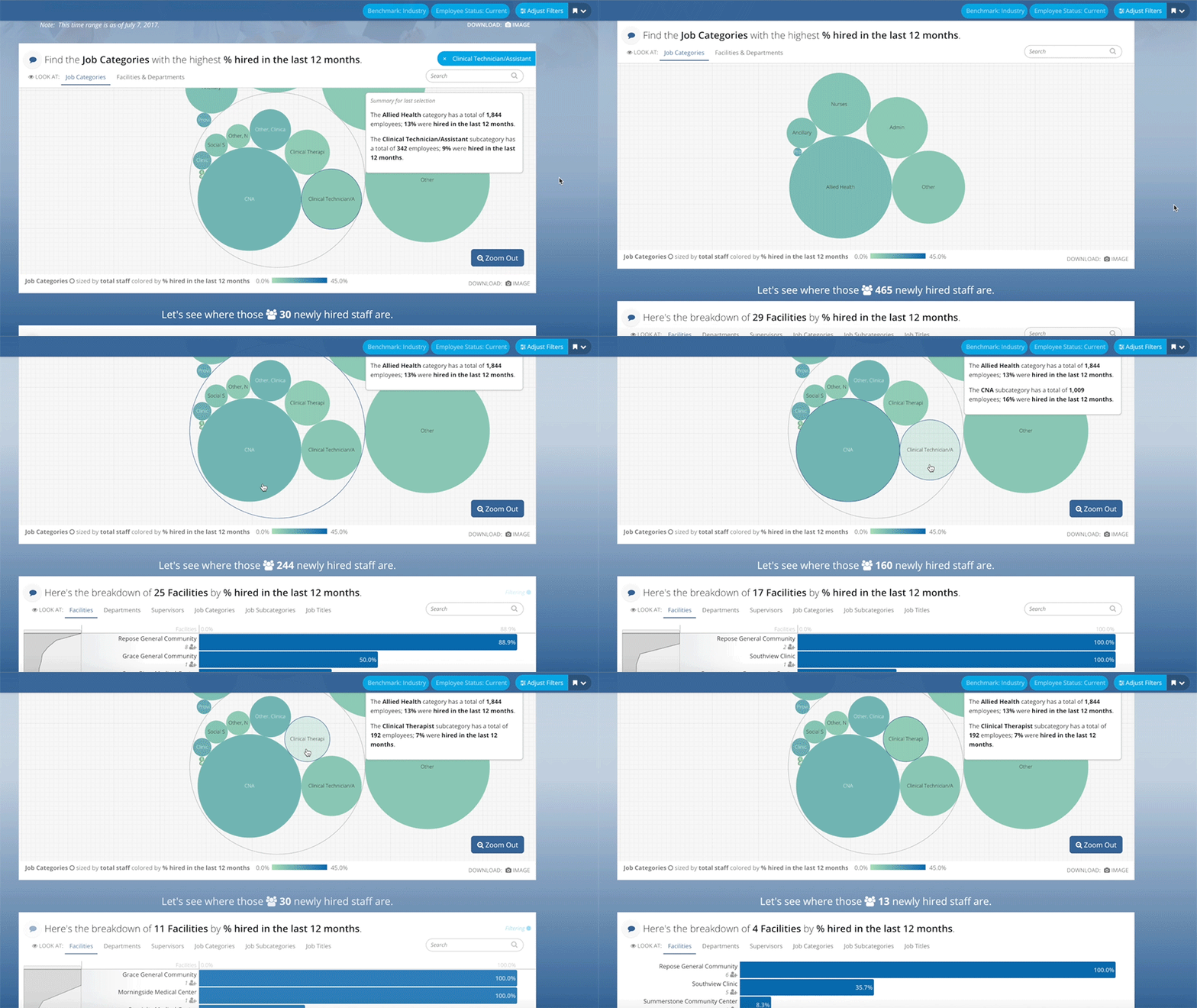
Some data stories are simple: they have a few metrics and a number of ways you can slice and dice the data. But what if a user wants to aggregate different sets of data and find trends, commonality, and meaning? This is one of the challenges we have taken on in Blueprint, and the starting point for finding such commonality is deciding on a root unit of measure. For Blueprint that is the employee of a hospital or health system. In our conversations with these organizations, we have discovered that leadership wants to see their employees under many different lenses (such as hiring, turnover, tenure, engagement, compensation etc.). The problem is that each of those lenses is a different data set. With Blueprint we have created an aggregator for those disparate data sets to live. By filtering the data down to an organization, department, or supervisor, we can allow a leader to “choose their own adventure” and find the story in the data that is most important to them. This allows them to see more clearly into their organization and make smart, thoughtful, data-driven decisions.

Blueprint may be the first of its kind, as demonstrated by its use of shorter modules/stacks that allow the user to make his or her selection and then carry it onto the next module, but we know it won't be the last. We're truly excited about what this “choose your own adventure” type of navigating means not only for the future of our products, but for the industry as a whole. And now the choice is up to you -- what will be the next step of your data storytelling adventure?

Creating User Personas to Tell Data Stories

Juicebox boasts a wide variety of users who all prefer to experience their data stories in different ways. Some users like to follow the story chronologically, some like to jump around to different parts of the story, and others prefer to simply sit back and explore the story. Our top priority is making sure that all of our users are able to achieve their different goals while using Juicebox's Guided Story Design. In order to ensure that this happens, we've created user personas. Here are the steps we took to create our user personas that you can recreate with your own users.

The first thing we did was sit down with our users and ask them questions. A lot of questions. Our personas were not created from what we think our users’ behaviors and goals are, but instead were born from real conversations with the real people who use Juicebox. Without the specific comments our users were able to provide us about their  wants, needs, and desires, we would not have been able to create successful user personas.

The second thing we did once we had collected this juicy information was to share it with everyone in our organization. We didn’t want to keep these critical details limited to a small number of people at Juice - we wanted everyone to feel as if they knew each of our users’ preferences and needs on a personal level. When sharing the information we also wanted to make it fun and easy to reference, so we made playing cards for each of our personas and spread them around the offices. Now whenever Juicers talk about product design, they can use the cards to make sure that all types of users are included in the big decisions being made about how our stories are structured.

Once you create your user personas, it's important to remember that users' behaviors, preferences, and goals are constantly changing. To ensure that we are always correct in our user personas and our ideas of what they need, we monitor users' actions with Fullstory. The benefits of being able to monitor our product use this way are seemingly endless. For example, when a user experiences confusion with the functionality of our product, we’re able to know about it immediately and address it.

Successfully taking large groups of our users, discovering how they prefer to experience our Guided Story Design, and humanizing them through persona playing cards has allowed us to walk a mile in the shoes of our users. This ability has fostered a strong sense of empathy for our users because we truly believe that we understand their preferences in a data product and can share the feelings they experience while using Juicebox. Using these tools as a concerted effort to bring the user into the front of everyone’s mind at Juice Analytics has been instrumental to our success. Because we truly care about users’ experience when navigating the stories we tell with their data, we’ll continue to strive to create the most engaging and insightful stories possible. And now that you know the secrets to our success, you can too. 

Want to learn more about Juicebox? We want to tell you about it! Send us a message at info@juiceanalytics.com or click the link below to schedule a demo.

Data Storytelling: The Ultimate Collection of Resources II

When we wrote the first installment of "Data Storytelling: The Ultimate Collection of Resources" the world was a different place. It was 2013 and we were all busy celebrating a new royal baby, adding the words "twerk" and "selfie" to our vocabularies, asking ourselves "What Does the Fox Say?", and just beginning to recognize the idea of data storytelling as a hot new concept in data visualization.

Flash forward four years and the concept of data storytelling has only increased in popularity. Since that first collection of resources was posted, the amount of quality content on the subject has grown exponentially. Below are some of our favorite blog posts, videos, presentations, and more about data storytelling that have been published since. Peruse and enjoy at your leisure.

Blog Posts

Videos & Presentations

Podcasts

Books

Other Resources

1. Blog Posts

Series on Storytelling by Jon Schwabish

What Is Story? “ While it sounds good to say that we’re telling stories with our data, I think far too often, far too many of us are not applying the word story to data correctly."

Story Structure “As the terms “story” and “data” get mixed together more and more, it’s worth taking a look at traditional story structure to see if we are appropriately applying the word story to data."

Applying Data to Story Structure “If, however, we are telling stories with data, then these models of story structure should apply to data and data visualization. But they don’t."

The Storytellers “In this final post, I look at the differences between analyzing data and talking to people and how those two ends of the spectrum differ across different types of content creators."

More Story References and Resources - A list of resources inside a list of resources -- so meta. Jon Schwabish details the materials he used while writing his series on data storytelling.

So What? By Cole Nussbaumer Knaflic “Everyone wants to "tell a story with data." But very often, when we use this phrase, we don't really mean story. We mean what I mentioned above—the point, the key takeaway, the so what?"

Storytelling with Data Visualization: Context is King by Nick Diakopoulos “To fully breathe life back into your data, you need to crack your knuckles and add a dose of written explanation to your visualizations as well. Text provides that vital bit of context layered over the data that helps the audience come to a valid interpretation of what it really means."

Data Storytelling: Separating Fiction from Facts by Brent Dykes “As various people step forward to provide opinions on how to tell data stories, I’ve seen misinformation creep in which—if left unaddressed—could lead aspiring data storytellers astray."

The Role of Data in Data Storytelling by Teradata “An (alarmingly) large number of comments and opinions describe in great lengths how people in technical professions are unable to explain or storytell their experiments and findings. Have we regressed that far that something as natural as stories has disappeared from our skillset? Not really."

Will You Present the Data As-Is, or Tell a Story? By Ann K. Emery “It’s not that one visualization style is better or worse than the other. They’re apples and oranges. I want you to figure out when your viewers are expecting to see each style and then learn how to switch back and forth."

Story: A Definition by Robert Kosara “Once you start looking at actual stories, you will find these elements everywhere. And they do apply to well-crafted stories about data just as they apply to traditional stories about people."

Implied Stories (and Data Vis) by Lynn Cherny “Even very simple stories, whatever the discourse form, rely on the reader filling in a lot of invisible holes. Some of the interpretation we do is so 'obvious' that only sociologists or cognitive scientists can make explicit the jumps we don't notice we're wired to make. "

Everything We've Ever Written On Storytelling by Juice Analytics

2. Videos & Presentations

3. Podcasts

Visual Storytelling w/ Alberto Cairo and Robert Kosara by Data Stories (Enrico Bertini and Moritz Stefaner)

Adam Greco’s 5 Analytics Data Storytelling Strategies by The Present Beyond Measure Show (Lea Pica)

Data Storytelling with Brent Dykes by Digital Analytics Power Hour

4. Books

5. Other Resources

30 Days to Data Storytelling by Juice Analytics

Did we miss your favorite data storytelling blog, presentation, podcast, or book? Send us a message to let us know!

3 Jobs Every Data Story Should Do

One of the companies we love is FullStory. Recently, they wrote a nice piece about how when people buy a product, they’re really hiring that product to do a job — a job they already needed to do but that is easier with the assistance of the product. 

This is true for data stories, too. In a nutshell, data stories are the assembly of data, visuals, and text into a visual narrative about the meaning of the data. Properly crafting an effective data story — one that connects the reader to their data, its meaning, and how it relates to their environment, all while assisting the reader in accomplishing a meaningful task — is not an easy endeavor in which to succeed. 

But don’t despair! Give your data story these 3 jobs to do and your readers will be more effective with their data.

Job #1: Tell them something they already know.

When you write a data story, the very first thing you have to do is build trust with your reader. Until they have confidence in your story, the best you can hope for is to drag them into the slog of figuring whether or not they can trust your story, which is typically performed through in-depth and independent data forensics. Did somebody say “Party!”? Um, no.

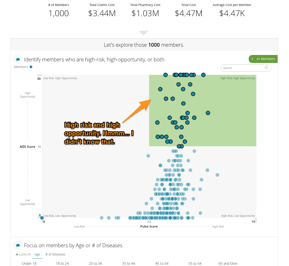
So, how do you build trust? By meeting them on common ground: tell them something that they already know and agree with. Here’s an example from an application we created using Juicebox, our data reporting application platform, that addresses the greatest opportunities for cost and care management in the world of population health.

We start by presenting a key metric of total number of members, a metric that most users would be familiar with and would give them the sense that we’re both talking about the same thing. Now we’re on the same page with the reader and, presuming we’ve done it correctly, the data story is ready to do its next job.

Job #2: Tell them something they don't already know.

A data story that only tells the reader what they already know isn’t terribly useful. So the second job of the data story is to make them smarter and introduce them to something new. This new piece of information demonstrates the value of your data story. If done properly, the reader comes away saying “A-ha! I see it!”

Continuing with our population health example from above, we introduce the bucketing of population members into a high-risk/high-opportunity group. “Oh look, there are 41 people in that group that are at risk, but who have a high opportunity for change."

But, as GI-Joe always says, “knowing is half the battle.” The other half? On to your data story’s third and final job.

Job #3: Give them something to do.

If data is presented and no-one acts, did it matter? If a tree falls in the forest and no-one hears it, did it make a sound? If the rubber doesn’t meet the road, is the cliché reality? Seriously though, when the new thing that the audience learned inspires actions, that’s when it become truly useful. Continuing with our example, you can see that the user is presented with a list of specific people who fall into the high-risk, high-opportunity bucket — perhaps feeding these folks into a campaign to actively manage their risk would be the next step. 

The more specific you can get with the recommendation, the better. This last step is most successful when your data story is written around a very specific and targeted narrative. This is what we at Juice call a short story... but more on that another day.

The next time you write a data story, give it these three jobs and we’re certain you’ll make your readers more effective at using your data. Need some more help with your data story? Send us a message at info@juiceanalytics.com or fill out the form below!